Variations and similarities introduction
The exam topic is 
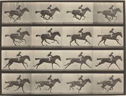
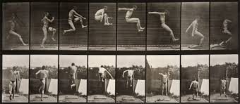
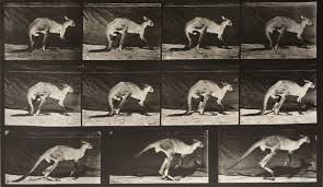
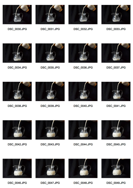
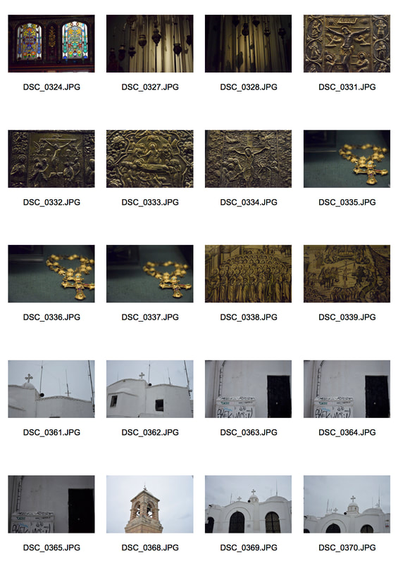
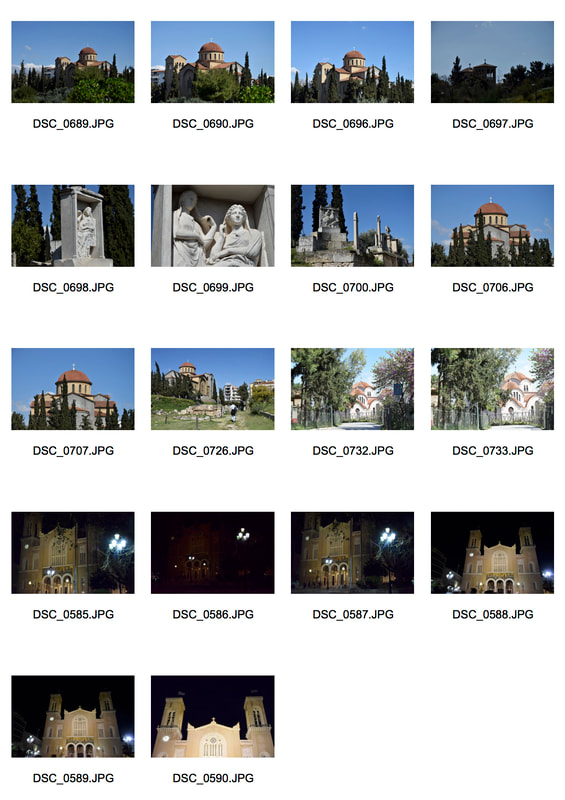
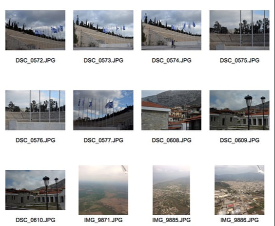
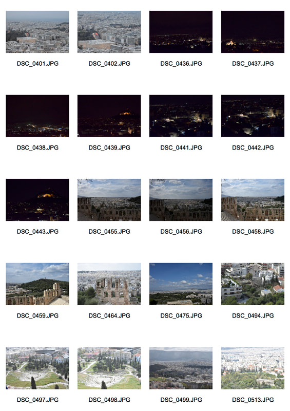
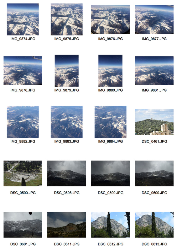
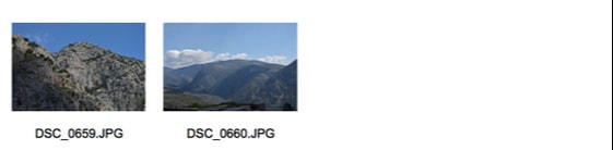
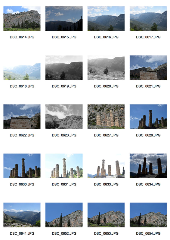
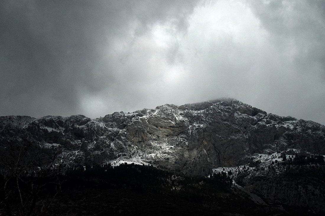
Variation and similarity, so this unit will be exploring the multiple ways in which variation and similarity can be created using photographic techniques. There is a vast amount of ways the topic could be interpreted, for example showing natural diversity, variations across a theme physical or conceptual and on a large or small scale.
Exhibition visits
Edward Burne-Jones
I visited the Tate Britain to the exhibition of the last Pre-Raphaelite, Edward Burne-Jones.
The Pre-Raphaelites were a group of English artists, poets and art critics which was founded in 1848, Edward Burne-Jones is said to be the last of the movement. The group wanted to go back to portraying a realistic description as the natural world, opposed to the style of the time portraying an idealised world. They were inspired by anything medieval and naturalistic, wanting to depict beauty which was being taken over by industrialisation and materialism of the time.
Edward Burne-Jones was of the second generation of Pre-Raphaelites, he studied with an original Pre-Raphaelite he admired, Dante Gabriel Rossetti. At this time Rossetti work had moved from portraying naturalism to more imaginary worlds becoming more decorative. This influence can be seen in Burne-Jones work as his work re imagines myths and legends in literature, through a variety of media such as tapestry, furniture, stained glass, drawings, jewellery and of course paintings. By the end of the 19th century he had moved the Pre-Raphaelite movement on to symbolism, making it less about the narrative and more the idea, form, structure and colours. Examples of his work can be seen below:
There were around 150 items of his work over seven rooms of the exhibition, I particularly liked his imagined world that portrayed the myths of Perseus and Sleeping Beauty (in separate rooms). These series stood out to me as the curator has placed them in a way around the rooms which told the story as you followed it round. Burne-Jones Sleeping Beauty series depicts a scene from the story, were the prince finds everyone asleep, the series shows different sections of the scene, creating a dream like world in the silence of the sleep allowing the viewer to imagine the rest of the story around this one scene. Overall I liked his work as it captured so much detail and expression, much of his work had the overall myth being told but subversive, more sinister elements that prompt the imagination.
His work shows the multiple variations that can come from one idea in how it is interpreted and depicted. As well as the comparison between the work of his time with modern art, in how it has developed and what key elements are still important or not,
Don McCullin
The exhibition was a retrospective of all his work over the last 60 years, it started with his very first pieces, most famously The Guv'nors and continued through to his latest Landscapes. McCullin grew up in London in Finsbury Park this is where his work started, when his image of The Guv'nors, a local street gang he knew, was picked up and published by the observer in 1959 he continued his photography abroad. He is best know as one of the greatest war photographers having captured conflicts in Vietnam, Cambodia, Cyprus, Congo as well as Iraq and more. However he does not like to be called a war photographer, nevertheless his images mainly focus on the less fortune people in the world, struggling through their own wars everyday. McCullin grew up in a poor area and both his parents died by the time he reached 14, so he likes to capture the stories of the less fortune and relate to them. He shots in film in black and white with a medium format camera and does all post production in the dark room using various techniques, to get his images as dark as possible without ruining the image. So much that sometimes the figures in his images become silhouettes due to the high contrast. He states his photography gave him a life time of experience and he uses it to find himself in the world. Nowadays he tries to move on from war and images of poverty and class divisions to forget the horrors he has seen, working instead on still life and landscapes.
I really liked the exhibition of Don McCullin as it showed a variety of work and the style of his work became clear across the different rooms. His work is very emotive and atmospheric, capturing shocking scenes like in the last images above and even when it seen the photo is peaceful it still has the intensity of a bigger problem like the other two images above. In the middle image a different issue is shown, one of the environment and how the steel industry had ruined it and will be left ruined for the people who live there but the people who caused it will move on. I think the black and white and high contrast production, works well to document the events and transport the viewer back in time to it.
It links to variations and similarities as there is a clear theme of less fortune groups and situations within society, however there is a uniqueness in each of his prints that portrays each environment and situation differently.
Response to Don McCullin
On the walk from the Tate Britain to the train station, I captured the city and events happening in a similar documentary style of Don McCullin. There happened to be a brexit march happening, which linked to his work in capturing certain groups and attitudes of the contemporary time, as brexit is a very current issue. Nearly all the series McCullin has created over his years document political issues of the time, therefore the brexit was a good event to document after visiting his exhibition.
I captured the images on my phone's camera, I was mainly looking to capture key individuals which stood out in the crowd, whether it was due to their outfits, their body language or how they looked within the group.
The images have a low depth of field due to them being taken on my phone, however the centre of focus is still quite clear in each image.
In the first image the focus was more on the unity of the group particularly shown in the many flags in the air with the clear colours of red and blue in the image, however in the left corner the image is too exposed and distracting to the rest of the image, as well as the phrases on the red signs being cropped and not fully shown gives the image a bad frame, it would have been better If the image was zoomed out and captured all of the phrases. The second image was only focused on the individual and their flag in the empty street, the focus could have been clearer and there could be more negative space so that the focus was clear on the flag, nevertheless it does capture the spirit and opinion of the individual. The third image and last do exactly this but in different ways, as the third captures the spirit and opinion of an individual within a group, as if he is leading them. His in motion body language also highlights this as he hold up his sign stressing its importance whereas everyone else's are down. However this image would be better to emphasis his message if there was a sharper focus which could have picked up the detail of his sign, perhaps down by a larger aperture then my phone has. In the last image his spirit and opinion is shown bold and alone, bold due to his clear sign and England flag outfit, and alone as the shadow acts as a separation boarder between him and the other people behind. Further highlighting the political loneliness of his view. Also his firm body language, standing still, depicts his firm views.
Typology
Our task is to create our own typology series documenting repeated forms, this type of photography will highlight the variations and similarities in the different images as they are displayed next to one another.
Zhao Xiaomeng
Zhao Xiaomeng is a photography and visual artist based in China, Beijing, below is his typology series 'Bicycles in Beijing, now'. To create this series he went round Beijing in search for bicycles, as he wondered what had happened to them. China was once a 'kingdom of bicycles' which were a cultural symbol and a shared memory for many generations as they were an essential mode of transport in China. However, when the car came about in China the bicycles were put away and replaced with cars, especially in Beijing. The bicycle was no longer a cultural symbol, but one that highlighted the people who did not have cars. Zhao Xiaomeng saw the locked away bikes that may be used one day, as a reflection of China's change and how its people were adapting to it.
I chose to photography models of angels which belong to my nan, to highlight a concept similar to Zhao Xiaomeng. His bikes highlighted a key part of Chinese cultural being left behind as China developed, the fairies are meant to highlight the loss of innocence in each generation as time progresses, due to technology children grow up faster and so the fairy-tale carefree world they are meant to live in is lost.
I decided to shot them using a tissue paper pink backdrop, to emphasise the fairies gentleness and overall atmosphere, moreover I used an aperture of 3.5 so that the image would have a softer focus adding to the fairy like atmosphere. I used a tripod when taking the images so that the different fairies were in relatively the same positions.
The angles work well as a typology as they have clear qualities in common, for example their wings and the overall and individual delicate, peaceful nature they depict. The pink tissue paper in the background is slightly different in each frame but it is not overly distracting, and the angels all seem to be in the centre of their images so that the typology has form and is easy to read. As well as, the angels vary in size and position adding a uniqueness to their unity. The detail was best captured on the bigger angles, such as the blue one in the second row in the second frame, then the smaller, such as in the last frame in the last row. However they all still have a dreamlike state. Also the centre of focus is not lost in the smaller ones as the negative space highlights the only subject in each frame.
The City
Our task was to capture the city in different ways, looking for similarities and differences in the locations. With the aim to stretch the boundaries of photography by producing images that portray varies photographic processes.
Antony Cairns
Cairns grew up and studied to become a photographer in London and so his main subject was the city, he wanted to portray the classic photographic theme of cities at night in different ways. He only shots in black and white film and uses varies darkroom/chemical experimental, forgotten or discarded techniques to create his final images, portraying the classic theme of cities in new and unique ways. In order to depict the mood and life of the cities. He has captured varies city like Tokyo and New York, as well as London.
When taking my images I used different filter effects on my camera, the colour sketch and toy effect. I took images of famous London landmarks like the Gherkin and the Tower of London. The effect were used to capture familiar places in the city, as Cairns does, in a different way to portray a different mood and experience of the city, in comparison to just seeing it normally.
I found the colour sketch effect worked well in picking up the detail in the buildings and environment, really outlining the form and structure through a different perception. Where as the toy effect gave the images an old film and in times patriotic atmosphere, as it highlights the imagine from the centre outwards, focusing on the key aspects.
The colour sketch images work well up close as they are able to highlight the detail and form, such as in the last image the leaves of the tree almost look like reflections on a glass/mirror building, were in reality this effect is due to the sun shining on the building. The white colour of the trees highlight their form nicely. The colour in the fourth of the yellow on the boat was what I was trying to capture in this image with the sun rays coming towards the camera, this was a nice detail of focus in the image however the buildings crop at the top is due to a bad angel and could be better if it was cropped lower or the top of the building was the image. The third image of tower bridge portrays an iconic London landmark, as in the first image, through a different way of capturing the city much like Antony Cairns does. The colour sketch effect makes them seem like tourist styled postcards, where as in the second image where the same buildings are captured, but in another filter to the first image, it conveys a different mood which is more serious and less noisy. The toy effect images have a calmer atmosphere to the others the second depth of field may be better if it was higher to capture the detail of the water and background buildings. the fifth image has a better depth of field and is more focused on one thing, as well as the colours, rust and authenticity of the boat compliment the filter effect, and give the image a different atmosphere to it having being taken in a normal digital way.
Focus
Our task was to explore focus and depth of field, in manmade and natural environments. In order to push the limits of what focus is, see how it varies or adds to the original subject.
Ralph Eugene Meatyard
Ralph Eugene Meatyard was an optician as well as an photographer, this element of his work can be seen in his work. As he explores beyond the normal focus and depth of field in images, creating images which are almost unrecognisable and portray something other then the actual subject. He was fascinated by the Zen Buddhism philosophy which can be seen in his images as they are minimalist and open to interpretation, he would wait 2-3 months before developing his negatives so that he could not remember what they were of, allowing the images to lose their connection to reality. Meatyard work is very experimental and portrays a dreamlike state, through blur motion, multiple exposures etc. As can be seen below in his series no focus and Zen twigs.
I took photos of the city at night (I focused more on the city than nature due to the lights), some of famous London landmarks to highlight how the technique of changing the focus can make familiar places hard to identify. I focused on having a low depth of field so the images would be blurred and also in other images used a long exposure time, either 4, 6 or 8 seconds then moved my camera while it was capturing the images, in order to create a motion blur. I also took still images with motion blur of the cars and buses passing. I took the images at night so that the lights could stand out in the darkness of the night.
I found the best images were the ones that contained negative space, in order to add to the eerie atmosphere the night and low depth of focus conveys in the images. I also found the more blurry (the lower the depth of field) were the better images, as they are more minimalist and open to interpretation as Ralph Eugene Meatyard are. In the first image the negative space isolates the building and the blur makes it overall seem distant and creates a real separation between the environment in the image and the reality behind the camera. This is true for the second image, however the second is more minimalist as the low depth of field and the different heights of the buildings, work well in sectioning off the image into thirds, further highlighting the form as the lights create blurred rectangles and circles. The long exposure of shutter speeds, 4, 6 and 8 seconds were used in taking the last two images, these are more vibrant and lively than the others due to the light movement the last is especially more vibrant due to the brighter colours of the lights. In these i moved the camera in a circular motion and side to side in order to get the light moving in these certain directions. It is nice how there are movement lights and block lights in the third image and the purple light below the main red, suggests the movement of fast vehicles or whatever the imagine sees it as. Both techniques work in pushing the boundaries of focus in photography how Ralph Eugene Meatyard does, in order to convey images subject to each persons interpretation.
Variations in Landscapes
Our task is to depict the differences and similarities found across the world in various places, whether that be within a city or across many, or woodlands and desserts for example. We are meant to display it in a gif/short film using screenshot images from google maps, in the style of the McGloughlin brothers, as seen below.
Kevin and Pariac McGloughlin
Kevin and Pariac McGloughlin are twin brothers who create short film animations, as seen below, from images sourced off google maps. Their short films highlight many settings across the world, depicting the similarities in certain settings which then contrast as the film progressives with different areas. The films are made up of hundreds of images from google maps which flash by quickly, creating an hypnotic and intense atmosphere. The tension is added to by the sounds which accompany it, it is also makes the films intense and eerie to watch. The sounds add to the journey the bothers take us on in their individual pieces, as they mainly sound like you are in an airplane or walking over the ground below and hearing the sounds made.
|
|
In order to create these gifs/short films, we had to use photoshop. Once the screenshots had been taken from google maps, the first step was to pick the first layer and then layer all the rest of the images on top of it. Once that was done the next step was to crop all the layers to the same size so that there would not be any unwanted edges in the gif/short film. To make them into an animation I had to open the animation window and then set each layer as a frame, once this was done the gifs/ short films gained motion like the ones below. I could then alter the speed to a faster or slower pace, as can be seen the first is a slower pace than the second I made as it had less screenshots.
In the first gif/short film I focused on displaying the differences found in various landscapes such as rainforests, desserts and alps. Even though the focus was on the differences, once the gif/ short film was made it was clear that the landscapes, despite their different coatings eg. sand, trees or snow, had much of the same textures and appearances as each other on the land. Highlighting that there can be both similarities and differences in the most contrasting of things. However the first gif/short film may have been better if there were more screenshots, as even though there were around 35, once sped up it seems quite short and repetitive. In the second gif there were more screenshots and so is sped up faster. This was a cities based gif/short film, it shows cities across the world but not only dense ones but also ones on small islands, as well as some completely desolate areas such as the dead sea. overall flicking from dense to sparse areas, highlighting what they could be like or what they may be like in the future. I find the second gif relates best to the theme and the McGlouglin brothers as there is a greater variation in landscapes and the cities have more detail in them due to the buildings than the sparser areas, making them seem less repetitive than in the first gif.
Variations in layout and part
Our task is to capture parts of buildings or bits of nature which can be photoshopped and made into buildings, which we can then as Goudal does, install them into the outdoor environment. In order to push the boundaries of reality without photography.
Noémie Goudal
Goudal work portrays the contrasts truth and fiction, in reality and the imagined, to highlight the difference and the similarities as it becomes harder to know where the line is drawn between truth and fiction. With the aim to make the observer really question what they are looking at. In her work below she has taken images of parts of building then constructed them in a way which portrays them as buildings in themselves, finally installing them into landscapes done by someone holding them up behind. She presented the series below in black and white so that they could be interpreted anyway and have a documentary style. She is interested in the different perspectives that can be gained from places various materials into a simple environment, as well as how these constructed buildings or backdrops (in her other series) are really 2D then seem to become 3D, due to lighting through the camera, but really they are 2D again as an image.
The images taken for this task were from around the school, I tried to focus on the structure of parts of the school building. Mainly looking for simple forms such a rectangles, so that they could be layered up to make a strong structure for the buildings we are going to make using the varies materials and shapes for the different parts of the structure. I also looked for varies textures which I thought could be interesting in portraying the building as realist and 3D, while also made up and imaginative as Goudal images are.
In order to make my building for installation I had to photoshop my images to create the structure. In order to do this I first had to select the area of the image I wanted to use with the polygonal lasso tool, this one allows for straight lines that can easily select the area. Once selected I had to select the inverse as shown in the third slide, so that I could delete the excess background detail I did not want to be part of my installation. I then used the free transform option so that I could rotate and move the section I selected to be upright, then I used the crop tool to make the image just of the selected area. Then I pasted this onto a new blank page, this was how the building was made, the smaller section is the same cropped section dragged onto the new page, made smaller and flipped.
This was my finished building I made, it was then printed off and stuck with glue onto a piece of cardboard. The outline of the building was then cut with a Stanley knife, and so was a cardboard stand for the building to stand up for the next stage of places and photographing it in different environments.
I chose to use the pipes on the ceilings at school that I photographed as my buildings material and structure, as it was all the same texture and already had the form of a building made of steel having a simple brutalism structure. Having the two along side each other make it look more realistic as buildings, also the 3D form of the building is clear due to the original pipes even though it is now a 2D image. I thought to add the steel chains on the top of the building to give it a more realistic view, perhaps as an ariel, however it was not able to be used due to not being connected and too thin if cut out onto the cardboard.
I went into the woods to find places to install the building I had created. I tired to find simple but interesting textures to place my building in, I also wanted to photograph them up close so that it was less clear where they actually were. As Goudal wants observers to really question what they are seeing. When taking the images it was better to take them from a levelled angle and more front on, to hid the base and stand of the building. I also in some images, used leaves to cover the base and stand of the building and further emerge it into the environment.
Goudal presented her images in black and white as she liked the archival style of them and could further be interpreted anyway. So I edited the images to black and white by changing them into the greyscale mode. I then adjusted the levels in order to brighten the images and create a higher contrast in the tones, especially involving the shadows, lastly I used the smart sharpen tool in order to heighten the detail and depth of field of the images.
The large aperture used to take the images can be seen, as the foregrounds are more in focus than the backgrounds due to the smaller depth of field. The blur lets the viewer interpret for themselves what is beyond the image and what kind of environment is around the photographer when they were taken. In the first image I chose to put it into a small river of water which pebbles and stones could be seen through, I wanted to give the illusion that the building was floating on the rocks, however the back of the stand can be slightly seen and it was hard to bet a good angle of this as the building floated, so I wasn't able to dig it into the ground as I did in the next two. Despite this the shadow of the building works well in depicting it as a real 3D structure. As well the tones of the different stones compliment the tones of the building. The texture of the moss on the tree in the second image adds detail and due to the black and white, up close it is not clear that it is defiantly tree moss, adding to the mystery of the installations. The angle is better as it is more front facing and level, but it would be better if the bottom of the building was not slightly cropped out of the frame. The last image was the best as the building was able to look as if it was part of the environment and not just placed there by me, this is because it was placed inside a tree trunk on the ground so the trunk was able to enclose it. As well as the shadow adds to the realist view of the building and the detail of the wood of the trunk is a nice natural texture to contrast with the steel building but also compare its similarities too, as the building is really made out of paper and cardboard. There is also the highest contrast in the last image and the simple fade in the background, all contribute to the effect the installation has.
Shadow an light portrait variation
In this task we are meant to create a series of portraits experimenting with different lighting backgrounds, in order to use lighting in a different way to conventionally used. To convey imaginative and experimental portraits, as Valerie Kabis does (below).
Valerie Kabis
Kabis makes thought provoking images which have an eerie, dark and melancholy atmosphere to them, she is using lightening in her portraits to experiment with making shapes where the light is restricted through the lenses, the restricted light creates things like overexposed light and shadows, which further add to the atmosphere of her images. They are expressive and can be interpreted in any way they are viewed, the black and white tone of them also allows this.
Many of Kabis portraits have a scary blurred effect or a deep longing feel to them, mainly shown through the eyes of the subjects. So I tired to capture these moods in my images through long exposures and different light directions so that different shadows could form, across the face or in the background. I took the images using a small aperture to capture the clear outlines and form of the shadows and light. I held a flashlight up to the subjects face, in a room with limited light and a blank background behind, while taking the images to create shadows and light the correct areas I wanted.
To make the images have the eerie atmosphere Kabis series does, I changed the images to grayscale so they were in black and white then adjusted the levels. For some of the images I found they looked better inverted, as this further experimented with the idea of light being made where it is restricted.
These first three images focus more on portraying the detail in the light areas, in comparison to the areas where all detail has been lost and there is only darkness. I was also trying to portray the deep longing atmosphere Kabis subjects have through the use of my subjects eyes. The first image is the only one with direct eye contact between the subject and the photographer and the viewer, it highlights the emotive atmosphere which is further highlighted by the contrast between the face being half lit and half not adding a sense of mystery to what could be in the dark areas and shadows. The next two images still have a longing mood but less direct, the second again only lights half the face while the other is covered by shadow. The shadow itself adds to the eerie atmosphere as it looms over the subject, creating more dark than light within the image. The last image of the three has more light than dark and a sharp depth of field. Using an older subject adds to the longing and weary atmosphere. Also the expression could be interpreted as scared or surprised, the black an white tones contrast leave the images open to interpretation.
These images focus on using long exposure times to create a blurred effect due to the longer shutter speeds. For the first two i also inverted the tones in order to depict areas that seem overexposed as in Kabis images. The first image was not done with a longer exposure time but was inverted. The shadow looming directly behind the subject depicts it as part of the subject and its longing and brooding as they look off to the side not showing all the detail of the face. The inversion, as in the second, darkens the face and highlights the hair, showing where the light has been restricted and so come out different to normal portraits. The second inversion also creates a worn side of the image on the right as the shadow has become a grey tone, it also creates a white shadow which clearly forms a separation of the darkness and the subject on the left. Almost creating a halo like effect around them, further leaving the image open to interpretation to the viewer. The last image is not inverted but did use a longer exposure time and had the subject shake their head in this time to create movement. (In the second image the subject was still while i moved the camera, this is why the second seems still but the frame capturing it has movement, while the subject is moving in the last but the frame is still). The last works well in portraying n eerie atmosphere which can be interpreted anyway, as when looking at the image it is mainly in shadows and dark, but the face has created layers due to the movement so can be seen differently depending on the angels.
Various strand ideas
- Different vegetable families
- Different cultures eg china town, brick lane, brixton
- Different generations
- Skin colour, height, hair colour
- Clothing inverted genders, styles
- Weather
- Liquid movement
- Culture eg tea sets
- Religion eg stain glass windows, buildings
- Landscapes
- Job uniforms eg fireman, priest, teacher, butcher
- Fabric
- Petals
- Transformations eg steam water ice
Strand 1: Liquid Movement
In my first strand i want to explore the similarities and differences within liquids through their movement. I want to highlight the movement through the use of contrasting and complimentary colours. I am also interested in the arbitrary patterns that the liquids will form in their movement, as it may be hard to control however this will make the images unique in themselves and compared to one another.
Dan Tobin Smith
Dan Tobin Smith is a photographer who specialises in installation and still life, and has been commissioned for various mediums such as fashion and music. Smith has done five other previous colour series, colour series five is similar in texture to colour series six which is shown below, as it seems to also use these colour gas clouds whereas the others are more block colours and 2D. I focused on colour series six due to the colours and texture. The colours are dark and rich which compare to the paler colours, this is the colour comparisons I want to explore in my strand.
Blue to purple
This was focused on complimentary colours. I first started with a base colour of blue and then dropped in pure blue food colouring, this complimented the lighter blue while also contrasting with it due to the darkness of it. I then mixed the blue in and added reds the more I added the more the base colour blue changed into a mauve purple. I added red on top of the bubbles so it would be richer and stand out on the top layer f white bubbles. I lastly added dark blue to be seen in the purple.
Green to dark green
This section was more focused on contrasting, subtle colours. I used a base colour of a soft turquoise green, I then added a darker green but this didn't show up very well so I moved on to adding a red this had a higher contrast with the soft green as red is a bolder colour. I lastly created the base green again in a fresh batch of water and bubbles as I wanted only a dark navy in with the green. I found this the most effective as it had the highest contrast with the soft green and the harsh dark navy.
Red to blue
This section was more focused on the richness of individual colours. This first continued on from the green by adding red food dye, as in the first I found it effective to place some of the dye on the bubbles to create a richer colour and texture, also to act as the focus in the images. I next tried to create the same effect as before but without the water, so I placed food colouring (red then blue) and bubbles in a cup then placed it into the dish in the shape I wanted, this allowed me to have more control of the liquid movement than in previous attempts above. (I also tried it without bubbles and just food colouring) I also added gold glitter to this section where I had not done before to create a sparkle texture and colour. These were good and the flash made them look like hard plastic however I think it was better when the water filled the whole frame.
Overall I found the best way to portray the colour and texture through liquid movement as Dan Tobin Smith does in his colour series six, was to use food colouring in water for the colour, mainly by dying the water one colour and then dropping or swirling in one or more other colours to create a pattern and comparison to the base colour. For the texture I added soap to create bubbles, these created a stillness as they add form and structure to the images to contrast with the movement of the colours, as well as acting as a layer on top further contrasting with the layer and texture underneath of the water and its content. I took the images in a pitch black room at night, with a flash light shining down on the dish I placed the liquids in. I did this so that I would not have to use flash when taking the images and could still use a small aperture to capture the detail as there was enough light. I wanted to do it at night so that I could use a bright light to really highlight the detail which natural light would not have done as well.
The first six images work together as they follow on from one another, however the last three are in their own section of the greens. The first six work well as a collective as they show the movement and transformation of the colours not only within each image but across all six. The first image has a clear contrast in the two shades of blue the darker shade looks like a spider web extending out and taking over the lighter blue underneath. Also the bubbles frame this well as they surround this movement and it seems to fade out around the edges as the bubbles lighten. The second image has a whole layer of bubbles over which literally seems like a sheet of lace fabric has been placed on top, with the blue it creates a peaceful and mellow mood, and is nice where u can still see through the bubbles where there is darker dye. The third image is almost like the shapes of countries outlined by the bubbles, creating an interesting interpretation as is with all of these images, similar to the sixth, however this is more focused on the texture of the bubbles, highlighted well by the different sized ones. However in the third the focus is lost on the edges of the image and so may be better taken with a smaller aperture to sharpen the detail. The fourth and fifth image have lovely liquid movement of the red dye, these much like in all the green ones, create a grainier depiction due to the movement which contrasts with the sharp still structure of the bubbles on top. As well as the grain quality of the dye makes it look like ink and more of a painting than photograph. In all of these with the movement it is nice how there are finer strokes of movement contrasting with rich clumps of dye, this gives a start/end point of where the dye is coming from and creating its patterns. The swirls in the second green one creates lots of patterns which are open to interpretation in the shapes they make, the soft green and dark navy contrast as well as compliment each other. The last green image not only sections off the dye well but also has the coloured detail of the bubbles due to the reflection of light, which gives the top and bottom layer of the image a focus.
Liquid movement two, developed
In this section of the strand liquid movement I want to focus on a faster pace movement, compared to the flowing of the food colouring in the water. to do this i want to look at how liquid moves when being poured into a container, I want to portray the final images in a way in which the progression of the liquid movement can be seen, for example in the form of a typology.
Eadweard Muybridge
Muybridge was a scientist who used a typology like style of photography to document his discovery and prove to others that horses could fly, as at one part when they are running all four of their hooves are off the ground. He used photography to portray the motion which the human eye could not see, he later when on to document the motion of other animals and humans, as can be seen below. I am using Muybridge for this development due to his focus on the motion of the subject and the documentary and typology style he depicts it in.
I wanted to portray the motion of the milk as it poured out of one container into another. So that the main focus of the image would be the motion i used a black background to contrast with the white milk. I chose milk as the liquid due to its contrast on a black background and the opaque texture of the milk. I also used a clear glass for the milk to be poured into so that the motion of the milk in the glass could also be seen as well as the motion of the milk being poured out. In order to capture the motion i used a continuous shoot mode on my camera so that i was able to take many shoots with a high shutter speed to capture the detail of the movement.
I used levels on photoshop to enhance the contrast, creating a pitch black background to highlight the glass and white milk. I also used the sharpen tool in order to highlight the details of the milks motion and the outline of the glass. The background also makes it clear where the focus of the image is and documents the motion as in Muybridge images. The documentary typology style worked well in portraying the motion of the liquid as it fills up more and more in each frame and then ends full without anything pouring in, but the still glass of milk. The movement o the jug that the milk is coming out of also depicts the motion, as it shows the person lifting the jug to pour the different amounts of milk as it transfers from one container to another. The best liquid movement is shown in the first four images as this is when the swirl of the milk can be seen, created by the ilk hitting the bottom of the glass. I wanted to capture more of this swirl but found it was harder to create once to glass already had milk it, also it was hard to create the swirl as i could not pour it too fast as i wanted to capture the detail in enough frames to present it as a typology. Nevertheless the contrast in the images create a lovely stillness to contrast the movement and motion.
Strand 2: Religion
In my second strand i want to explore the differences and similarities within religion. Either across religions and how they are portrayed and practiced, or within the same religion. I am mainly interested in certain aspects that make up the religion for example the buildings or the dress that goes which certain faiths.
Henri Cartier Bresson
Henri Cartier Bresson was a french documentary photographer who shot in 35mm film, he went around different countries capturing decisive moments, he was known for his candid photography and viewed photography as being able to capture a decisive moment that stood out to him. The similarities and differences can be seen throughout his many works over various countries. Below are some of his images from Greece, as this section will be shot in Athens. I want to capture a certain aspect of Athens and Greece which for me portrays a view that may be had of it. This for me is the orthodox religion of Greece.
In Athens I found the best way to capture the religion of Greece was through the religious buildings around the city, and some parts of their interiors. The images were taken on various days, overall i was looking for the structure, mood and symbolism that the buildings present. It was best to do this with buildings from an angle looking up and with negative space, to present them as looming over, powerful and influential.
The first three images focus on portraying the structure and influence of the religious buildings, through the angle looking up and the negative space. The first image has a nice contrast in colour due to the white building against the white sky and the black parts of the building, also the sky light in the middle of the image really highlights the cross and focus of the symbolism. Similarly with the second image the white sky adds a serious and still mood to the image, the angle sadly misses out half of the cross but it is still recognisable. It is nice that the sky can be seen through the building, which is also nice in the third image. The negative space in the third singles out the building as the focus, this would seem like a normal building if the cross was not highlighted. Depicting the common displays of religion around Athens. The fourth image is of a gravestone found in a churches cemetery, even though the concrete all blends into each other in the image I found when passing the structure of the cross stood out to me. The last two images portray a more dreamlike romanticised atmosphere to Greek religion, due to the nature that conceals and leads the viewer to the buildings. The last image is especially nice as I feel it captures a nice warm feel of Greece with the religion and nature. As well as the purple flowers, light blue sky, colour of the white buildings and tiles of the roof all compliment each other. The levels of the buildings and the winding of the round and hidden building parts add to the romanticised religious element.
Strand 3: Landscapes
In my last strand I want to explore the similarities and differences in landscapes. I want to do this within the same landscapes for examples within the same city and the same countryside's, but also to compare the differences across the landscapes and how it can look like a completely different place but really these landscapes are not that far apart and may share similarities. Almost playing with the idea of fantasy and reality within photography in how I want to portray them.
City
I want to take images of the city from a high vantage point, mainly trying to highlight the detail of the city through a very small aperture and a large depth of field. I want to take the images at midday when the sun is at its highest so there is the most amount of natural light for the images, as I will using a small aperture so more light is needed so that the photos do not come out too dark, I also want to take the images in the day so that the colour can be seen.
Marcus Lyon
Lyon depicts the major growing population within the BRIC countries, including Brazil Russia, India and China. In his series shown below, Brics, he was interested with the idea of urbanisation and how in 2008 many rural areas transformed into dense urban residential areas, and how it is said that in the next 40 years the population of the world will double and 95% of it will be found in these Bric countries. I want to capture the dense buildings that make up the city of Athens, in order to later compare them with the more rural areas of Athens. I want to portray the city as Lyon does from his high vantage points, in order to capture the cities buildings as a whole.
These images were taken with a small aperture at midday for the most amount of light and from a high vantage point. It was a cloudy day and so from higher up there was a fog but this could be lighten in photoshop. They were taken in Athens from the top of a mountain which was reached by a cable cart. The high vantage point allowed me to capture the city as a whole so that contrasts and comparison can be drawn from within the city, as well as capturing the structure and form of the city which was the aim of having them taken from above.
In order to enhance the colours and detail I used photoshop to edit the images by adjusting the levels to emphasise the contrast in colour and brighten the images, I also used the sharpen filter in order to highlight the detail and give the images an even larger depth of field, allowing all the detail in the images to be in focus. Giving the viewer to see the city as a whole all in detail which the human eye may not be able to do, but can be seen in these images. These images are like Lyon series Brics as they highlight the expanding city which takes over most of image in comparison to the same sections of the green rural areas. In the first image it is nice how there are different levels of focus, creating a focus in the image and the rest to fall around it, this is the tall building on the left side. The image is also sectioned into four parts due to the city and green areas seen one after the other. similarly in the second image there is a close up view of the bold coloured stadium and spacious green, mountain and car area which contrasts to the busy, crowded city behind mainly in one tone of grey, which further expands endlessly into the fog. Like in the third the city again seems to get smaller and fade into the sky as the image expands. I particularly liked the negative space and calm tones in the sky which contrast the packed city below, the emptiness of the sky highlights just how packed the city is. The third image also has nice parts of green which try to escape through the city which has taken over the landscape. The last image shows mainly city and hardly any green, having less negative space than the rest of the above images, the detail allows to see the colours of the roofs on the buildings creating a soft simple mood due to the greys and pastel colours.
Again I used the levels and sharpen filter to highlight the contrast and detail in these images. Here I wanted to depict images similar to Lyon, buton a closer more personal level. Taking the images more zoomed in, to capture more of the structure of certain parts of the city and its buildings. In the first image the form was nicely captured, as the roads in between the buildings create aisles of negative space, separating the different street blocks off. The detail of the different coloured balcony roofs can be seen in blocks, oranges pinks greens blues and reds can all be seen, adding life to the grey busy city of Athens. The second image highlights the structure of a view taken looking down from my hotel balcony, highlighting even in places expected to have a nice view there is still packed hidden away parts of the city, further highlighted by the many bikes cramped into the bottom right corner of the image. The tones in the image are complimentary of each other as they are all quite dull. The angle of the image is more aerial than the others, but still works in conveying the concept of urbanisation and the similarities and variations across the city landscape. The last image focus more on the structure of particular buildings in comparison to the green around it, in this image it is not so clear, due to the low angle and crop of the image, if the buildings or green are taking over. Playing on the reality of the city shown in the above images of the city, where it is clear it is mainly packed but seen more peaceful in this last image due to the negative space the green areas create.
Mountains
These images are also going to be taken in Athens. This section of the strand will act as a contrast to the city section, to demonstrate the different landscapes in one area.
Ansel Adams
Ansel Adams was a landscape photographer mainly of the American west. He was an environmentalist all his life as he thought nature was key for our survival and so spent much of his time exploring the wilderness. I want to present the more rural areas of Athens, focusing of the mountainous landscape, much like Adams does, in the same style he does. Adams was part of the F64 group who focused on portraying the pure reality in their subjects through using a small aperture of f stop 64, this allowed for extremely clear images with a large depth of field. I want my images to portray the reality and detail that the human eye can not see and take in all at once. I also want to explore the use of light, shadows and emotive landscapes as Adams does to depict his style and images' timeless and vast atmosphere.
I mainly photographed mountains in Athens and some on the plane out the window on the way there, this was done on my phone and so the quality not as good. However with the rest of the images they were taken on my camera using a small aperture of 28, in order to have a large depth of field to make every part of the image pure reality. I looked for mountains that has different materials like stone and nature so there was various textures and details. I also took some images in black and white to create a timeless atmosphere as Adams has, to portray his emotive atmosphere I focused on the detail of the sky and the light, highlighting and concealing certain parts adding a greater depth to the images.
I used the levels adjustments in photoshop to highlight the contrast in the images, this was especially effective with the skies in the first and second images. I also used the sharpen filter to highlight the detail and depth of field further in the images. Both these helped to portray the dramatic and powerful atmosphere of the mountains as the movement of the sky and clouds contrast with the stillness of the vast mountains, also the levels and sharpen tool helped to highlight the detail which the human eye could not see naturally.
The first image have a very emotive atmosphere due to the dramatic sky which seems like the light in the middle is shining down on the mountain, contrasting to the left hand side where the sky is gloomier and darker. The grey tones also help to portray the emotive atmosphere as they are quite serious, the image was not changed to black and white but these tones were actually the tones beyond the lens. The traces of white snow add nicely to contrast against the grey tones while also complementing them. A similar atmosphere can be seen in the second image, this one was taken using a black and white mode on my camera, nevertheless has a tranquillity and vastness to it. The sky works well to dramatise the image as the movement of the sky can be imagined, which contrasts with the stillness of the mountain. Moreover, the small aperture and editing really highlights every detail clearly for the viewer as if they were there. Much like what the F64 group does, shows reality but also that bit extra. The third image is much like the second in the detail of the mountain, however due to the colour and use of light it has a different atmosphere. Less dramatic and more mysterious, as the shadow stretches across the left side of the mountain outlining its shape. Again contrasting the movement of the shadow and the stillness of the mountain. The last image is of a different quality and a lesser depth of field due to it being taken out of a plane on my phone, also looking down so the angle is different and does not involve the sky. Despite this there is a nice contrast in the mountains detail and the snow, I especially like how it looks like a sketch and the paths of the snow can be seen.
Train development
Out of my three strands, liquid movement, religion and landscapes. I have decided to continue with the strand, landscapes.
For my first development of the strand I want to explore the variations and similarities in a journey, so i am going to get a train to York and document the landscape along the way. The strand landscapes has a large depth of field due to the detail of a small aperture, as well as the detail being heightened in photoshop. However in this development I want to capture the movement in the landscape as Gursky does in his series Tokyo and Utah (below).
Andreas Gursky
In the images below Gursky captures a moving moment several times by going up and down on a high speed train, he then layers the images of similar contents using post production digital editing to create his images. This allows his images appear still, while keeping elements of the movement, to make the viewer question if they are looking at what is reality or not. Gursky is usually trying to show what is beyond reality, leaving his images open to interpretation.
I got a train to York in the early hours of the morning around 6 AM. This meant that i was able to capture the process of the sun rising which created detail and movement in the sky. Also the early morning timing meant that i was able to capture the environments with no people in them, allowing the focus to be purely on the landscapes and movement created within them. I wanted to depict the journey of the changing landscapes as the train move out of the city London to the more rural areas alone the way to York. I did not use a faster than normal shutter speed in order to capture the landscapes in detail as i wanted to have a blur in the images so the movement could be seen.
Unlike Gursky I did not feel the need to layer my images as they already has elements of both stillness and movement. I found the images that had this contrast worked best in capturing the landscapes in movement as this is what is seen when passing in a train, the eye captures a singular moment and the rest has a small depth of field around. The images are interesting as it pushes photography in seeing landscapes that have an element of movement and not just a large or small depth of field.
The first image portrays the rising of the sun through the clouds showing glimpses of bright light contrasting with the dark clouds and ground below, the structure in the background creates a focus point for the viewer and shows the start of a journey. The movement can be seen in the clouds but would be better if there was more obvious movement. The next two images focus on the landscape of the lake but at different speeds. As the first out of the two, has a forefront of fast pace movement which contrasts with the background which can be seen clearer. It seems like separate images have been layered like Gursky does questioning the reality of it. The next image still has movement but seems stiller due to the flat level of the water, it is nice how the clouds ad lower ground have a low depth of field compared to the middle section which has larger depth of field, this highlights the conflicting stillness and movement within the landscape. The next three images have the central focus of the buildings within them, the movement of the clouds in each of them cascades over the below landscape. In the first the movement of the forefront building due to the low depth of field contrasts with the stillness of and detail of the background buildings. The colour of the houses in the second image merge into one another nicely due to the blur this subtle blur contrast with the fast pace blur of the train station sign as it can hardly be seen, further contrasting with the slow pace movement of the clouds. There is more movement than stillness in the second image, but the different speeds of movement can compare to one another and the still train lines in the top right hand corner. In the last image the glare from the window can be seen which reminds the audience they are taken on a train, capturing a single landscape as moving pass on a fast train. The overcoating of the glass window creates the stillness from outside the image looking in on the movement within it, nearly all the detail in this image has a small depth of field but is nice is making the viewer look beyond the reality of it, as Gursky wants his viewers too, and interpret it how they want.
Reservoir development
In this development i want to explore the more naturalist and rural landscapes as i found these were most interesting due to their negative space. Although the train development was nice in how it mixed together the stillness and movement in one image to portray but also question reality, i want to focus more on the detail and textures within my images as in the original strand of landscapes (above). Having the detail and texture in a large depth of field, created by a small aperture, contrasting with negative space. With the aim of portraying more fantasy, peaceful and dreamlike images. I am going to go to the Woodberry Wetlands to capture the reservoirs.
Adam Jeppesen
In order to create this effect i want to look at the work of Jeppesen, focusing on his series parts and folded. They are both printed onto rice paper and split into sections either within the imagine as in folded (second image below) or within the image but also across multiples, the sections make the landscapes more than photos but also like maps. Each section is the size of an A4 sheet, with parts he was just testing out printing size but then found the process of creation was just as important as the final creation, so left them to b presented in parts.
I chose him as the focus artist for this development due to the effect the rice paper and sections establishes. It works to create a timeless, vast and dreamlike state within the images. Also highlighting the detail of the images as a whole but also in each of its sections. Really drawing the viewer to look at all the details and textures within the images. As well as Jeppesen use of negative space and presentation of the landscapes as portraits adds to their tranquil atmosphere. The colours in his series folded further add to the dreamlike mood of this series.
Film
Digital
I went to the Woodberry Wetlands to capture the two reservoirs on opposite sides. I did this using a film camera and also my digital camera in case there was anything i missed or i wanted to use the zoom, as the film camera did not have this. I chose to go to the reservoirs as i thought the water would work well as negative space while also conveying the texture of the water, also the reservoirs are vast nature landscapes would have a peaceful and still mood. I chose to use film instead of a digital camera in order to further the texture and uniqueness of the images. In taking the image i was mainly looking for negative space, environments with only nature in it and details and textures in the nature to compare to the negative space. Overall trying to portray images in a dreamlike setting.
These first two images were shot on film. The pink tint was due to the film camera, I think it works perfectly to conveying a dreamlike effect, which was natural and didn't need lots of post production to create. In photoshop i only used levels and the sharpen tool to highlight the contrast and texture of the images. The first image has a peaceful atmosphere and is very dreamlike due to the texture in the sky and background trees almost looking like silhouettes, it is also nice how the density of the detail shifts across the image from left to right as it has the negative space of the water and fewer corn but processes right to no water and much more detail this shows the variation in the landscape. Nevertheless the image is still quite dark and was hard to brighten it in photoshop without losing the contrast. The second image has a softer tint which is more blue, it still has a peaceful atmosphere. The light ray in the right corner splits the image diagonally down the middle, the small tree structures also section the image off again highlighting the variations in a landscape across on small area. The stillness of the water make it seem like a sheet of blue bordered by flat green grass, creating an overall peace in the image as the duck looks content. However I think the image would look better and suit the style of Jeppesen and what I want to portray if there were no building in the images. As the buildings allow the image to be dated and more realistic.
These next images were also shot on film they have bolder colours of blue and gold which nicely compliment each other and similar too the ones above I like the vastness of the images and the distance it stretches back to. The images being taken on a clear blue sky day worked well for these images, as it created further negative space which compliments the water, making it look as if the sky is reflecting off or into it. I particularly like the use of film in these, as the scratches of the film can be seen from the original negative, adding the unique quality and texture to it that using film does. I particularly like the second image as the golden colour of the corn is so rich it really adds a vibrant atmosphere to the image. They are more realist than the pink ones however still have a peaceful and timeless mood.
The last images I decided to do in black and white instead of colour to see the contrast in mood the colours can create when altered. The first image was taken one my digital camera where as the second was taken on film. I much prefer the quality and texture the film camera captures compared to my digital as I think it highlights the detail and atmosphere better. The corn in the first image is nice as it creates very fine white lines however the image is overall grey tones and may be better in a higher contrast and deeper texture, as I found the quality was worse on my digital then the film camera. Also the angle may have been too high up as there is less negative space of the sky in it than in the other images. The last image works very well in contrasting the detail with the empty negative space. I think this last image does have a dreamlike atmosphere as it has such minimalistic subjects to focus on, it can allow for the viewers imagination to fill it what or where it could be. Because the image was taken from the bottom of a small hill it allows for there to be a complete background of negative space documenting the timeless landscape. The black and white furthered their timeless and peaceful atmosphere and allows the viewer to interpret the mood how ever they want.
I next wanted to portray them in sections as Jeppesen does, in order to illustrate the detail in the images on a closer scale. I will do this by sectioning the image off and printing them out onto A4 paper. Jeppesen prints onto rice paper in order to give his images a map like texture and the subjects inside his images a 3D feel to them. I want to print onto watercolour paper as the images are mainly of the reservoir or of landscapes around it, so as Jeppesen folding of his images highlights the levels and ridges in his images, i want to use watercolour inkjet paper to highlight the colour and texture of the water, it is inkjet so that the paper can be printed on and the details of the photos will not be lost. Adding to the dreamlike fictitious atmosphere.
I chose to print off one of each of the different coloured sets from the reservoir, I chose how to section them by isolating the areas that would present two sections of the same image to be compared but also contrasted, as i wanted one half to have more detail, while the other half to have more negative space. I found the water colour paper gave the images a deeper texture but did lose some of the large depth of field. The first image goes from more negative space as the corn is less dense on the left, to more detail within the image as there is more corn making the right side denser as the river comes to an end. The halves nicely follow into each other as they connect to form a larger image. Even though it was not the style I originally wanted, the fading of colour and detail created by the paper added to the dreamlike soft atmosphere in the first image. The second image was less saturated and soft and more vibrant in colour. These sections are not cropped from directly next to each other as can be seen when together, however it is not that obvious so is fine, and makes viewer question if what they see is reality or pieces put together. The second half of the second image is particularly nice as the scratching from the film can be seen adding a natural detail from the film. The last is the best in portraying the detail contrasted to the negative space, as well the black and white questions the reality. As it was really a hot day when taking the image but the black and white high contrast tones, make it seem like there is snow on the tree and ground. As well the image is overlapped onto both halves again questioning the reality of the image. The blank second half creates a peaceful atmosphere as it seem like the negative space carries on and is timeless.
Sectioning the images helps to focus on the details and what is reality and fantasy in the landscapes if there is any.
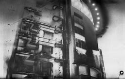
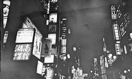
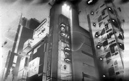
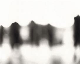
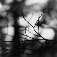
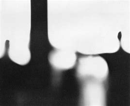
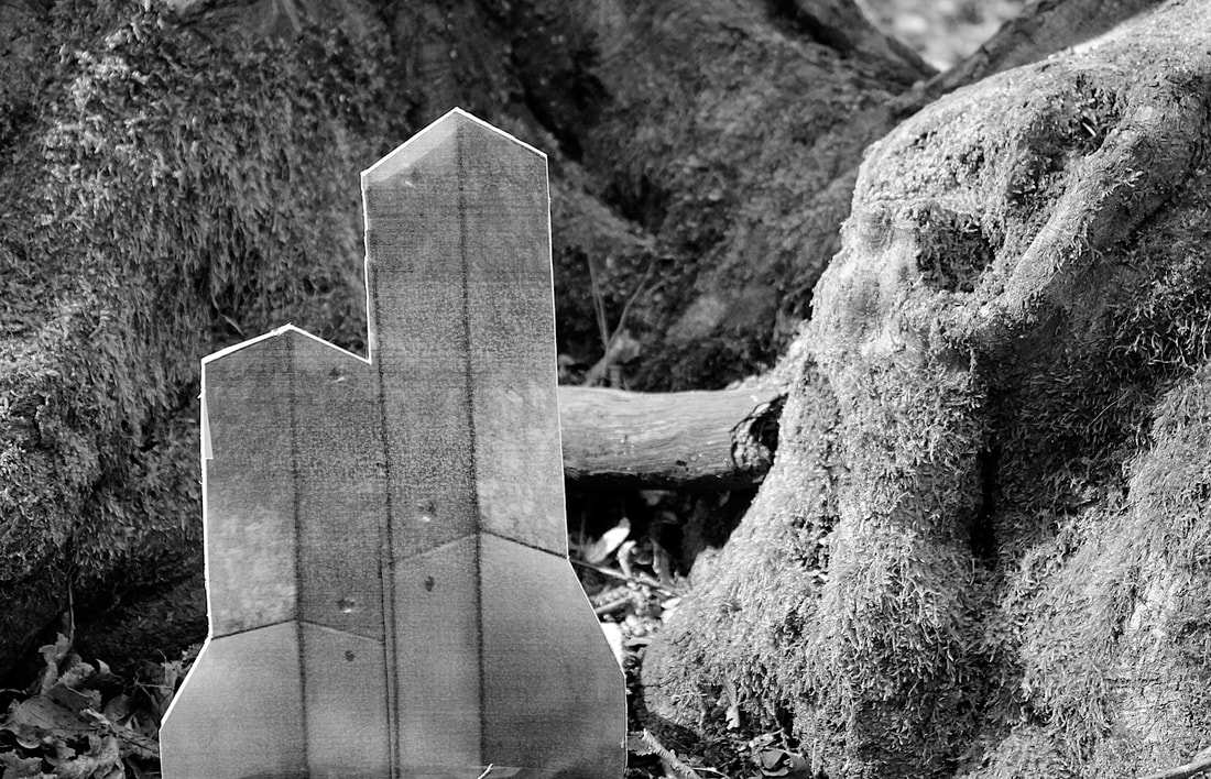
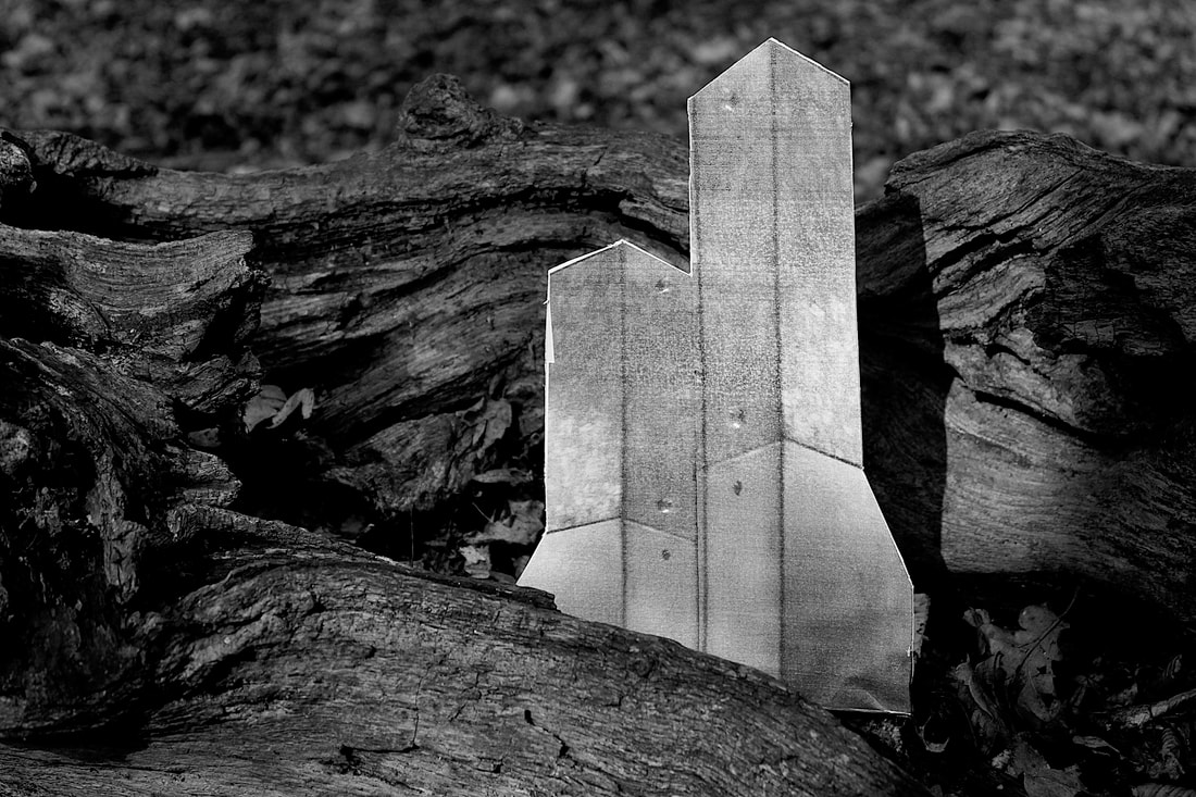
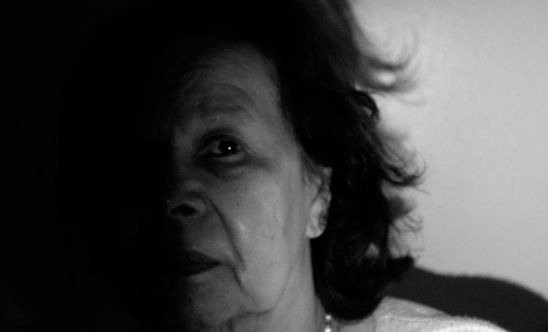
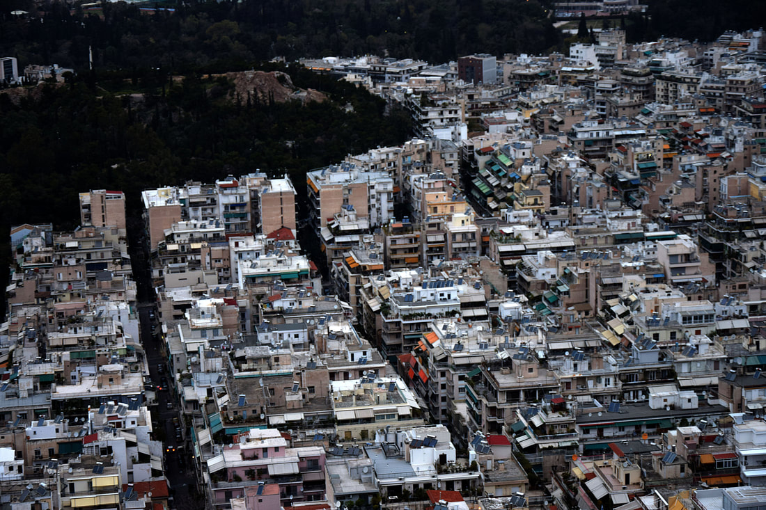
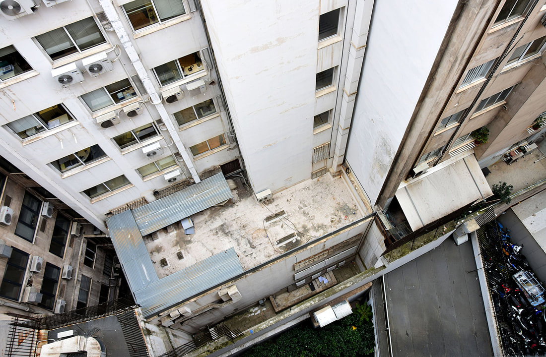
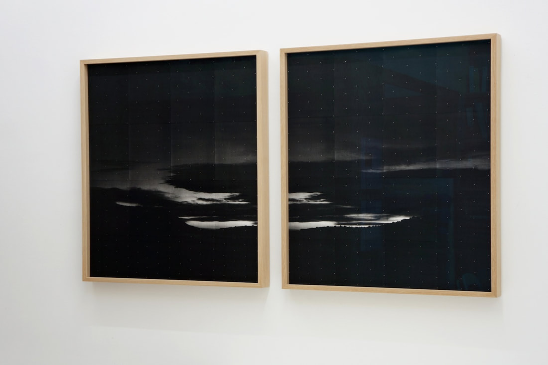
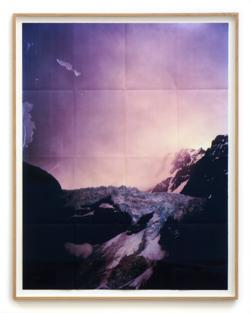
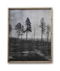
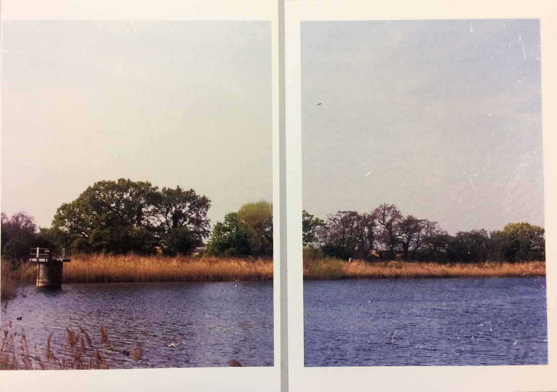
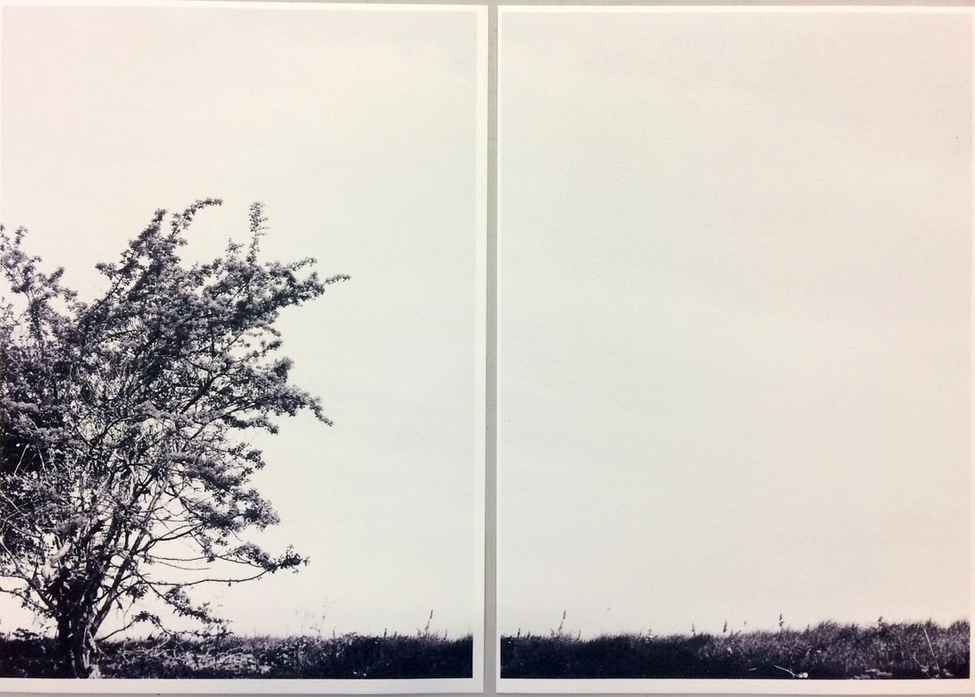
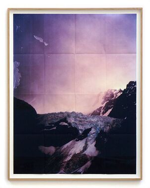
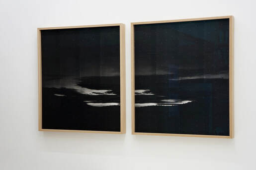
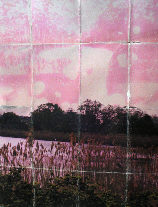
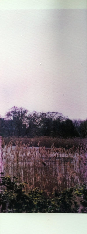
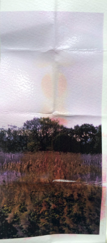
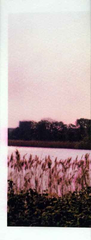
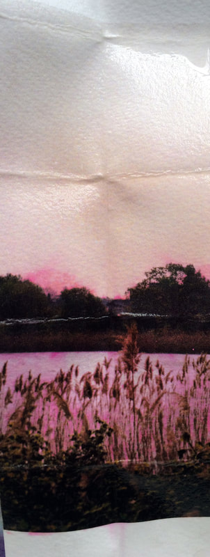
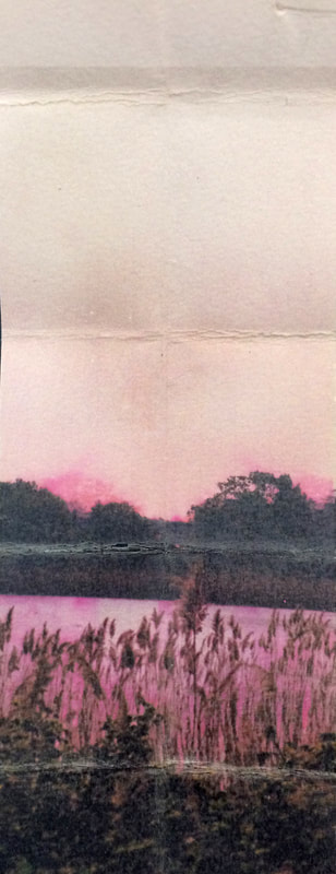
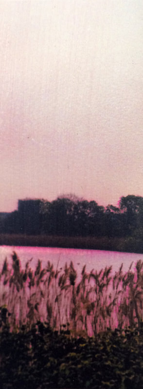
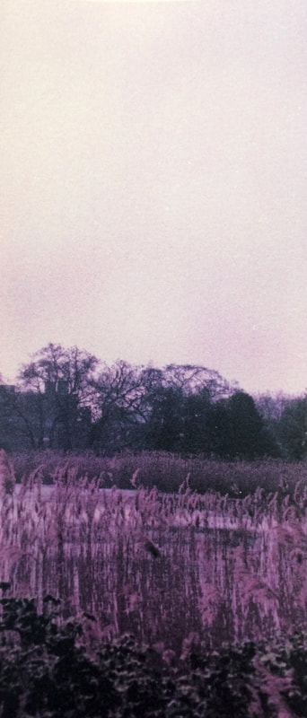
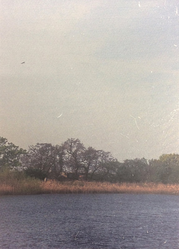
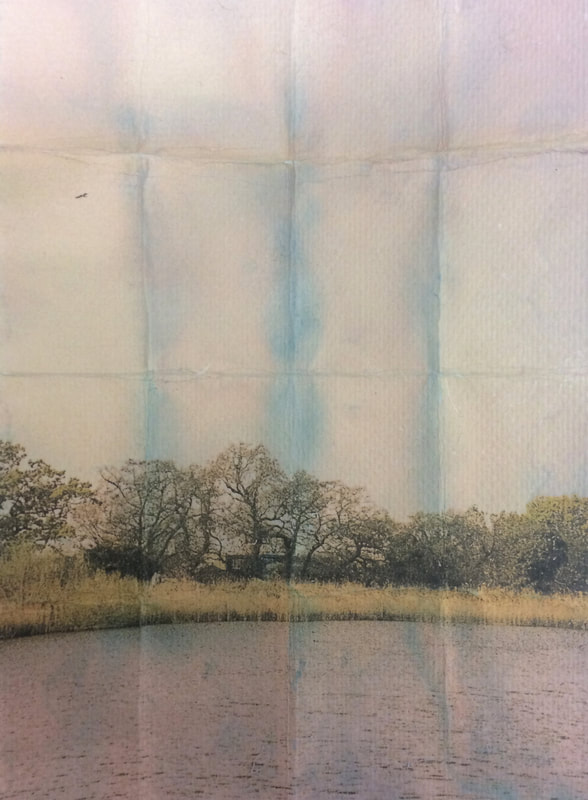
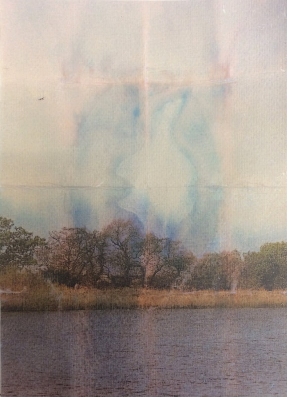
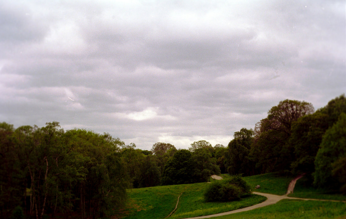
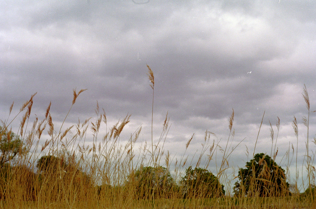
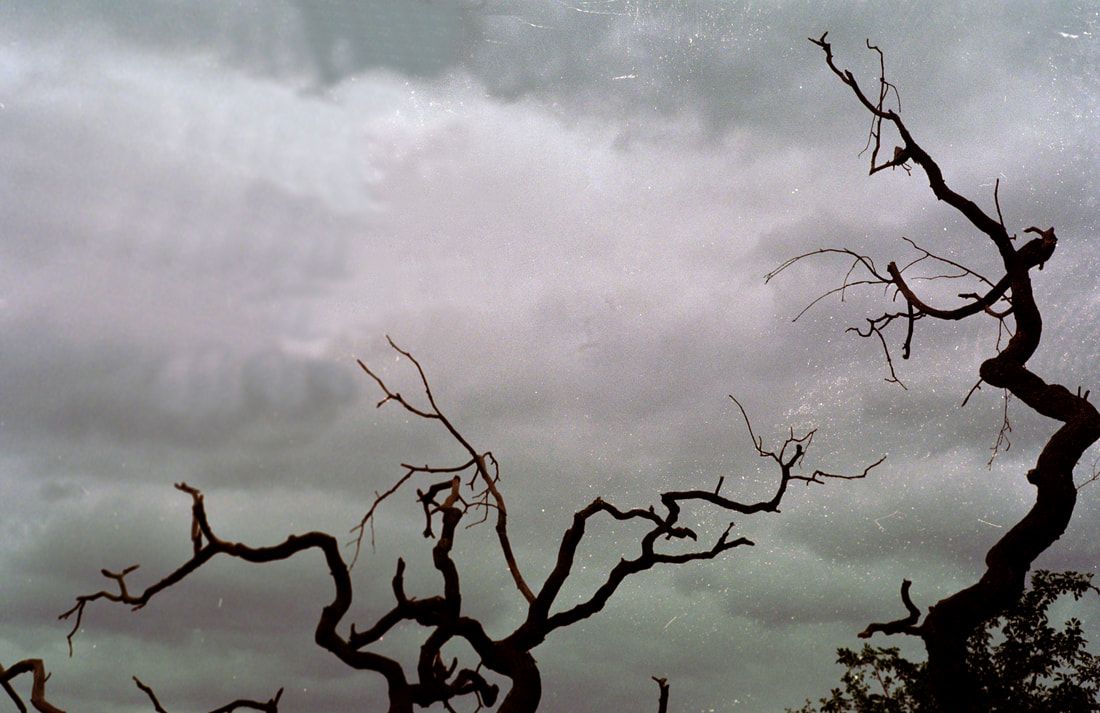
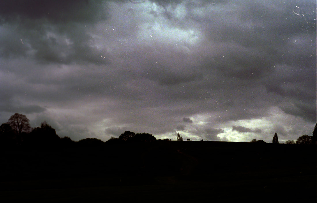
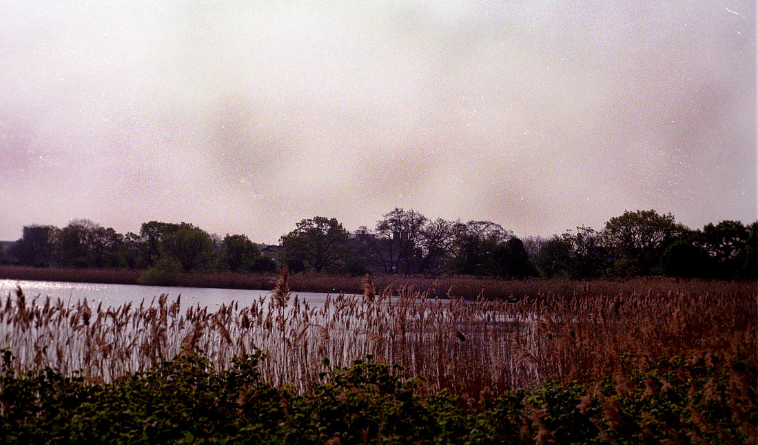
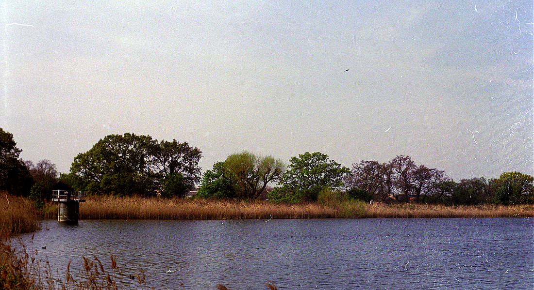
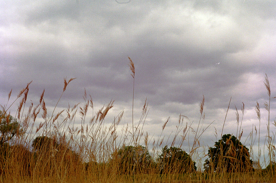
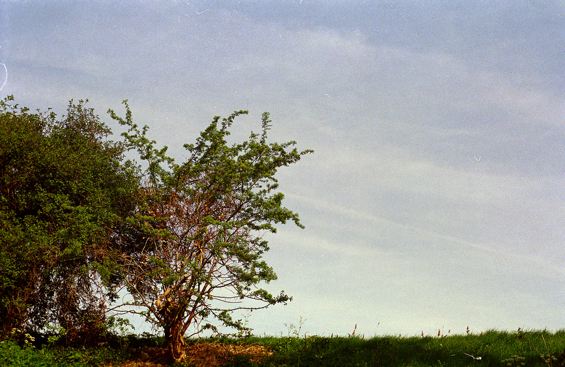
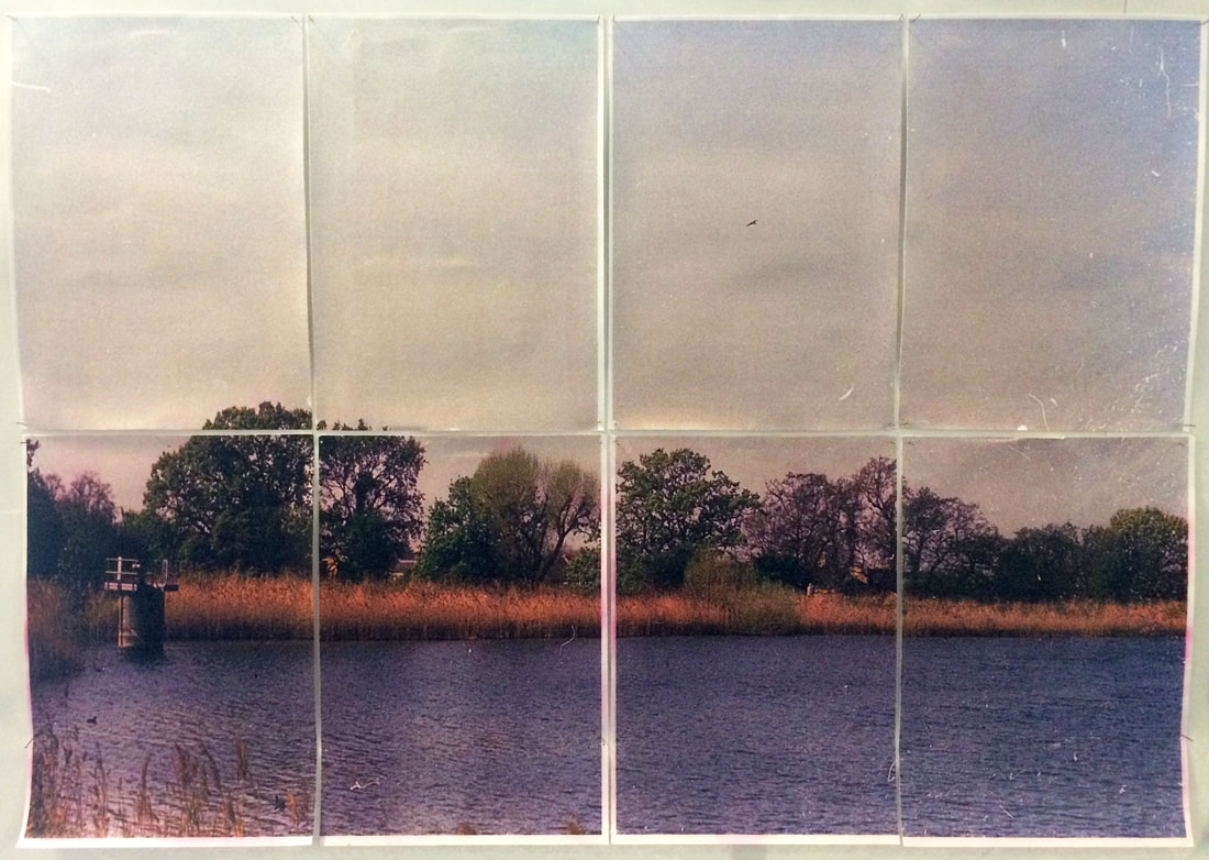
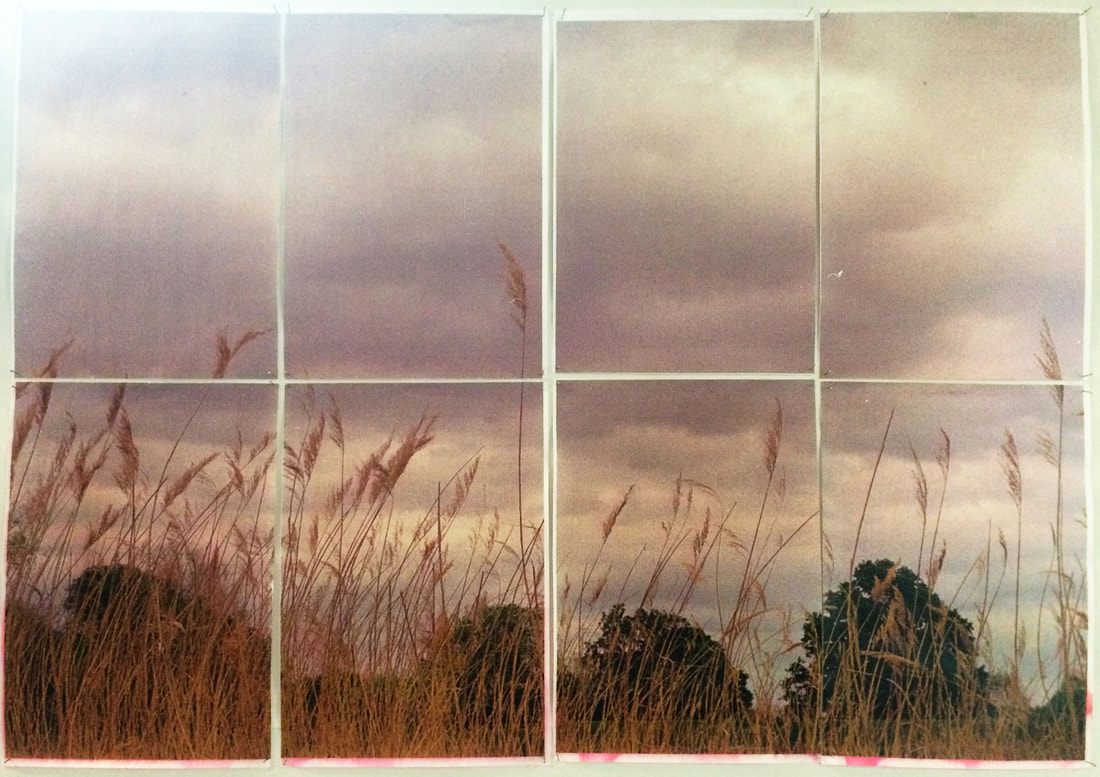
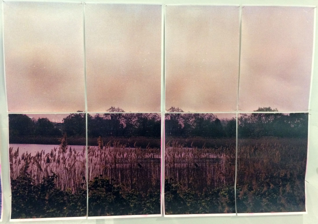
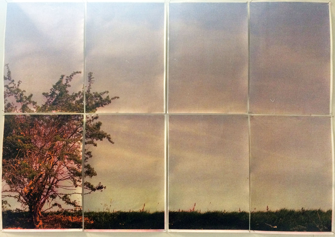
Artist and meThese are Adam Jeppesen images, the first is from the series folded and the second from the series parts. This section is to compare his work and mine, the images above.
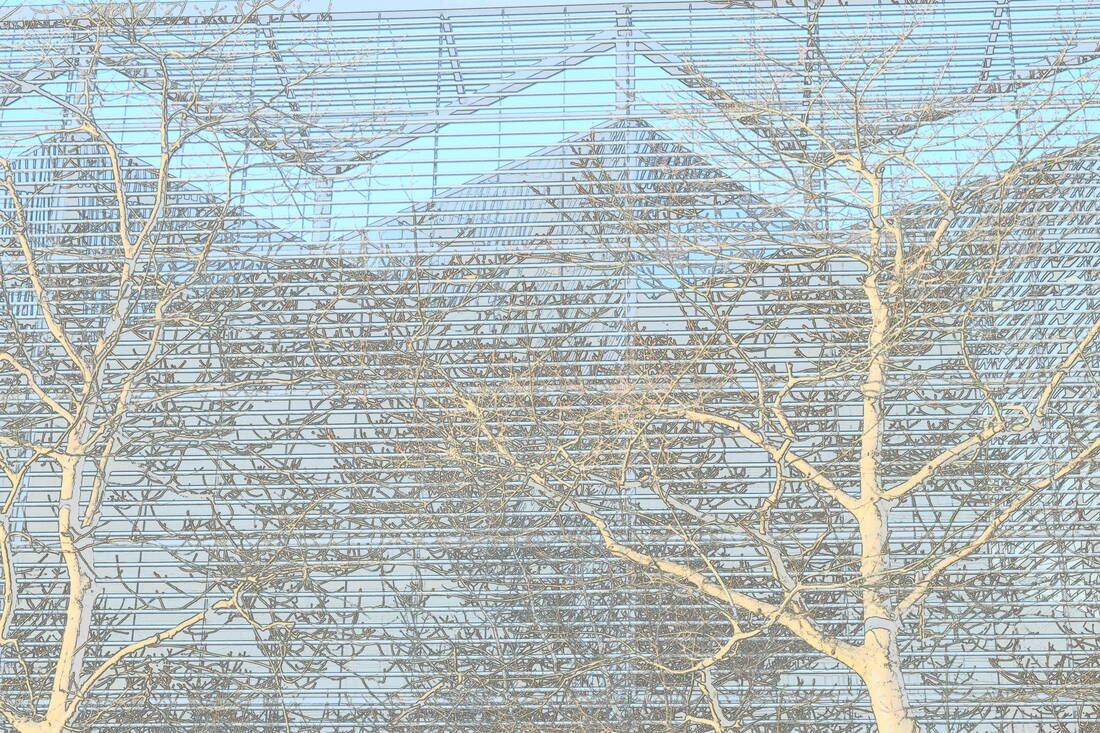
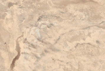
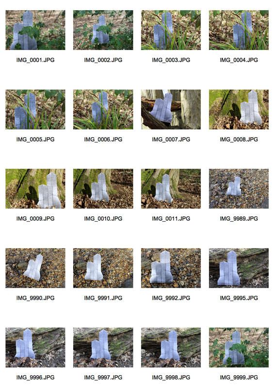
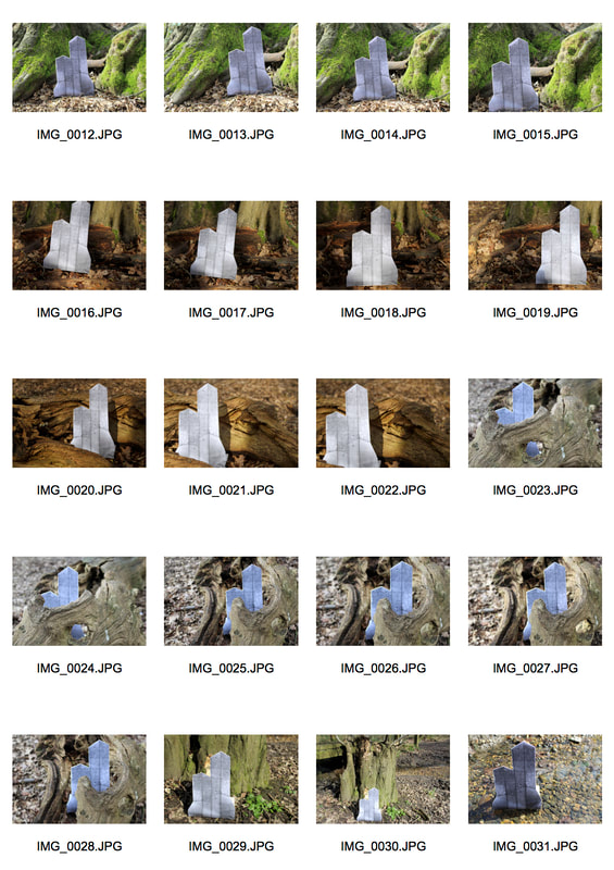
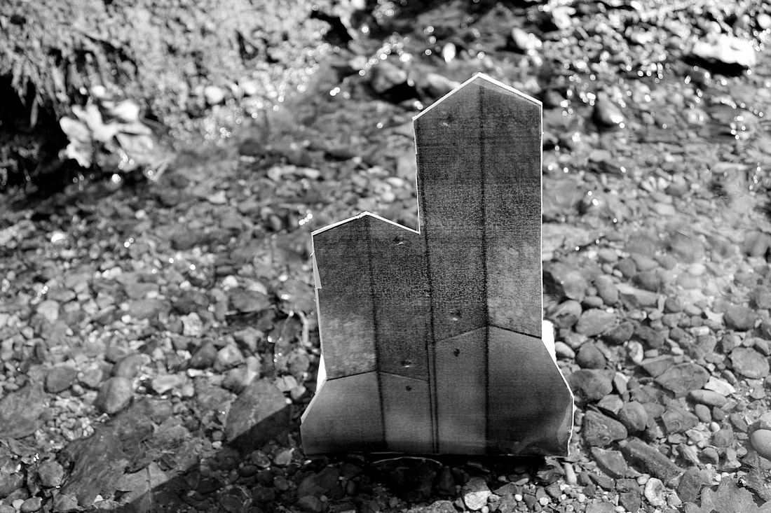
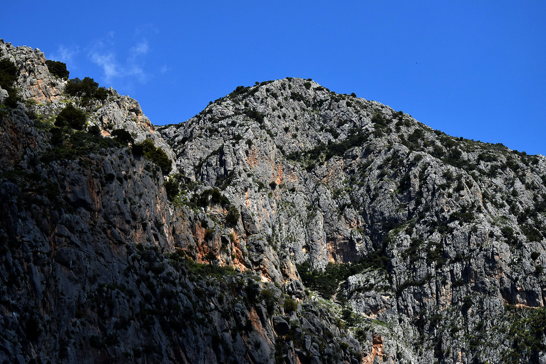
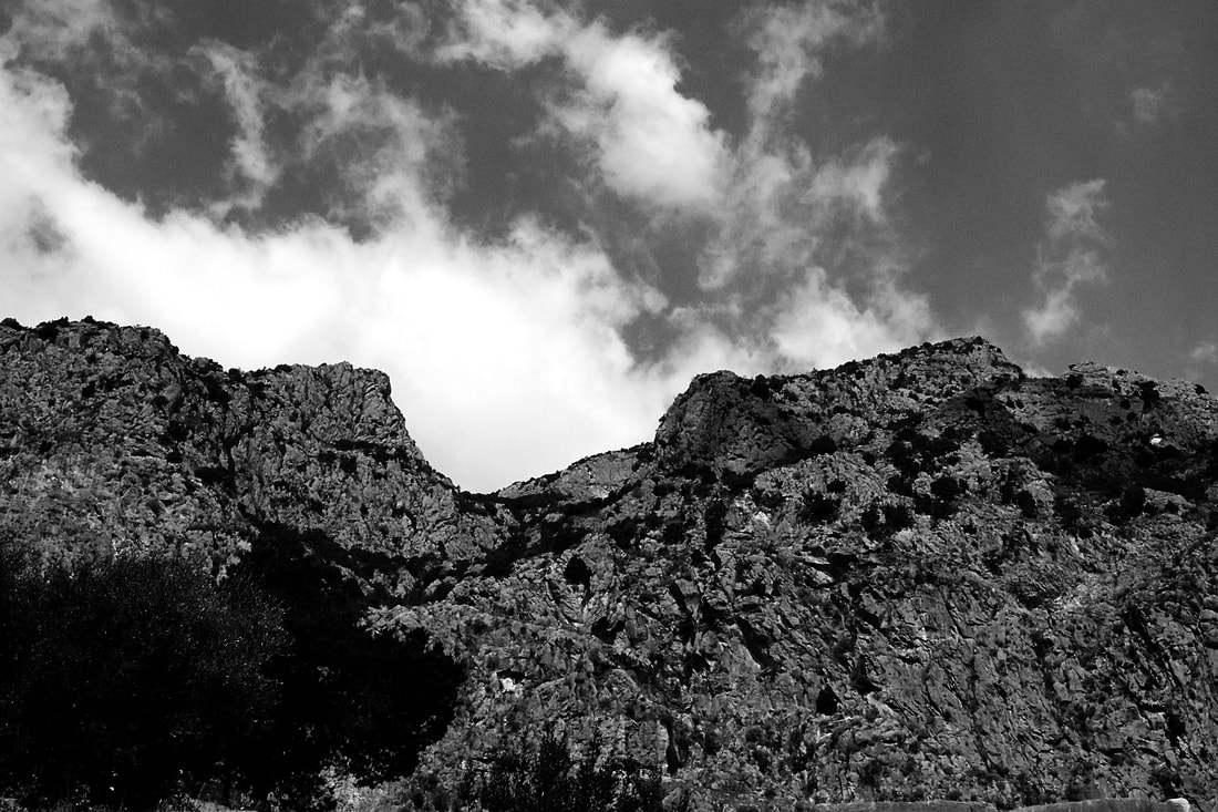
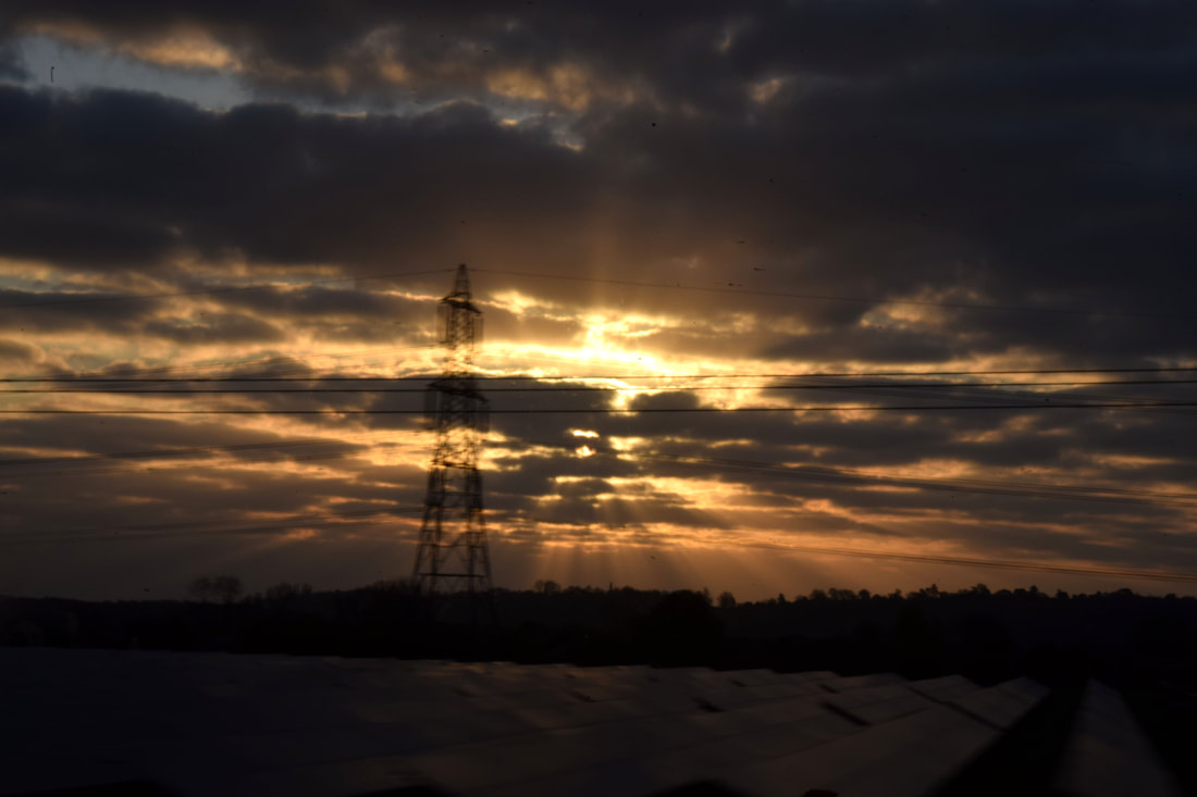
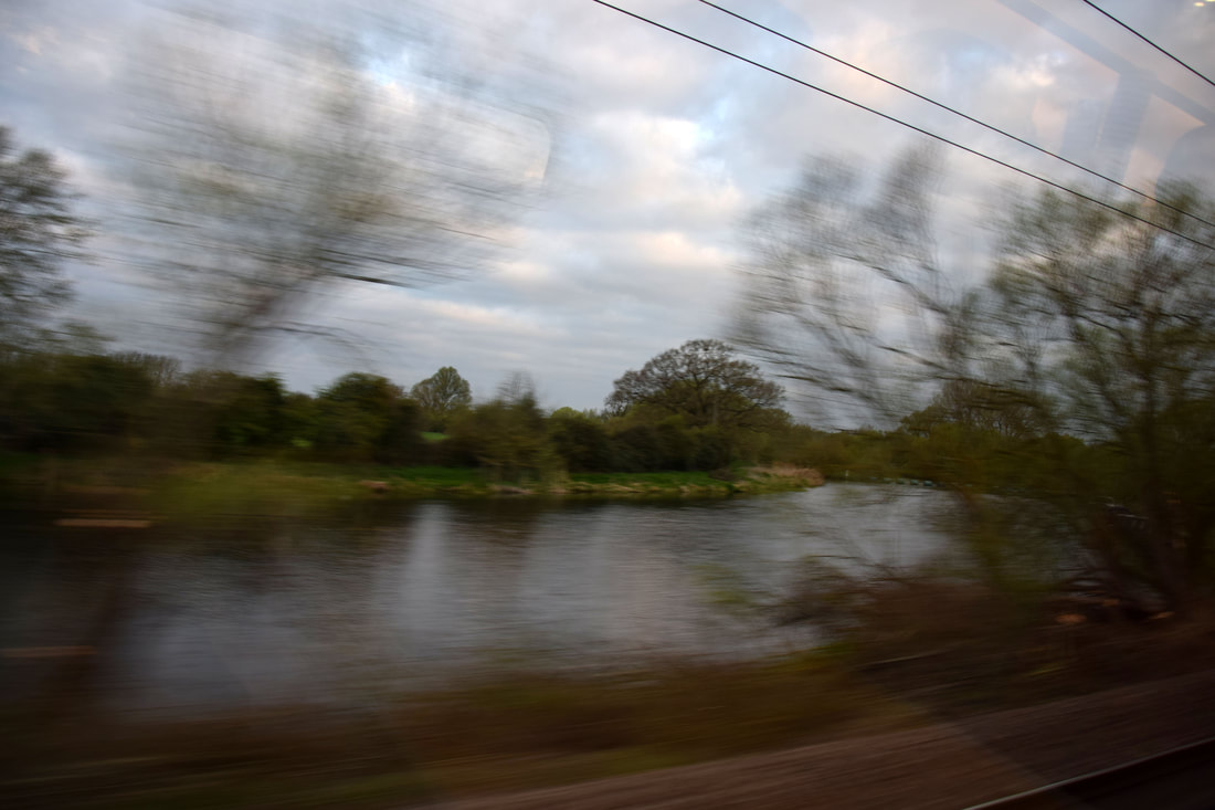
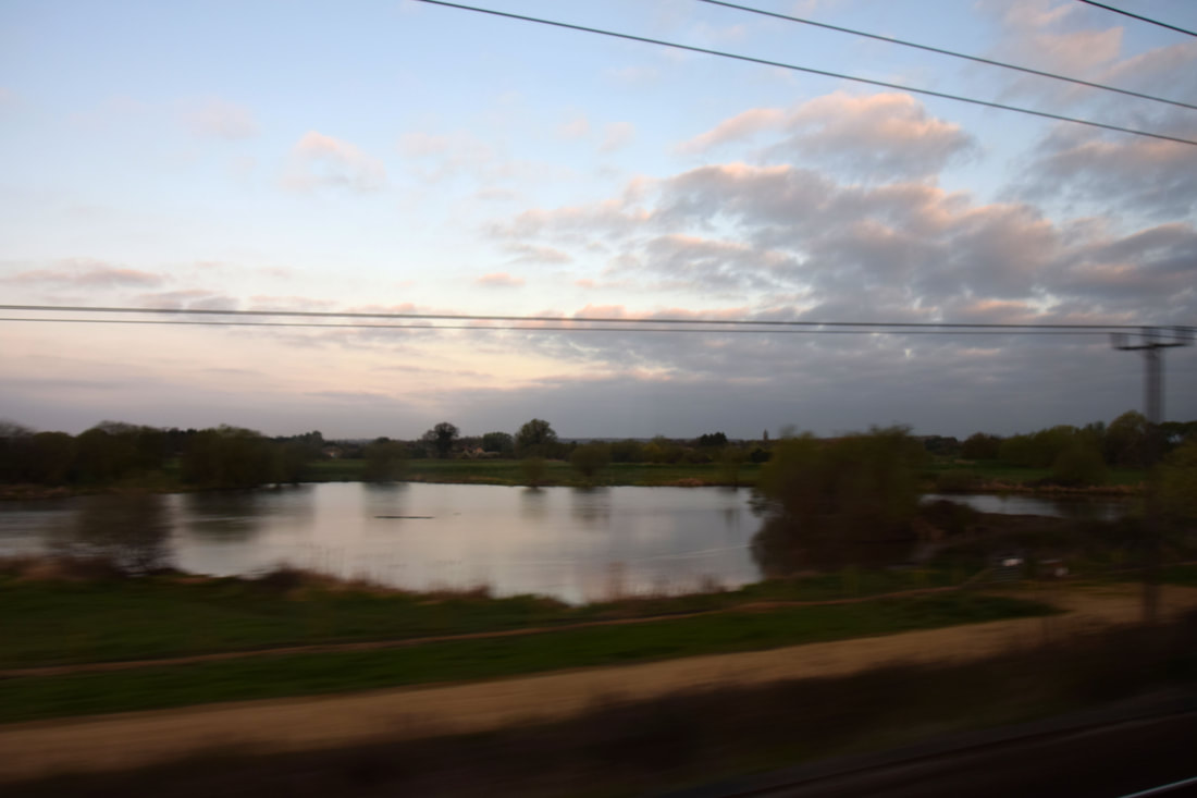
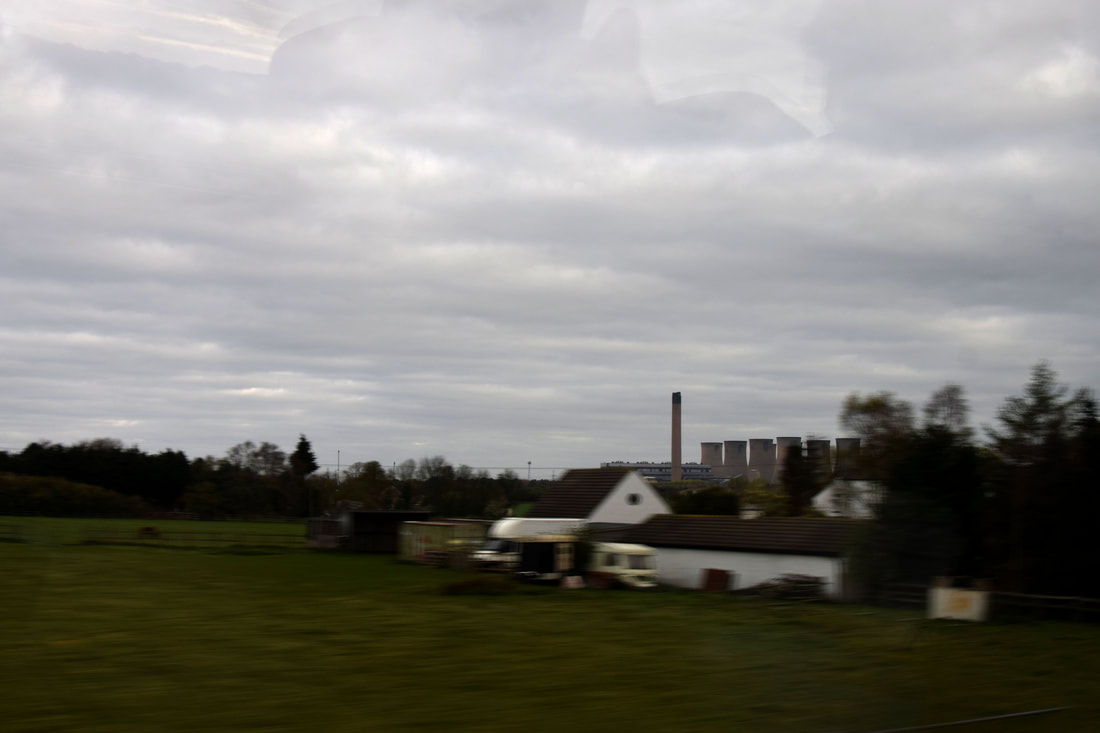
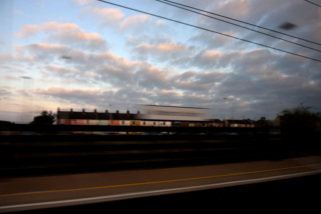
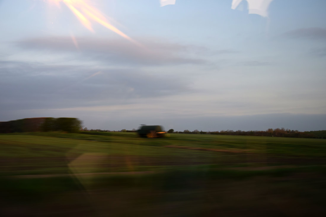
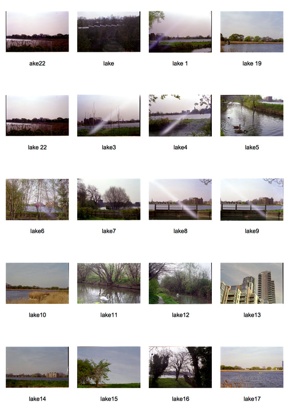
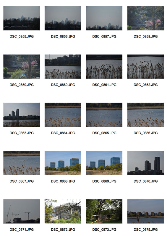
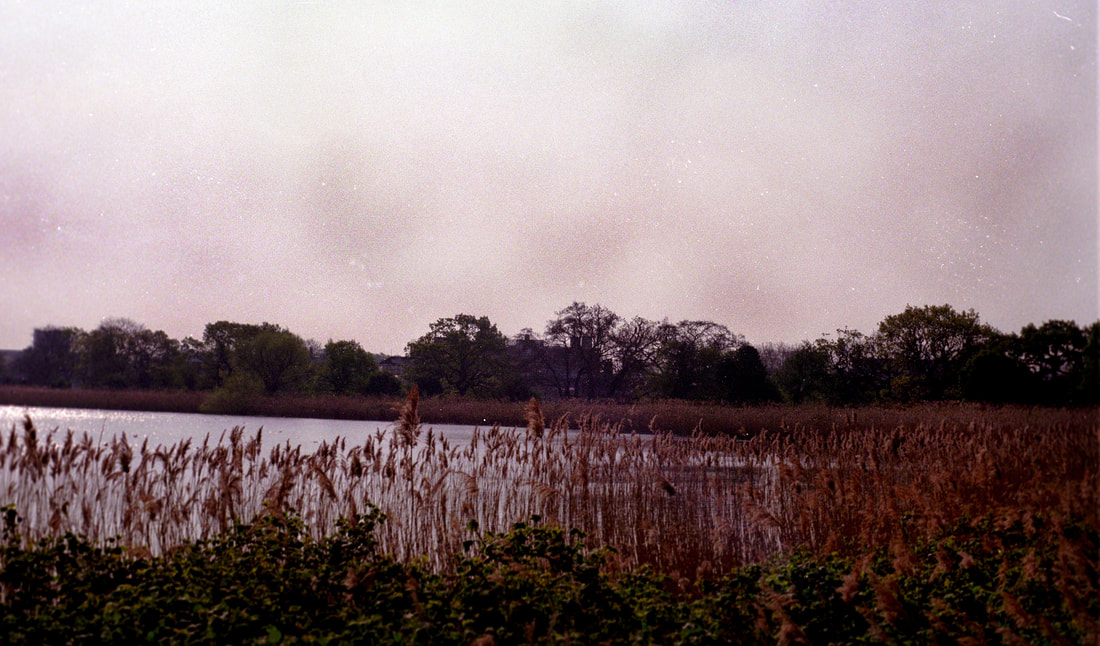
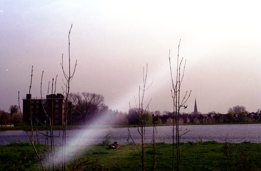
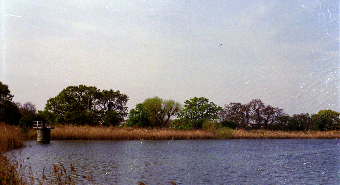
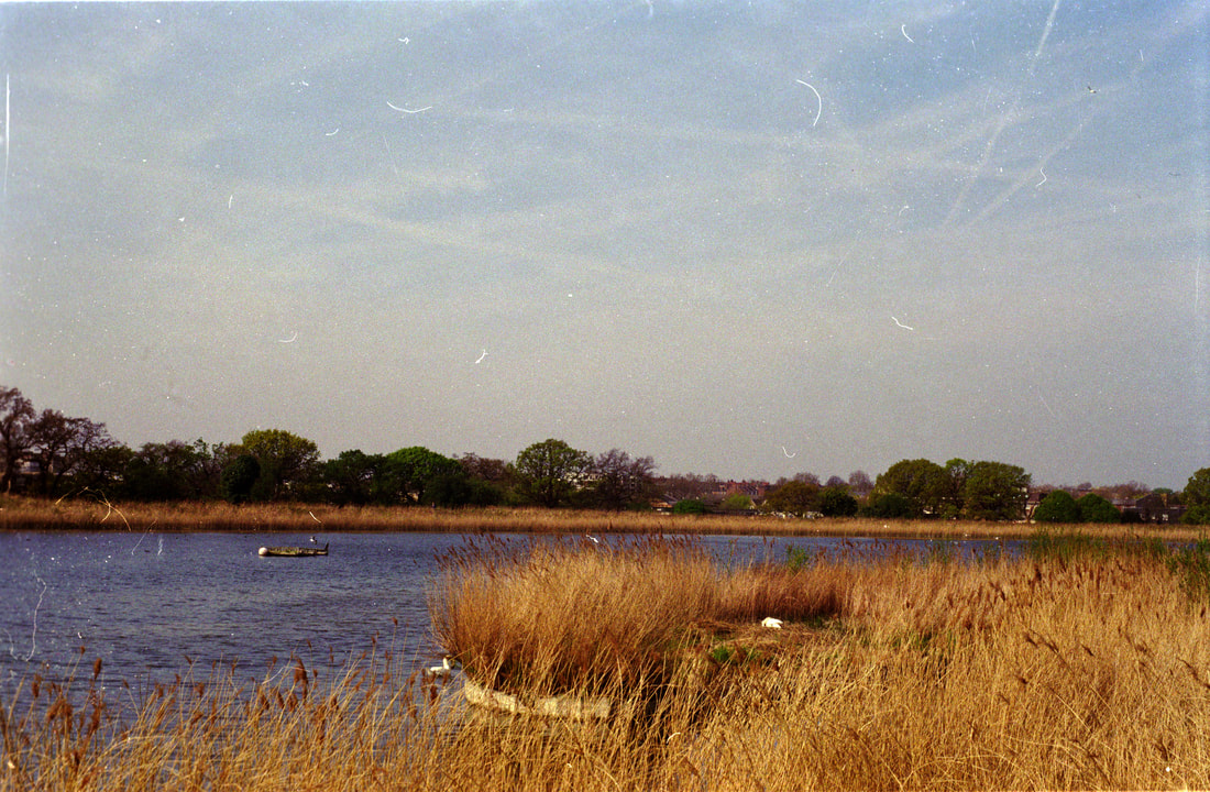
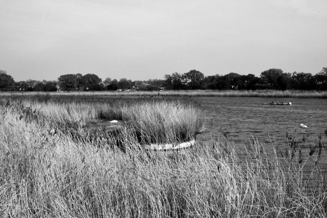
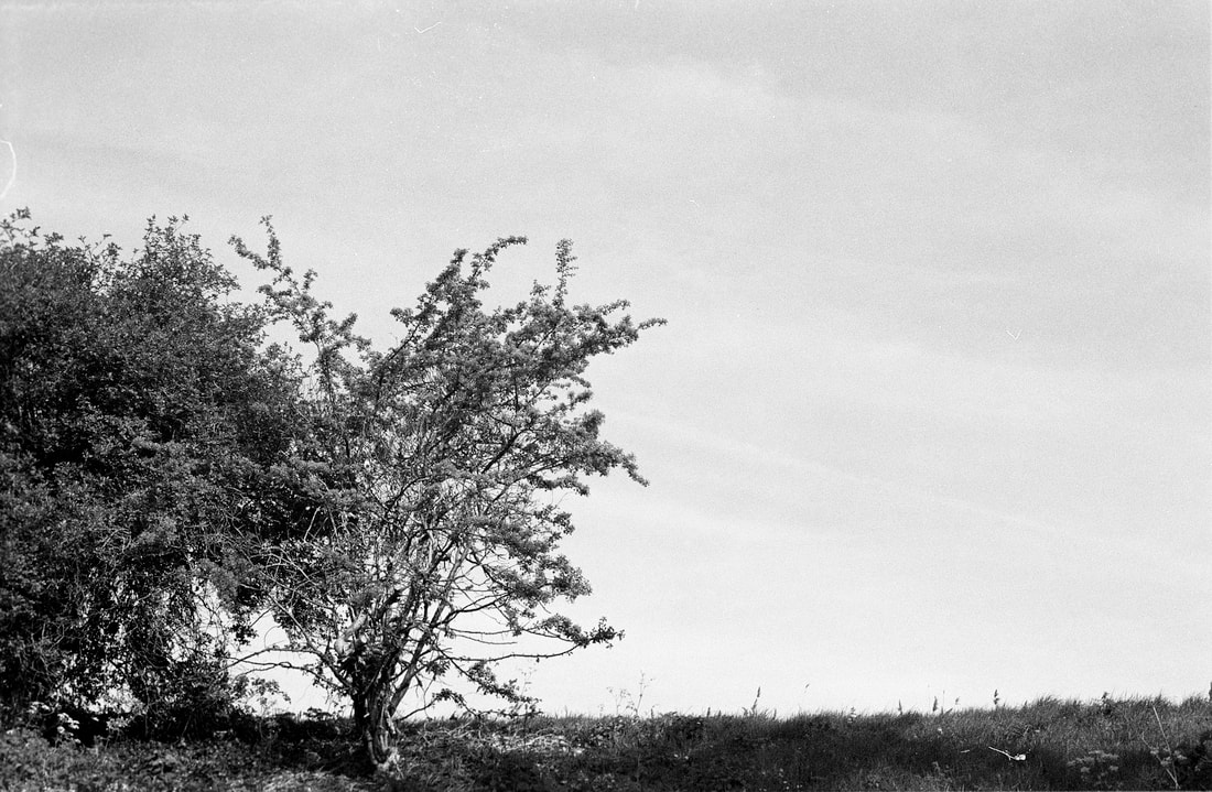
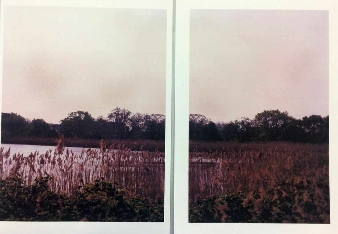
In my images i have tired to incorporate both his techniques in presentation from both his series folded and parts into my own work. In my work above i have tried to portray the fantasy atmosphere found in his colours and use of negative space to contrast with the detail of the landscapes. I tired to portray this atmosphere by using film instead of a digital camera as the film has a unique texture and quality the digital does not, also through the use of the sky being negative space contrasting to the landscapes below, which i captured natural landscapes with no or hardly any buildings or people in them. So that a timeless atmosphere could be presented. I also took the layout from Jeppesen series parts, in halving the images and presenting them across two frames, in order to show the variations and similarities within and across the landscapes. Where Jeppsen prints onto rice paper, i decided to print onto inkjet water colour paper to add further texture to the images. Unlike Jeppesen i did not further section the images by folding them, however i may in further developments as experimentation. I may also further develop the images by places the images printed onto the water colour paper into water to further the texture, as Jeppesen uses rice paper and his folding to highlight the 3D elements in his images. As well as placing them in water will re-immerse them into their natural environment as they were taken in the environment of the Woodberry wetlands. |
I want to portray the final outcomes of the printed images in a unique and almost aged style, while still having the detail and texture underneath. I looked on pinterest for ideas and created a board as seen above. Mainly looking for images of landscapes that had been aged by the environment or have the aged and worn effect due to the material it was printed onto. For example images underwater or buried or bleached or printed onto cloth.
After looking on Pinterest I decided to continue to print the images out in sections onto water colour paper, as I could submerge the images into water once printed onto and the texture of the paper would absorb the water and highlight the colours and detail. This links to the Pinterest images as many of them are put back into the environment to age them after being printed. This is what the water done, as I put the images taken at the reservoir into water to link it back to its environment. As shown above I also use the idea of Jeppesen in folding the image in order to create sections within it, to make the viewer focus on the image as a whole but also the smaller section of detail. Due to the way I folded the image the ink leaked out, mainly the pink ink, which was from the printer. The folding and leaving it in water for around an hour and a half created this faded effect and patchy sky which, in parts, shows the paper underneath. The fading creates the dreamlike atmosphere which still keeping the basic detail in the images. It is especially interesting in sections as the top half of the image, the sky, is very abstract and different tin comparison to the bottom half of the image, despite this it still works well as a whole image. However the abstract style of the sky was not the style of photography I want to portray.
I next further experimented with the after effect the images could have once printed onto the water colour paper, as the style in he previous attempt was not what I wanted. I printed off one image and cut it into four sections. The first two images were put into bleach which gave it this purple like tint in comparison to its original pink tint. The purple gave it a harsher. colder atmosphere which is not the peaceful dreamlike one I was trying to create. The second row of images were just put into water, this just leaked the pink ink out of the images, which I preferred as it kept the pink dreamlike tint and portrayed a warmer mood. The first column down on the left are just put into the bleach or water as they were, whereas the second column down on the right were folded and put into the bleach and water, both left to soak for around 40 minutes. Leaving them for a shorter time of 40 minutes was better than the longer time of an hour and a half as the ink was not so dramatic in how it leaked. I mostly liked the last water image which had been folded as the folding created darker patches of pink where the ink had leaked, creating nice horizons behind the trees and around the corn, giving the image a most 3D effect and fading the ink downward the image makes it look more natural than it was in the previous attempt.
After they dried i found that the colours had become more saturated and less glossy and highlighted then they were when the images were still wet. So i decided to try and highlight the detail and colours by using an overcoat on the actually prints instead of in photoshop. I used bees wax in the first, varnish in the second brushed on with a paint brush and in the last i used spray on varnish (the varnish is water based as so not that strong that it would change the colours of the images). The spray on varnish did not really highlight the colour in anyway, it just ever so slightly enhanced the texture of the paper so this was not the final finish i was looking for. The bees wax and vanish brushed on worked much better. The beeswax created a more brownish and saturated tint. This looked nice especially in the folded of the paper and adding to the fogged over dreamlike and aged state of the images i am trying to convey, however it did not work as well as the varnish did in highlighting the colours. The bushed on varnish worked the best to enhance the colours and give the image the glossed over almost like it was still underwater effect i wanted. The stroke lines of the brush can be seen depending on the angle of the light, however i do not think this is such an issue as it just adds more texture to the image and looks natural. If i am to use varnish bushed on to the final prints i produce, i will need to make sure the brush strokes are not to prominent and only cover it in one coat, as anymore many start to smudge the ink, taking away the detail.
I also tried to print onto normal water colour paper, not inkjet paper, to see what it would look like as the texture of the normal water colour paper was less dense than the inkjet water colour paper. The first image was just printed onto the paper, it kept the detail of the image however it was not shown very well as the paper made the colours much more saturated and dull than they originally are. So i then printed it again onto the normal water colour paper and folded it to give the image more texture and placed it in water hoping that the ink would become more vibrant as it did with the inkjet water colour paper when it was placed in water. I left it in the water for 40 minutes as this timing was good for the inkjet paper, however all the blue ink leaked out and left the image even more saturated and in tones of yellow and light pink, the blue ink leaked out completely but stained into the folds of the image as can be seen above in the second image. Its atmosphere was much more derelict and eerie than the original, the style was interesting but not the style i was looking for. I printed the image a final time onto the normal water colour paper, folded it and left it in a tray of water for only five minutes. However even then the blue ink leaked straight out of the image, staining it down the middle as van be seen in the last image above. This was better than the second attempt/ image as the colours in the ink did not saturated and fade as much, however it left the folds barer and pink and left the stained blue ink down the middle drawing the focus away from the photo beneath.
Overall it will be best to print the images onto the inkjet water colour paper instead of this style of water colour paper, as the final outcome of the image is much better in quality as the colours, detail and texture is contained better.
Kenwood development
For my final prints I want to take new images so I am going to go to Kenwood to capture the nature in the landscapes. Particularly looking for the dramatic sky and negative space to contrast with the detail of the nature below. Still trying to convey the fantasy and tranquillity in Jeppesen series folded and parts, as well as the detail and large depth of field.
Film
Digital
In this development I used a film camera as I liked the style it gave the images before and I hoped for the pink tint to be captured again in the images. I also used my digital camera to capture any images that I wanted to use zoom with or take multiples of. The day was quite cloudy and so the sky worked will in creating a dramatic background for the nature as the clouds added layers and depth to the image. I used a small aperture in order to focus on capturing the detail in the photos, and found that taking images from a lower angle helped to highlight the overcast sky and overall mood.
All the images above were taken on film and scanned in, and then edited on photoshop using levels for contrast and the sharpen tool for the detail. The first two images have a pink/ purple tint to the sky which towers over the nature below, with the cloudy sky it works well to create a dramatic atmosphere, which contrast to the calm atmosphere the natural below portrays. The first image has a vast and fantasy mood as the hills roll over the landscape it is also dreamlike as the path travels on the hills being concealed at times. The second image was taken from a lower angle looking up at the corn, this was so that the corn would be the main focus instead of the larger trees in the background, they can still be seen but are less prominent due to the low angle of the image conveying mainly the corn in comparison to the negative space and texture of the clouds. The second row of images portray the landscapes as silhouettes due to the high contrast in levels. I found increasing the levels more then usually gave the images a gloomier fantasy atmosphere. As it dramatised the sky giving it a darker purple and grey tint and added mystery to the landscapes as only there outlines could be seen, not the actual detail within them. The first image works well to portray the fantasy by the tangled defined structure of the tree branches contrasting onto the lighter sky, the film scratching detail on the right side also adds to unreal atmosphere. The low angle in the second image works well to convey the fantasy landscape as the sky looks as if it is touching the ground below and towering over in a 3D style, the movement of the clouds can almost be imagined. In the second the negative space is the bottom of the image and the detail is found in the top half, this is different to the pervious landscapes i have done but works well to convey the atmosphere and texture of the sky, which is nice in its contrasting light and dark areas.
Final piece
For my final piece i am going to use a mixture of images from the Reservoir and Kenwood developments. I am going to present them in the style of Adam Jeppesen parts and folded series. I am going to section each image into two halves, i will then further section each of the two halves into 16 A4 pieces of watercolour paper sections, i will do this for both halves. So that the original image will be split into two halves which are then further split into smaller sections, in order to present the variations and similarities across the sections, halves and images as a whole. Overall hoping to convey a fantasy dreamlike atmosphere of realist landscapes, for the viewer to question if the images are real or altered to appear this way. After printing the images will be soaked in water for 40 minutes then hang up to dry allowing the ink, mainly pink to leak out and give a unique quality to each of the sections. Once they are dry the images will be coated in a layer of varnish applied with a paintbrush in order to enhance the colour and give the images a glossy coat, as if they were still in the water. Once dry they will be displayed in their sections halves side by side, with a small gap in between all the sections, to show it is one whole image nut also smaller sections of images within. Making the viewer focus on all the details, textures and aspects of the image and how to join together to create the atmosphere of the images as a whole.
Out of the two developments, Reservoir and Kenwood, I chose these four images to use as my final pieces. This is because they work best in conveying a dreamlike, vast and timeless atmosphere which can be imagined beyond the photos by the viewer. Even though the images are trying to convey a certain mood and atmosphere, they can still be left to interpretation to the viewer. They were the best due to their texture, detail in comparison to the texture and detail of the negative space. In order to highlight these textures and details i chose the images taken on film as they have a quality unique to the film camera which the digital cannot display. It portrays the images in a pure and realistic way that it seems like it must be unreal and a dreamlike fantasy. When the images print onto the water coloured paper, it adds a deeper texture to the images which compliments them however also due to the texture of the paper the depth of field is lowered. Therefore i over edited the images in photoshop using the sharpen and unsharpen tool to create higher contrast, as well as using the levels. So that the clear detail could still be seen.
I felt these worked best together as there are two which have a pink tint and the other two which have an overall blue tint.
When printing the images i discovered it would be better to print each half of the images into sections of four instead of sixteen onto A4, as if i were to print them off into sections of sixteen each image would be very large and the quality and large depth of field would be lost in blowing the sections up onto A4. So i decided to print them off into sections of four so the detail and quality could be kept and still have the image split into sections. Unlike Jeppesen i am not going to fold the images as the sections will already be presented in the sectioning of the images, folding each section as well would be too much and look messy.
In order to print them off into sections i used photoshop as shown in the slideshow. I used the ruler tool and then guide lines in order to find the middle of the image so i could split it into quarters. I then cropped the image to one of the sections and changed the image size to the width and length measurements of the water colour paper so it would fill the page of the A4, But not completely as i wanted a thin border around the sections outer edges. After this the images were ready to print and i repeated this for each sections.
Once they were all printed i put them into trays of water to soak for 40 minutes, i found from my pervious development attempts this was the best time too leave them, as any shorter the ink wouldn't leak enough and the image would still look the same as it did before contacting the water, and any longer too much of the ink would leak drawing the focus away from the images and to the leaked ink effect. Putting them in water meant that the ink would leak and give each section a unique effect so when brought together the variations and similarities in the sections and image as a whole can be seen. The only colour that really leaked out was the pink ink that was in the images, even the blue ones have parts of pink ink leaked through. Although it did work best with the pinker images as there was more ink to leak out. Once they had dried i used a paint brush to coat the images in varnish so that their colours would be more vibrant, I used a sponge to dab the varnish once applied to decrease the appearance of the brush strokes. I then left them to dry and finally presented them on a white board so the gaps would match the white border around the outer sides of each image, i presented the halves of each image next to each other in their sections, leaving about 0.5cm in between each image. In order to show the detail and texture in each section, the halves and the whole image. Overall depicting a dreamlike, timeless and peaceful atmosphere for the viewer to question and imagine the reality and fantasy within and beyond the photos.