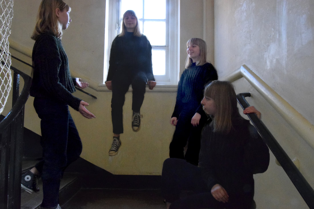
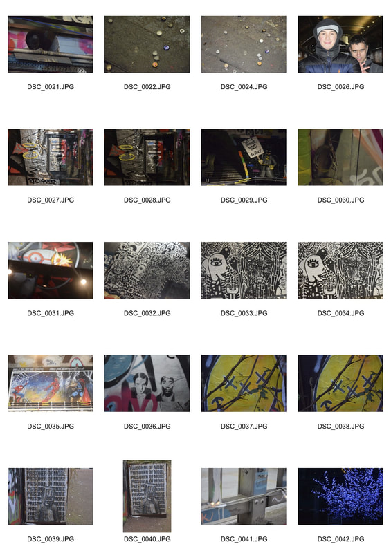
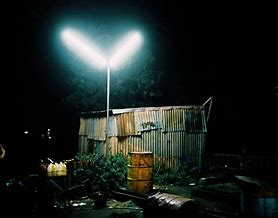
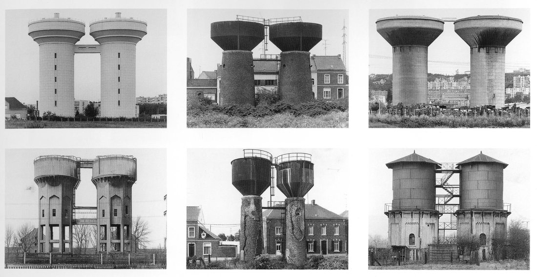
Secrets, codes and conventions.


|
|
|
|


|
|


|

|
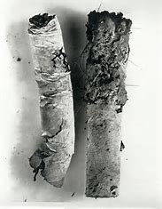
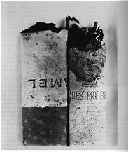
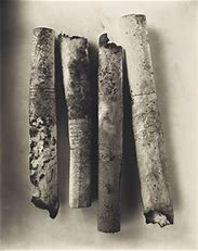
Irving Penn
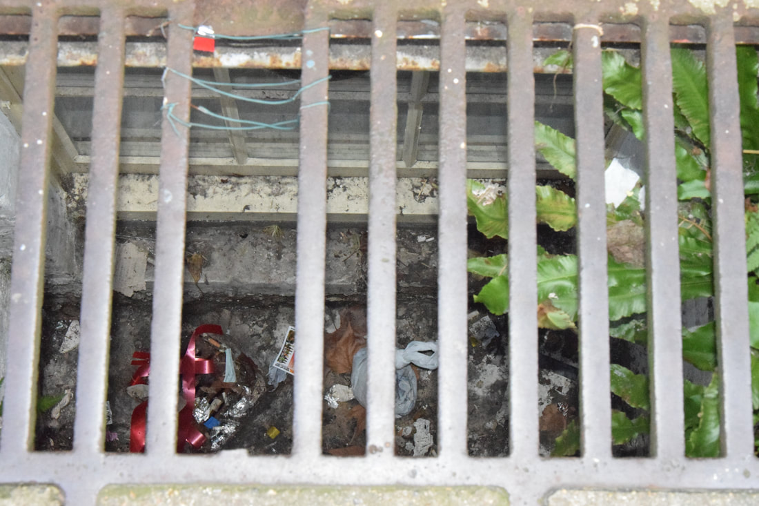
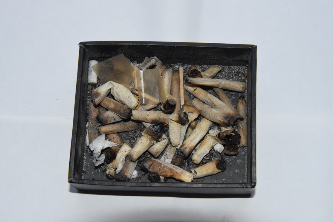
Penn evolved his approach to still life over decades starting from the 1930's. He photographed everyday objects in studio conditions in order to give them a contextual purpose in art. In his series Cigarettes, he found these everyday discarded items on the street floors and challenged the conventions of art by photographing them in studio conditions, and making them a symbol of the contemporary culture. He made something so widely consumed and discarded have artist value and beauty.
   |
Sam Mendes
Mendes is an English director stage and film director, in his film American Beauty, there is a scene (as shown above) which similar to Penn 's art gives everyday discarded objects beauty. He gives a simply plastic bag such life, context and purpose in the world, emphasising its beauty, innocence and purity. Here he is highlighting the idea that there is beauty everywhere not just in the things that are conventional found to be beautiful, but everywhere, we just need to look deeper.
|
|
|


|
|
|
|
      |
      |
|
|


|
|
|
|
|

|
|
|
|
|

|

|
|
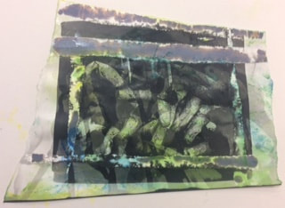
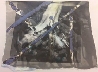
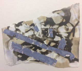
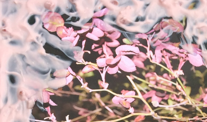
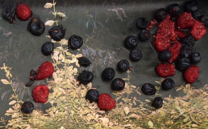
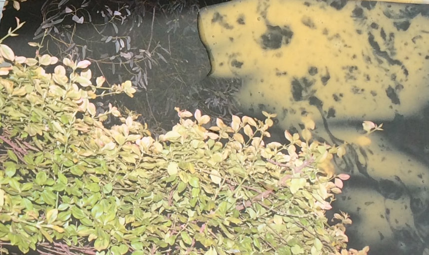
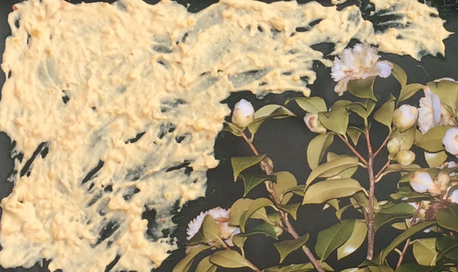
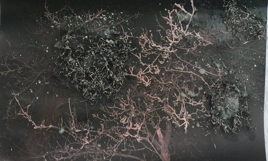
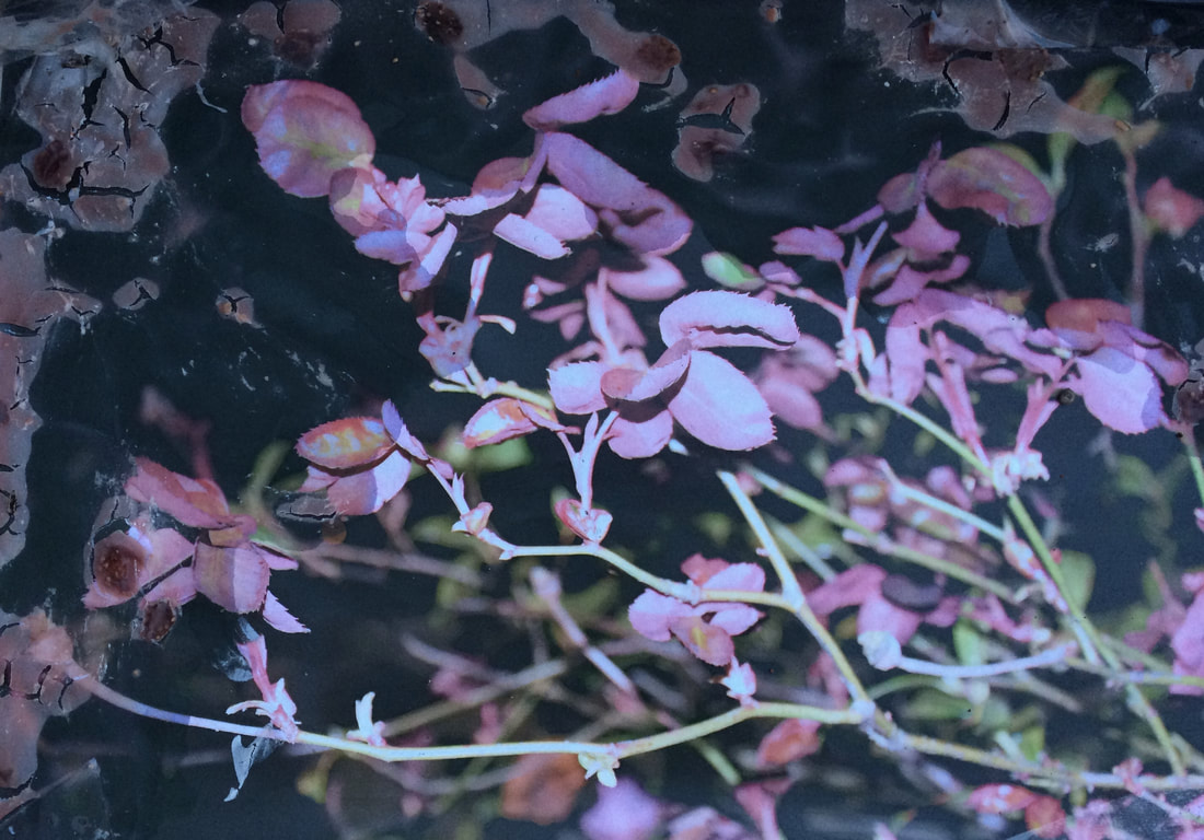
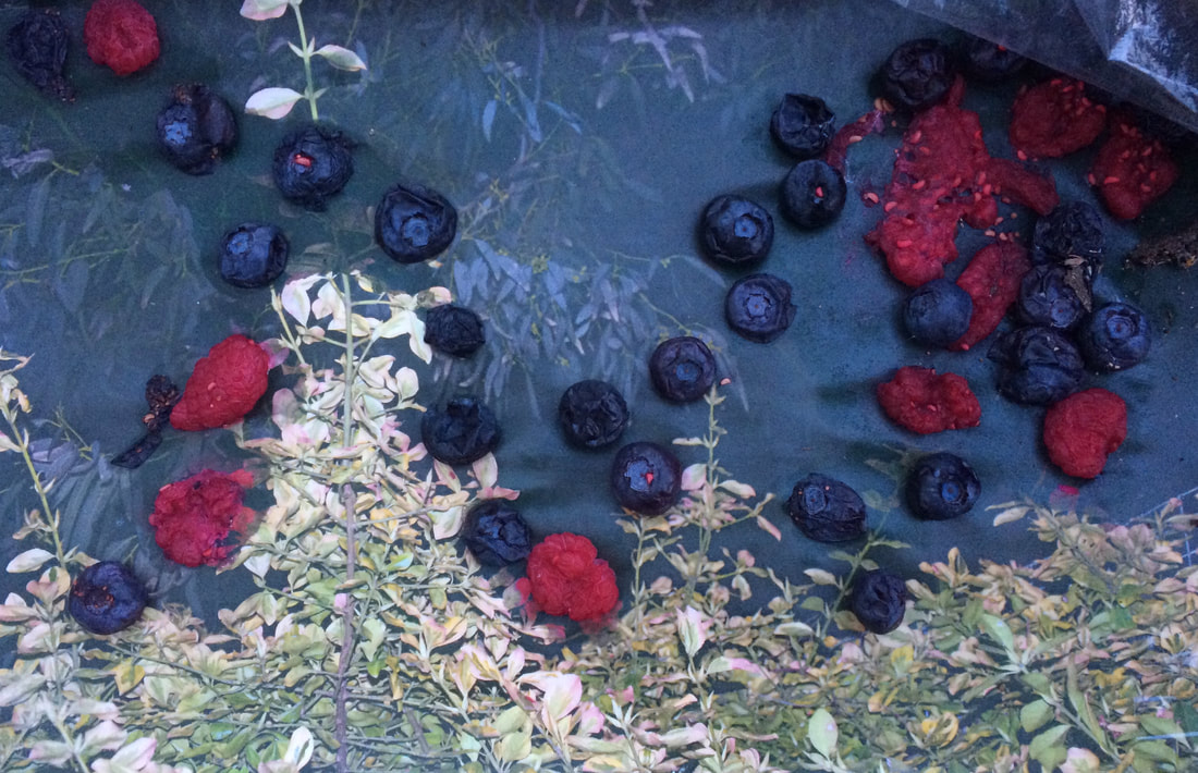
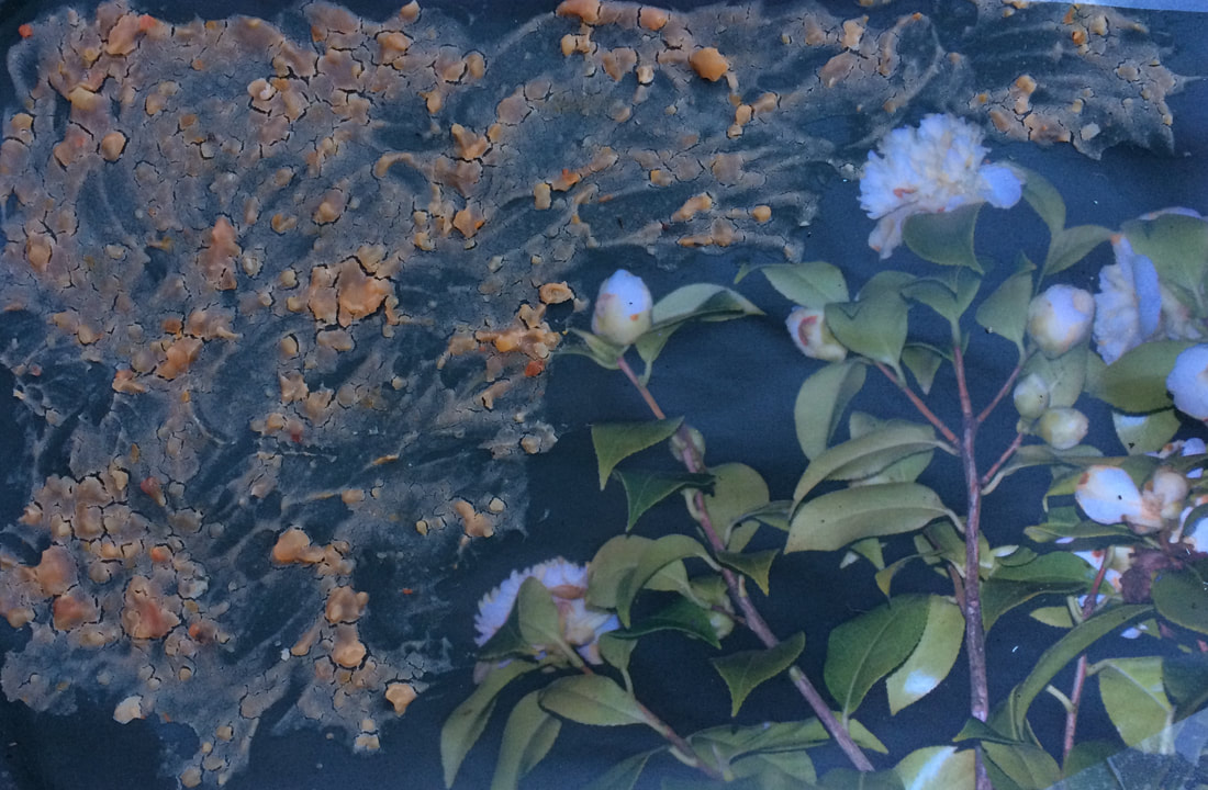
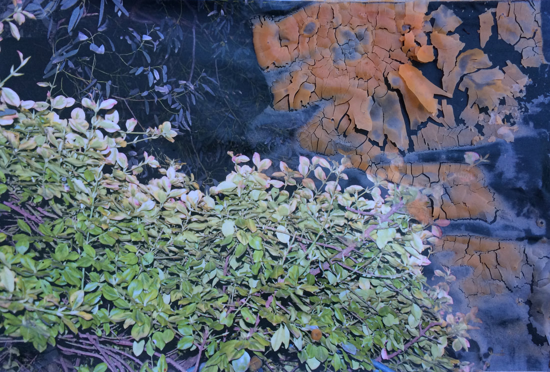
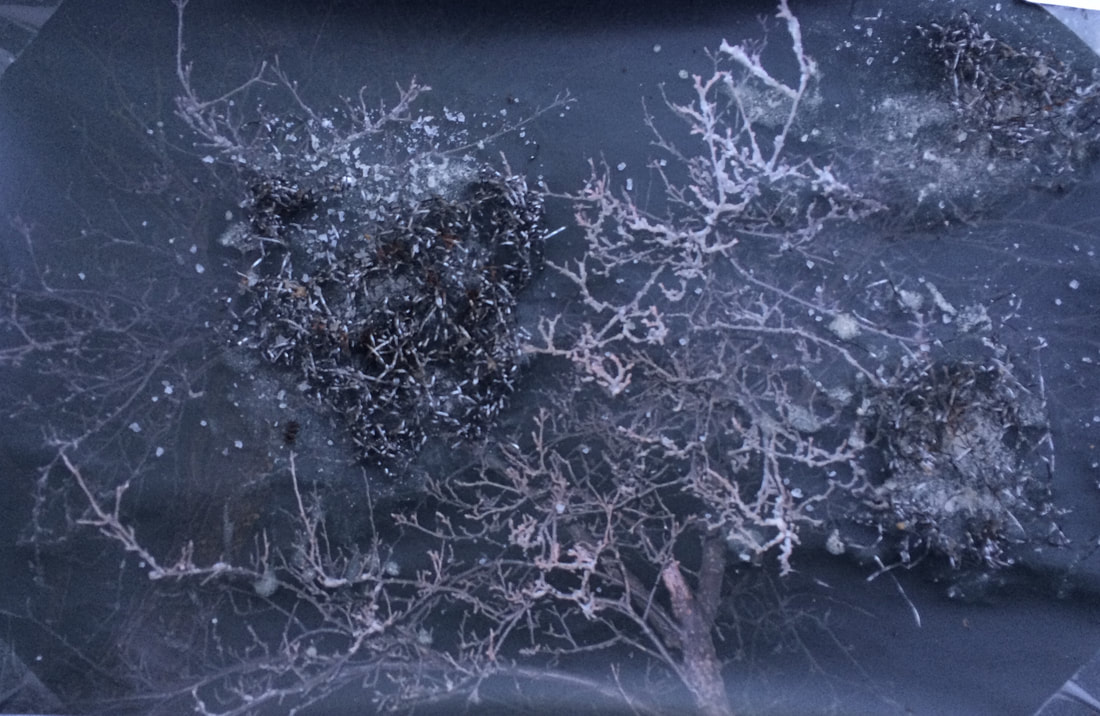
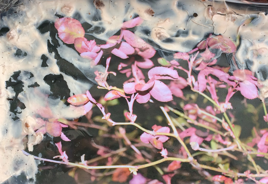
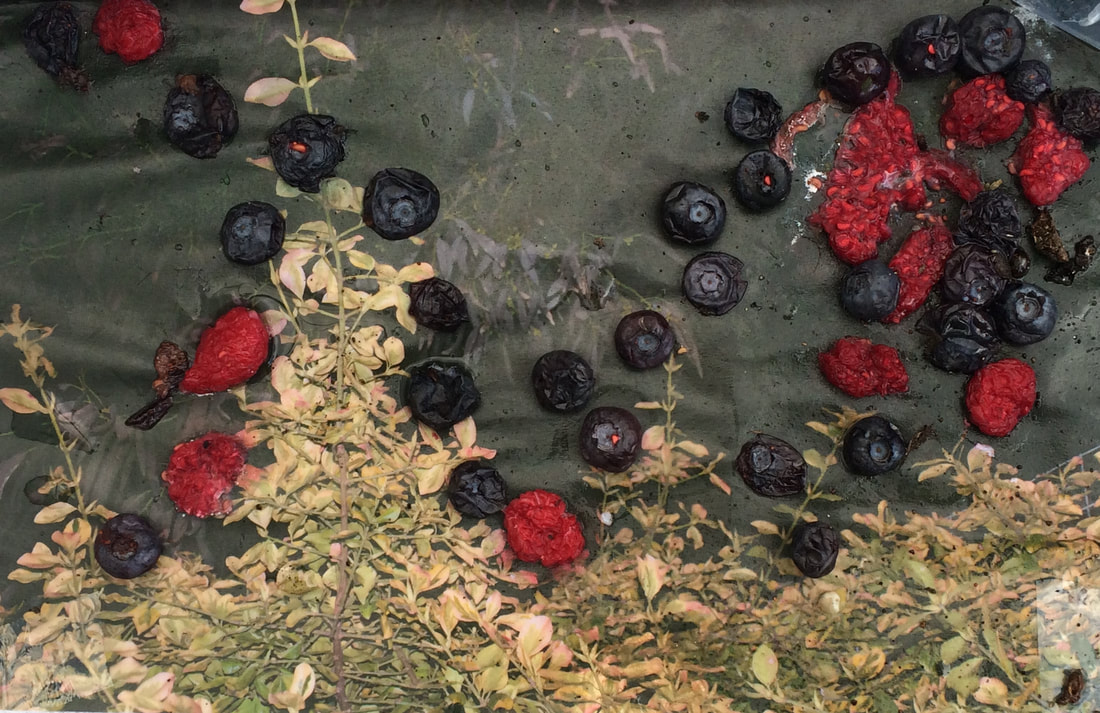
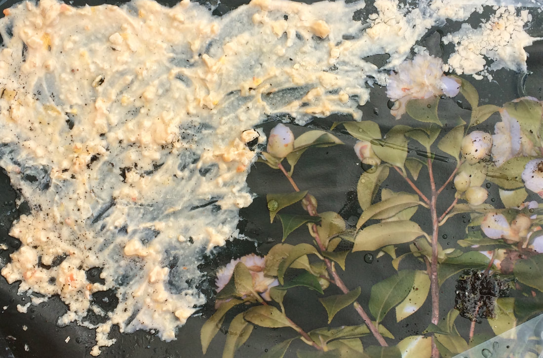
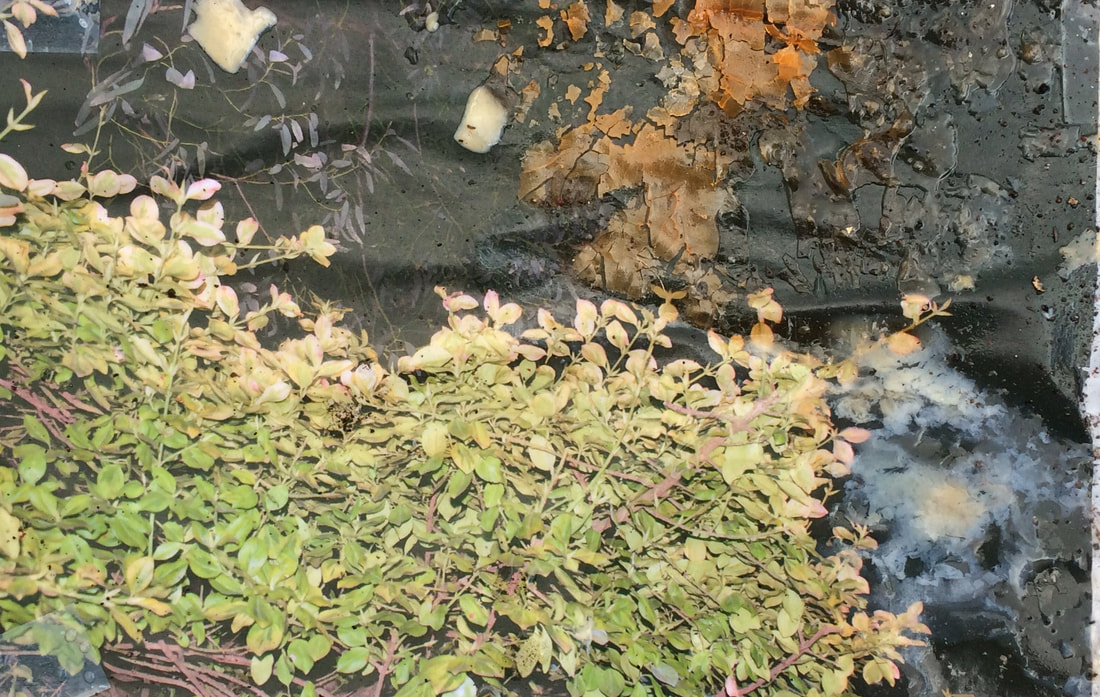
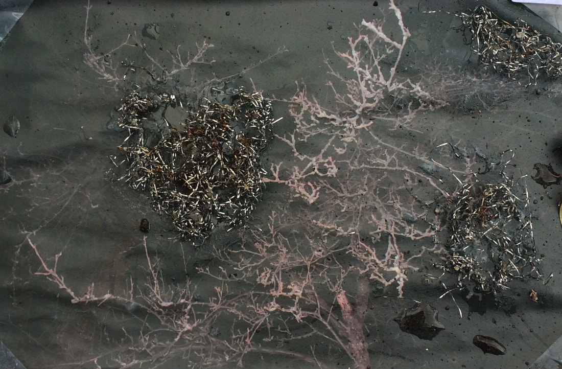
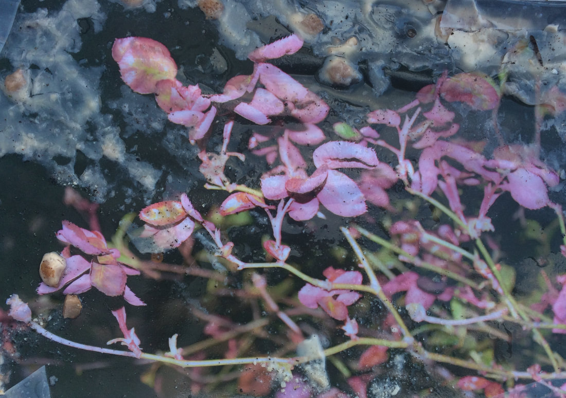
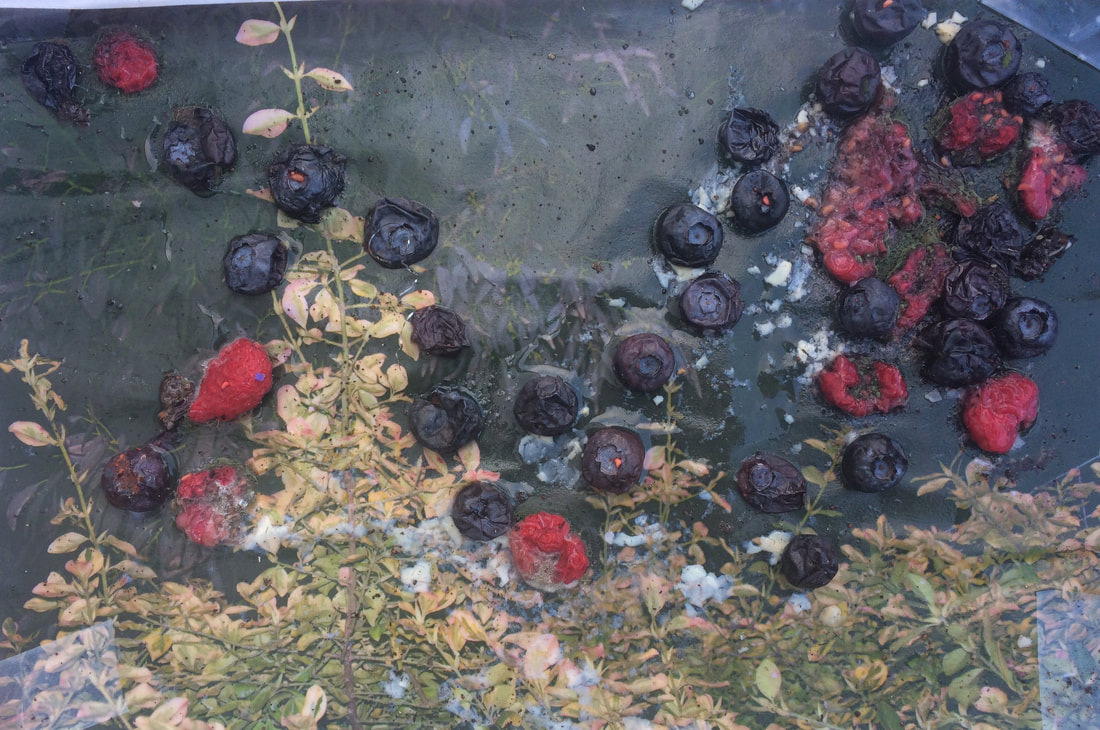
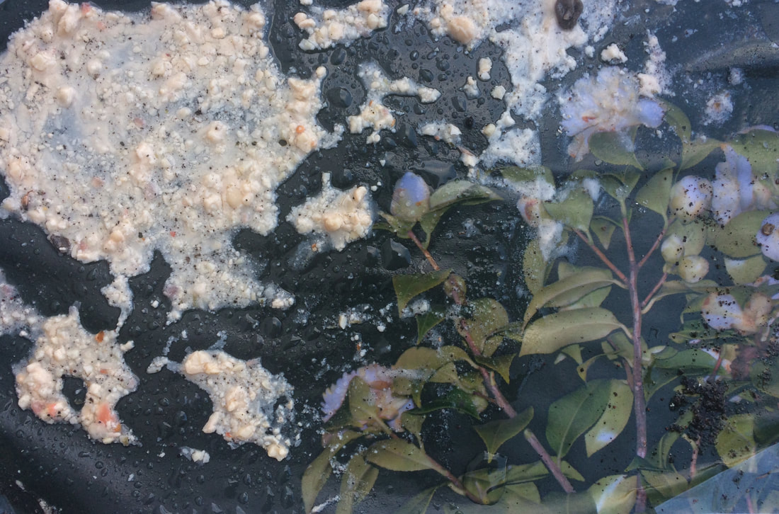
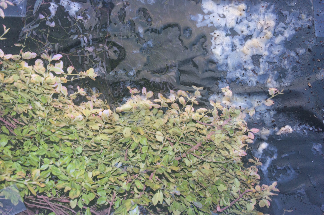
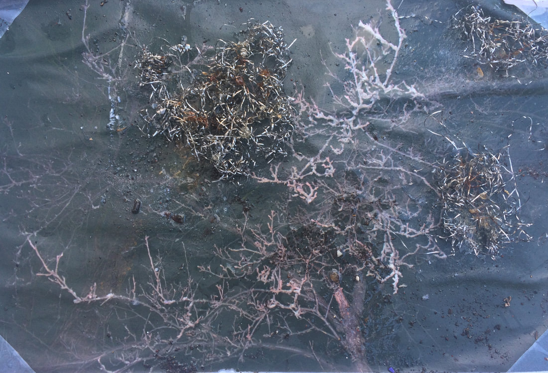
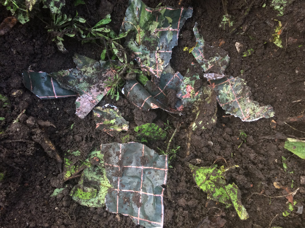
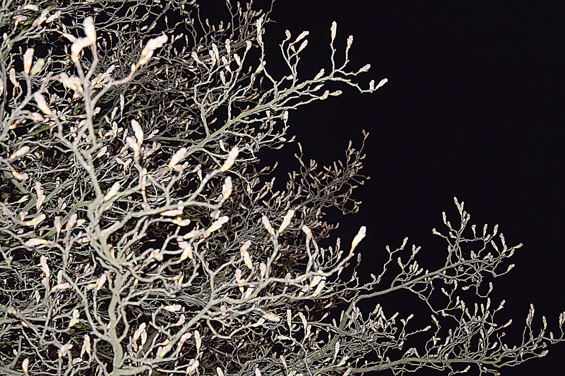
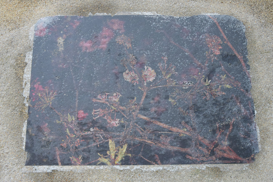
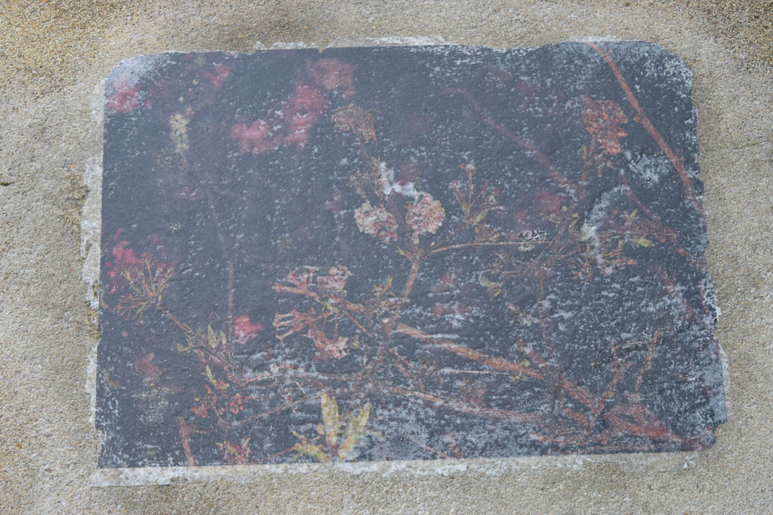
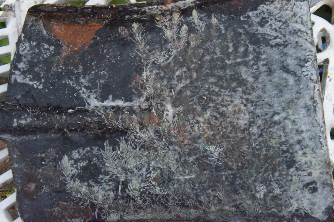
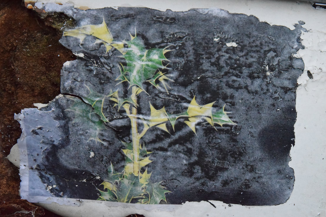
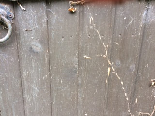
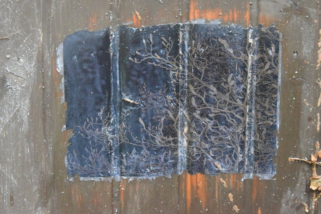
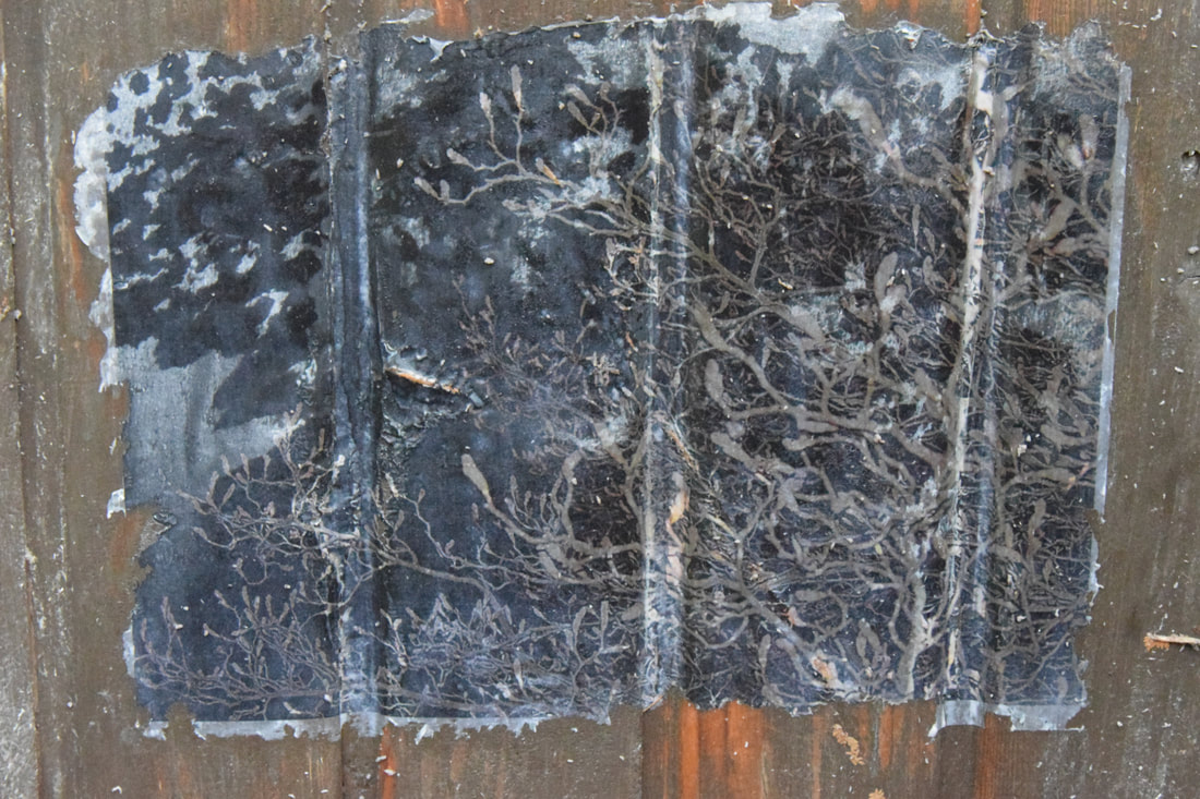
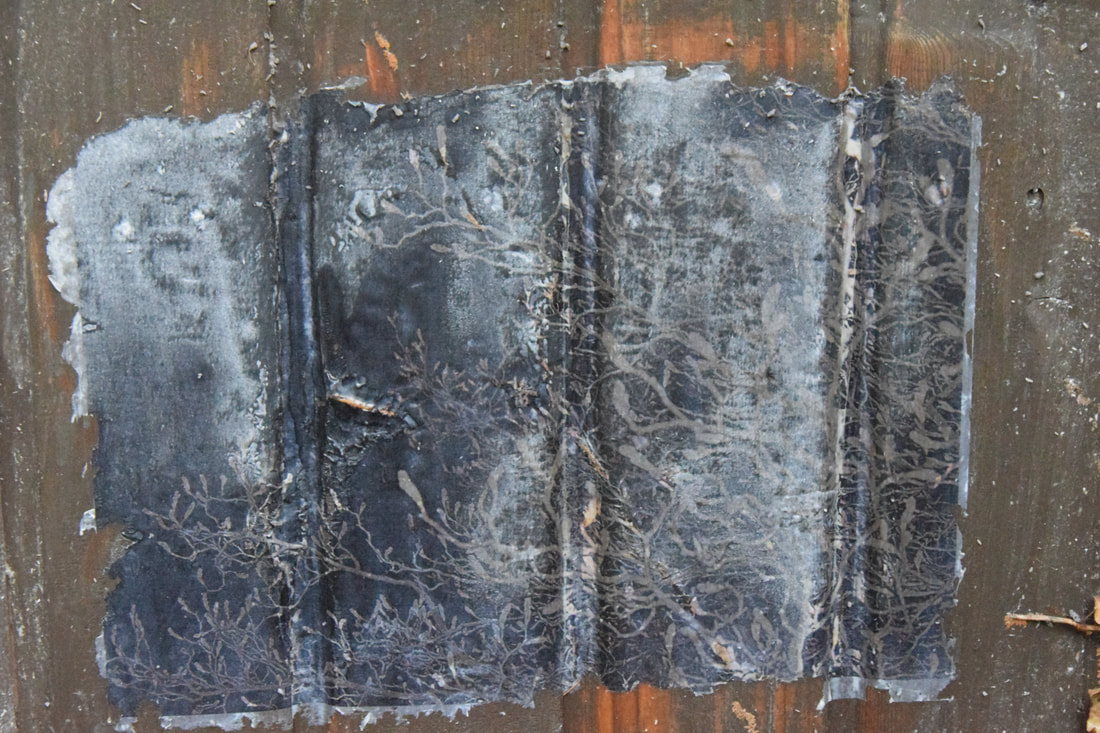
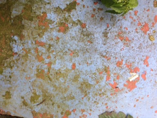
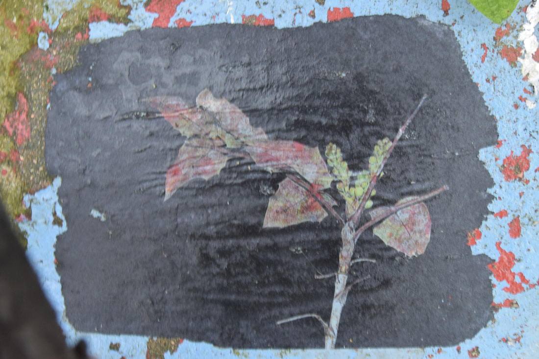
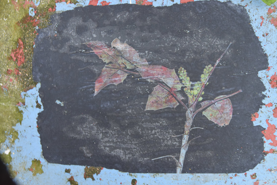
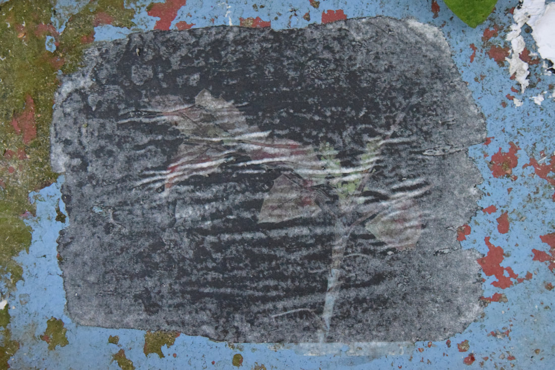
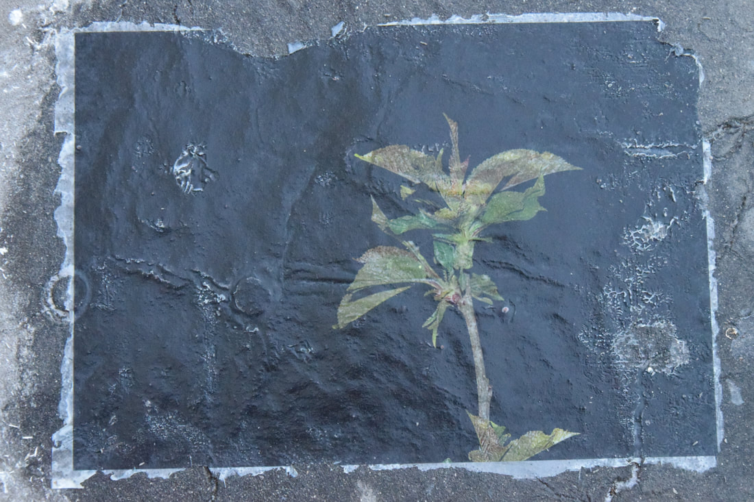
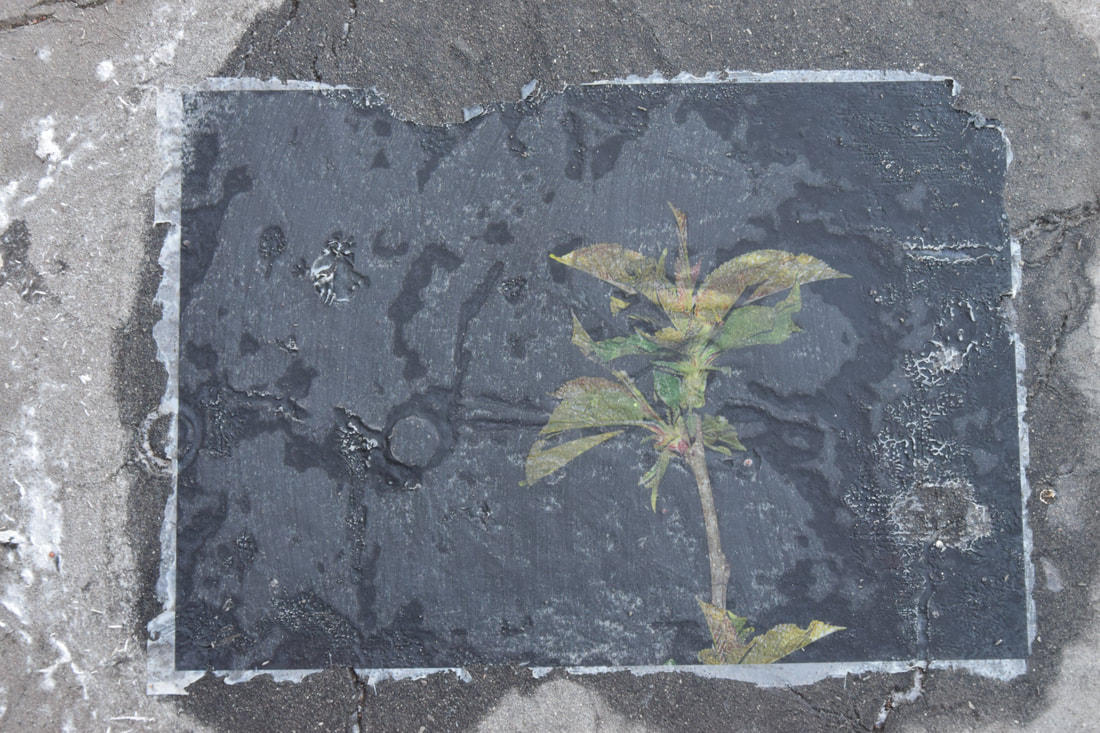
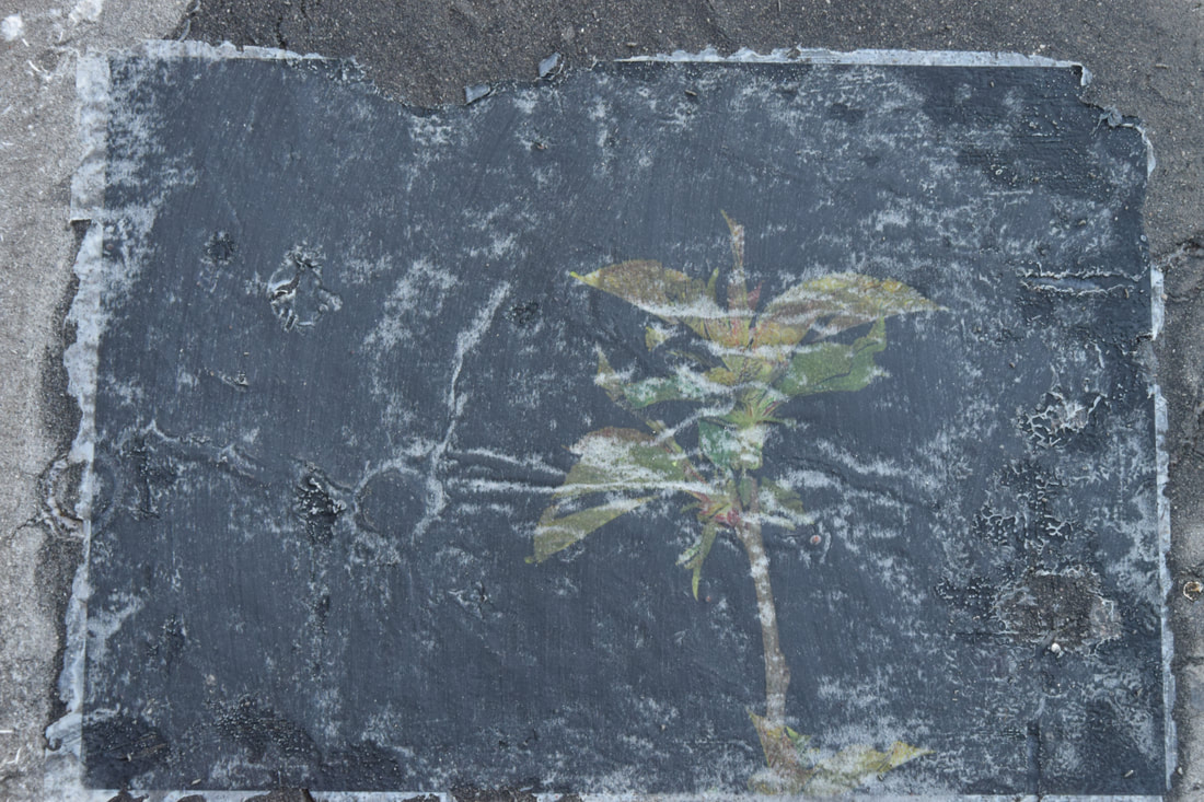
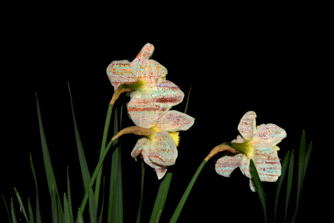
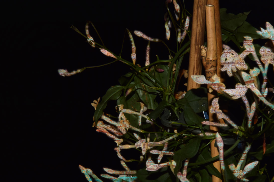
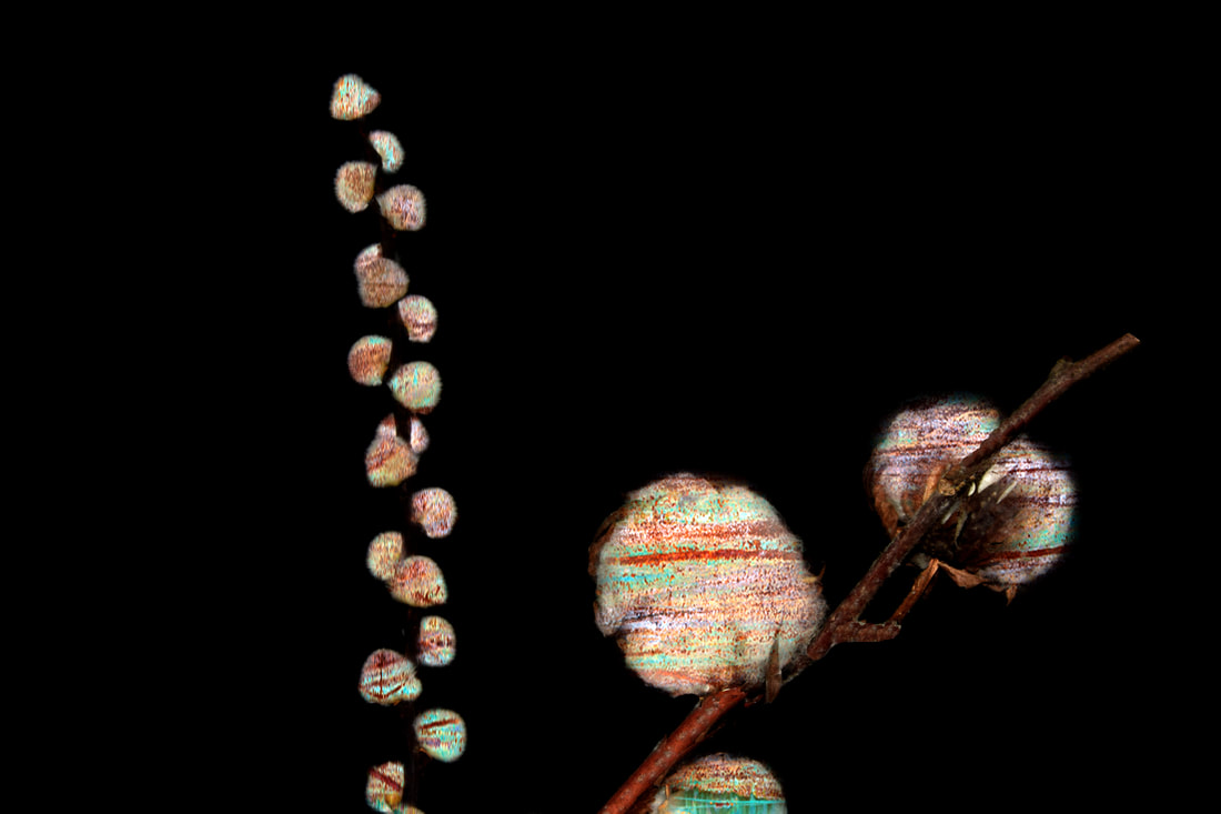
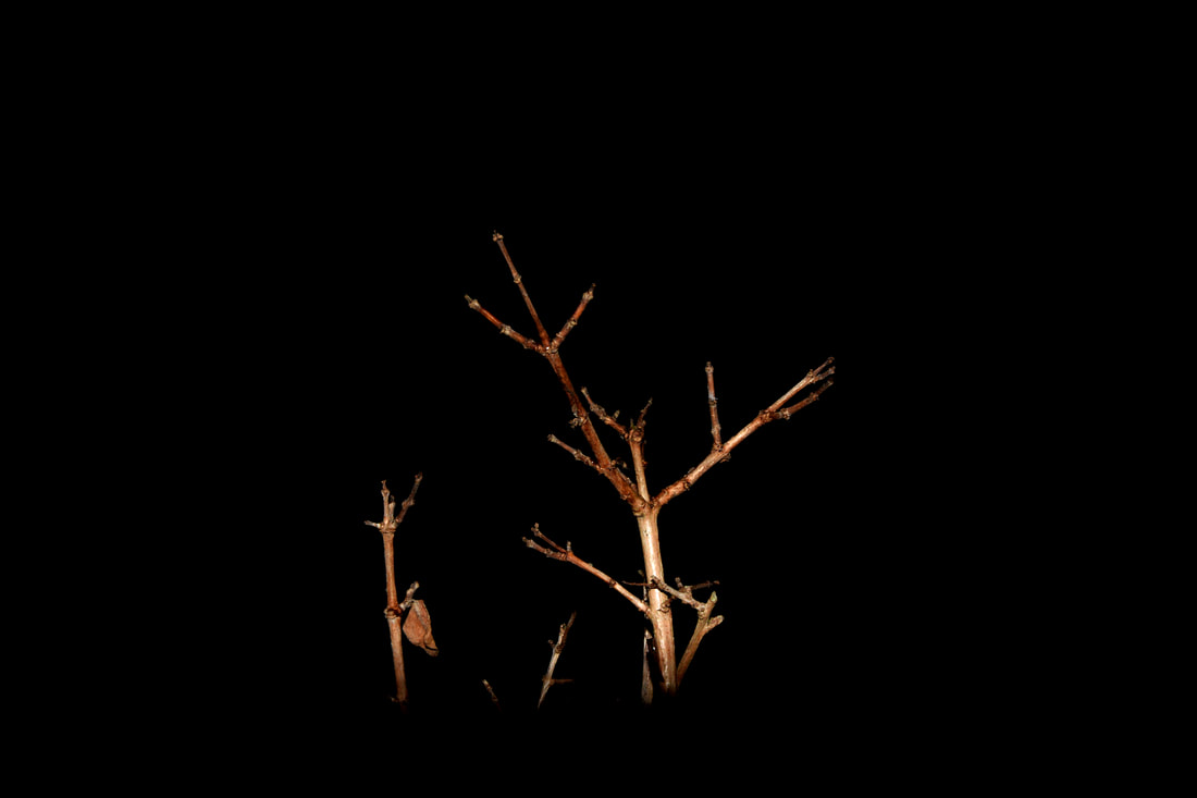
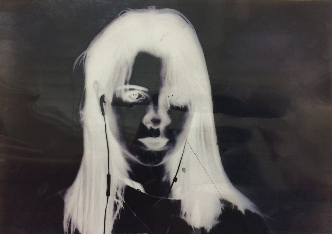
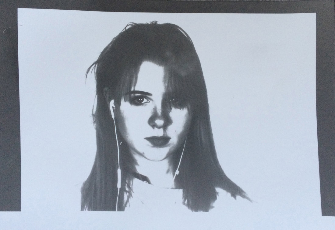
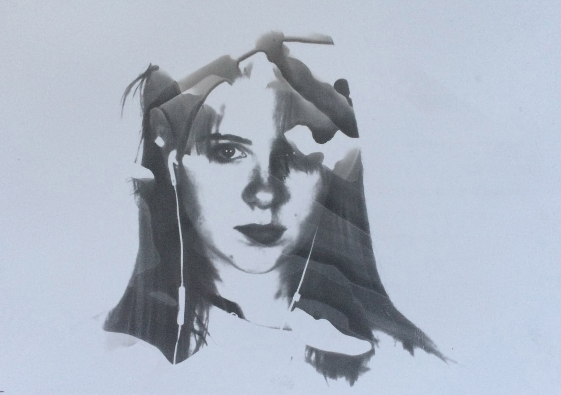
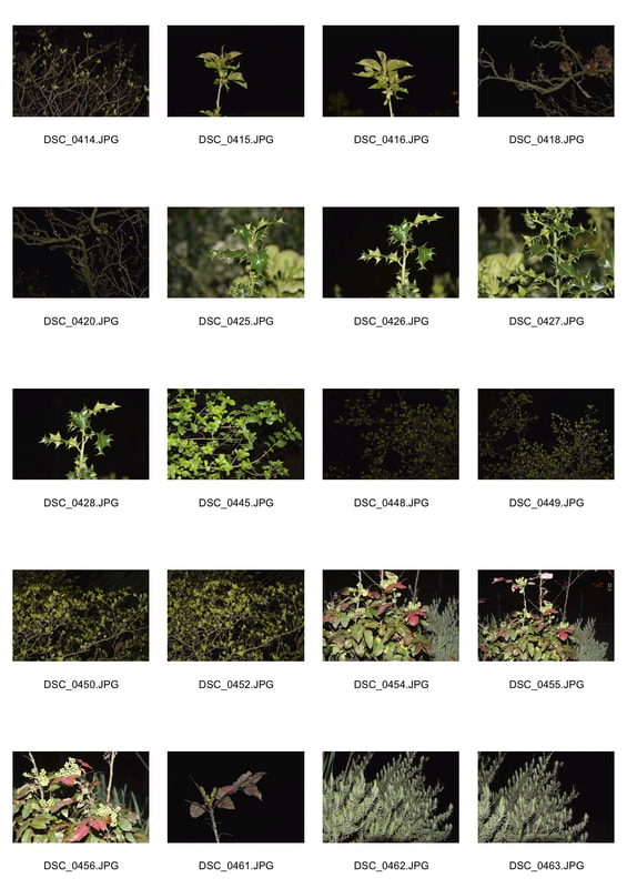
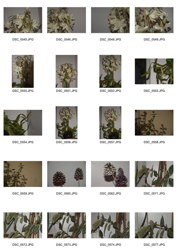
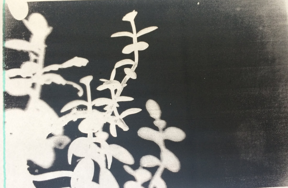
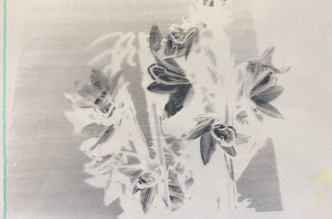
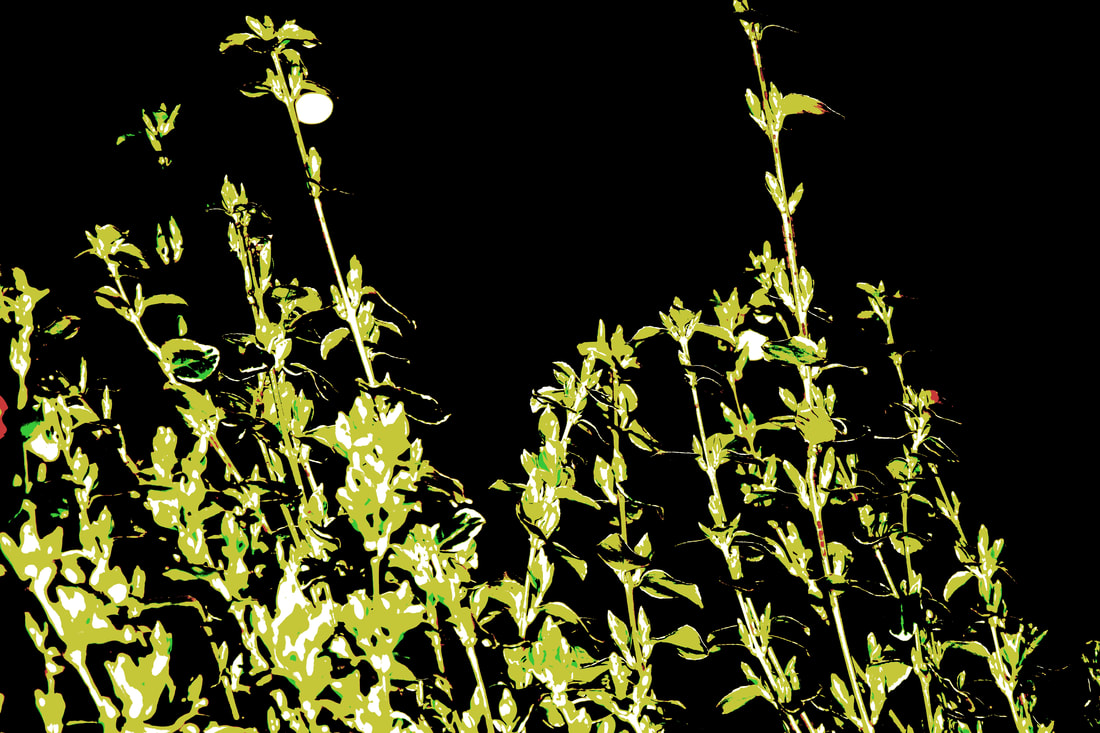
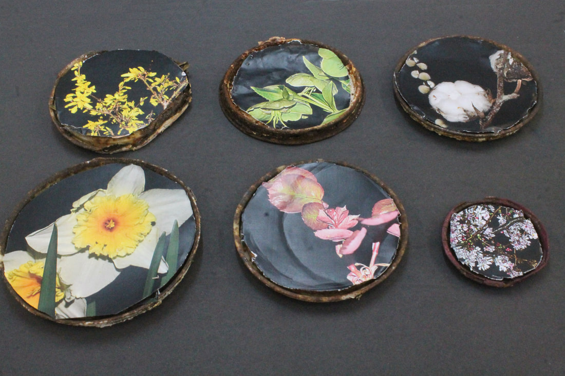
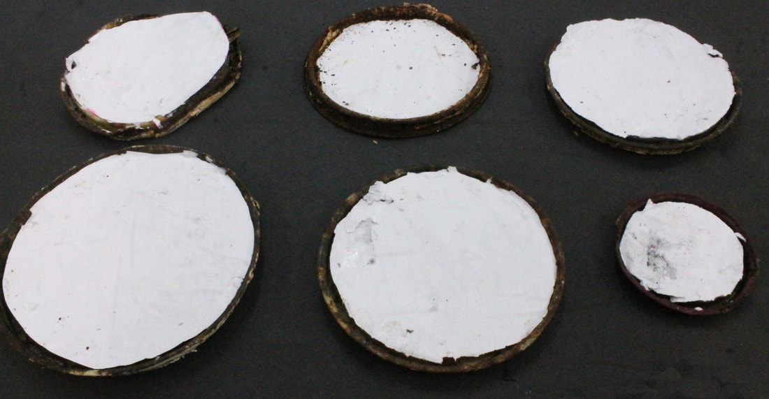
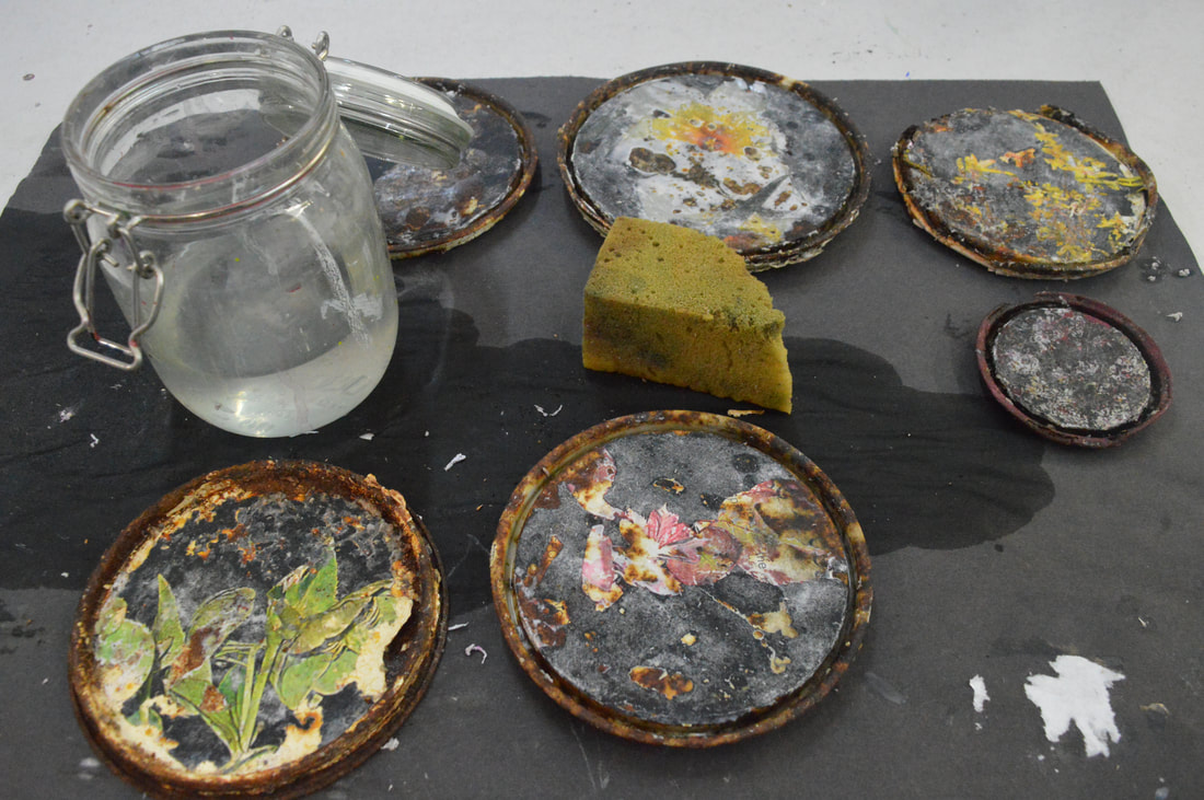
Natural post processing
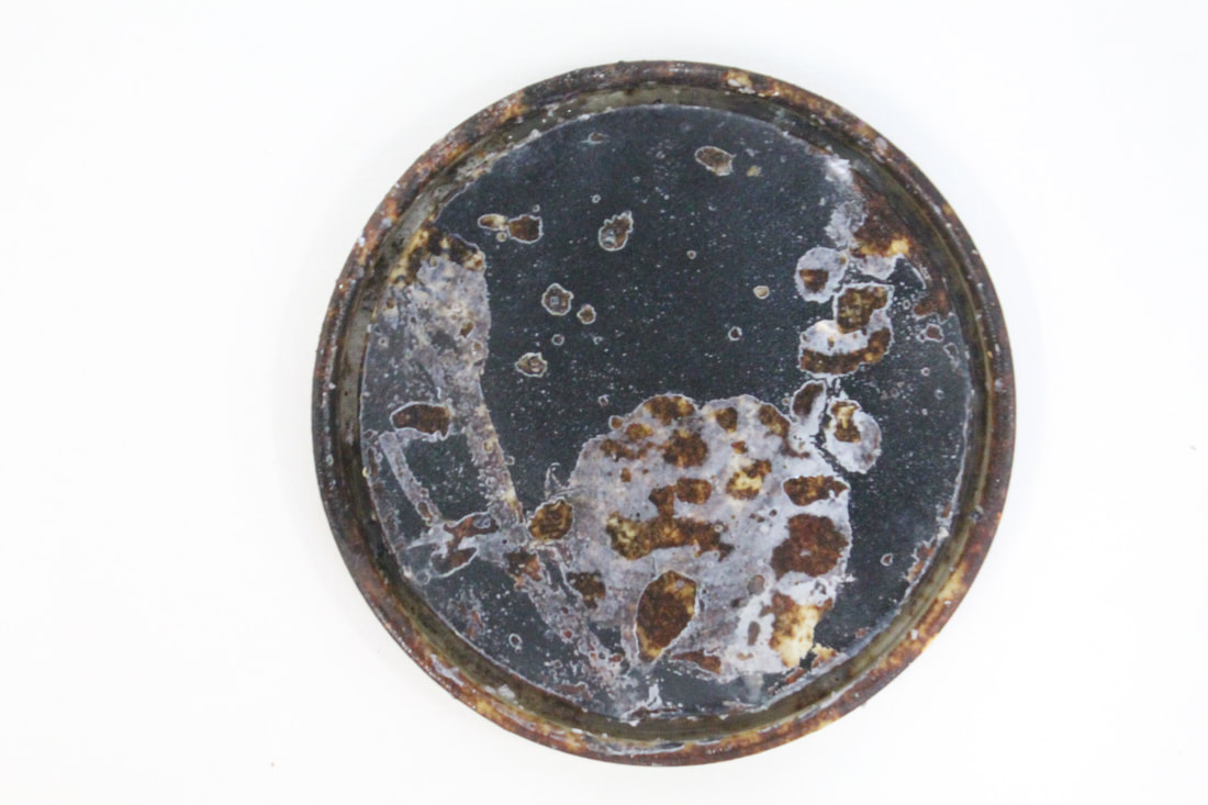
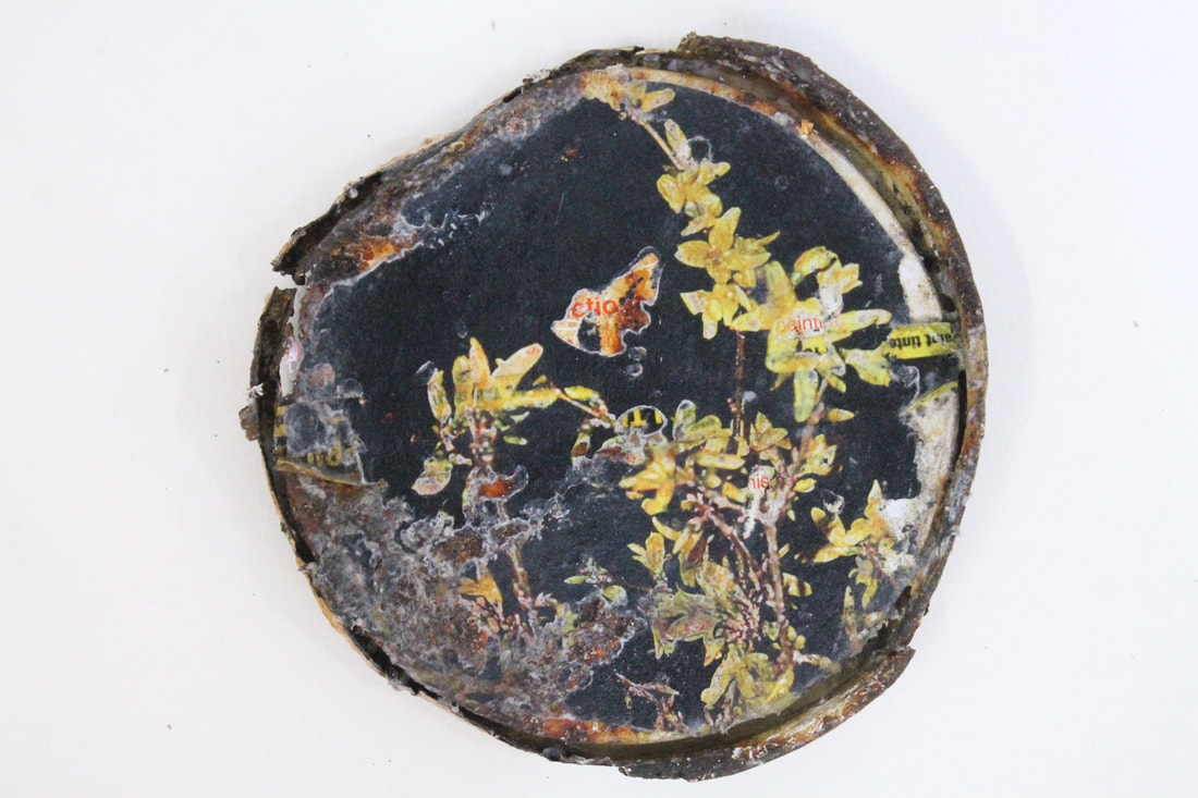
Mould Image transfer Shadows
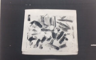
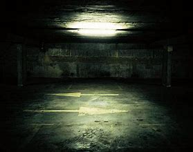
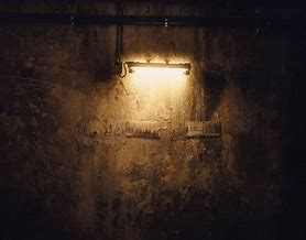
Dark room 
|
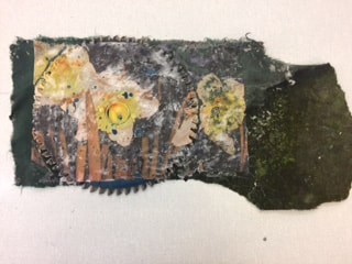
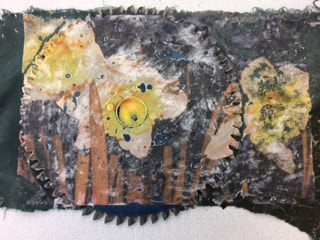
computer editing
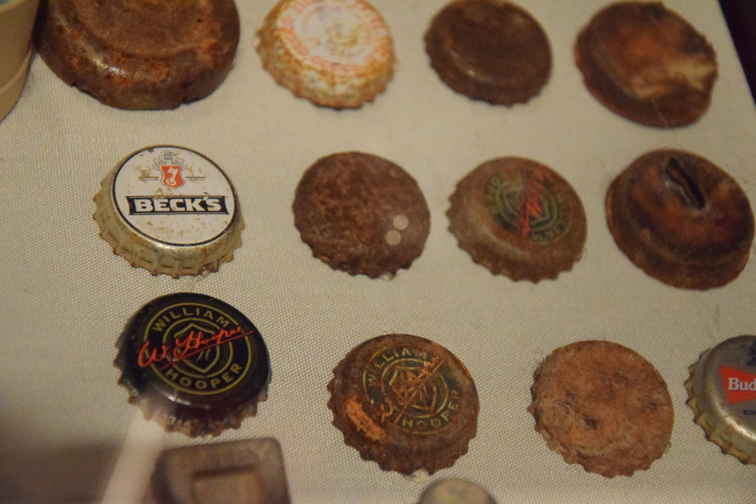
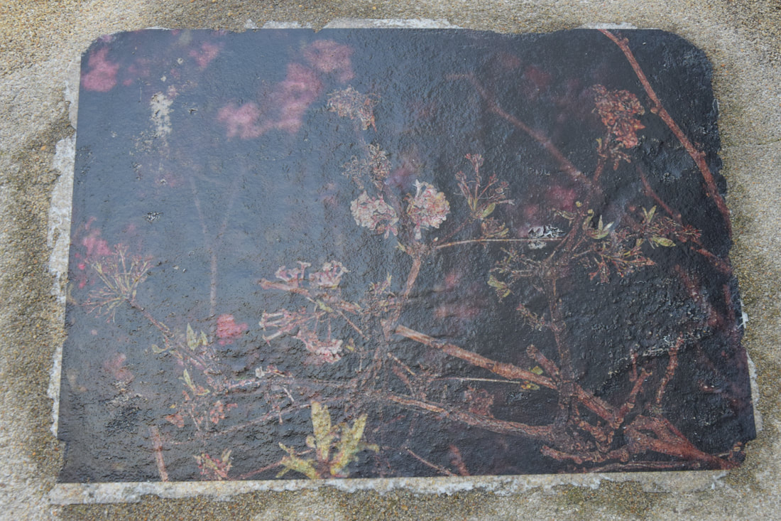
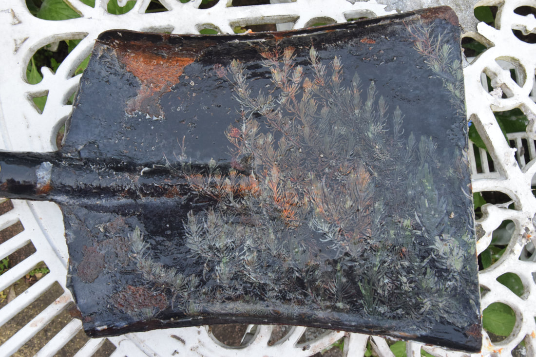
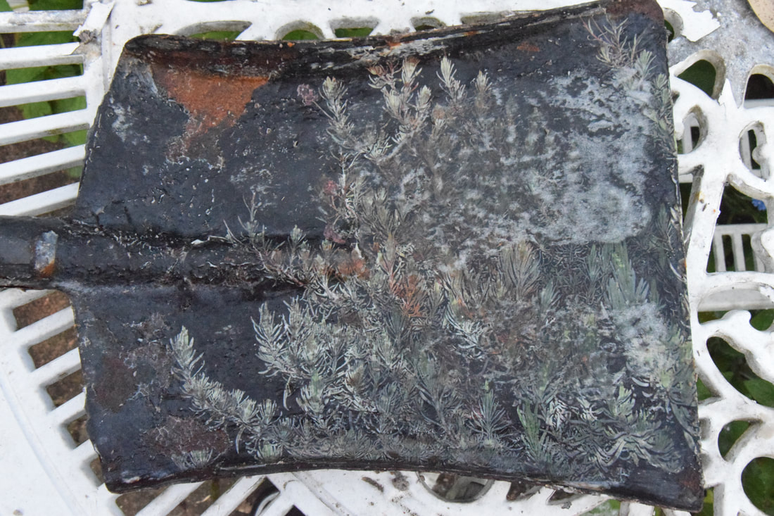
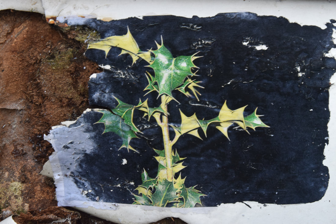
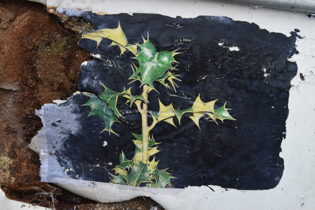
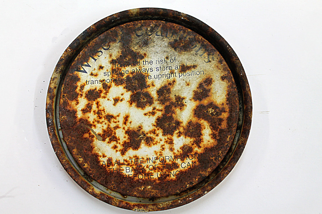
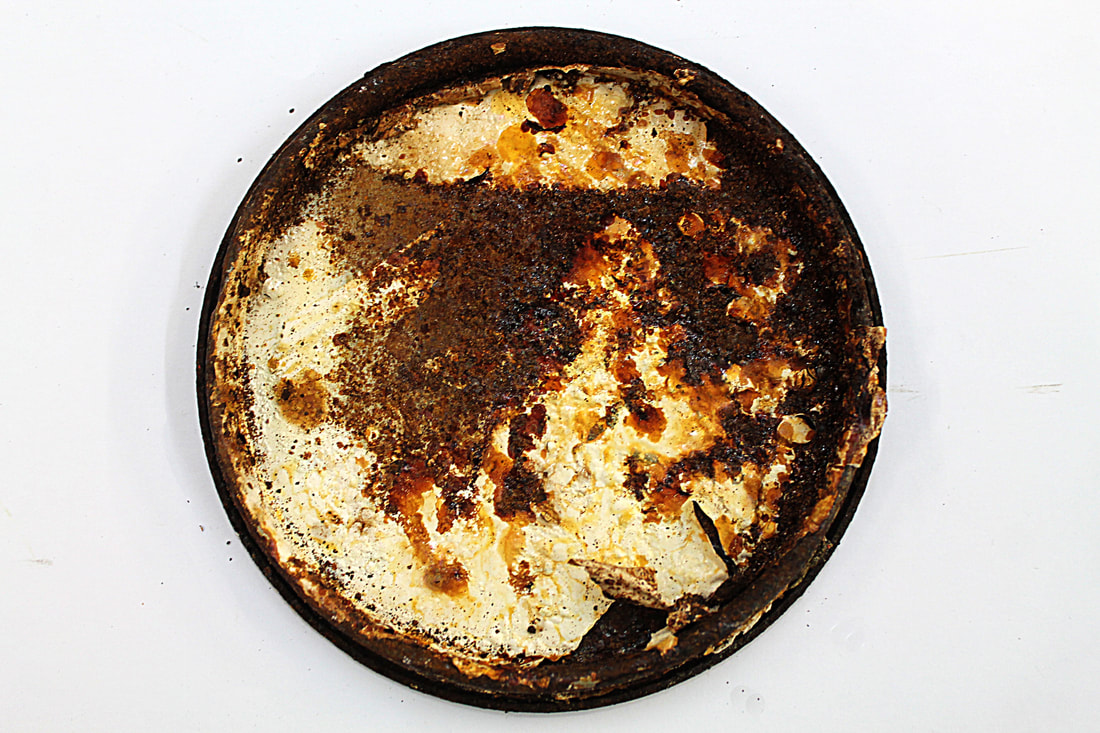
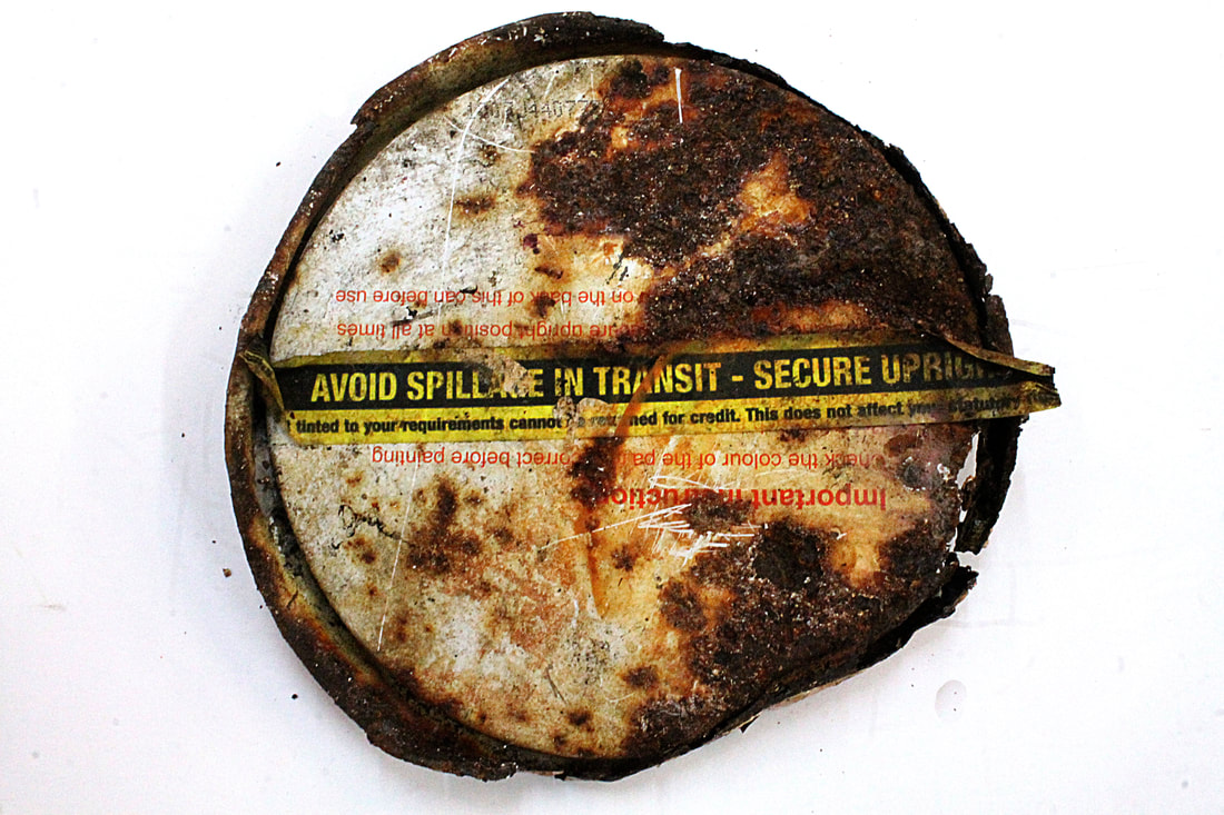
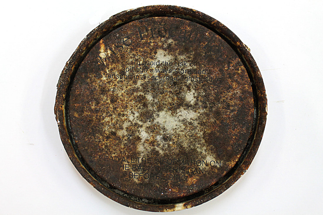
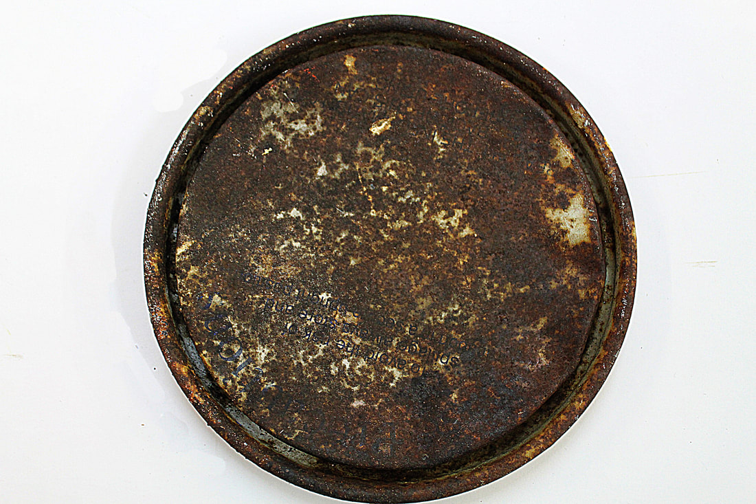
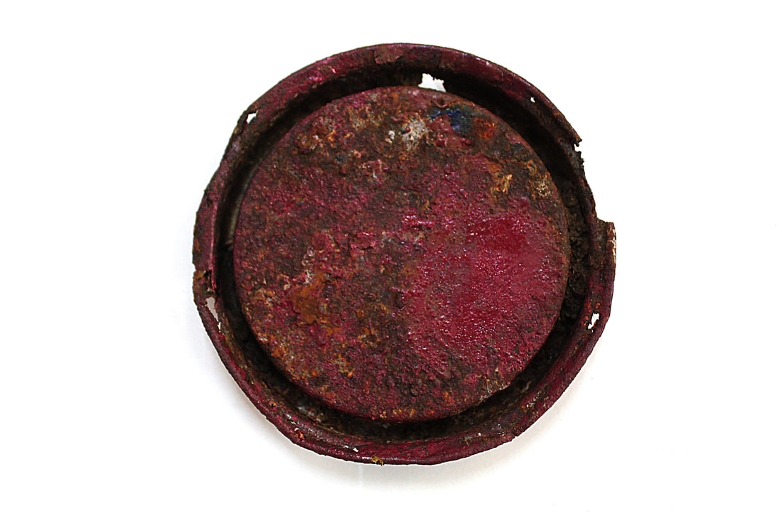
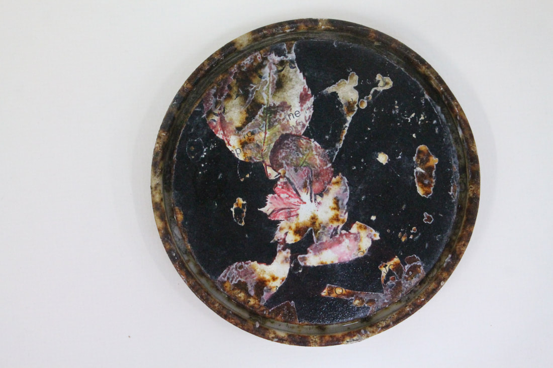
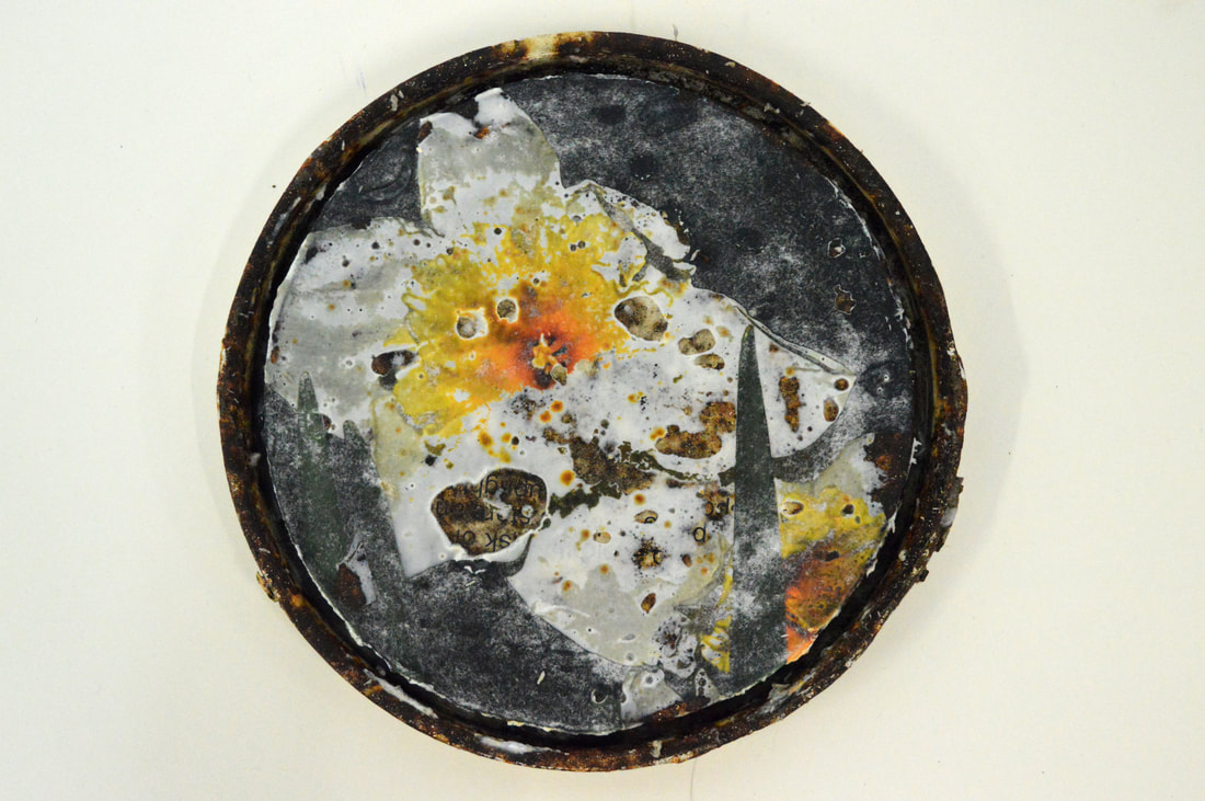
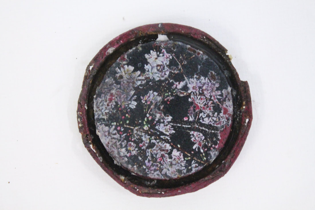
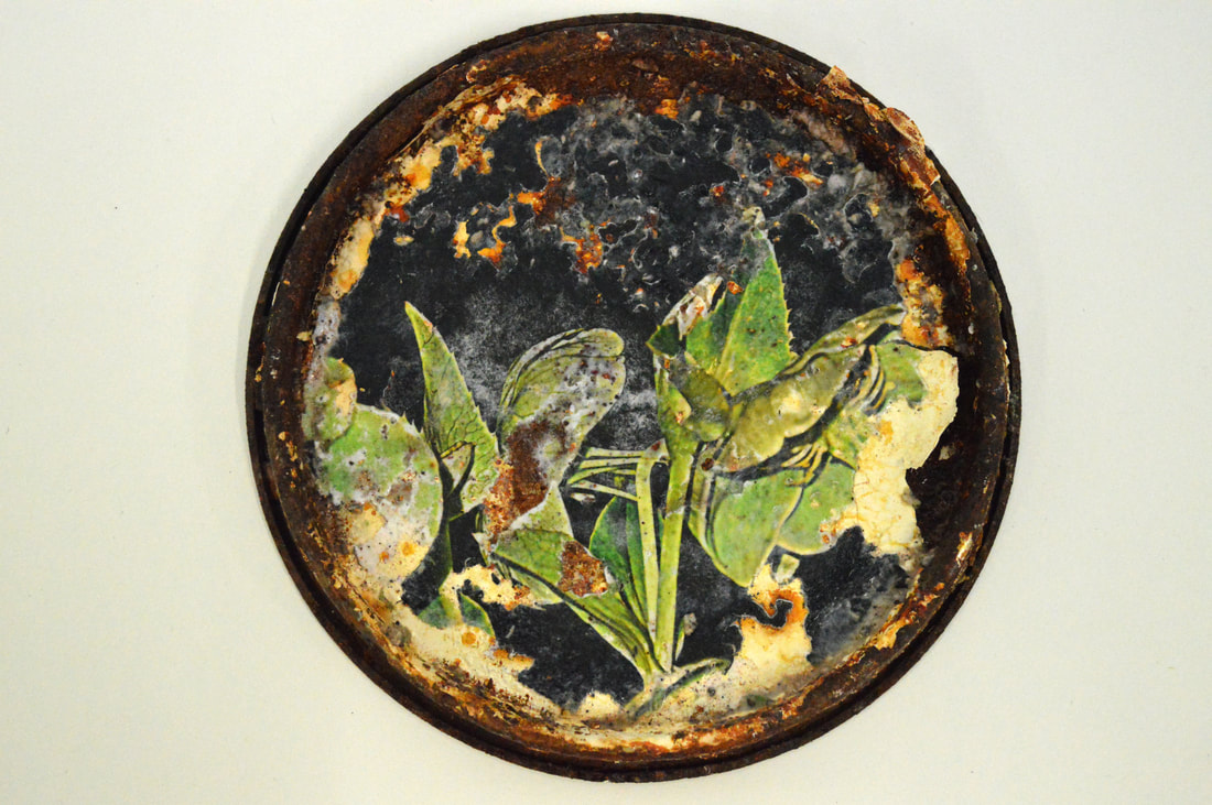
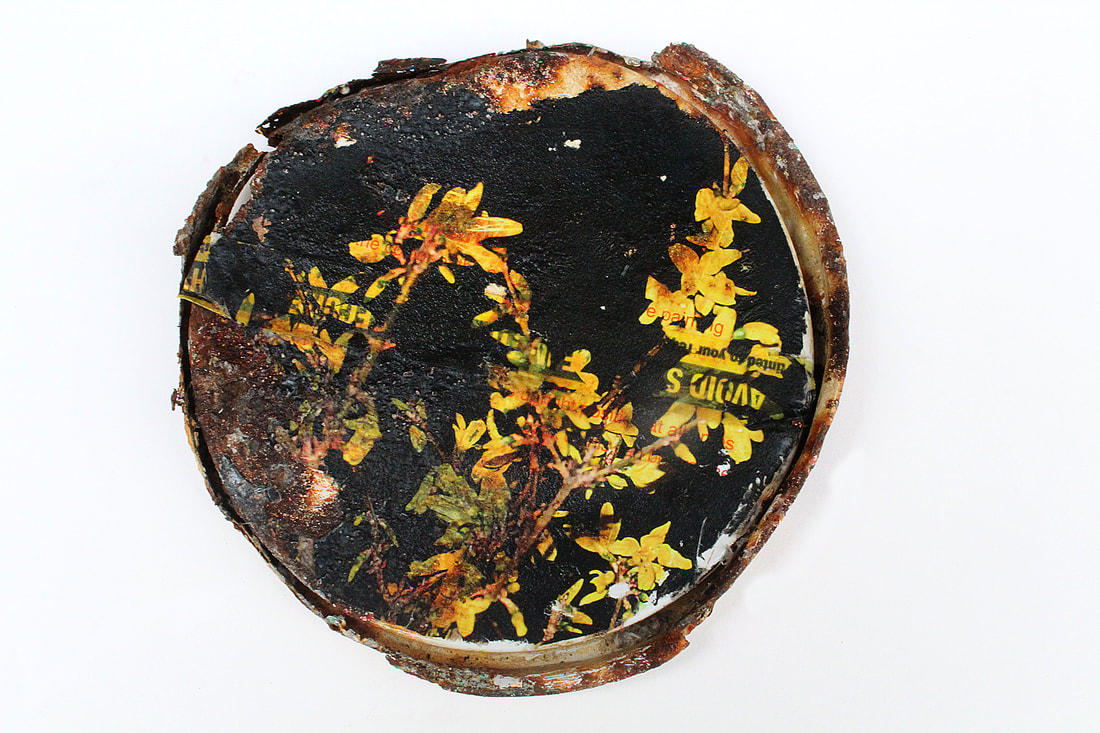
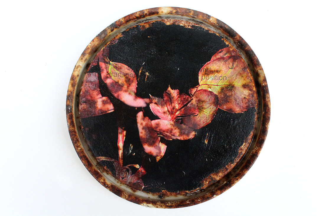
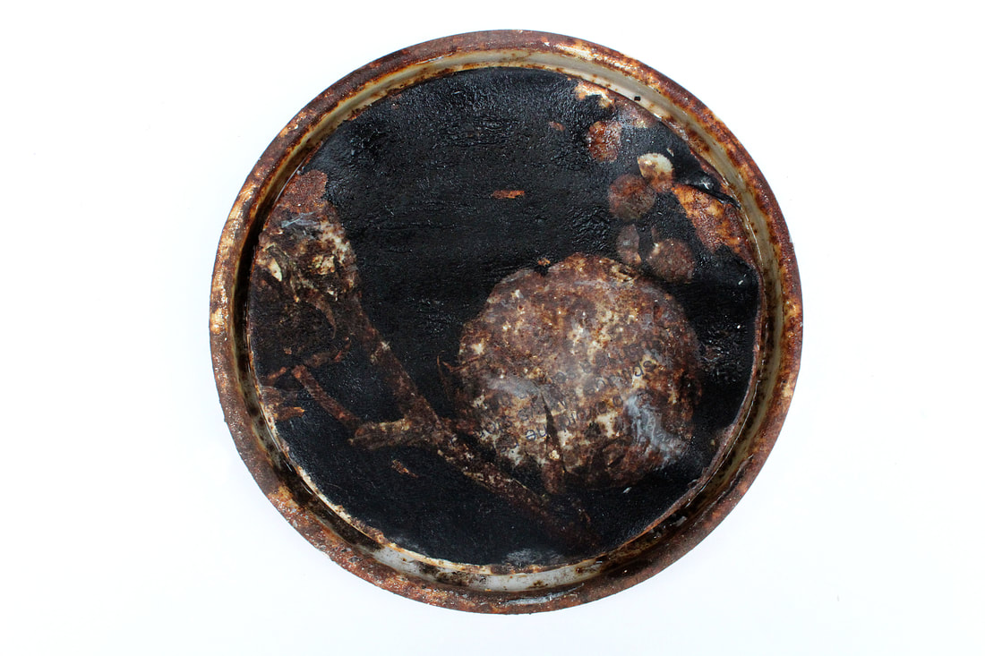
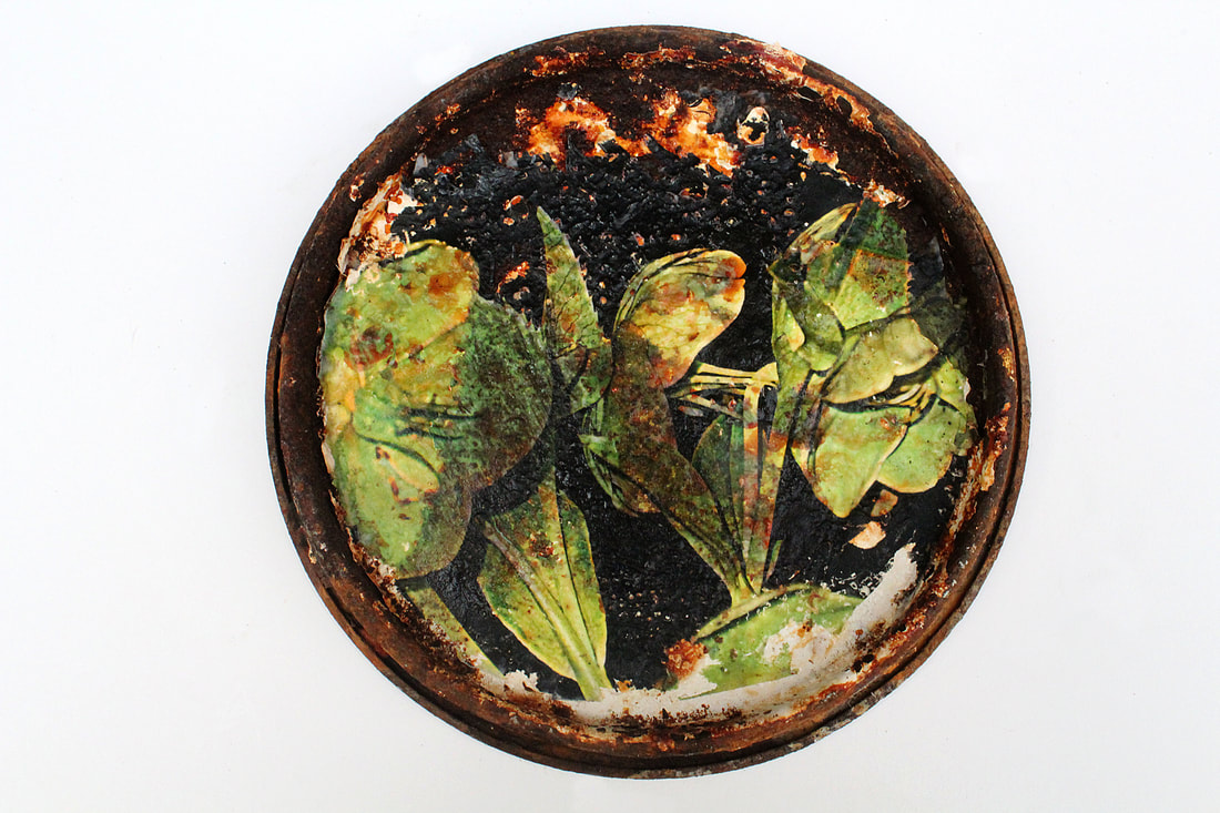
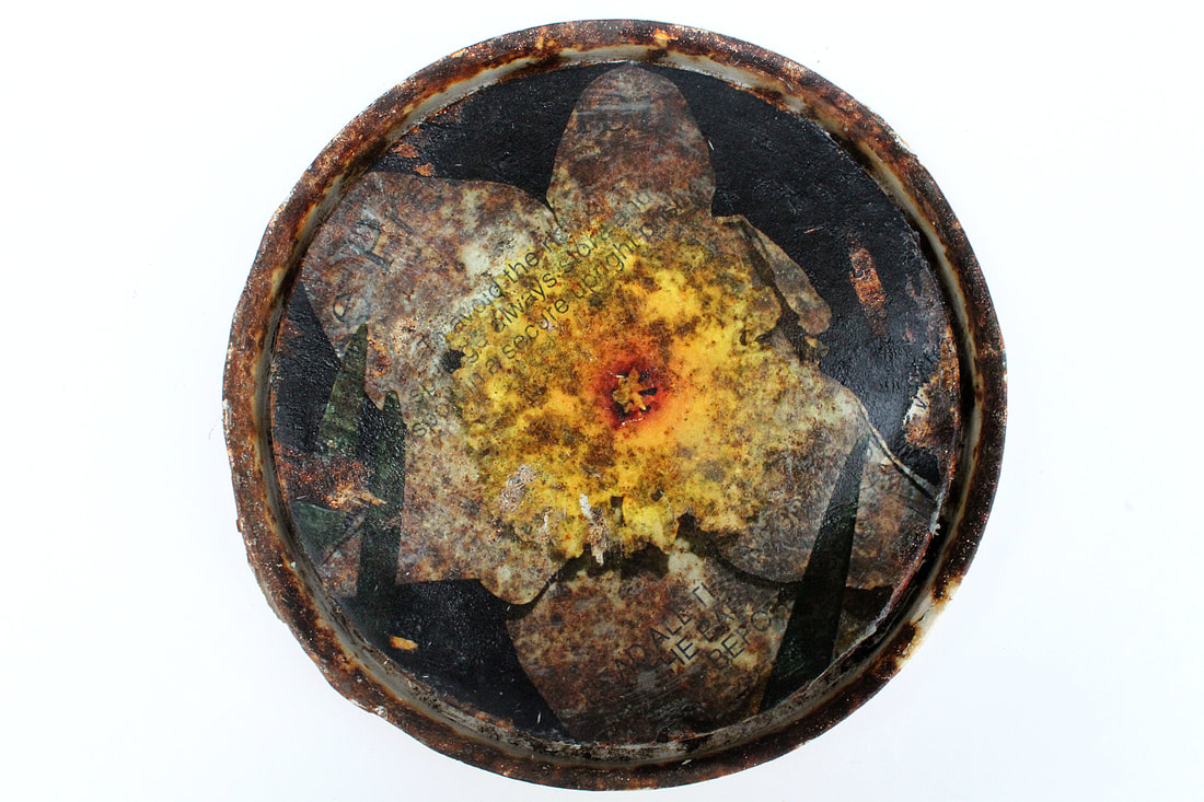
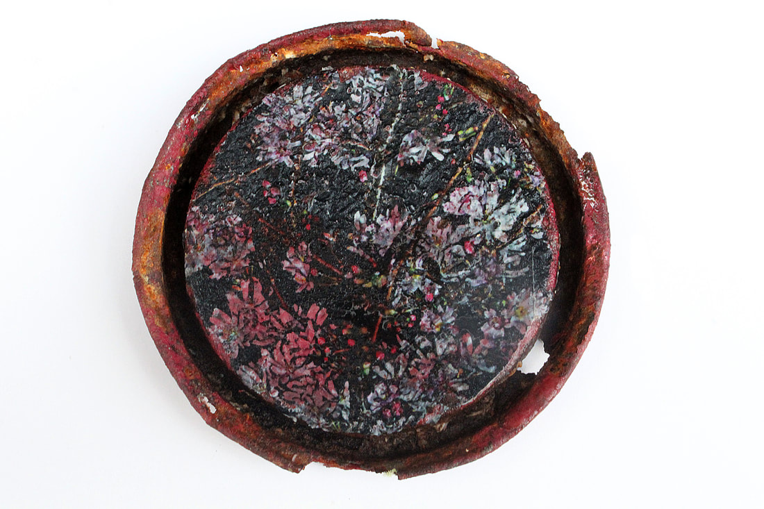
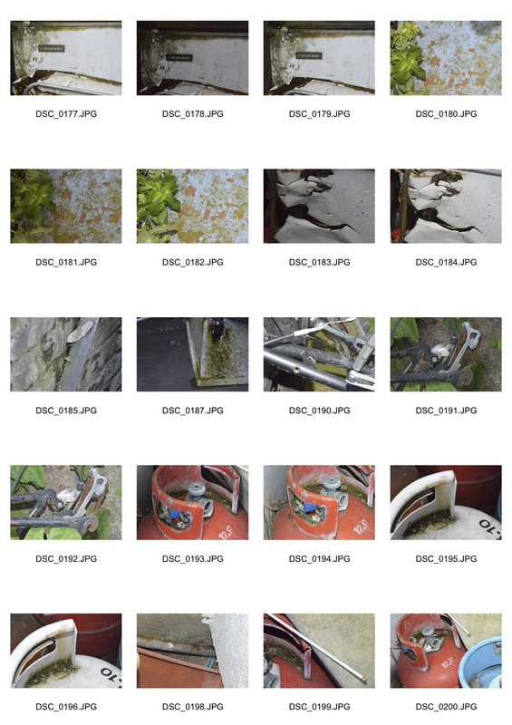
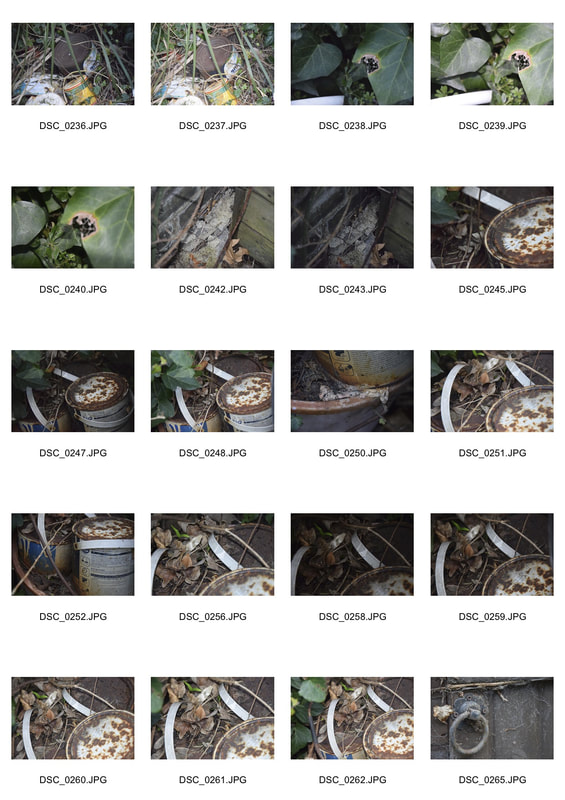
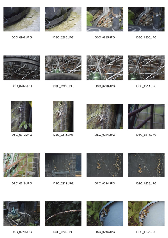
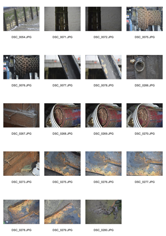
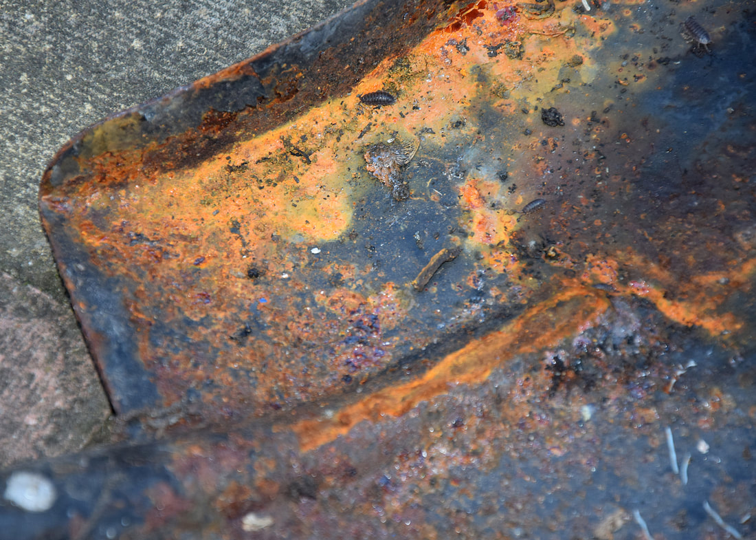
Jana Scott (rust) Exposed

|