Exhibition visits
London nights
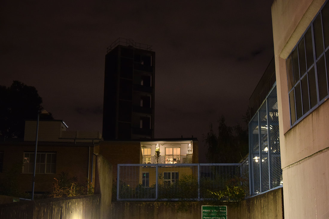
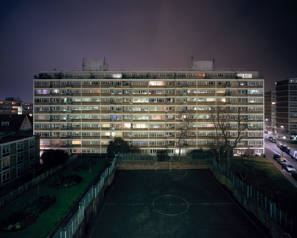
The first exhibition that I visited was London nights at the Museum Of London. The exhibition explores the city at night in a variety of ways through many different artists. It was separated into three rooms, London Illuminated, Dark Matters and Switch On Switch Off.
London Illuminated was mainly scenes of the city lit by artificial and limited natural light, it portrayed familiar and lesser known London sites allowing the viewer to react to each piece of work differently.
Dark Matters was more about the darker and more threatening side of London night life. These works focus more on how the dark can evoke feelings of threat, isolation and vulnerability, instead of the beauty of the night. This is done through real and imagined scenarios.
Lastly Switch On Switch Off focuses on Londons everyday work, rest and play. This section ranges from the everyday commute journey home after a long days work, to the thriving night life of London.
Below are particular photographers and their works which stood out to me in each section:
|

|
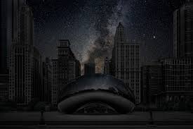
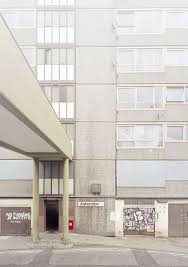
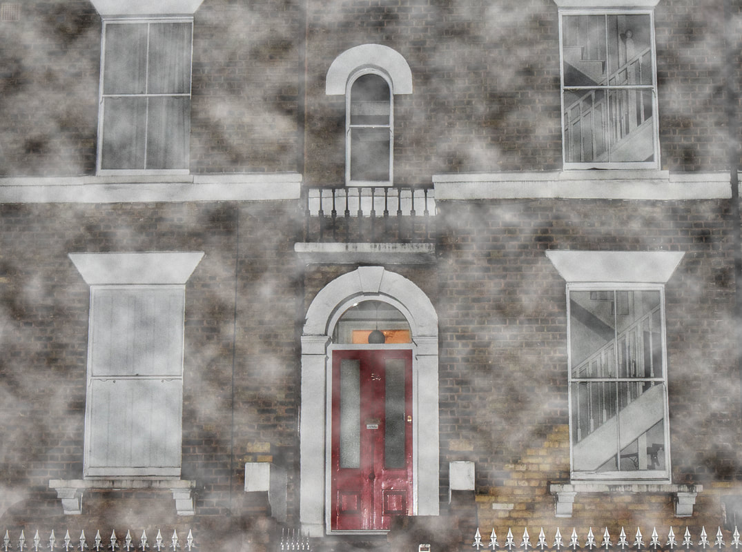
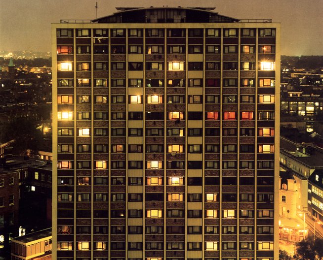
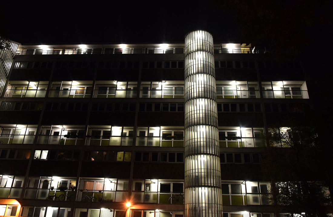
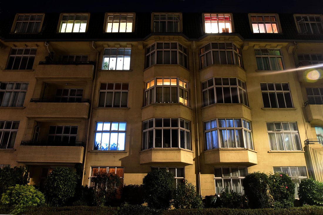
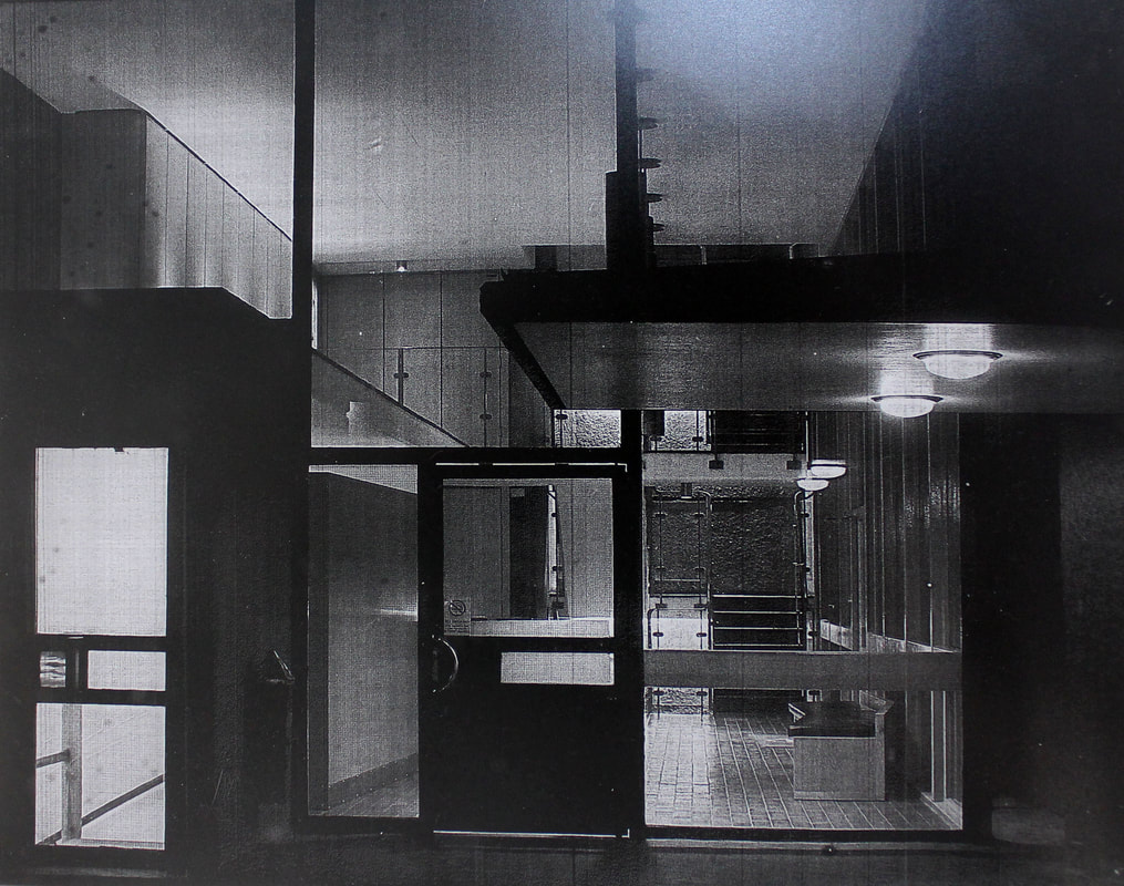
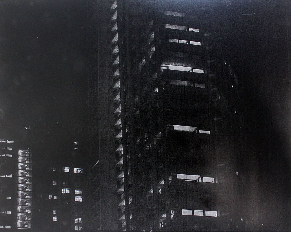
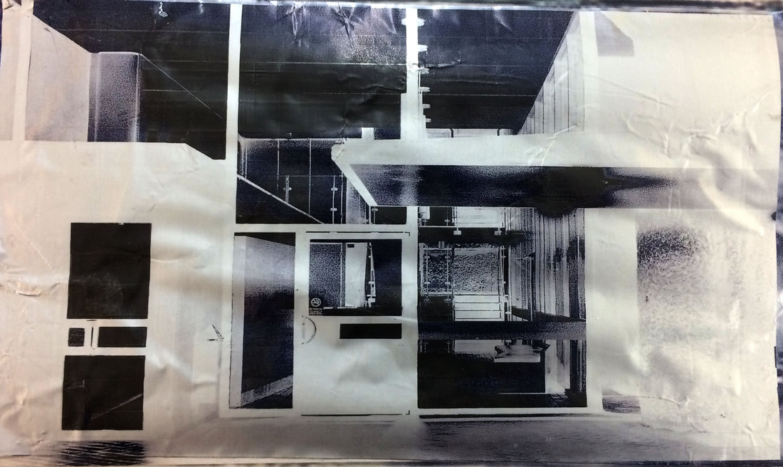
These are from the first room London Illuminated, the first is Thierry Cohen his work stood out due to the beautiful night sky full of stars in the background, it was interesting that this is what London's sky would look like if there was less pollution. The next is Antony Cairns I liked his work due to the aluminium effect and finish he puts on his photos.
|
|
These are from the second room Dark Matters, the first is a imagined Hitchcock inspired photo by David George, this interested me due to the soft detailed pictorial style of it, while it has a dark sincere atmosphere. The next is from a series that was in the exhibition by Nick Turpin called Night Bus, I liked the way the colours in the background are blurred and gloomy creating an outline for the figures.
|
|
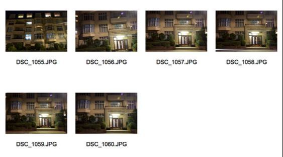
These are from the last room Switch On Switch Off, the first is by David Moore from a series called The Velvet Arena. I liked how the blackout background highlights and separates simple poses, making them rich in colour and pure. The second are a series of portraits by John Goto, I liked the old fashion style of the 70s they portray. There cheerful atmosphere transports you to the period and helps you connect with the figures, I liked this about them.
Shape of light
The second exhibition I visited was the Shape Of Light at the Tate Modern, it consisted of an almost timeline of 100 years of abstract photography and art. It features many different artists over the 100 years who have worked with light to create abstract work, there work focuses on highlighting the shape, form and expression they are conveying in it. Many of the works in the first rooms had famous old paintings along side newer artists work which has inspired them to create their work in a certain way.
Below are certain works that stood out to me:
Below are certain works that stood out to me:

The ones that particularly caught my eye were the ones that consisted of paint and colour patterns like in the first four, as i liked the colour and texture in them. But also I enjoyed the abstract photograms, due to their shape and form used. As well the black backgrounds create a mysterious empty atmosphere, highlighting the form of the abstractions.
Personal Brief
My practical work follows on from my curatorship taking the same title, 'The beauty in destruction'. The idea behind the title is that mankind continues to damage and destroy the environment and nature around it, seeing the consequences. Nevertheless continuing. As the linear progression continues we lose more and more of our natural environment, as the title suggests the beauty is no longer in the natural environment as it is lost, but in the destruction itself as it is all that remains.
Therefore my practical work focuses on the environmental problems caused mainly by mankind and the lasting impact. Being that these issues leave environments derelict and abandoned, left to decay and ruin. The significance of portraying this issue in my series of images which will follow, is to highlight the issue that worsens daily and is forgot about.
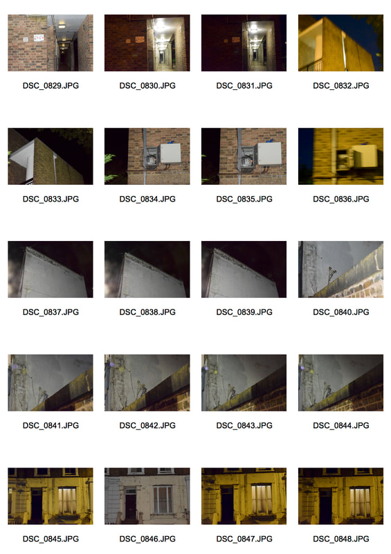
I will start with looking at decay and isolation found in everyday environments.
Therefore my practical work focuses on the environmental problems caused mainly by mankind and the lasting impact. Being that these issues leave environments derelict and abandoned, left to decay and ruin. The significance of portraying this issue in my series of images which will follow, is to highlight the issue that worsens daily and is forgot about.
I will start with looking at decay and isolation found in everyday environments.
First development
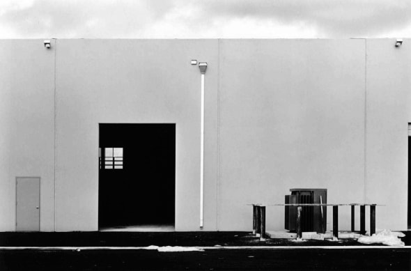
Nadav Kander
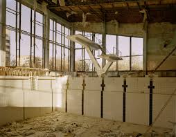
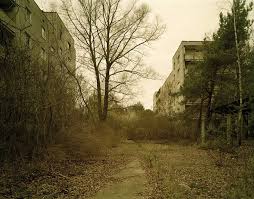
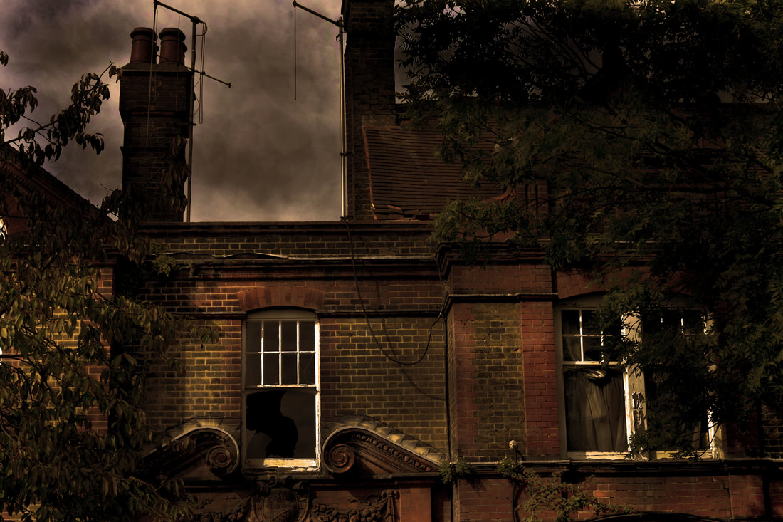
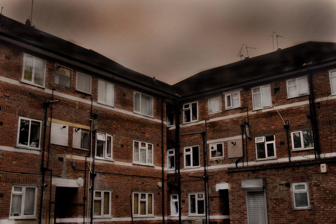
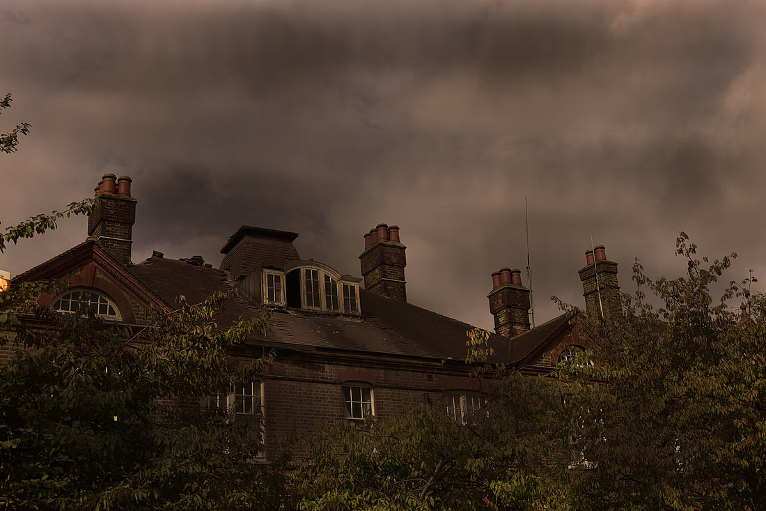
I began with photographing derelict locations in response to Nadav Kander's work, in particular his series half life.
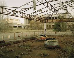
Half life was shot in Chernobyl on its 20th anniversary, in 1986 the Chernobyl nuclear power station exploded. Creating a suddenly very toxic atmosphere due to the highly dangerous radiation that was released. This meant that the whole 40,000 population had to be immediately evacuated, the city was deserted, peoples whole lives left in mid action. I chose Kander to influence my first set of images as many of his series focus on showing the unconventional side of beauty. In half life his images show the problem I am trying to highlight throughout my work, that humans have ruined natural environments to build upon for our own use, but then when it is not longer needed left the environment to decay and ruin. Making the environments uninhabitable.
Moreover Kander was particularly interested in the eeriness of the deserted city of Chernobyl, contrasting with the beauty in the silence of a once model soviet city. The beauty in the destruction, a theme prominent in many of Kander's series, can be seen in his images below:
|
|
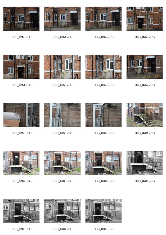
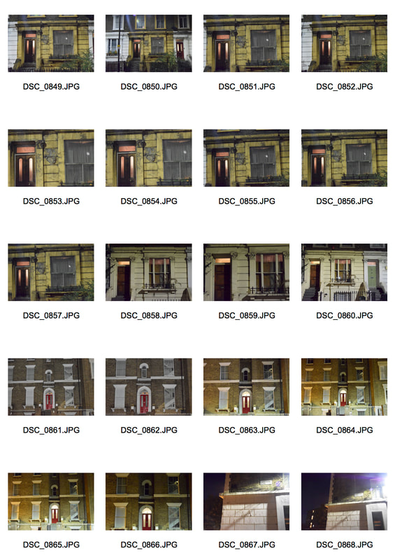
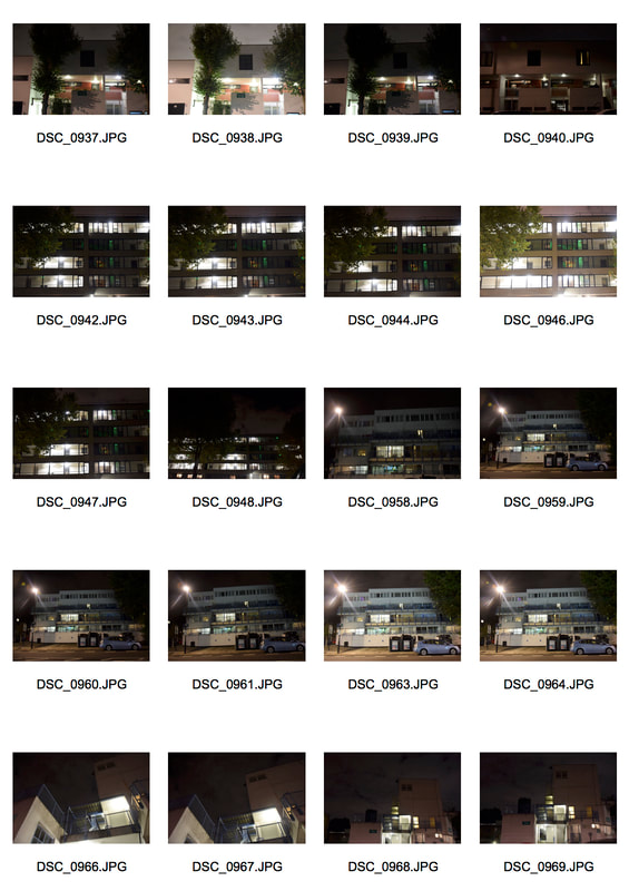
In response to Kander's half life series, I tried to photograph old, damaged buildings found in the local environment. Mainly buildings coloured with worn down browns, as Kander's images have a dull saturated light brown/ yellow tint, which helps to portray their uneasy atmosphere. In contrast to Kander, I wanted to photograph on a local scale to highlight everyday decay and neglection which we may not notice normally. Moreover I decided to take the images in the morning/midday, so that the building would have a white backing, further adding to the atmosphere. As it was bright out I decided to use a small aperture in order to capture to maximum amount of detail.
These are the steps I used to overall darken and saturate my images. I first adjusted the levels of the image, to enhance the detail and colours through adding more contrast. Next I added a warm light brown/ orange photo filter to the image, to saturate the colours and portray the atmosphere of the image. Lastly the burn tool was used on midtones, on an exposure of around 50%. The burn tool was used mainly on the sky to darken it, creating the effect of a polluted sky.
All images work well in portraying a silent eerie atmosphere and the dull colours contrast well with the white window frames. However the first and last may work better than the middle image, as they have nature as well as the structural buildings to focus on. The nature concealing parts of the building adds to the derelict atmosphere as it suggests a sense of abandonment, as the nature has been left to overgrow. In the first image the structure of the building shows the damage, for example the broken and curtain draw windows. Although like in the last image the burning of the sky may have blended in better if the exposure of the burn tool was lowered. Nevertheless in the middle image this is done well as it blends in with the sky better. In the middle and last the negative space works well to show the size of the buildings and the presents, but in the last image the detail has been lost due to the burning tool, it may be better if the white frames were highlighted.
Second development
Simon Kennedy
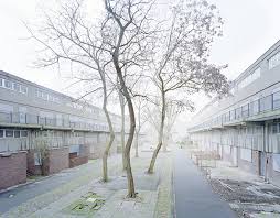
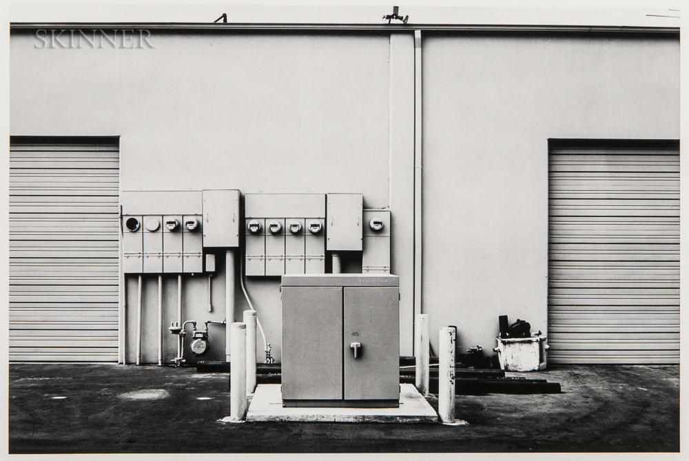
I next looked at Simon Kennedy as i liked his use of saturated colours and the use of fog which hides and highlight different parts of his images to create the atmosphere. This follows on from Kander as it looks at derelict locations and the use of tonal colours.
Simon Kennedy is a trained architect who uses photography 'explore and test ideas that I have developed during my time as an architect.'
The images below are from his exhibition Heygate Abstracted, he used a large format camera to capture the detail well due to its high resolution. He visited the estate numerous times in 2010 when the estate was awaiting its demolition. His series was taken at a time when affordable housing was at a shortage, they make us see the beauty still left in the estate and make us question if it is a failed estate and needs to be demolished. It was once a symbol of the new future, now remembered as a failed ambition.
|
|
In response to Kennedy's Heygate Abstracted, I went around Highbury photographing estates and housing that had began to be neglected or worn down. As Heygate estate was once a normal estate which failed, this development aims to emphasise the need t look after out environments so that we do not let situations like this occur again. As well as I was looking for pastel tones and colours to evoke Kennedy's saturated colours effect, that add a mood to the buildings, as if the life has been drained from somewhere which should be full of it.
These are the steps I done in Photoshop to create a fog effect on my images. First I duplicated the image and changed the blending to a soft light, next a made a new empty layer, naming it fog. This layer would be placed on top the image and be used to create the fog. I had to make sure to set the colour of the layer fog to white, so that the fog would naturally be white. Then use the quick mask tool. After I selected the areas in which the fog wouldbeable to form, by using the render tool and different colours. Then take off the quick mask t leave the selected. Then the selected area needed to be filled with white to create the fog, then deselected the different clouds. Lastly I copied the fog layer and transformed the size of this new layer to try and make the fog more dense, finally I changed the Opacity of the fog layers to whichever amount I saw best for the image.
The results are seen below:
The results are seen below:
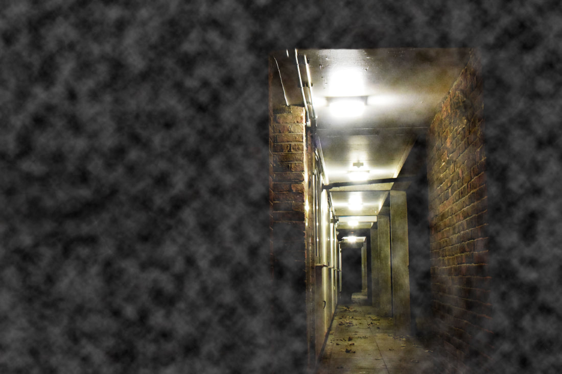
The fog effect may have worked better if the fog was made more dense and if the images were not taken at night, instead in daylight with a white sky. This would have allowed the fog to blend in better with the images, as it stands out too much on the blackness of the night. Nevertheless the images as a series, work well in highlighting the colours of the images and worn down parts of housing. As in the first three images they portray the worn out details in the buildings. In the first image the silvery decay is highlighted by the use of flash, lighting up the foreground of the image and shadowing the background. This is seen again in the second image of the detail of the green decay contrasts effectively with the darkness of the image. The third neglect detail of the peeling paint is established through the shadows formed and the dark backgrounf to create a border fotr it. In the last three images the colours create the atmosphere. In the fourth image the red door stands out as the centre of the image, which makes it less dull than it would be if the door was just another white window frame. The fifth image evokes a more eerie atmosphere as the long, lit corridor fades out and gets smaller, the fog adds to its eeriness, however may be better without it. The last image has lovely tones of green, reds and yellows, giving the image a warm feeling concealed under the fog. In all the images the central focus of them is clear, allowing the rest of the detail to fall around it.
Third development
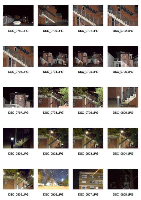
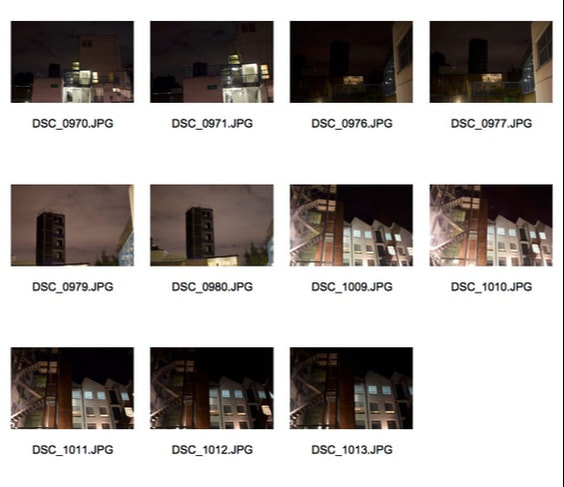
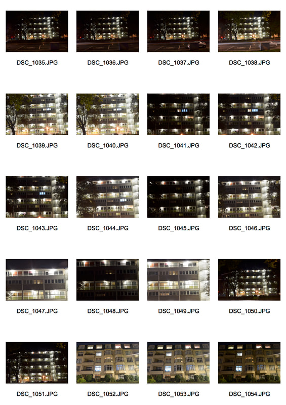
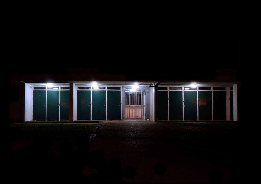
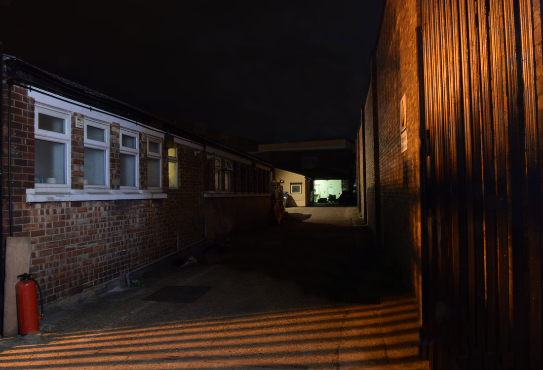
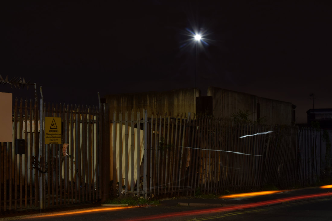
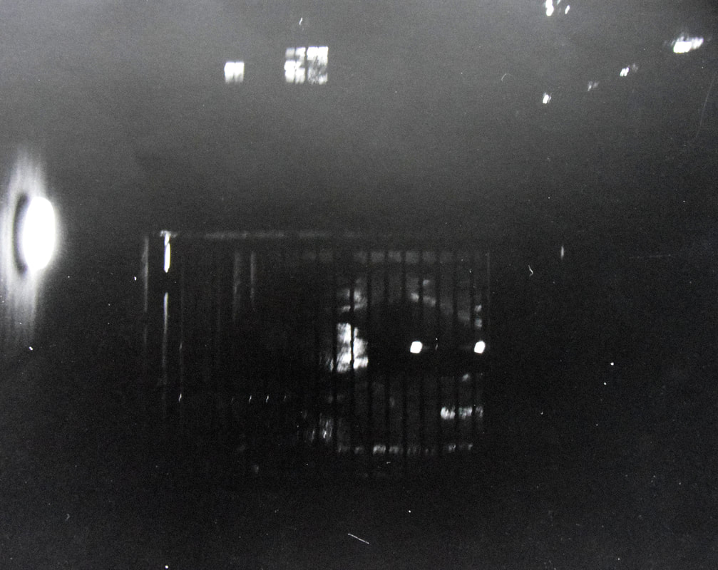
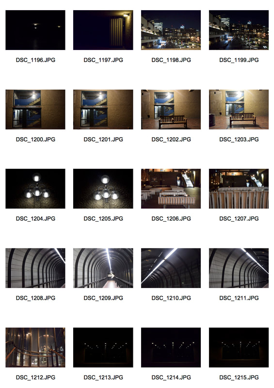
For the third and forth development I focused on the area around Gospel Oak station, as it had a combination of different estates and spacious allies. As well many of the locations around Gospel Oak had coloured features which I thought would look good contrasting with the dark of the night.
Rut Blees Luxemberg
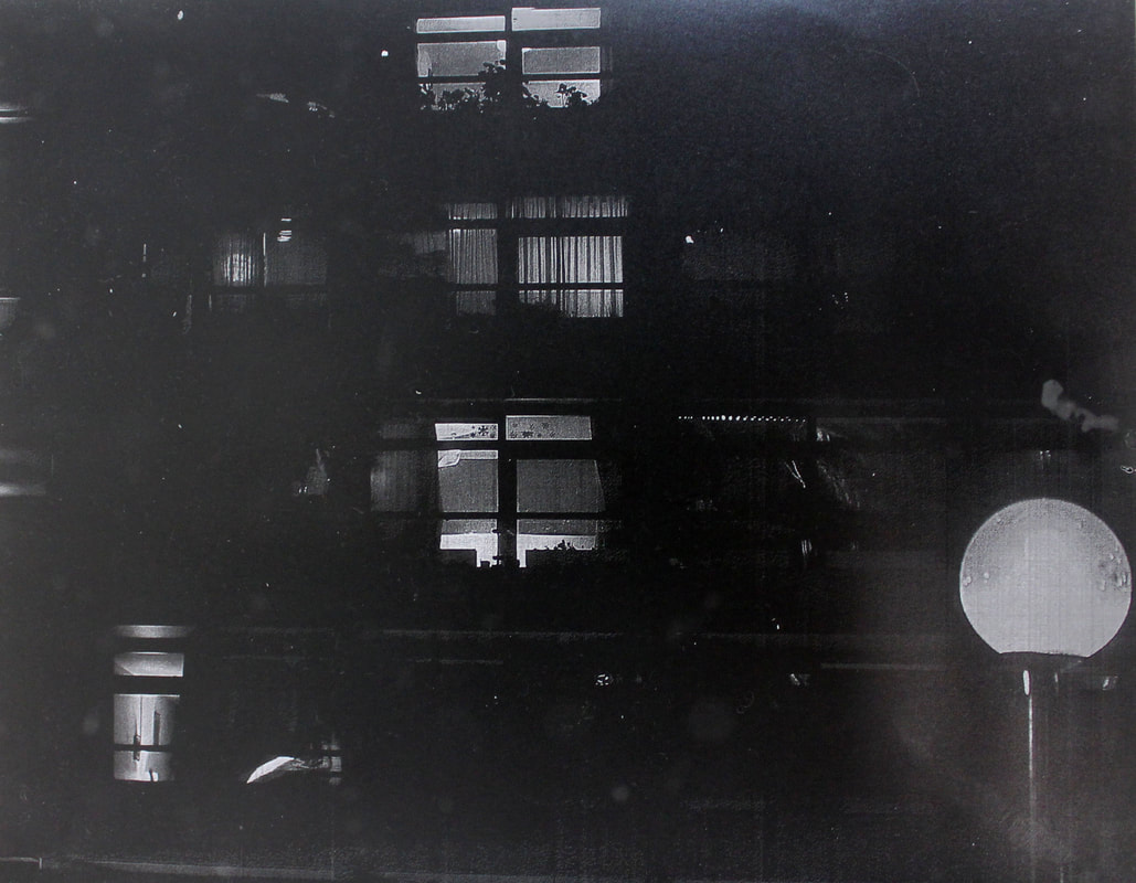
Next I looked at the photographer Rut Blees Luxemberg, a German photography who's art usually looks at nocturnal life in urban landscapes. Luxemburg is interested in the utopian ideals of modernist architecture (like Kennedy above is), shared spaces, and the London that exists at night, outside of the confines of the ordinary working day. Below is her series London, a modern project, was taken from 1995-1997 when she was studying photography at university. She was interested in the 'beauty in the illumination, the structure, the clarity of the architecture'.
She uses long exposures so the images taken at night are only lit up by the lights in the subjects she is photographing. The images were also taken on a large format camera, so everything in the images are in detail and the viewer can immerse themselves into the photos.
She uses long exposures so the images taken at night are only lit up by the lights in the subjects she is photographing. The images were also taken on a large format camera, so everything in the images are in detail and the viewer can immerse themselves into the photos.
|
|
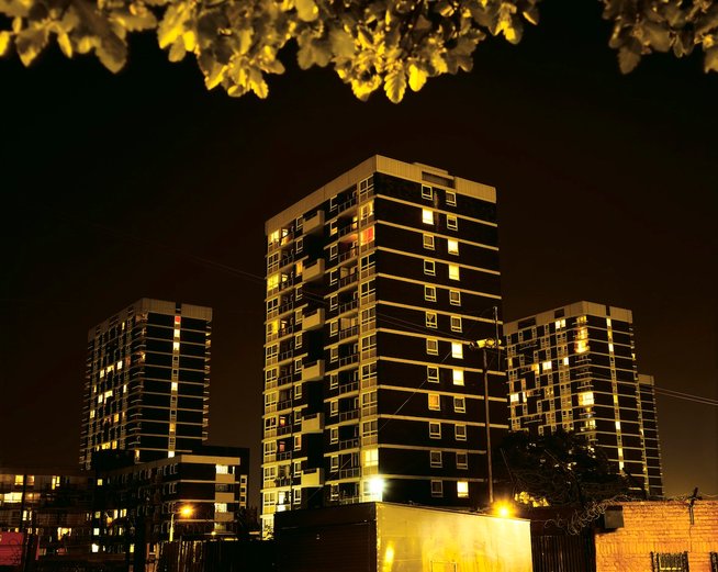
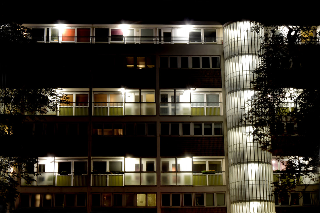
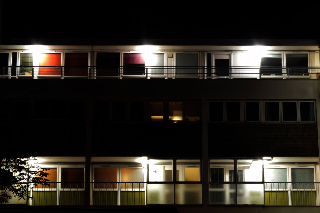
I focused on capturing estates at night, I used a high ISO of 1600 (as the images were taken at night), i mainly altered the shutter speed depending on the image. Mainly keeping it low, varying it from 1/1.5 to 1/20. The aperture automatically changed in accordance with the shutter speed.
I wanted to portray the lights and colours in the estates, as they highlight the many different lives being lived in the buildings. Adding to the aesthetics of the image, but also implying the issue of rapid human growth and how it will effect the environment.
I wanted to portray the lights and colours in the estates, as they highlight the many different lives being lived in the buildings. Adding to the aesthetics of the image, but also implying the issue of rapid human growth and how it will effect the environment.
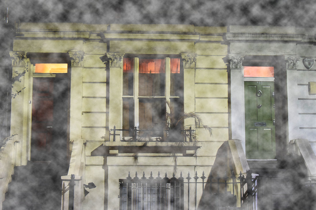
The subjects of the images were good in there colours and structures, for example in the first image the orange complementing the white, in the second the different shades of green panels lined alone each level of the estate and in the last image the the soft blues and purple/ pink sky highlight the lit up box apartment in the distance. However the colours and detail of the buildings would have shown up clearer if a tripod and longer exposure time, around 10 seconds were used. Moreover in uses a longer exposure time the lights in the images would have shown up more focused and overall brighten up the images.
Fourth development
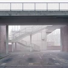
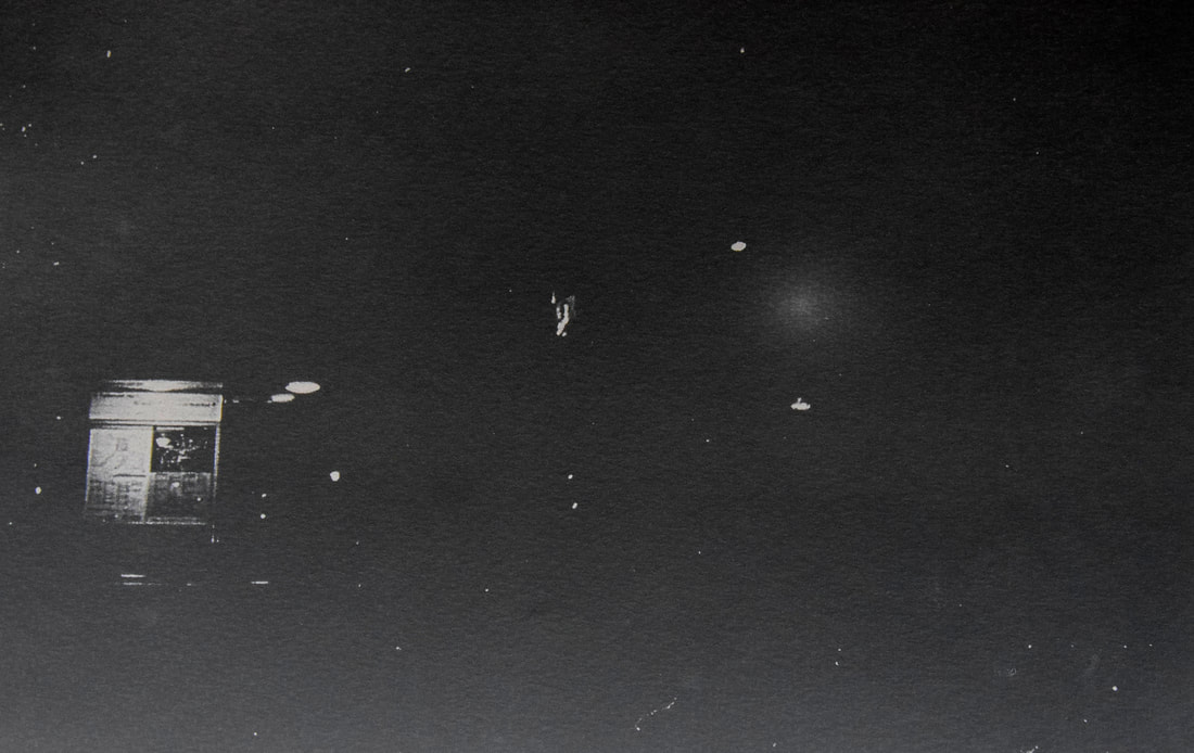
William Eckersley
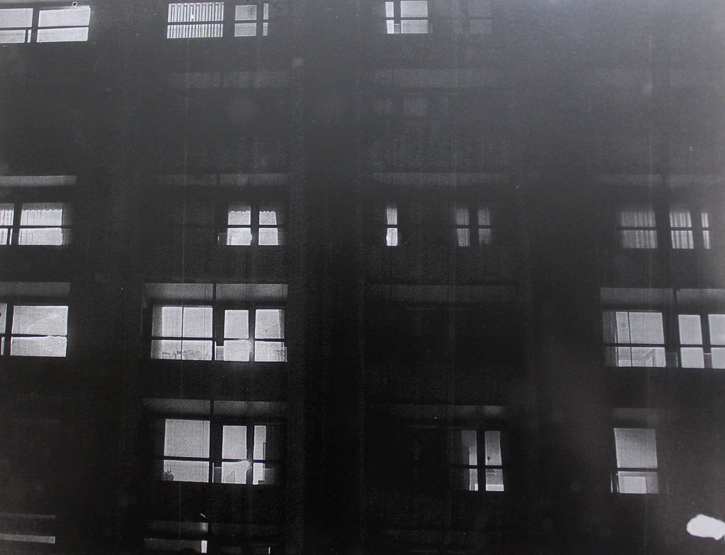
After Luxemberg, I looked at the work from Eckersley series Dark City, shown below. In creating my response to Luxemberg I found I was more interested in the use of light in his images at night. Eckersley's image look also at estates night life, but more in general he wanted to depict an unseen London, it interested me how he could make such a buzzing city seem so derelict and abandoned. Over four years Eckersley captured the silent beauty of London on a large format camera, with the aim of showing the beauty of London that is forgotten as people rush around the city daily. By shooting the series at night, it highlighted the colours of the normally grey and dull city made for human functions and services. With the city at night he says 'our urban spaces appeared to stand forlorn'.
|
|
Again I went around Gospel Oak looking for empty places that would usually be in use by people. I had a high ISO of 1600, a shutter speed of 1/20 and the aperture in accordance with it. This was so that I could capture the light in the images while not losing the detail of them. I found the best places were down alleyways off the main roads, and that the images worked best if they had a spacious atmosphere and lit by their own light not flash, like Eckersley's are.
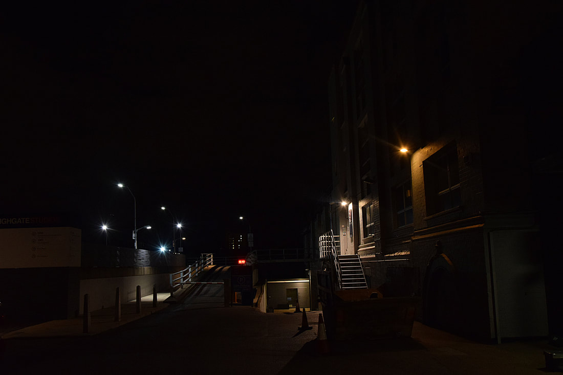
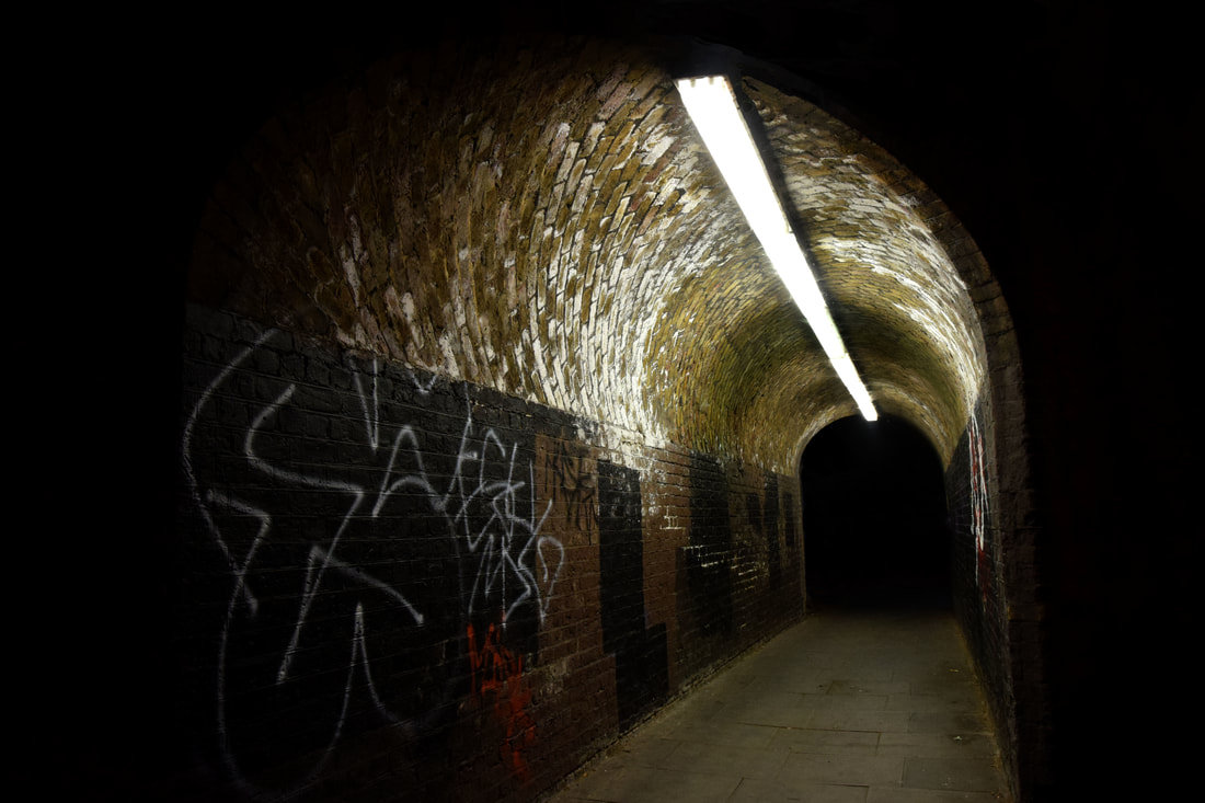
In all the images the use of negative space creates a spacious atmosphere, like Eckersley, giving the locations an empty and abandoned feel which they would not normally have. The street lights in each image suggest focus points in each and allow the images to be able to keep their darkness while still portraying the colour and detail. In the first image the blue gate and detail of the puddles and gravel, can be seen in the driveway to the car park. However the image may be better if the blue of the gate was brightened and so more contrasting with the dark of the night. Likewise in the second image there may be too much negative space, concealing the detail. Nevertheless it is nice how the different levels in the image are highlighted by the lights, for example the steps going up on the right and the drive way going down in the back middle of the image. In the third image the light shows the detail well of the different white and yellow bricks, and the graffiti adds more colour to the image. As well the darkness adds to the atmosphere of the image as it fades out gradually and the tunnel narrows. In the last image the detail of the shadows of the opposite tree is show contrasting on the white garages. The warm yellows of the light coming from inside the homes, also contrasts well with the cold exterior lights. However the right blue light is too bright, big and distracting. It would have been better if it was minimised and dulled. Nevertheless the structure and form of the buildings is simple and organised, with the reds, whites, and yellows it creates an elastically pleasing image.
Fifth development
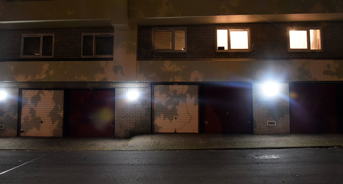
In this development I went back to Gospel Oak with a tripod to photograph the images. The tripod allowed the images to be more in focus and capture the colour and detail in the images. I was able to use a longer exposure of 10 seconds, this meant that the more light could be let into the camera due to a longer shutter speed, without having to use flash to highlight the details of the subjects.
|
|
I went to two places I had photographed previously, the doors and first estate. As well as a new differently structured estate, I decided to photograph this one also, as the lights in the large windows all displayed different colours which contrast with the white structure of the estate.
When taking these images the focus was to highlight the colour, mood and detail in the subjects. These were a continuation of the images influenced by Luxemberg and Eckersley, trying to show the beauty in the night life of London that is usually by passed and ignored in the day.
When taking these images the focus was to highlight the colour, mood and detail in the subjects. These were a continuation of the images influenced by Luxemberg and Eckersley, trying to show the beauty in the night life of London that is usually by passed and ignored in the day.
I edited the images in photoshop in order to emphasise the contrast, colours and negative space. In the hope of overall portraying the beauty in the silent city at night. As seen in the screenshots, my first step was to tilt the images so that they would be straight, as some were tilted due to the uneven floor I was using the tri-pod on. After tilting the images I cropped them to the size I wanted, they were mainly cropped so that the focus would be clear and any unnecessary detail could be removed. I next altered the levels in order to emphasise the contrast between the colours and negative space, highlighting the colours and darkening the negative space. Lastly I used the clone tool to make the negative space more even and completely black, (in some images I also used the sharpen tool in photoshop to emphasise the detail in the images).
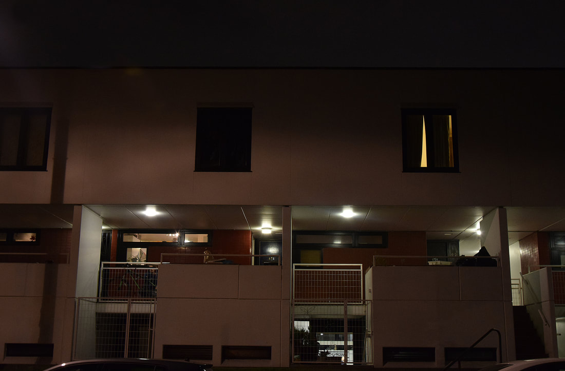
I chose these as I found them to be the best images that capture the mood, colour and detail. In photoshop I enhanced the colours by using levels to create a greater contrast within the images, I enhanced the detail by using smart sharpen so the images were more in focus and the overall mood was created by the contrasting of the lights and colours with the darkness of the night. The structure of all the subjects is symmetrical and ordered, making it pleasing and easy to take in. The first image works well in highlighting the greens, yellows, purples and blues, however the image is not focused clearly enough and so the detail of the building is lost. Aswell it may look better if the trees were not there. Likewise in the next image the little branch on the left is out of place and would be better if it was not part of the image. Nevertheless the colour and detail was kept in this image depicting a colourful nightlife, much like the lights in the next image portray the different moods and lives in each window. However like the previous image some of the lights are too exposed, making the lights stand out as they are bright and white. The last image is more of a response to Eckersley than the estates are to Luxemberg, the use of negative space, acts a dark unknown frame for the doors lit up by the night lights, really capturing the cold, isolated, mysterious mood of the image and night. The whole image is mysterious in the darkness, the doors and gate make the viewer wonder what is behind and what is in the darkness. The cold blues of the doors and bright white lights contrast with the warmth of the pink behind the gate, suggesting the harshness but also the beauty of the night in the simplistic image.
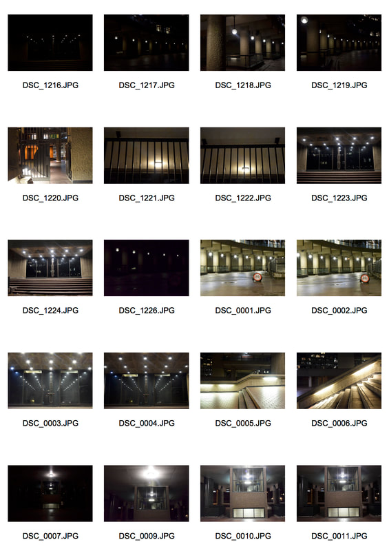
Sixth development
William Eckersley
In this development I am continuing to look at William Eckersley series dark city, however this area focuses less on the city left derelict at night and more on the industrial part of the city at night. These images from his series, show the working industrial areas of London silent and abandoned at night. His use of long exposures highlight the detail and tones in the images, allowing them to be lit up by the street lights, adding to the mood.
|
|
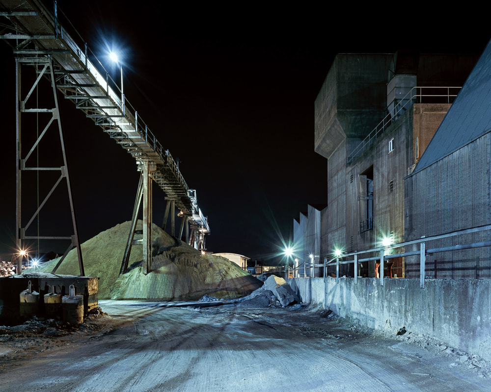
I took these images of industrial areas around the area of Ikea at night, to show how the area around a large consumerism store has been ruined and left as dump sites, due to the construction of Ikea. I tried to find places that were lit up with street lights, had negative space and portrayed an interesting mood, mainly through colour and texture.
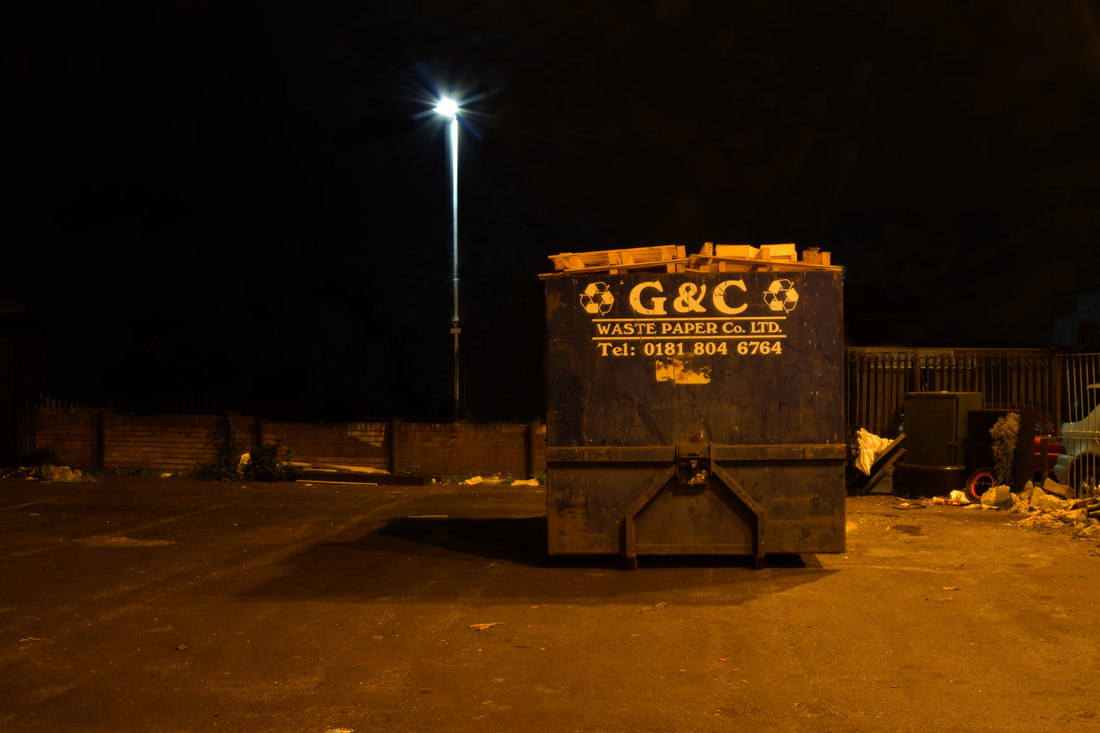
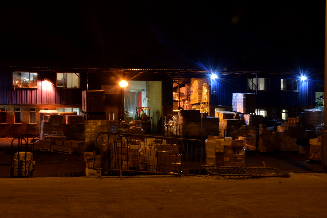
All the images have warm orange tone to them, which contrasts with the harsh navy/black negative space of the sky. The warm portraying the industrial work and the negative space portraying the loneliness and abandonment of these areas in the city. In the first image there is lots of negative space contrasting with the messy pile of rubbish in the right corner. The focus of the image is the bright street light and the big waste paper faded blue container, the rest of the detail falls around them. In the second image the street light reflects off the railing creating a nice structure of light and shadow on the ground. As well the colours in the image add atmosphere to it, like to red fire extinguisher, the white window frames and the yellow and light green in the background. The next image is separated into three sections the first negative space with the bright white street light, then the darkened industrial rundown, forgotten building area and lastly the orange and red lights which appeared due to the long exposure as a car went past. However the building could be lit up more to see the detail of the building. Nevertheless it works well as an image showing how the area area Ikea, consumerism, has been ruined and left to waste. In the last image the lights work well to set the atmosphere and mood, on the right the mood is harsher due to the blues whereas on the left it is a warmer tone due to the pink and yellow. the image may be a bit too noisy however contrasts with the negative space of the sky.
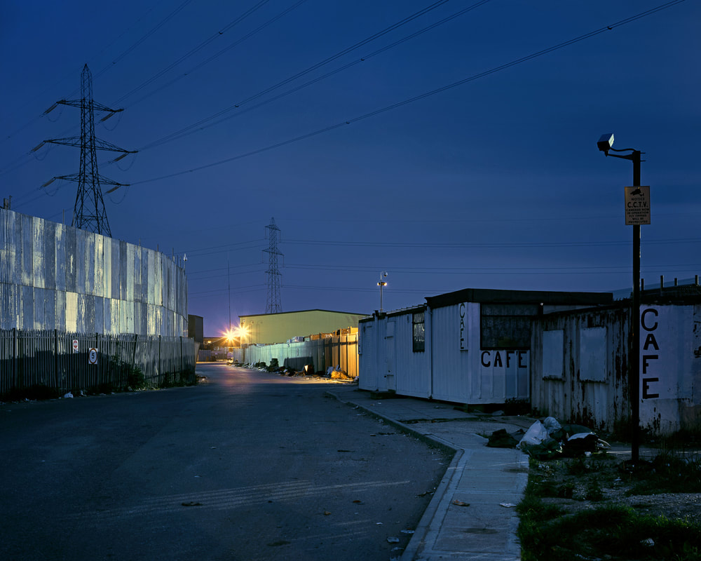
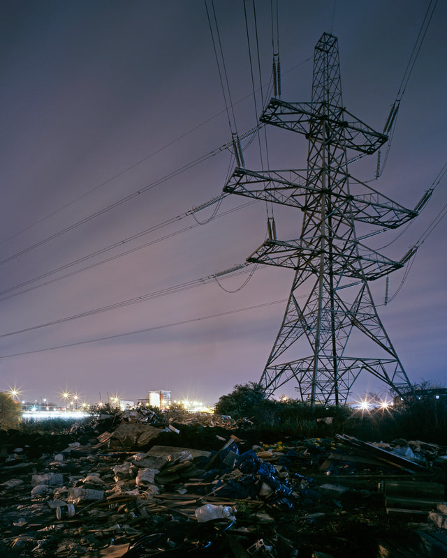
Seventh development
Gilles Coulon
I next looked at Gilles Coulon series white night, in this series he focuses on the universal object of light as he travelled around different cities such as Shanghai and Paris, over the course of there years. Each place has its own personality portrayed through the different bright lights, however are all unified by the lights and familiar places, such as restaurants and car parks.
|
|
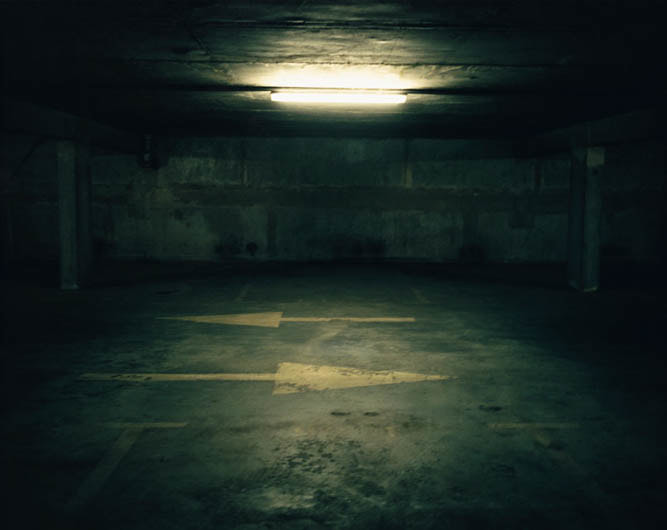
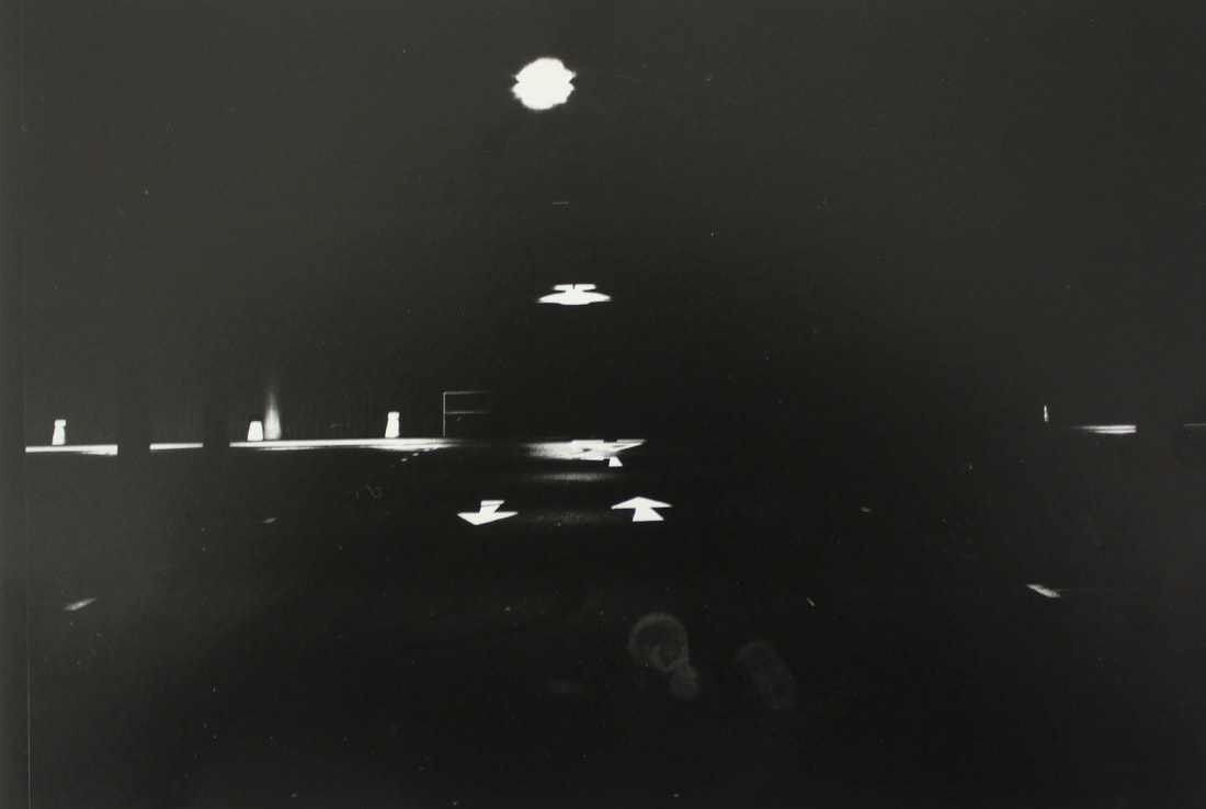
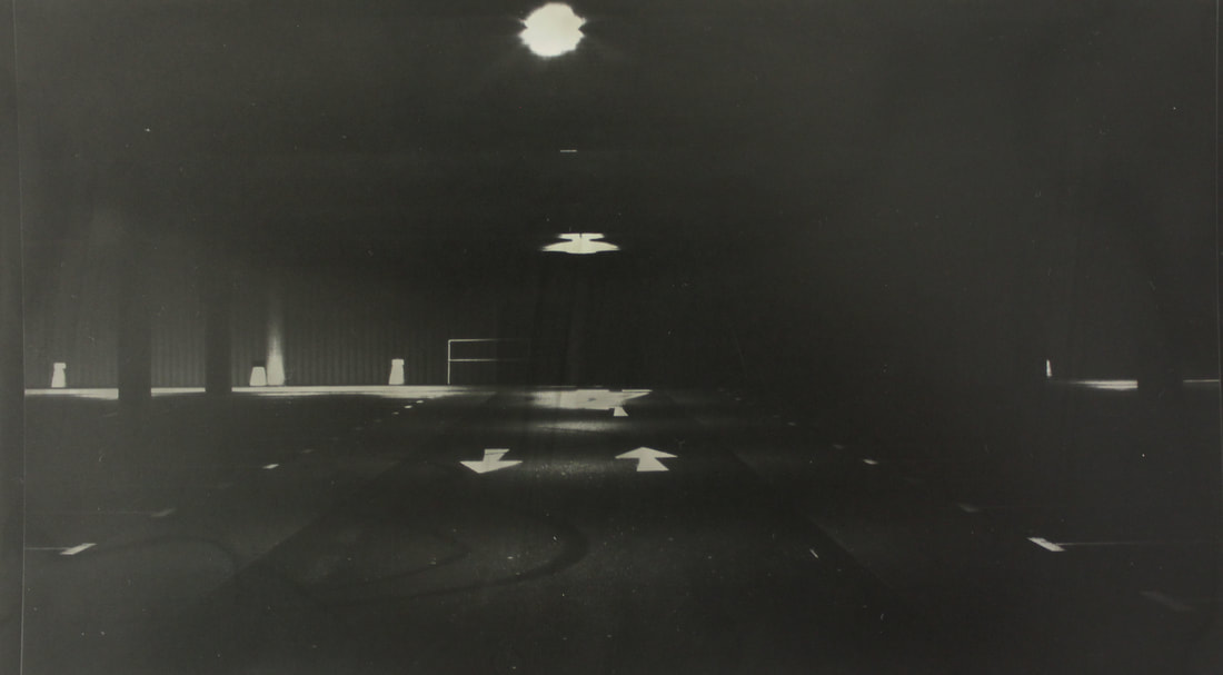
I focused on taking pictures of a large car park at night which would usually be packed with cars, now left empty and full of negative space. Car parks are areas made solely for human use, but when empty they are just concrete structures. I focused on car parks as they have a lot of negative space creating a vast image, moreover they are full of bright white lights which could be a centre of attention in the images, as they are in Coulon's images.
This carries on from looking at industrial areas around consumerism being ruined, as it shows vast land car parks made for consumerism. Taking up lots of space which could be used for more beneficial things.
This carries on from looking at industrial areas around consumerism being ruined, as it shows vast land car parks made for consumerism. Taking up lots of space which could be used for more beneficial things.
I photoshopped the images so they would have more contrast in light and shadows and negative space. I used levels in photoshop to create a bigger contrast in the light coloured concrete and the black of the night, also to highlight the shadows to give the image more depth. Next I used the sharpen tool in order to highlight the detail in the images and focus it more. Only in this image I used the clone stamp tool to get rid of the lights in the background to create less noise and more negative space, in order to make it look more abandoned and isolated. Making the darkness of the night seem endless, I cloned the black in the rest of the image to cover up the car and street lights in the background.
In the first image the light focuses on the isolated door, spotlighting it adding a mystery to the door and what is behind it. The isolated trolley also has the same effect. The blue, green and yellow colours add a mood to the images separating the different levels of the image, however the light in the front is quite bright and too exposed. The next image works well in depicting a derelict city night, particulrly through the negative space
Eighth development
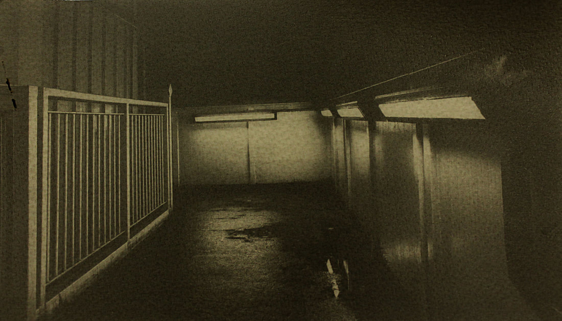
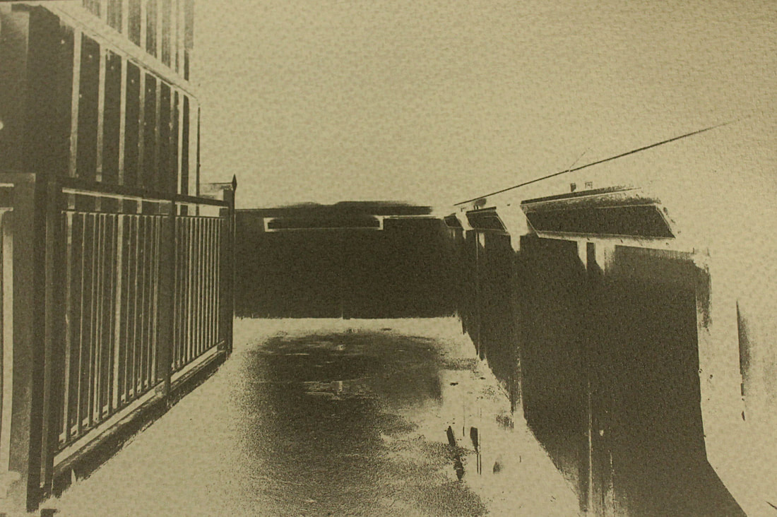
Next I captured train stations, after people had left it. In order to show a normally busy and active area full of people, now empty at night. This section follows on from the works of Eckersley and Coulon, still focusing on places that become abandoned after dark. I chose overground train stations as I thought the orange would be good for colour to contrast with the black negative space.
The focus when taking the images, was again, colour negative space and lightening. These were took after it had been raining, the puddles and water drops added to the eeriness of the images. I took these images with a 1/20 shutter speed in oder for the detail to still be captured without having to use flash, also flash was not needed as the lights in the images lit them up.
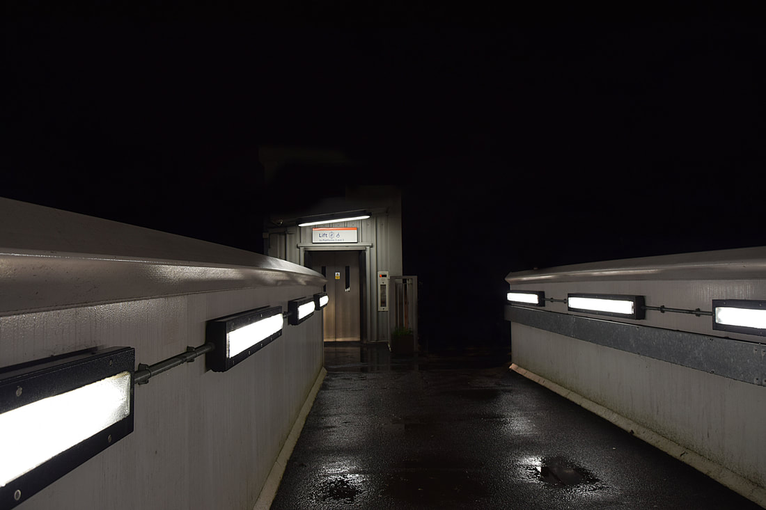
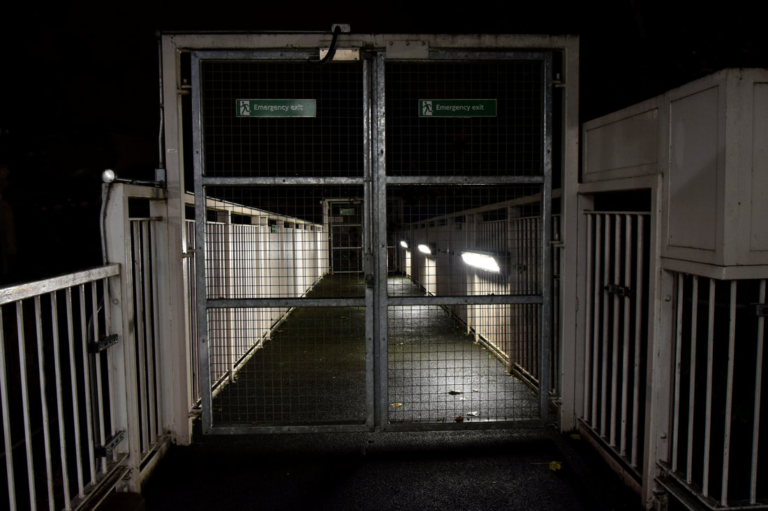
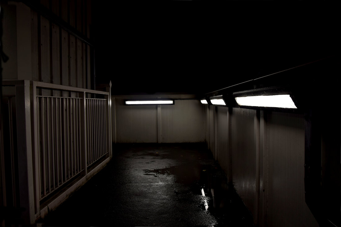
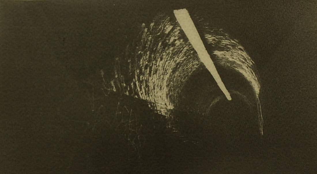
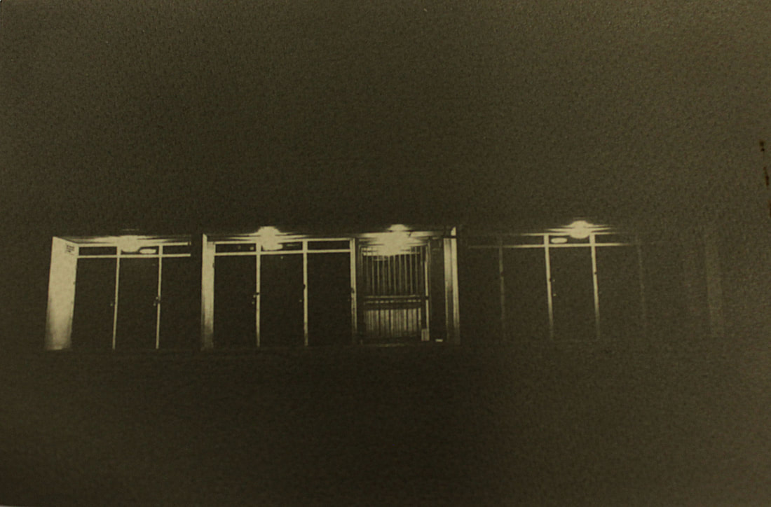
In the first three images the florescent white light is the focus in the images, it highlights the details and leaves the rest in darkness. Creating different tones and shadows. in the first image the negative space fades into the background, depicting it as endless and mysterious beyond the walkway to the lift. Likewise in the second image the gates fade into the parallel gates behind, however the image depicts them as narrowing down and getting smaller, creating an illusion in this way of the reality of the doors. As well as the lights in the first and the last image highlight the detail of the water dripping down the walls and in puddles on the floor, furthering the abandoned and melancholy atmosphere of the city a night.
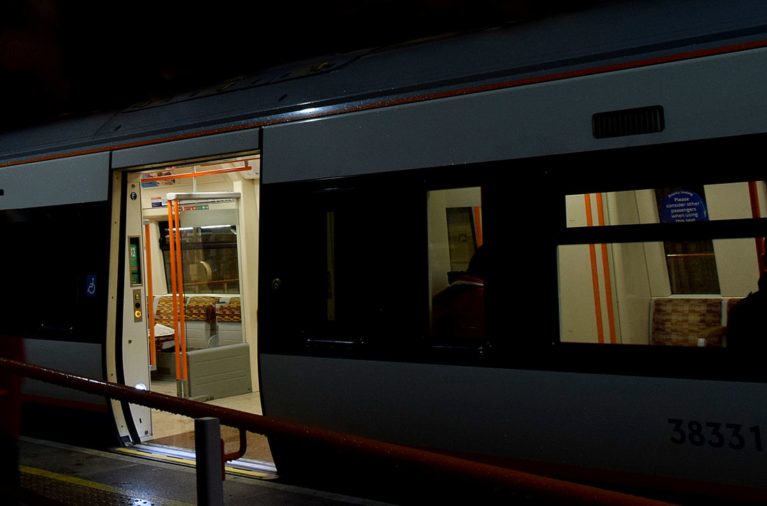
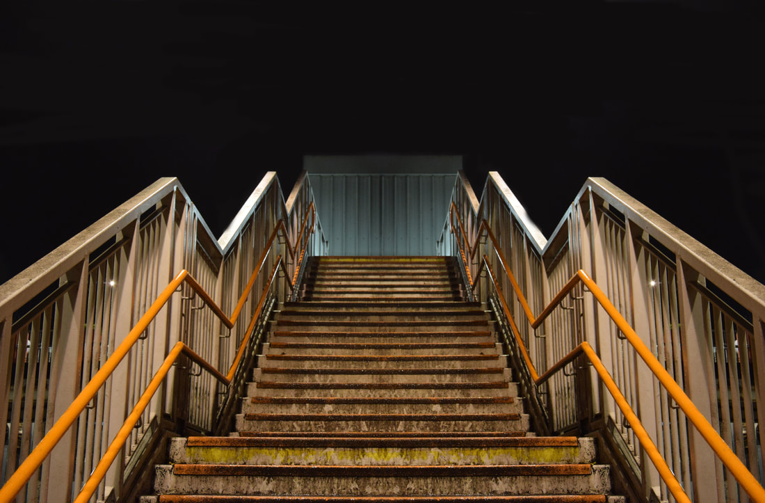
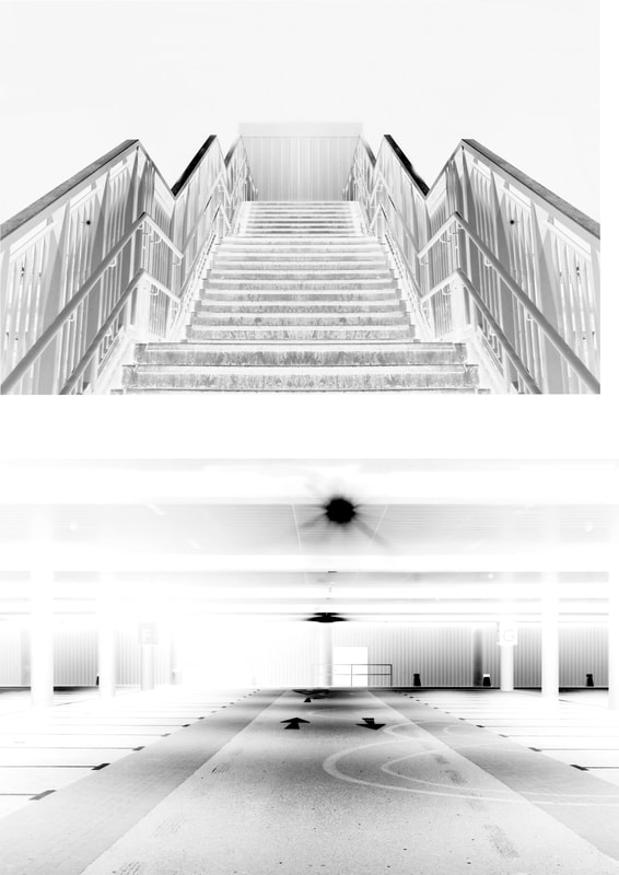
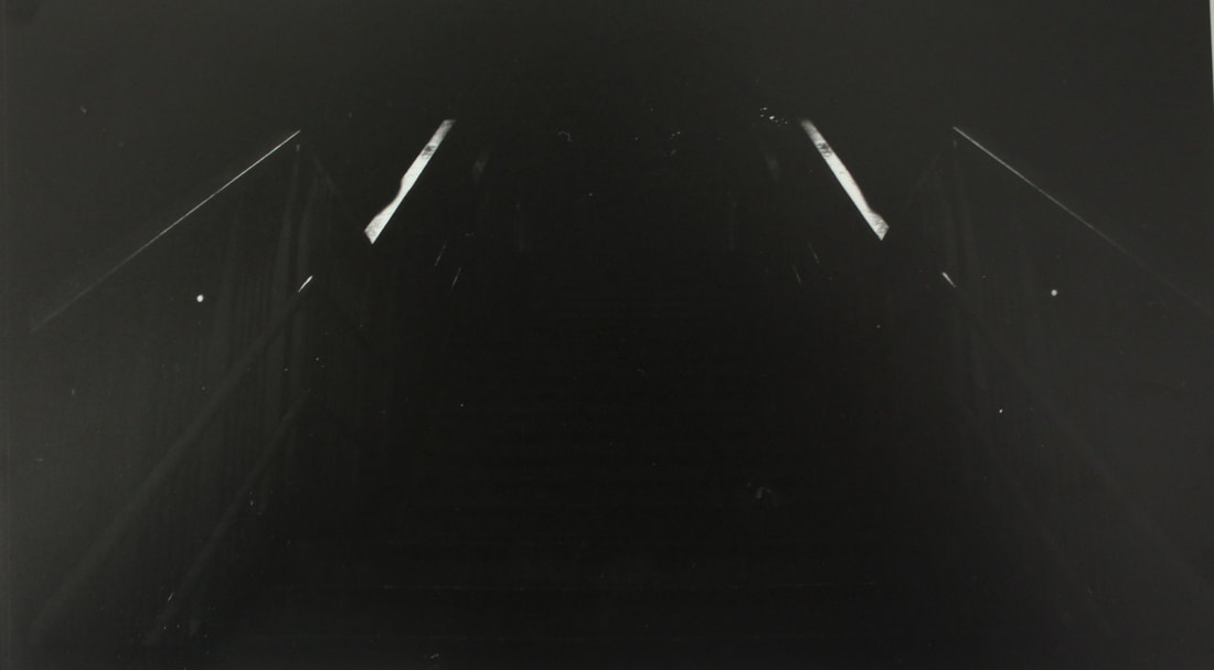
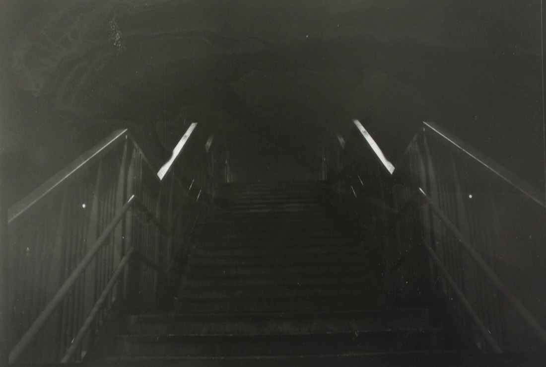
In the last two images the mood is less dull and dreary as it is not just tones but has a prominent orange colour. The empty train image depicts somewhere which would usually be busy and packed, now left empty as the daily commute comes to an end. The last image similarly highlights the train station stairs which would usually be full of people rushing up and down, now again left empty. It suggesting the wear and decay of the everyday commute through the dirt and rust left on the stairs. The image was taken from a below angle looking up to the top of the stairs, this angle emphasises the grandness and length of them.
In the last two images the mood is less dull and dreary as it is not just tones but has a prominent orange colour. The empty train image depicts somewhere which would usually be busy and packed, now left empty as the daily commute comes to an end. The last image similarly highlights the train station stairs which would usually be full of people rushing up and down, now again left empty. It suggesting the wear and decay of the everyday commute through the dirt and rust left on the stairs. The image was taken from a below angle looking up to the top of the stairs, this angle emphasises the grandness and length of them.
Ninth development
Antony Cairns
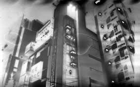
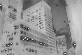
After capturing various urban places at night including carparks, industrial areas, train stations and estates. I wanted to develop the images in a different way through experimental post production. This idea was mainly inspired by the work of Antony Cairns, he grew up in London and so his main subject has been the city. He wanted to carry on and develop the classic theme in photography of cities at night, through re-production in the dark room. Cairns experiments with mainly different materials to print his images onto, with the aim to convey the city atmosphere and the illuminated light in his own way, he has used aluminium, translucent paper and special Japanese paper so that the light is able to shine through. Conveying the image as lit up, light the city at night always is.
First I choose two images from my previous developments, one from the Ikea car park series and another from the train station series. I chose these two images as they both had negative space and variations in tones, which I thought would be highlighted in black an white. Next, on photoshop I inverted the images tones and printed them onto acetate paper, so that they could be used in the dark room and the tones be as they were in the original image.
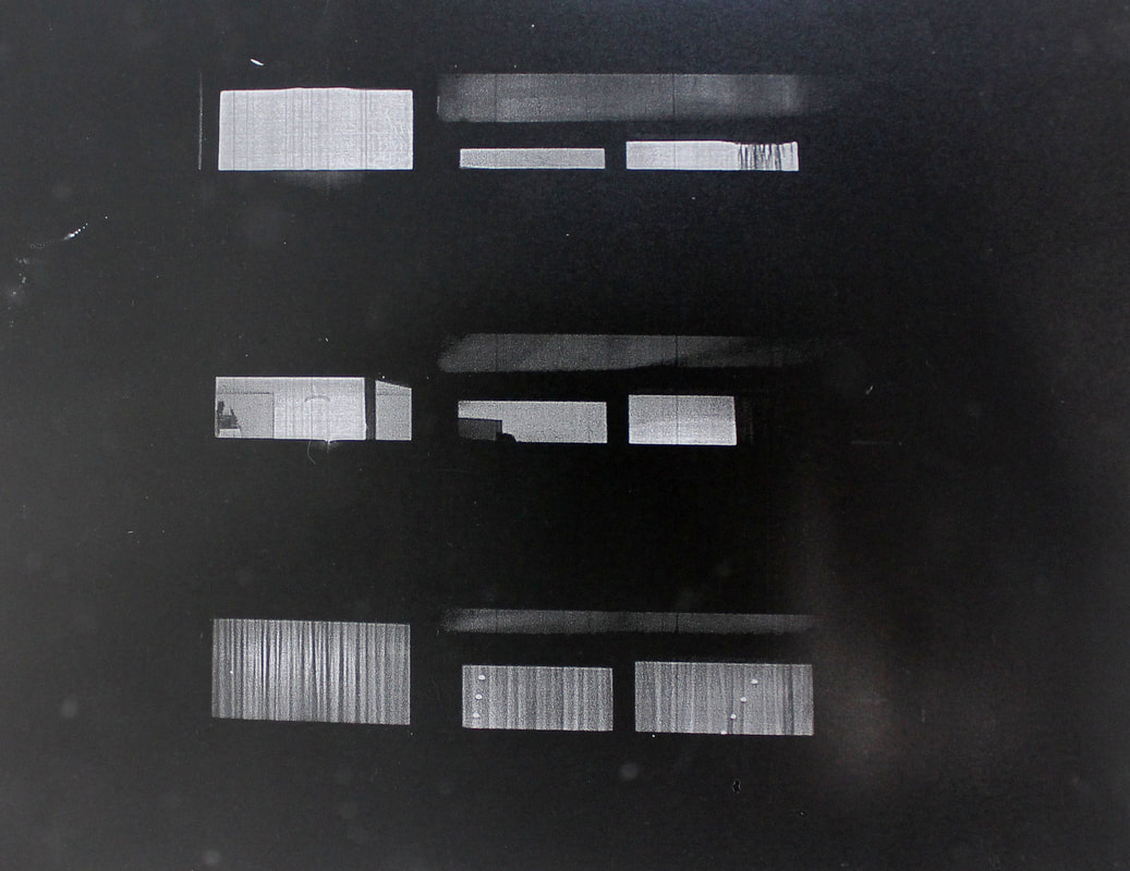
I done a test stripe and from that decided to print them in an exposure of 6 seconds (first two images below), however much of the detail was lost so I also printed them in an exposure of 4 seconds (last two images below).
I done a test stripe and from that decided to print them in an exposure of 6 seconds (first two images below), however much of the detail was lost so I also printed them in an exposure of 4 seconds (last two images below).
|
|
In the first prints done with an exposure of 6 seconds, there was a higher contrast between the black and white areas. However the images look too intense and harsh in their contrast, also the detail is lost. This is why I then done them again with a 4 second exposure in order to capture the detail as well as the contrast. Although the isolated and extended fading into the darkness is lost in the exposure of a shorter time. Moreover in the last image of the stairs of 4 seconds, the developer dripped onto the paper first before it fuller went into the developer, this meant that it seems like there is a stain on the image. Similarly on the first image of the car park in a 6 second exposure, there are fingerprint marks which can clearly be seen.
I next printed onto fibre paper in the dark room instead of photographic paper in order to give the images more texture and uniqueness. I decided to print the negatives as well as the positives to depict the different contrasting tones.
After doing a test stripe I decided to use an exposure of 7 1/2 seconds. I chose these images from previous developments as they had detail, negative space and tonal variations. (The positive prints are shown on the left hand side, while the negative prints are shown on the right hand side)
After doing a test stripe I decided to use an exposure of 7 1/2 seconds. I chose these images from previous developments as they had detail, negative space and tonal variations. (The positive prints are shown on the left hand side, while the negative prints are shown on the right hand side)
|
|
|
|
|
|
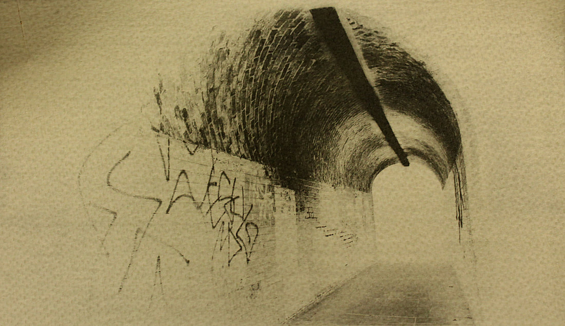
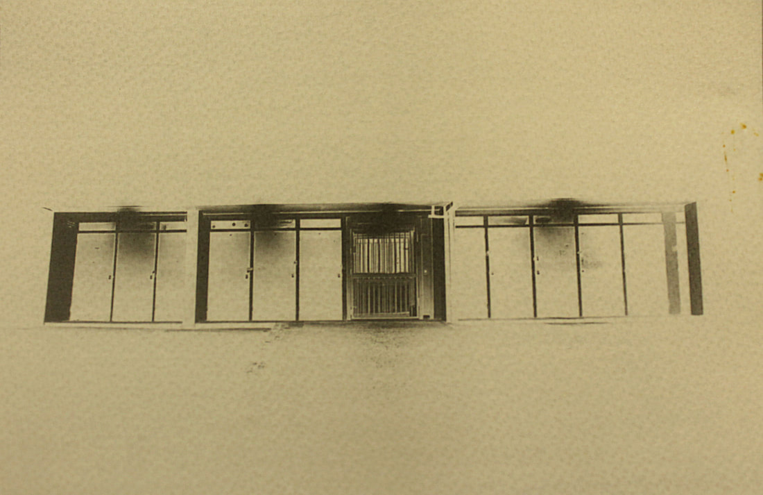
In the first set of prints the image of the train station at night is too full, it would be better is there was a particular subject to focus on, instead of all the detail in the image presented. The other sets work better as there is more negative space and a clear subject outlined. In the first image the tonal variation is portrayed well as it highlights whites, greys and blacks meaning the exposure time worked well in showing the detail of the actual image. In the negative print of the train station the inverted tones portrays a decaying environment, as the whites seep into the darker tones, however there is too much happening in the image, making it messy. Nevertheless the high left corner of the negative may be interesting if focused in on, due to the clear separation of tones. In the next set of prints of the tunnel, too much detail is lost in the first (positive) print due to the dark outer negative space. Although the darkness of the negative space works well in creating a high contrast with the inner layer of lighter tones of the light and bricks. It also works to portray an eerie atmosphere as the tunnel is surrounded by and fades into isolated darkness, only lit by the tunnel light. The negative of the tunnel works well in highlighting the detail and texture of the bricks and walls of the tunnel, however the dark tone of the light going through the tunnel is quite bold, the negative may look better if the light was instead bricks. The last set of prints best distinguish the different tones, as the doors work as outlines. In the first print of the set the texture of the fibre paper lessens the depth of field, making it seem blurry. Nevertheless the tones are nice in that they fade down each door being highlighted by the lights at the top and fading down into the darkness of the negative space. In the negative of the doors the image is better as the doors look nicer white, contrasting with the darker tones. It also makes the image seem flatter, making it seem more like a print than a digital image. However the lights above the doors are too exposed, making them look more like clouds of darker tones than lights.
Tenth development
Lewis Baltz
Baltz was an american photographer best known for his black and white photography of man altered landscapes. His work was a key turning point in landscape photography, as it shifted from the classic beauty of nature landscapes to a more everyday one that had little interest to prior photographers. Such as Adams and Weston. Lewis Baltz is closely linked to the works of his contemporaries, Robert Adams and Bernd and Hilla Becher. As like Baltz their works also focused on more everyday places, such as gas stations, supermarkets, parking lots etc. Overall places which has been taken over by consumerism needs or become abandoned and decayed.
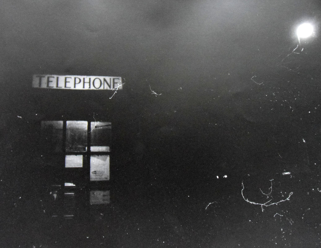
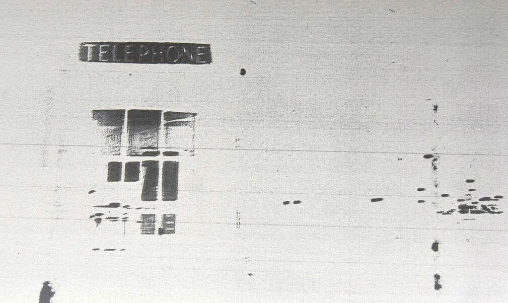
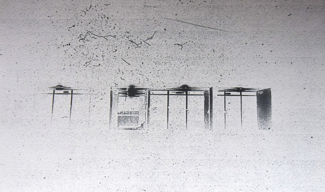
I wanted to take some more photos which I could use to develop onto different materials. I decided I wanted to take them on film instead of a digital camera, in order to capture London at night in black and white and for them to have detail and texture similar to Baltz. The film is meant to give the images a different, more eerie atmosphere. I went back to Gospel Oak to shot images of some familiar places and new places in the area, I thought would depict a derelict London at night of places which are usually busy in the day. I used an inferred film to create a higher contrast between the tones and in depth, it had 35 shots on it.
I developed the images in the darkroom, the first two images were done on normal glossy photographic paper and the last was done on fibre paper this gave the image a matter appearance and gave the image more texture. All the images were exposed for around 5 seconds in order to capture the most contrast without loosing too much of the images. Due to the inferred film, there was already lots of contrast and so much of the images did not come out brighter than these. The high contrast is similar to Baltz, however mine lack too much detail due to being taken at night in comparison to his at day.
The first image highlights the different tones in the telephone box well and clearly shows where the focus in the image is meant to be. I left the dust on the film which created these white specs (mainly in the right corner) I think they add to the eerie atmosphere I was aiming to portray, as well as they make the image more interesting as there is more detail then if the background was completely black.
The second image may appear to have too much detail and not a clear structure, making it hard to identify what the image is actually capturing. Moreover the image seems to lack in depth of field, depicting the image as unfocused and messy. Nevertheless if the image had a shorter exposure potentially more detail would appear making the image better.
The last image has a softer atmosphere due to the texture of the fibre paper, the film negative of this image (a bus stop) was already this dark and did not pick up much information apart from what is seen in the print. So the image is taken over but negative space which is distracting of the detail that is in the image. However on closer inspection the detail of the maps can are very clear and so the image may work better if it was cropped to focus in on the left section of the print.
I wanted more of the detail too be seen as well as the contrast as in Baltz images where both can be seen. Therefore I decided to print the images inverted. This would allow a much longer exposure time to be done as the background would go white not black, white means that the detail can go as dark as possible without the background taking over the image, as it did in the positives above. Before printing I had to change the negatives into positives in photoshop so they could be printed like this onto acetate and used in the dark room. Also in photoshop I altered the brightness and contrast as well as the levels in order to depict the best contrast in the final print. Moreover I used smart sharpen so that the detail would be highlighted.
|
|
The inverted prints highlight the focus of the images better than the positive prints above did. They also portray a more interesting atmosphere, as they appear more like sketches than prints, emphasising the form and outline of the telephone box and doors. As well as the white negative space further the idea of the city left empty at night as it singles out the subjects as if they are floating in the emptiness, allowing the prints to be eerie. In the first print there are lines which came up along the print and the black dots on the right side are actually car lights which it is hard to figure out in the print. Nevertheless the telephone box came out blurred as the original negative was like this, but it gives the print a faded look which adds to the eerie mood I was trying to portray of the city at night, moreover the actually outline of the box is not visible but this again adds to the faded look. In the second print the dust of the original negative created all the specs along the print adding detail to the image, which could be interpreted as the detail of the ground and sky giving the print a more realistic atmosphere. Using a long exposure helped to enhance the contrast and clearky show the structure of the doors, as Baltz uses contrast to highlight his form and structure.
Eleventh development
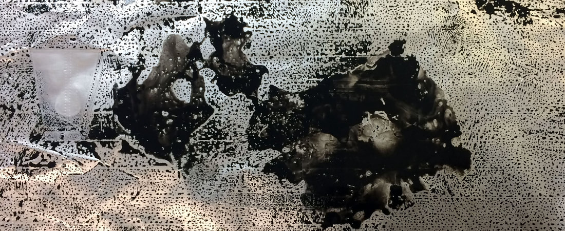
I next wanted to print onto metal as Antony Cairns, in order to give my images an illuminated feel to portray the city at night as still full of energy despite the people drained of energy, having deserted the city as it continues to function. (I used previous images from different developments to experiment onto the metal with, the images still having the focus of depicting derelict environments and ones which would usually be full of people now left deserted.)
Below are some of Antony Cairns images:
Below are some of Antony Cairns images:
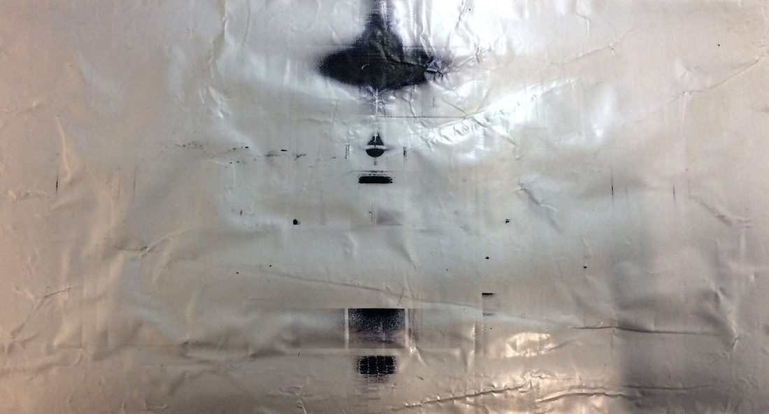
I first experimented printing onto metal with photographic emulsion liquid light, as this is what Cairns uses to make his images. I used the liquid light on Tin, Copper and Aluminium foil so that the images would have different detail and texture to them. However, as it can be seen above on the foil the images can hardly be seen, in the top left corner a black line can be seen which is part of the image but that is it. I tried on all of the metal twice using different exposure times but nothing showed, apart for the liquid light turning black in the developer. This was the most successful print and it was exposed for a short time of about 2 seconds.
In order to use the liquid light I first had to heat it up in a jug of 50 degrees celsius water, so it would be spreadable. Once heated I spread it onto the metals using a paintbrush and paint roller, to make sure it hade been evenly spread and was thick enough. I then left it to dry, once dried I did a test strip for the best exposure with a cut off strip of foil, however it turned out all dark so I exposed with long and short exposures onto the metals , (all the prepping was done in the dark room due to light sensitivity of the liquid, although the results were not as successful as hoped).
In order to use the liquid light I first had to heat it up in a jug of 50 degrees celsius water, so it would be spreadable. Once heated I spread it onto the metals using a paintbrush and paint roller, to make sure it hade been evenly spread and was thick enough. I then left it to dry, once dried I did a test strip for the best exposure with a cut off strip of foil, however it turned out all dark so I exposed with long and short exposures onto the metals , (all the prepping was done in the dark room due to light sensitivity of the liquid, although the results were not as successful as hoped).
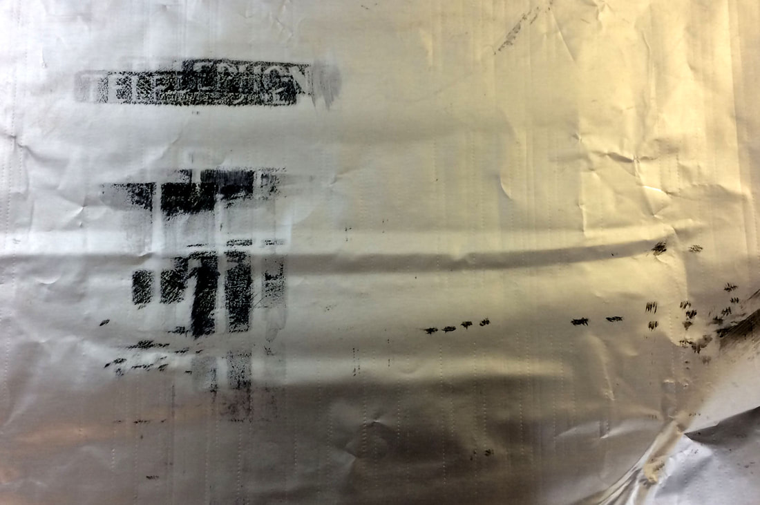
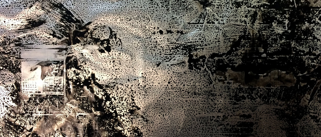
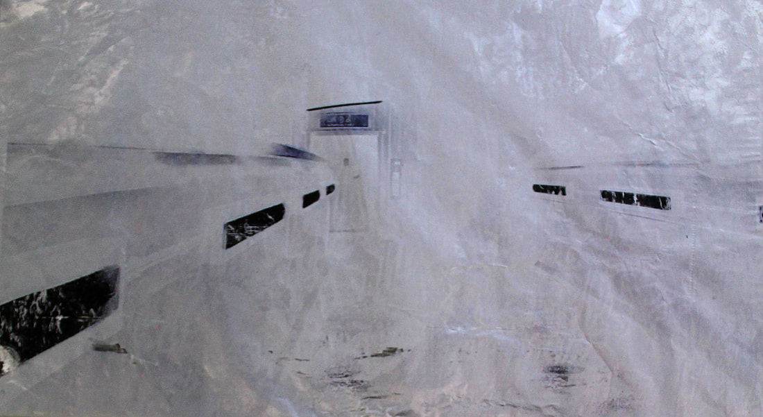
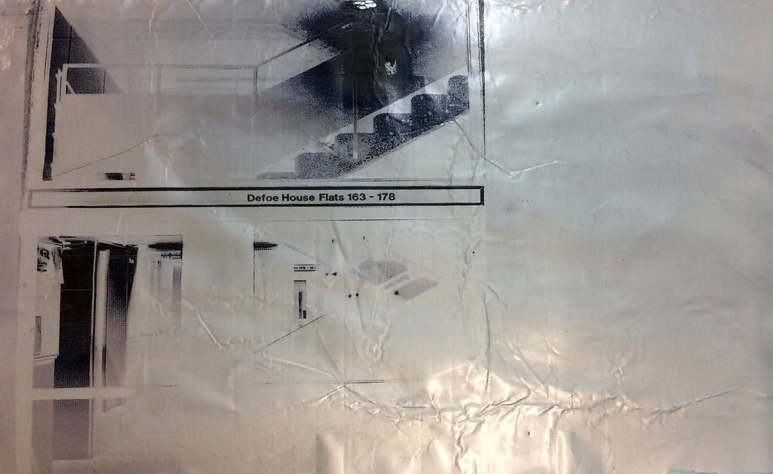
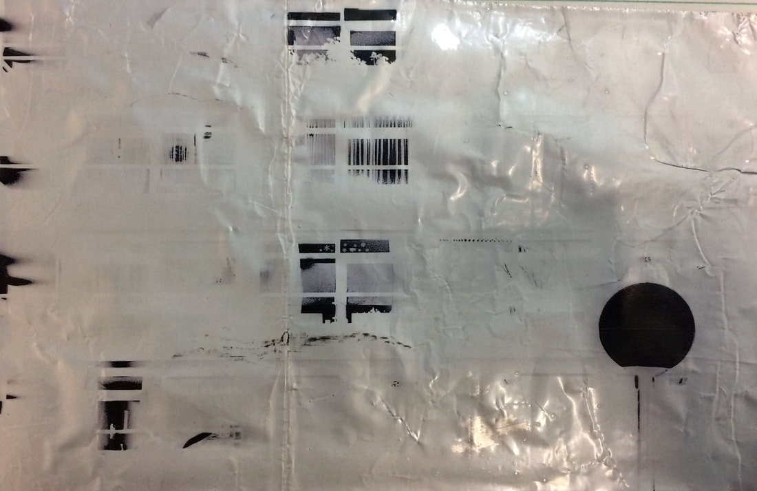
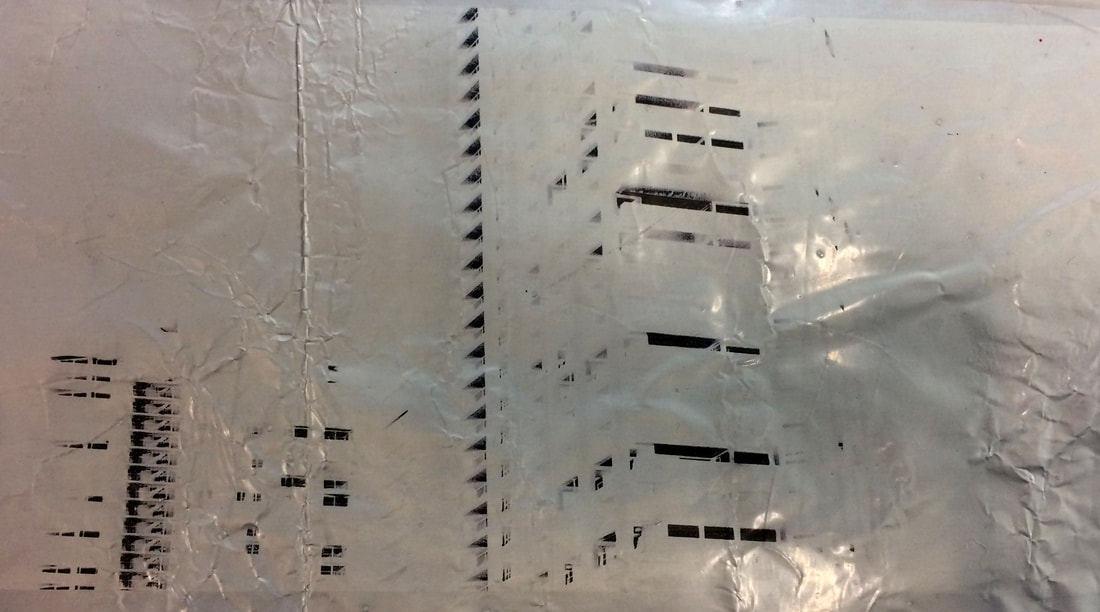
Still wanting to print onto metal I next tried to put the foil through the inkjet printer. Above are the outcomes of printing the inverted versions of the images onto the foil looked like in black and white. In the first telephone box attempt it was put through the printer twice however the ink did not print onto the same place it did the first time it went though, giving the print this double exposure effect. I put it through the inkjet printer twice as on its first print I found that the ink was too faint and it gave the effect of the images just being stamped into the foil, not seeming like the foil was part of the image. As I wanted it to be, so the texture of the foil would add something different than just being printed normally. The other three images were only put through the printer once hence the faintest of the ink. The second and last are not as bland as the third image, as the third has too much negative space and not enough content, where as the second and third have more detail creating more interesting prints, although they still seemed like they were missing something.
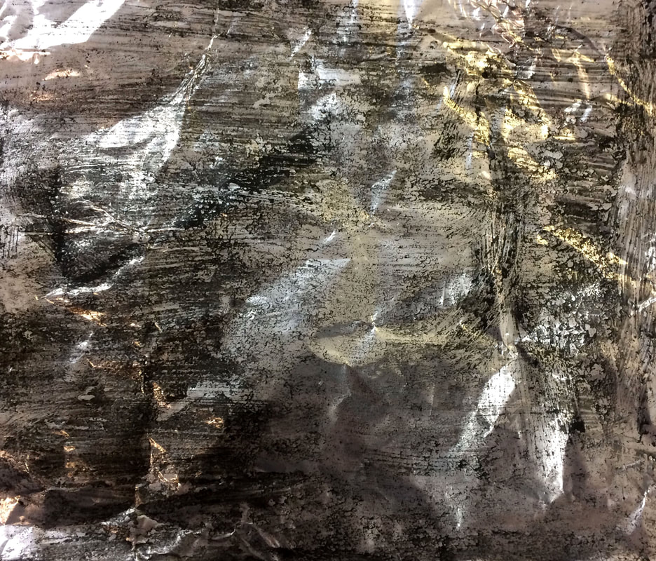
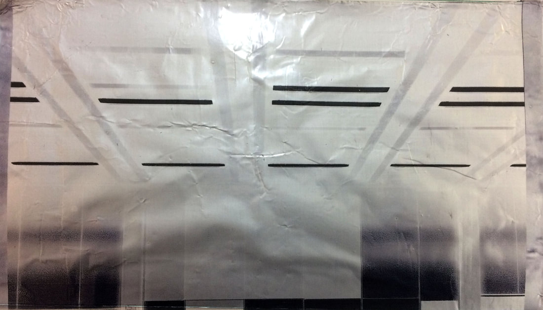
Unsatisfied with the negative printed onto the foil, I decided to try and print the positive versions of images onto the foil. These worked much better as the ink highlighted and concealed certain parts of the images, giving them a more interesting appearance, the ink did smear over in different ways but I think it makes the print unique and the ink is richer than in the negatives. Moreover the image seems part of the foil when printed like this in comparison to looking stamped on. As in the second print the foil on the left is glowing illuminating the image. Much of the detail is lost however this shows key parts are highlighted and detail can be seen when looking closer like in the first print in the big ink area. The images highlight the city at night left still active through the texture of the foil and the lack of detail highlights the gradual decay of our environment and our nature being taken over by manmade environment as the ink takes over parts of the image.
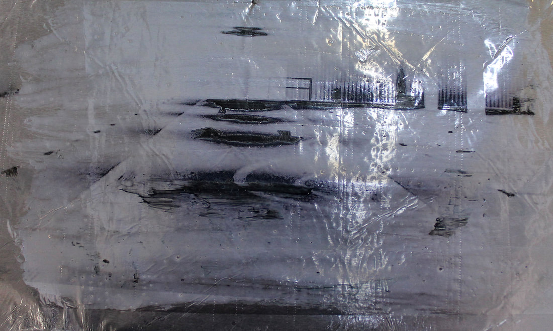
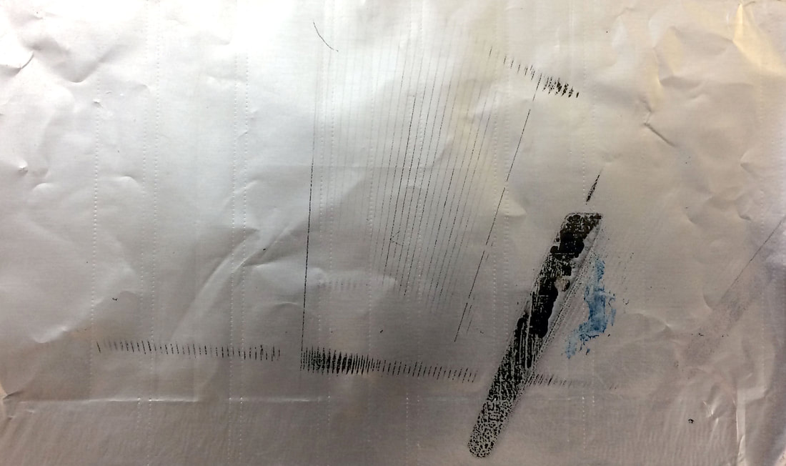
Since I found the first set above of inverted lacking too much detail and the ink smudged lots on the positive printing onto the foil, the next step was to try and print the positives onto the foil without the ink smudging. Therefore in the prints above on aluminium foil I either rolled a layer or dipped the foil into PVA glue then after it dried put the foil through the inkjet printer, so that the image was print onto the layer of the PVA glue. PVA was the substance I chose to use as it would dry clear so that the foil would still be seen under it, also as the texture is less slippery that the surface of the foil and so the ink would not smudge.
In the first image the paper was put in the printer wrong and so printed twice, nevertheless the interior of the train can be seen well due to the different tones highlighting the detail but not as well in the second print. In the second the form and structure is well highlighted by the clear tone separation. The third image has a clear focus on the dark night lights due to the inverted tones, the blank negative space fading around the lights suggests the emptiness of the city at night and how lonely it can be. The last inverted print was done on a thicker layer than the rest of the prints, this gave the image a glossier outcome and the middle arrows on the floor look like oozing puddles creating an eerie more surreal atmosphere.
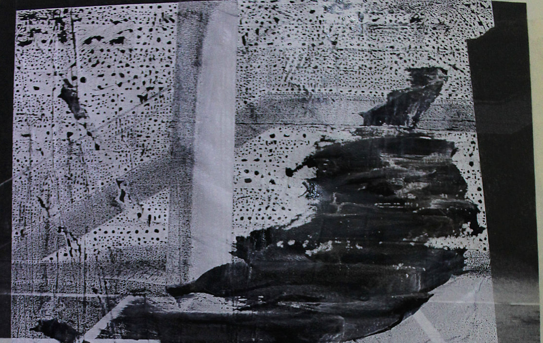
The next image was layered with white spray paint instead of PVA glue to test if it was a better substitute, however it was not. As the background was no longer silver underneath but of a white colour, as well as half the detail was kept as the rest smudged creating the little dots that can be seen in the negative space. Using the spray paint portrayed the image as more of a matt pencil sketch than a print and was overall not the look I wanted.
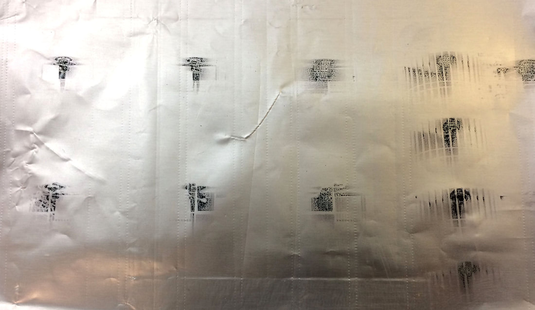
The last four images were the positive versions of images printed onto the foil coated in PVA glue. The images are clear of what they are more like Cairns images as the silver shines through, illuminating the city at night through the darkness. This is best shown in the second out of the four postives, as the silver colour is clear and the detail very focused, also the silver shining makes the street lights look like the night stars. However in the second and third out of the four the foil creased too much when going through the printer, which is distracting of the actually image, this could be avoided by using thicker foil. Nevertheless there is a lot of good detail added by this in the third image as it adds to the decaying fading away city.
The first and last images out of the four is the clearest however the creasing of the images make it hard to see the image, as on the left hand side of first image and the right hand side of the last image. The last image is more abstract than the rest as it harder to identify what the image is of, adding to the mystery f the night and having to figure out what the image is through the illuminated parts of silver.
In the first image the paper was put in the printer wrong and so printed twice, nevertheless the interior of the train can be seen well due to the different tones highlighting the detail but not as well in the second print. In the second the form and structure is well highlighted by the clear tone separation. The third image has a clear focus on the dark night lights due to the inverted tones, the blank negative space fading around the lights suggests the emptiness of the city at night and how lonely it can be. The last inverted print was done on a thicker layer than the rest of the prints, this gave the image a glossier outcome and the middle arrows on the floor look like oozing puddles creating an eerie more surreal atmosphere.
The next image was layered with white spray paint instead of PVA glue to test if it was a better substitute, however it was not. As the background was no longer silver underneath but of a white colour, as well as half the detail was kept as the rest smudged creating the little dots that can be seen in the negative space. Using the spray paint portrayed the image as more of a matt pencil sketch than a print and was overall not the look I wanted.
The last four images were the positive versions of images printed onto the foil coated in PVA glue. The images are clear of what they are more like Cairns images as the silver shines through, illuminating the city at night through the darkness. This is best shown in the second out of the four postives, as the silver colour is clear and the detail very focused, also the silver shining makes the street lights look like the night stars. However in the second and third out of the four the foil creased too much when going through the printer, which is distracting of the actually image, this could be avoided by using thicker foil. Nevertheless there is a lot of good detail added by this in the third image as it adds to the decaying fading away city.
The first and last images out of the four is the clearest however the creasing of the images make it hard to see the image, as on the left hand side of first image and the right hand side of the last image. The last image is more abstract than the rest as it harder to identify what the image is of, adding to the mystery f the night and having to figure out what the image is through the illuminated parts of silver.
Twelfth development
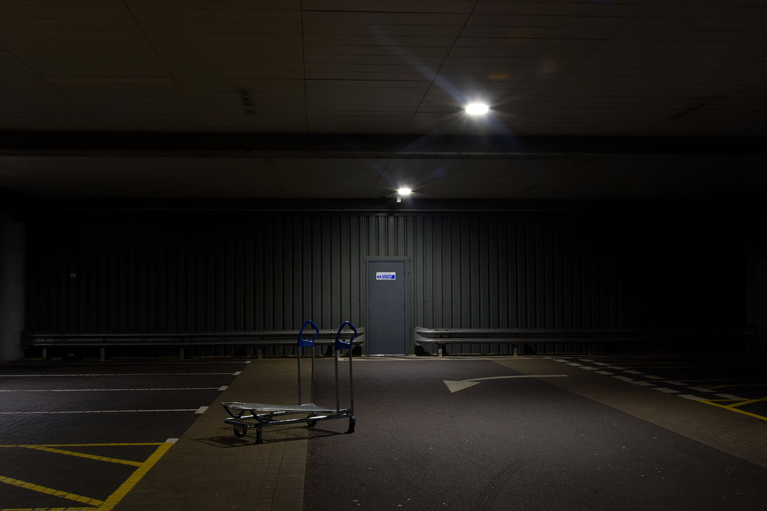
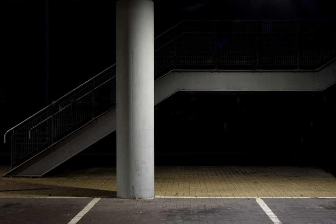
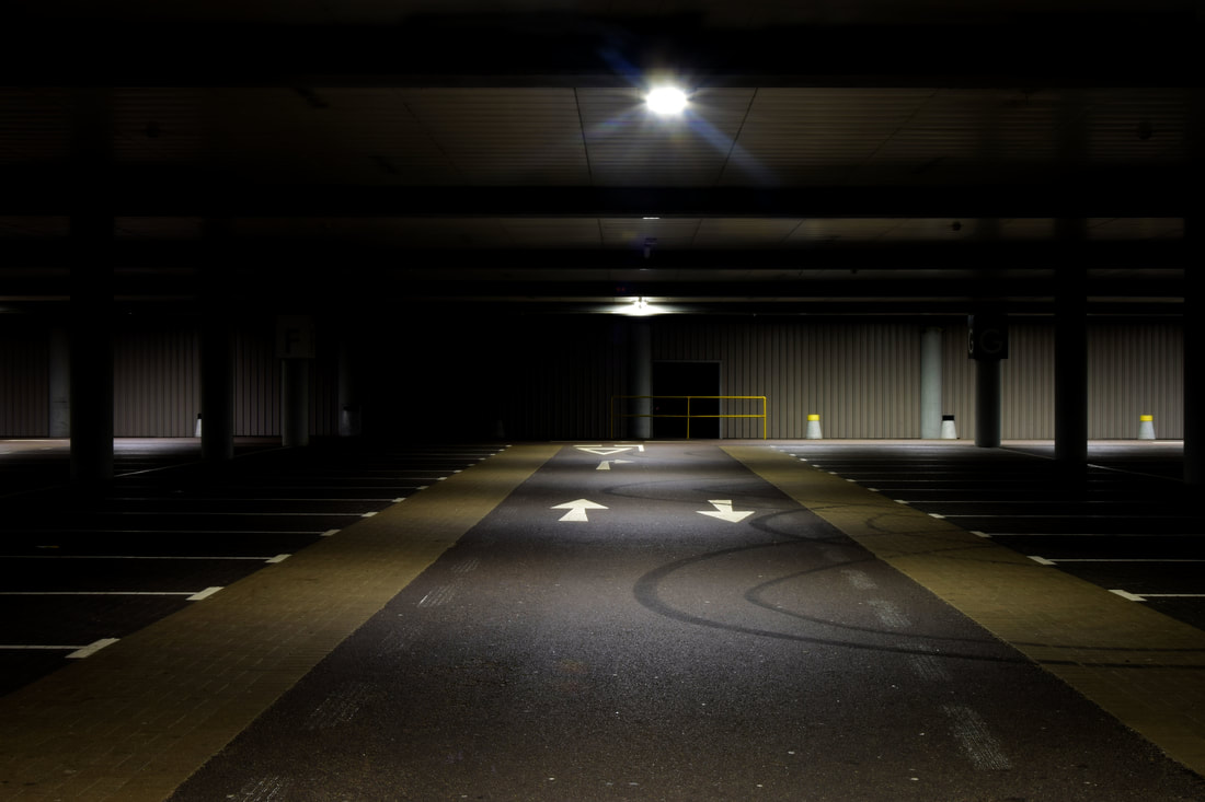
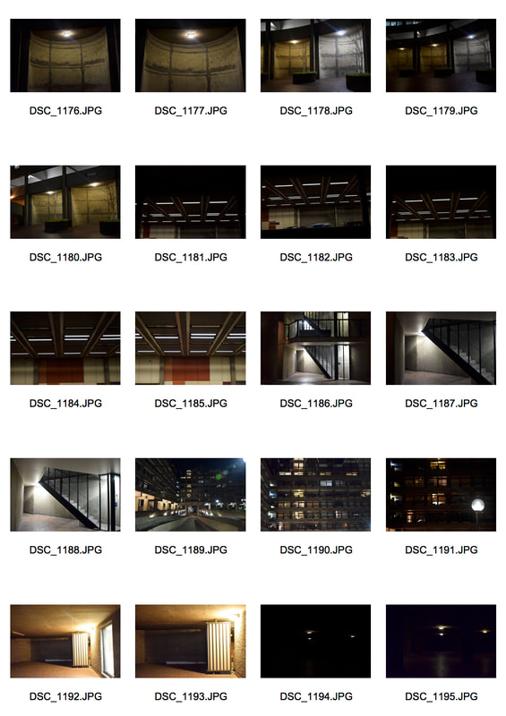
After testing out different methods of printing onto the aluminium foil with pervious images taken and used before, I went to The Barbican to take a new set of images. I chose to go to The Barbican at night to capture a place which is usually full life in the estates and events in the centre, now deserted awaiting the next day of use. Moreover the Barbican is a place made primarily for human activity which will one day be completely left to decay and the environment around it wasted. As well as trying to portray these concepts though my images I also wanted to capture places lit up by street lights to highlight the city illuminated, negative space to show the beauty in the abandoned city at night which is usually overlooked on daily commutes, also to look for form and structure so that when the images are put onto foil or solarised in the dark room, would not be too difficult to identify the subject.
When taking the images I had my camera on shutter speed priority so that there could be a long exposure in order to capture the light and detail in the images, without having to use flash.
When taking the images I had my camera on shutter speed priority so that there could be a long exposure in order to capture the light and detail in the images, without having to use flash.
|
|
|
|
Solarisation sabattier effect
Using the photos from the Barbican above I decided to explore the technique of solarisation, sabattier effect in the dark room. As the outcomes of the effect are similar to how Cairns images appear.
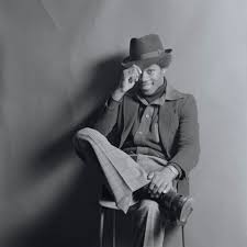
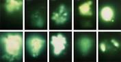
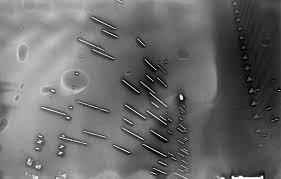
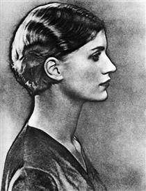
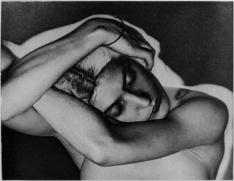
Solarisation was accidentally came across by Man Ray and Lee Miller, Man Ray started to use the technique in his work to 'escape from banality'. He was an American visual artist and a prominent figure in Dadaism and surrealism, he considered himself above all as a painter but worked in varies different mediums of art throughout his life. Man Ray mainly used solarisation technique in his portraits to highlight the outline and contour of his subjects, this can be seen below:
Solarisation was accidentally came across by Man Ray and Lee Miller, Man Ray started to use the technique in his work to 'escape from banality'. He was an American visual artist and a prominent figure in Dadaism and surrealism, he considered himself above all as a painter but worked in varies different mediums of art throughout his life. Man Ray mainly used solarisation technique in his portraits to highlight the outline and contour of his subjects, this can be seen below:
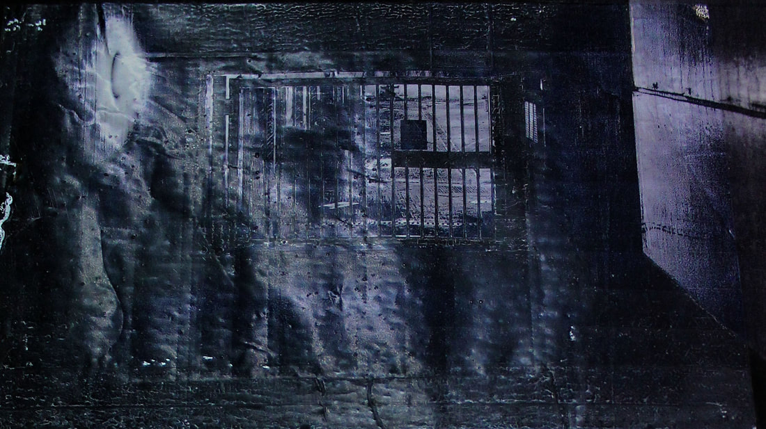
I mainly chose images of buildings to solarise as they had the best form and structure than the other images. Before I could use the images in the darkroom I had to first edit them in photoshop so that they could be printed onto acetate paper as negatives to use in the darkroom to create positive prints. I first had to change the image mode to greyscale and then invert the image. I next adjusted the levels to increase the contrast, and sharpen the image to increase the texture and detail of the images.
In order to solarise the images I exposed the photographic paper as normal with the negative acetate on top, I chose the exposure time of six seconds as it has the best contrast of tones. I then put the image into the developer as normal, when the image started to appear I took the paper out and exposed it again for about two seconds, then put it back in the developer and preceded to create the image as normal in the dark room. The whole point of solarisation is to invert the tones, wholly or partially. So the darker tones would invert to lighter ones and the lighter tones would appear darker in the final outcome of the print, unfortunately this did not happen to the extent I wanted it to in my prints. The lighter tones did become a darker grey, however I would have liked it if the darker tones came out lighter. Instead of the image be subtlety solarised I would have preferred it to be wholly inverted. Nevertheless the prints do have a high contrast, allowing the city to be illuminated by the lights from the buildings as Cairns image are also illuminating the city through its street lights and building lights still on.
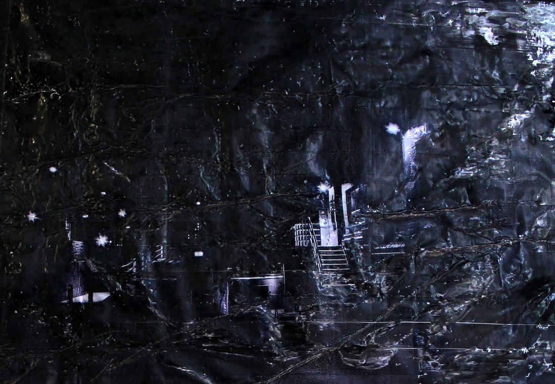
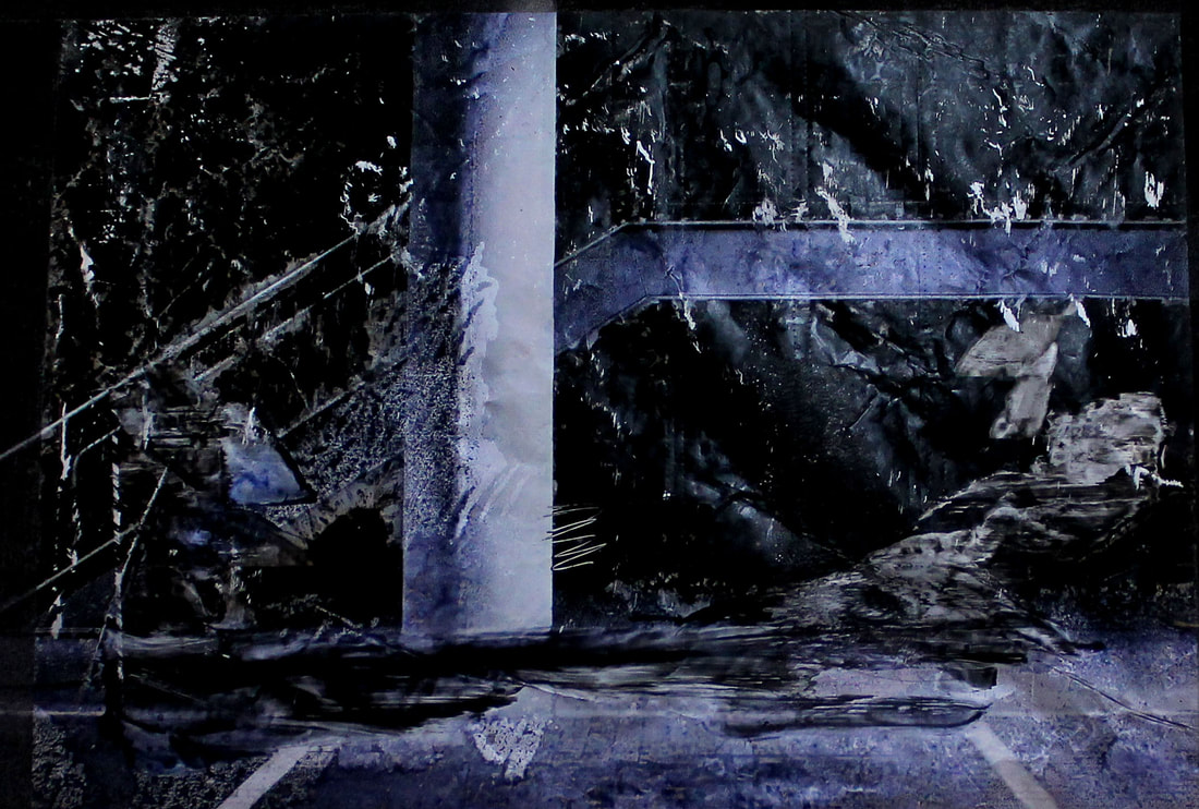
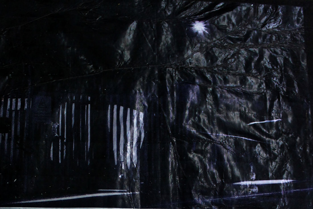
Aluminium foil
After experimenting with varies way in order to portray my images of locations in the city that become derelict at night in a similar way to the photographer Antony Cairns, I decided to chose technique of coating aluminium foil with a layer of PVA glue to print my final images onto. I wanted to print the images onto foil so that they have a unique texture and mood to them, which printing onto paper cannot give. The foil illuminates that city at night giving it an energetic mood which contrasts with the black and white eerie atmosphere the images of derelict locations conveys. The layer of PVA allows the image to be put through the inkjet printer and the outcome not being mainly smudged ink, it also gives the images a matter looking background which relates to the atmosphere trying to be portrayed then shiny foil. I decided to print the inverted versions of the images instead of the positives, in order to show more of the foil and the image, if the background was black the dark negative space would take the focus away from the actually detail of the images. The inverted versions help to highlight the beauty of everyday environments that go unrecognised.
Again I chose images which showed places which would usually be full of people like bridges, stairwells and estate buildings now empty in the night. Moreover, places which are only useful for human purpose and will one day be left to ruin as the environment is no longer needed.
Again I chose images which showed places which would usually be full of people like bridges, stairwells and estate buildings now empty in the night. Moreover, places which are only useful for human purpose and will one day be left to ruin as the environment is no longer needed.
|
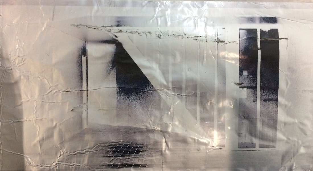
|
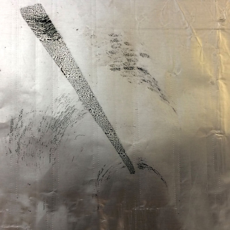
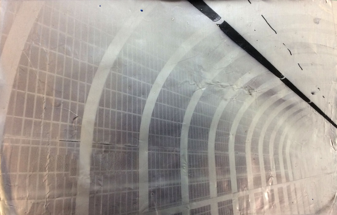
In the first and second (from left to right) the negative space takes over the prints a bit too much, hiding the detail however it doesn't conceal all of the information showing how the buildings will decay in future years to come. In the first this is shown through the bottom staircase disappearing and in the second the frame of the building is very faint. The next two in the second row, also have lots of negative space however due to the form and structure of the estate buildings it is easier to identify what the subjects are in the prints. In the first image of the second there is lovely detail of the plants and curtains in the windows of the estates and in the second the high contrast against the foil allows the image to be seen without too much of the building actually on display. The next two pints in the third row Highlight the beauty in the architecture of the bridges, in the first the foil creates an effect that the bridge is lit up by each of the white arches, like an array of light engulfing the tunnel, the angle of the image also suggests the tunnel goes on forever as it fades into the whiteness. In the second image of the third row it also has a clear form, showing different tones, softer and bolder in places suggesting the city still awake as the people begin to shut themselves in and sleep. The bottom layer of the panels are cut off, it may have been a better image if more of the bottom layer was shown in order to contrast with the top layer. The second last image has more detail and the highest contrast out of all the other prints. The high contrast creates a clear separation of the different tones, really highlighting the illuminated city through the lighter tones in comparison to the darker ones. Moreover it makes the image seem 2D and have a simplistic form, which conveys the silence of the city at night. In the last image has an eerie atmosphere at the staircase fades away, wondering where it ends (like the fifth image of the tunnel), also the high contrast of the darker areas compared to the empty foil negative space adds tot he eeriness, as it hides certain parts of the image wondering what is hidden in the darkness which the viewer cannot see. For example the door is half hidden, wondering is there a room to the side or does it just follow the staircase up.
Overall the uniqueness of the ink printed onto the foil allows for some of the information to be hidden and some shown, but this is only known at the end of the process. This adds to the mystery of the night and the idea that all mankind made places will eventually wear away and decay. Furthermore the high contrast in all the images works well the allow the foil to shine through and contrast with the darker tones, portraying an illuminated but derelict city at night.
Overall the uniqueness of the ink printed onto the foil allows for some of the information to be hidden and some shown, but this is only known at the end of the process. This adds to the mystery of the night and the idea that all mankind made places will eventually wear away and decay. Furthermore the high contrast in all the images works well the allow the foil to shine through and contrast with the darker tones, portraying an illuminated but derelict city at night.
