Structure
In this unit we are looking at how structure in nature is used by different artists and can be used in our photos. The artists use structure in nature to isolate the nature and show the subjects beauty.
Structure in Nature
Myoung Ho Lee
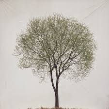
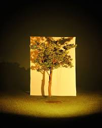
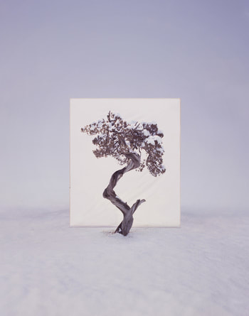
Myoung Ho Lee creates his photos by decontextualizing his subjects. He does this by choosing which subject he wants to separate from the surroundings it is in, then separates it artificially by placing a white sheet behind the subject. This creates an almost frame or canvas for the subject, it also always the subject to be isolated from the nature around it, therefore making the subject stand out more.
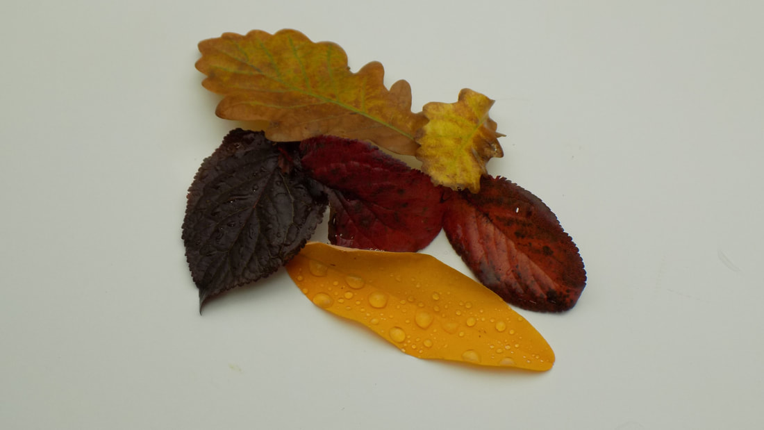
First response
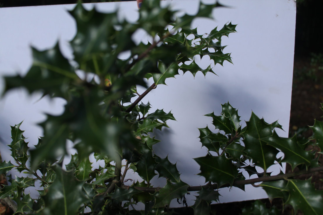
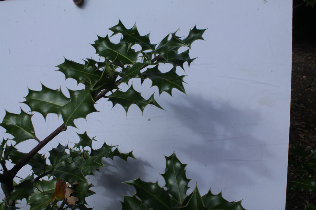
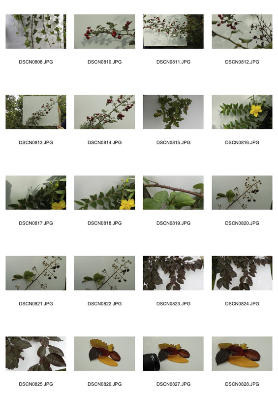
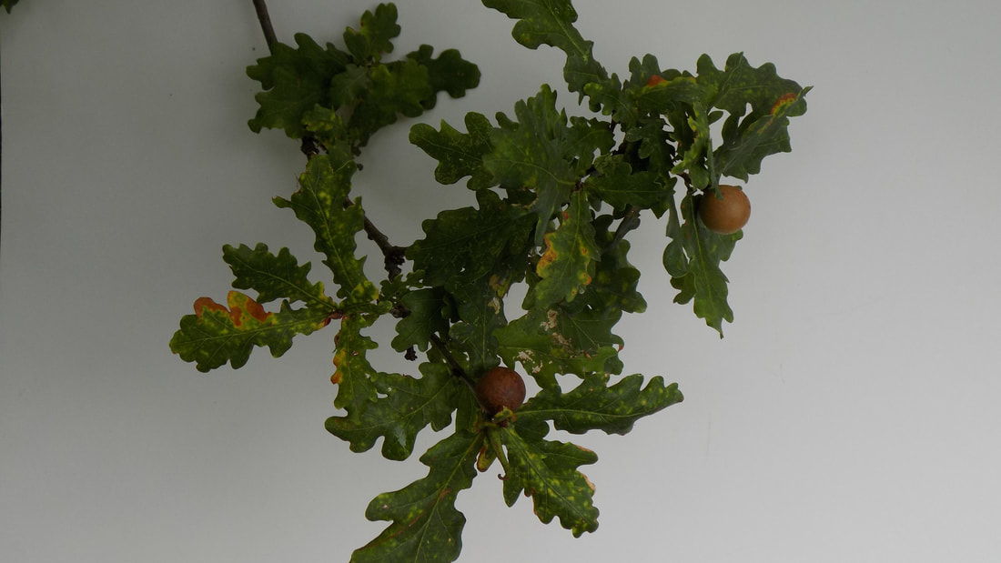
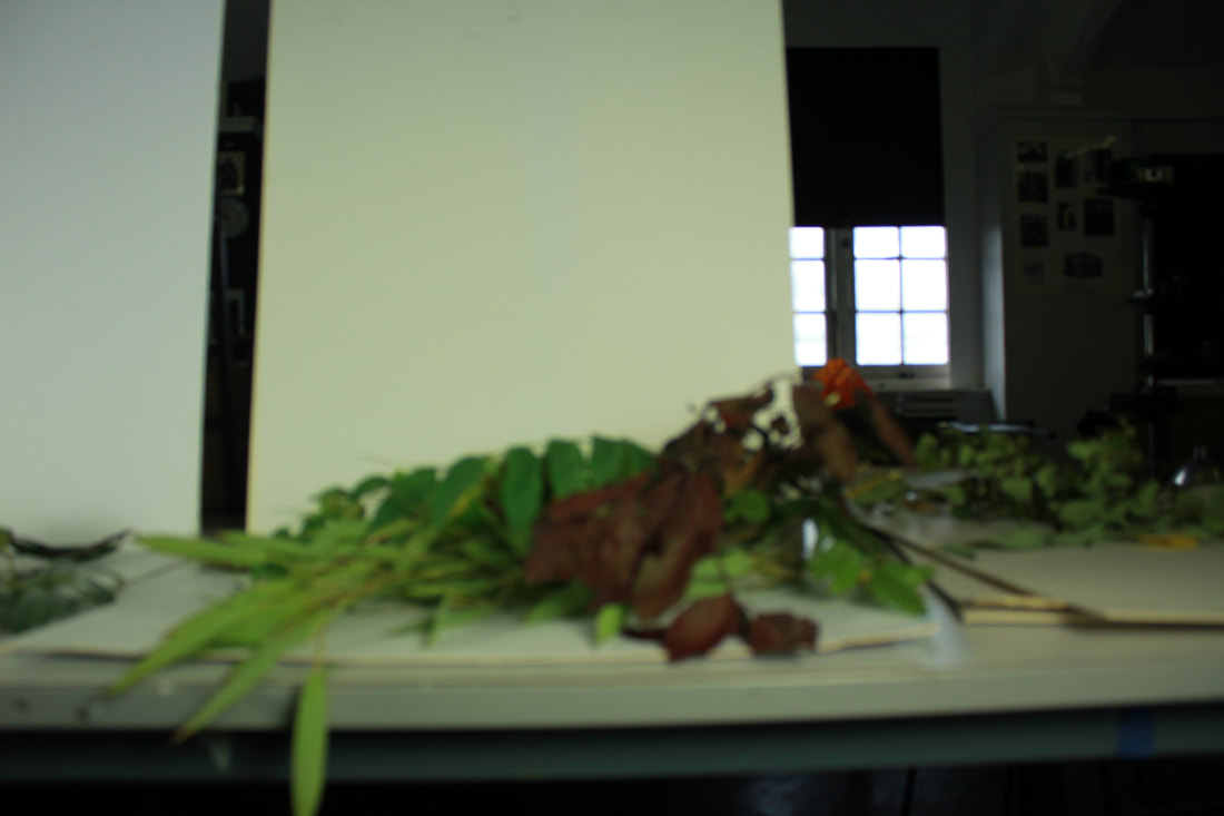
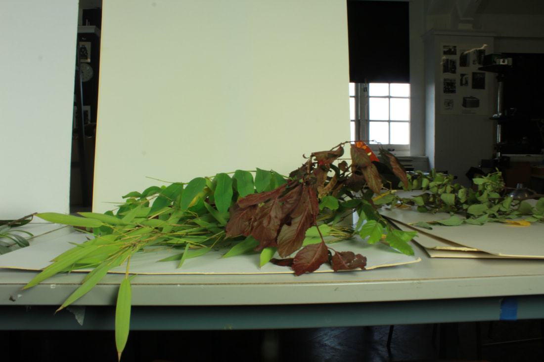
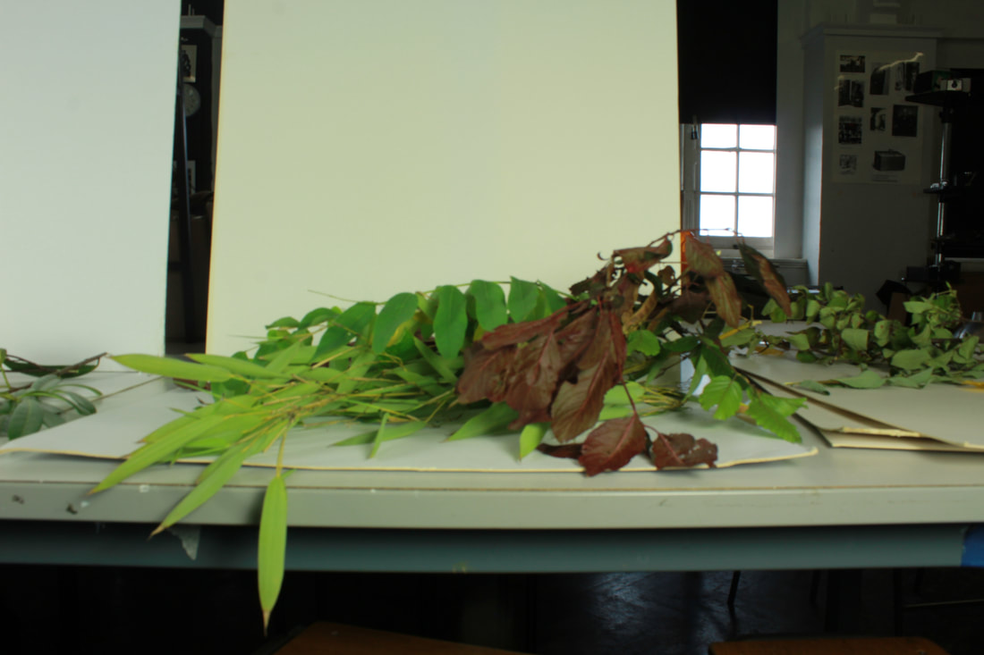
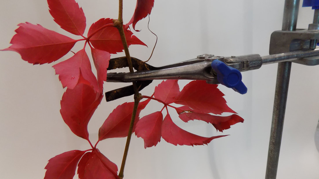
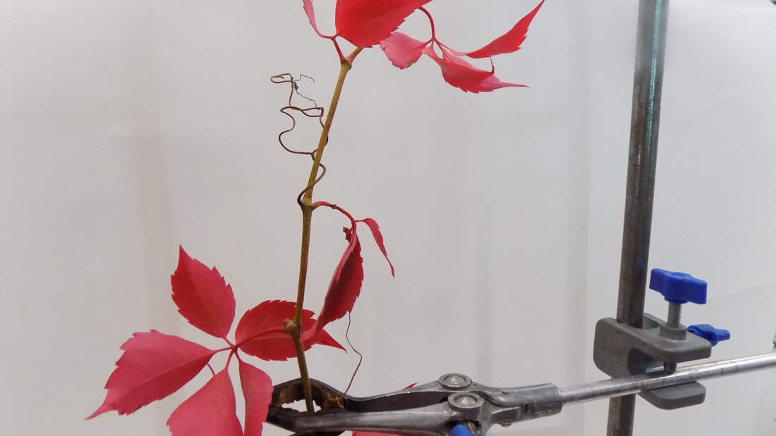
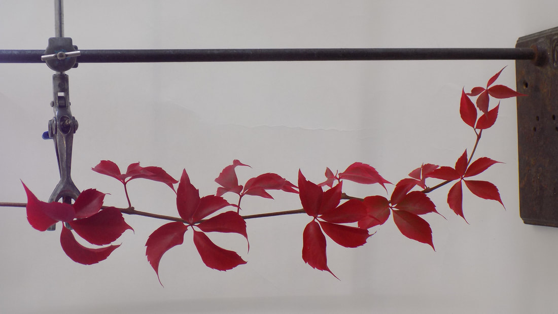
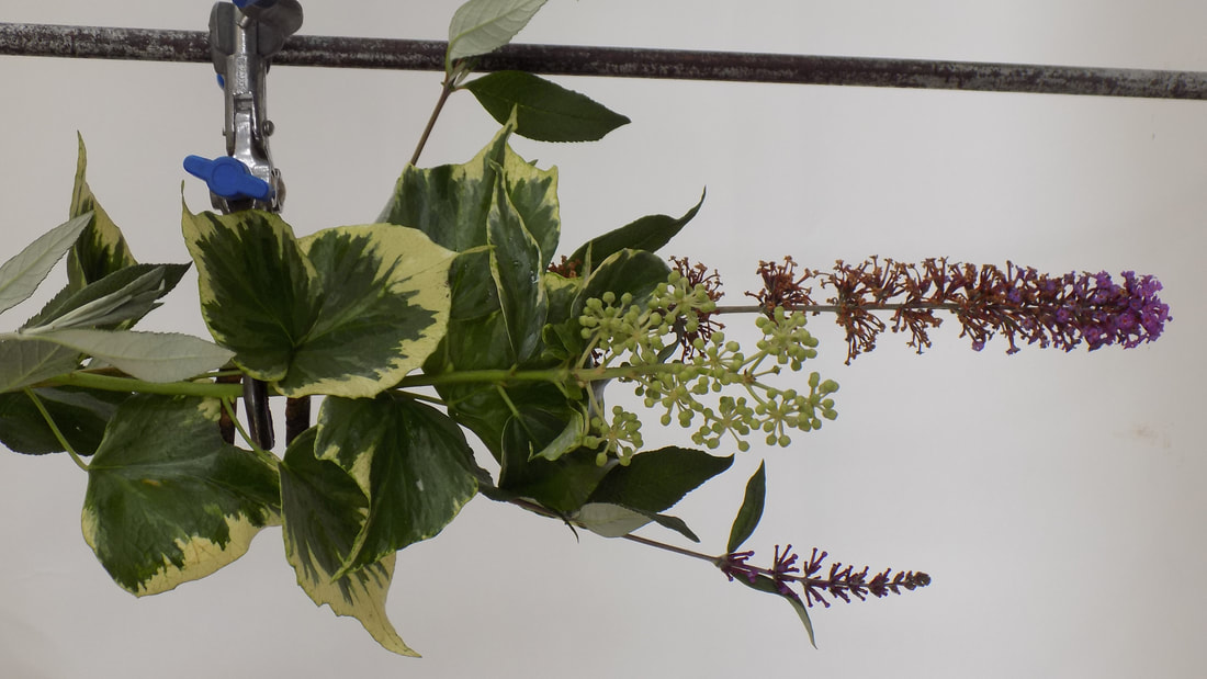
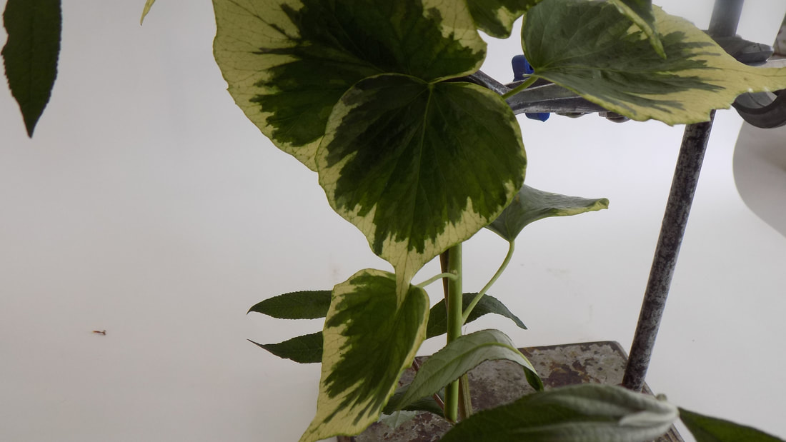
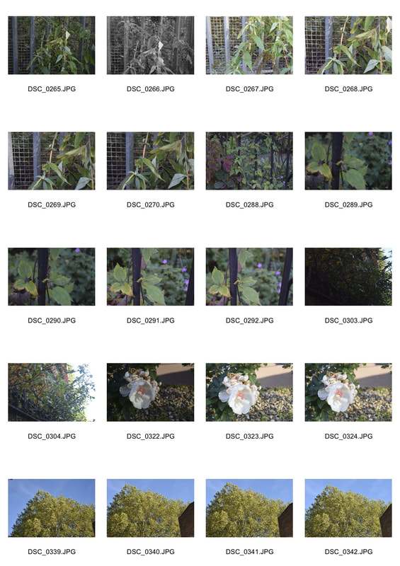
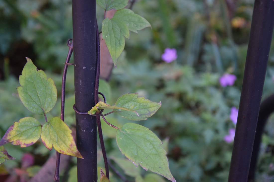
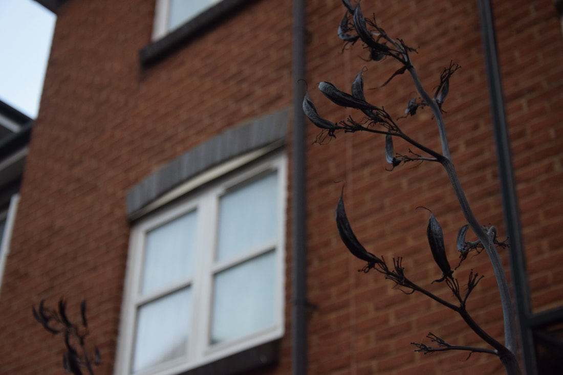
For this task we were meant to use a white backdrop behind the nature to isolate and bring out the natures true beauty. We were meant to see the difference of a completely white background and an the white background with the nature behind it. This task was inspired by Myoung Ho Lee, as this is similar to what he does in his field of work (as shown above).
|
|
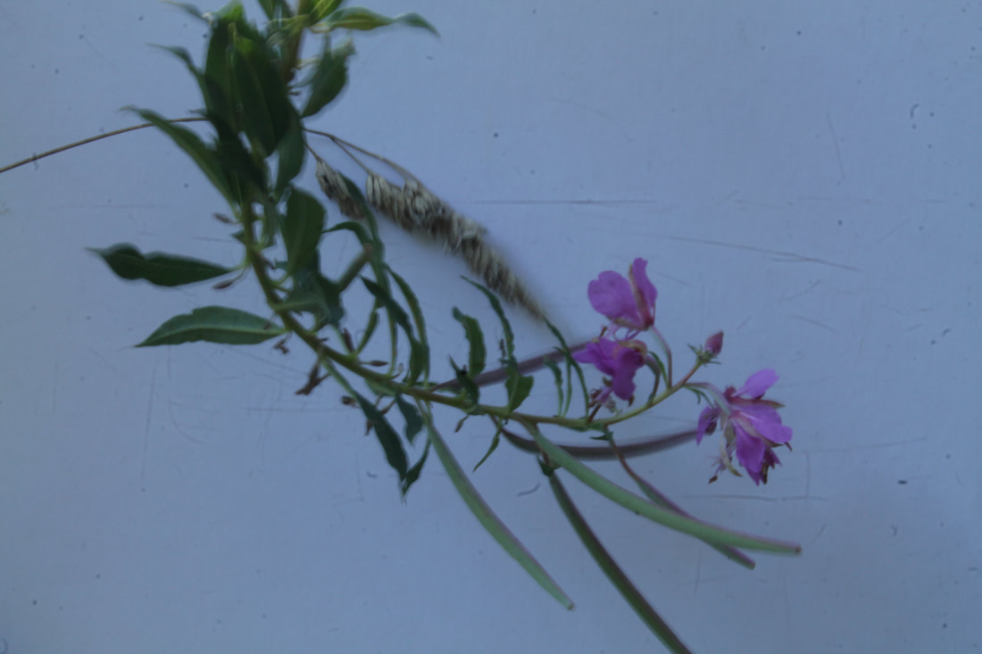
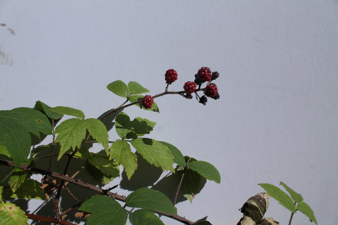
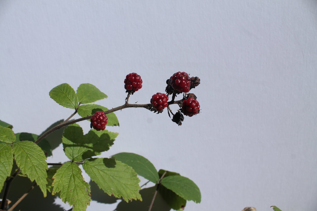
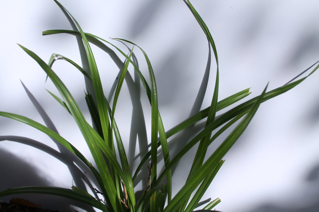
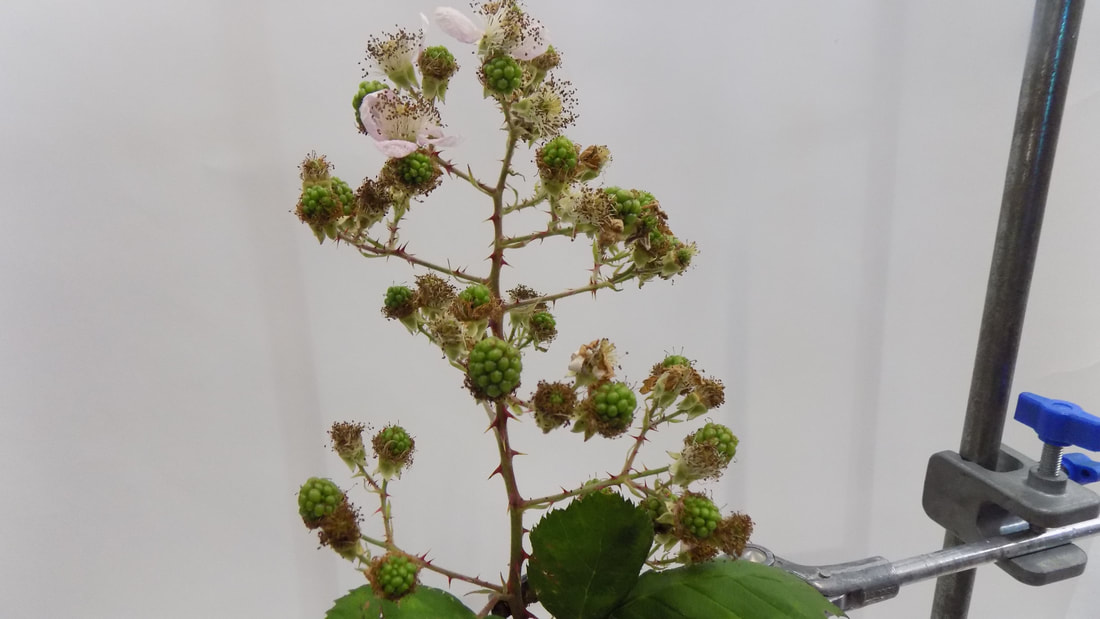
In some of the photos, for example photo four, I successfully used aperture to create a desirable affect. Moreover photo three is well lit and clear, the white background helps to bring out the beauty of the berries and the detail of the leaves perfectly. As well, photo six is well lit but has shadows which create a contrast on the white background. However in some of my photos they turned out quite dark, such as photos one and five, so it would be better if I had a more effective set up for allowing light in, such as a shorter shutter speed or bigger f/stop.
Second response
|
|
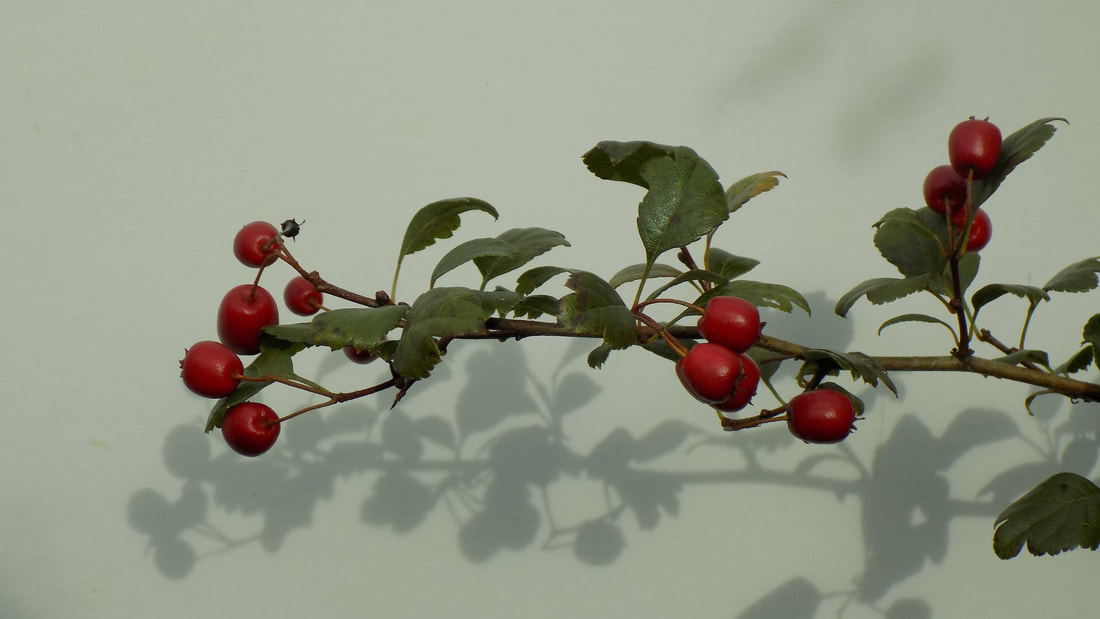
There are shadows in some of the photos which adds to the structure, making it more interesting. For example photo one has very detailed shadow of the berries, which i believe makes the photo more interesting to the eye. Also i think that photo three is simplistic but very unique as the drops of water on the yellow leaf capture the colour and life of the fresh leaf. Although, the last photo is too noisy and so could be more focused on one part of the image.
Technical focus aperture
Aperture is the opening and closing of the camera lens, which allows different amounts of light to pass through the hole.
For this task we looked at how a change in aperture effects the outcome of the photos. I found that the smaller the f/stop the greater the depth of field, therefore as the f/stop increases the depth of focus decreases.
For this task we looked at how a change in aperture effects the outcome of the photos. I found that the smaller the f/stop the greater the depth of field, therefore as the f/stop increases the depth of focus decreases.
Sanna Kannisto
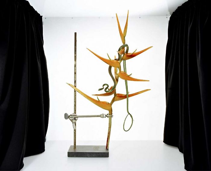
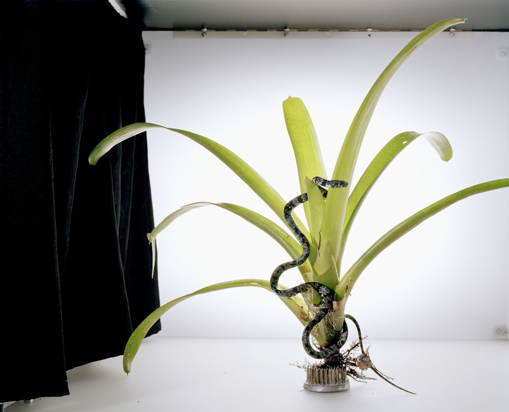
Sanna Kannisto is an photographer who wamts to interact art with the natural sciences. She does fieldwork in the rainforest in scientific stations in which she talks to the scientist and joins in on their work. As seen in the photos of hers above, she likes to use animals in her photos, such as snakes and hummingbirds, in which they are her subjects or used on the plants in her photos. Sanna Kannisto likes to use a white background as it refers to scientific documentation and natural history drawings of the photos.
First response
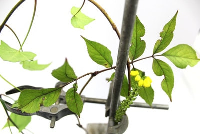
Our task was to use the scientific apparatus, backdrops and flowers of our chose to create artist photos in which there is a contrast in the nature and the natural sciences. The task is inspired by Sanna Kannisto, as this is similar to what she does in her field of work.
|
|
The photos came out sharp due to them being taken with a larger f/stop. For example photos one and five show the detail, luminosity and realism of the plants. Despite this some of the photos seem a bit cropped and so lose some character of the photos. For example photo two and six could be taken less close.
Second response-dark room
Here we looked at structure in nature in the dark room, I made two prints using the same flowers to capture their individual structures. In order to this I used printing paper and an enlarger, first I placed the printing paper under a dim light under the enlarger and placed the flowers i was using in the positions i thought would best capture their structure. Then i placed a glass sheet on top of it to flatten the flowers, next i exposed the image for about six seconds. Then used tongs to place the print paper in the developer fro 2-3 minutes, then in the stop for another 2-3 minutes and lastly in the fix for another 2-3 minutes. Once this was done i place it in a sink of water to wash all the chemicals off it. Finally the prints were dried in the dryer and the process was finished.
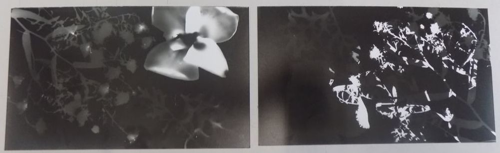
On the first print the structure of the flower on the right is shown well, the contrast of the black and white highlight the detail of the petals. However the flowers on the left faded too much in the developer and so may have been needed to be pressed down more by the glass. In the second print I double exposed the flowers and so this is why there is a layering effect on the right. Although due to the double exposure the flowers on the left where not exposed for long enough and so did not show up at the end of the process.
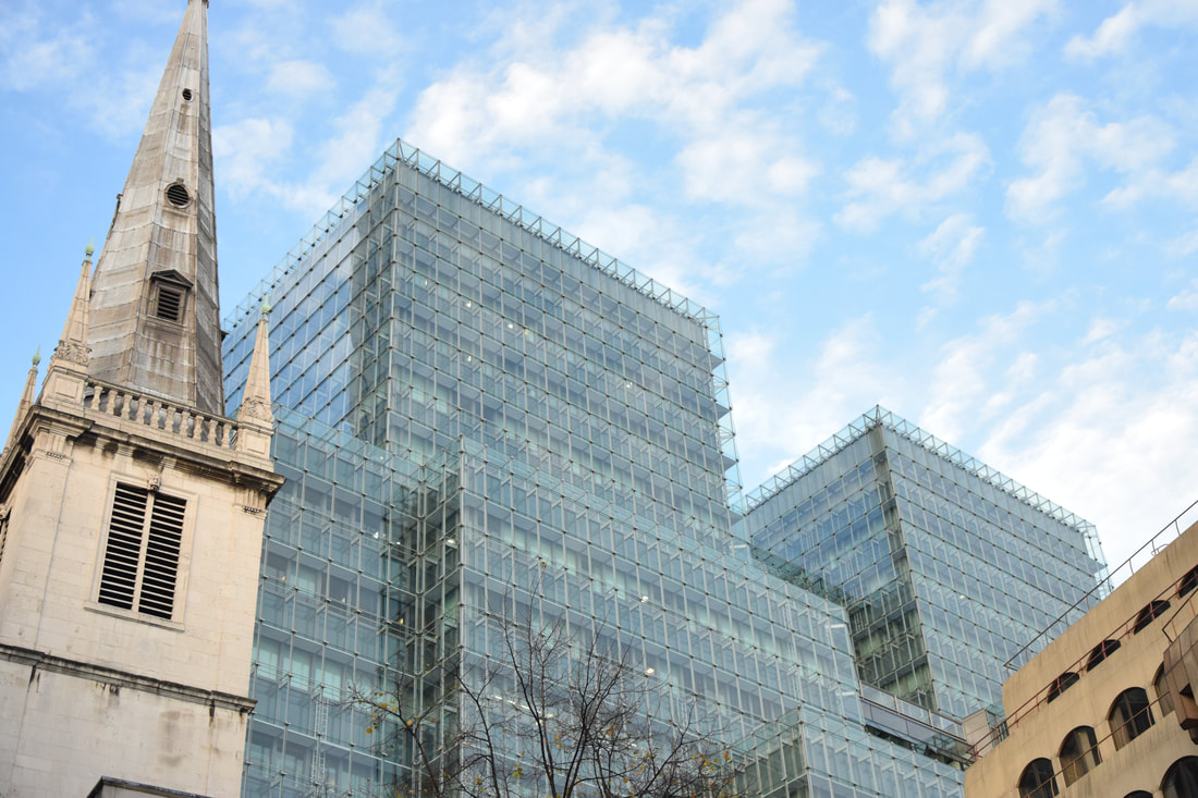
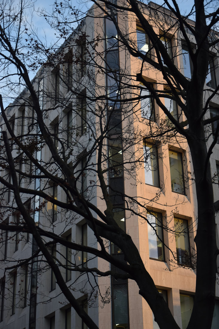
Structure in Architecture
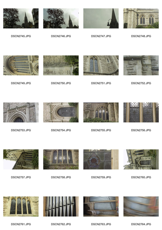
Paul Strand
Paul Strand was a straight photographer who focused on the form and shape of his subjects. He mainly photographed buildings, and tried to capture there realism. He began the type of photography that was more abstract and real than soft and romantic.
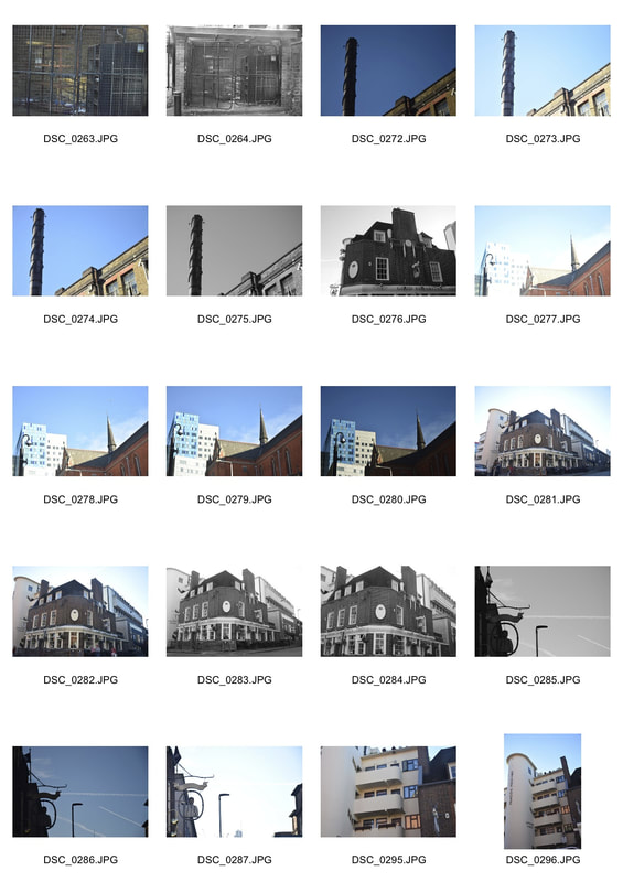
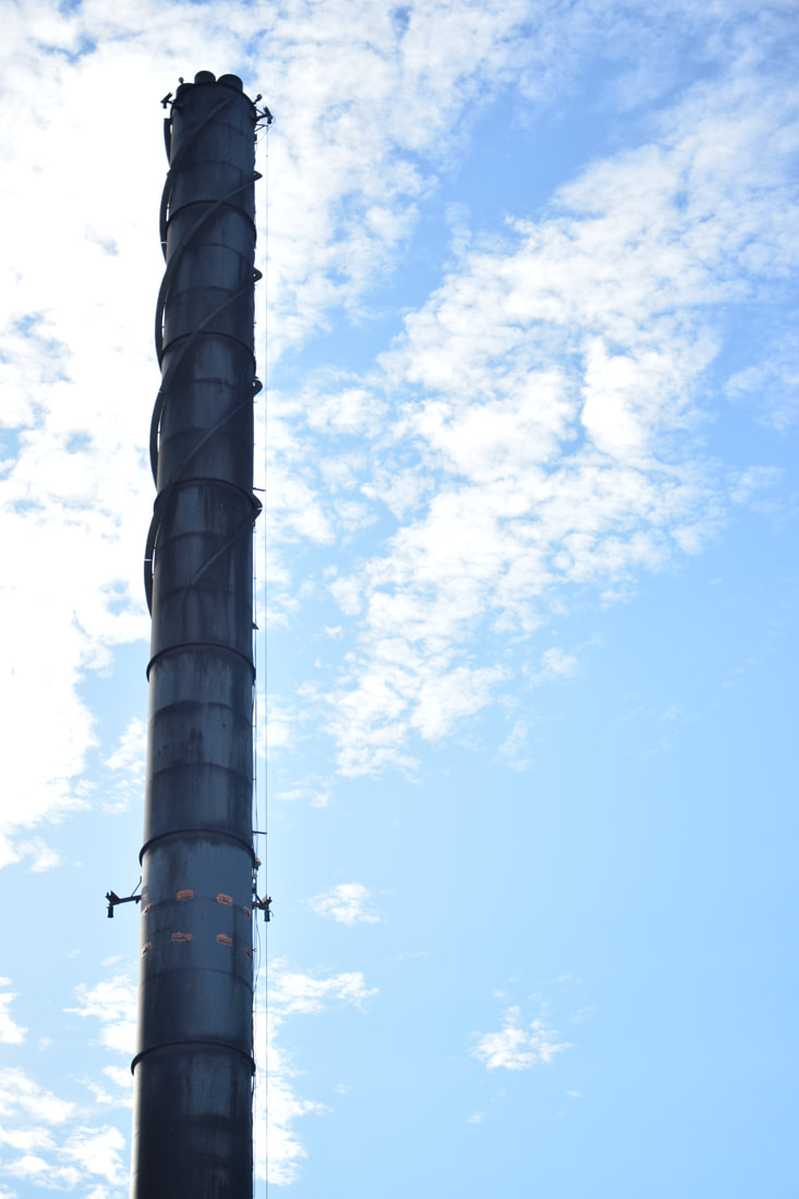
First response
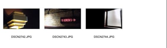
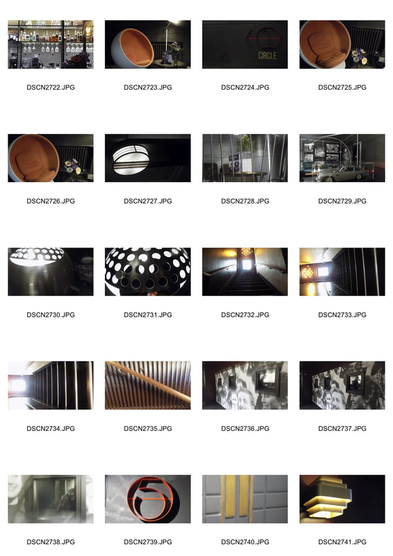
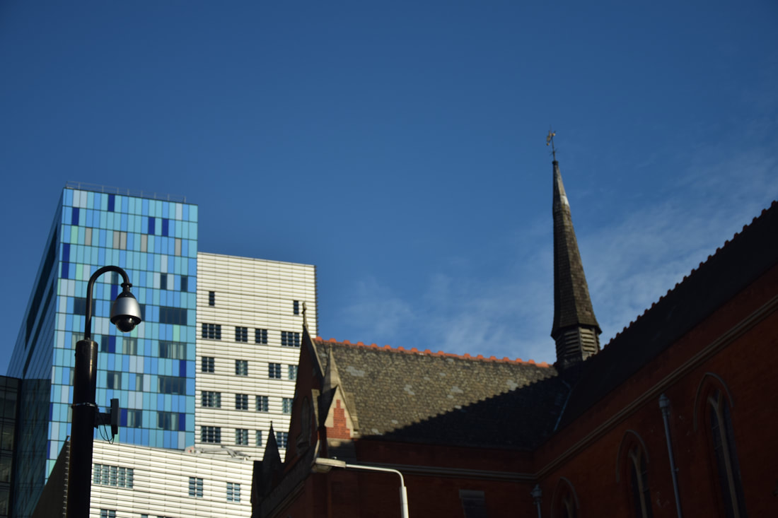
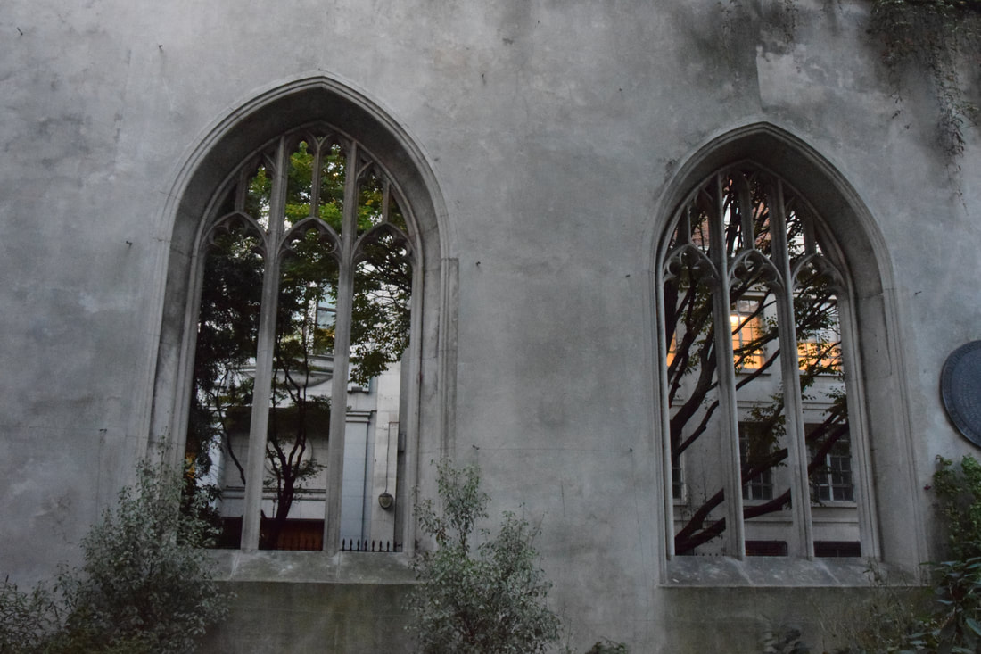
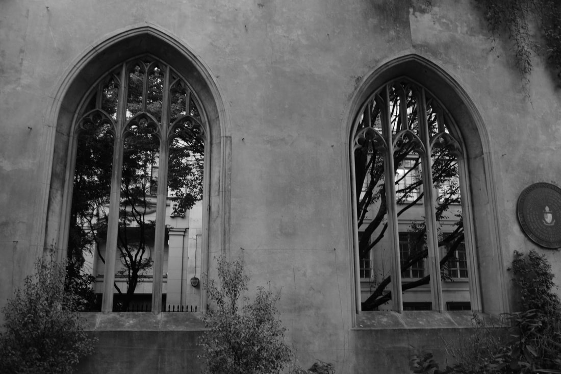
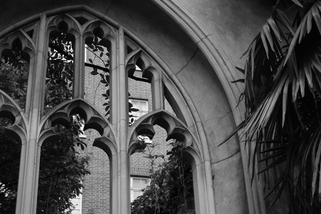
Our task was to photograph the iconic buildings in Muswell Hill and capture their art deco architecture. We were trying to capture the structure, detail and layers in the buildings. Like Paul Strand we focused on the form and shape of the cinema and church we were photographing.
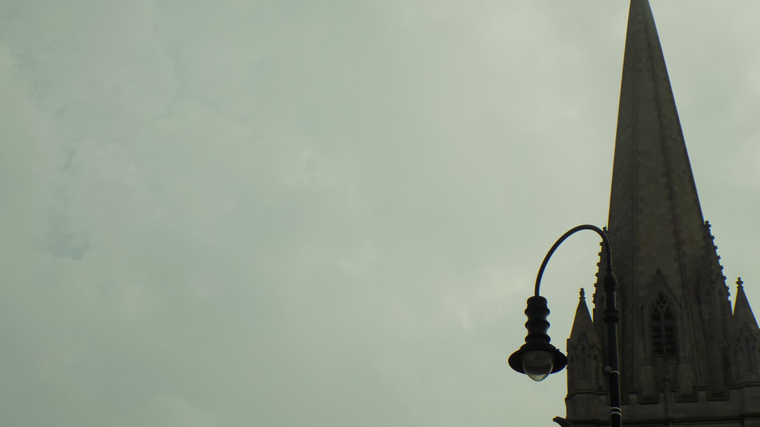
|
|
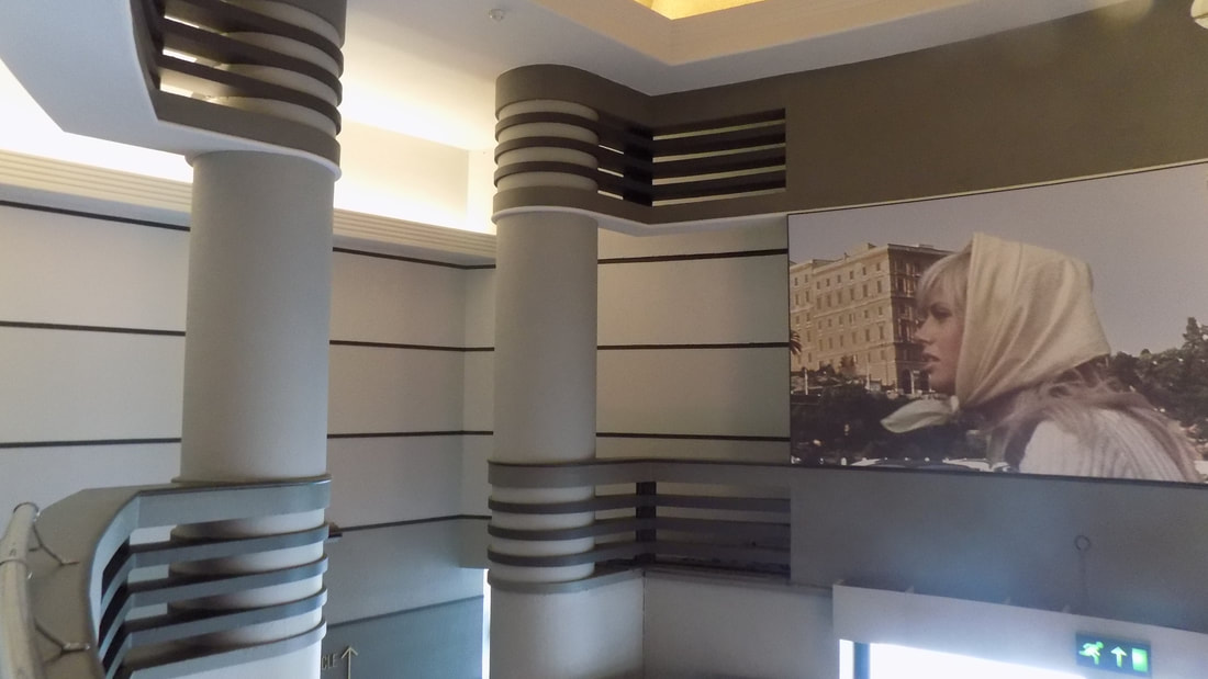
In the first photo detail of the chairs is highlighted by the sharp focus on them and the blurriness of the background, this effect was created by my use of aperture. The last photo Is a shape and clear capture of the lights aesthetic. However the second photo could have been better angled to make the photo look less generic, despite this the form and shape of the pillars are prominent.
Second response

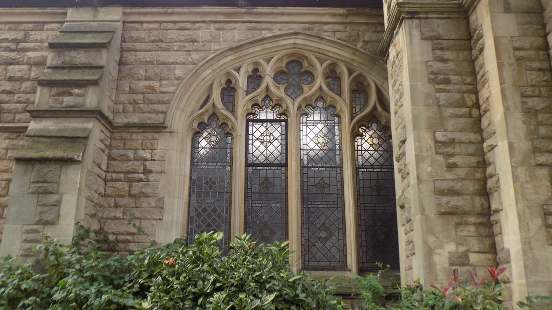
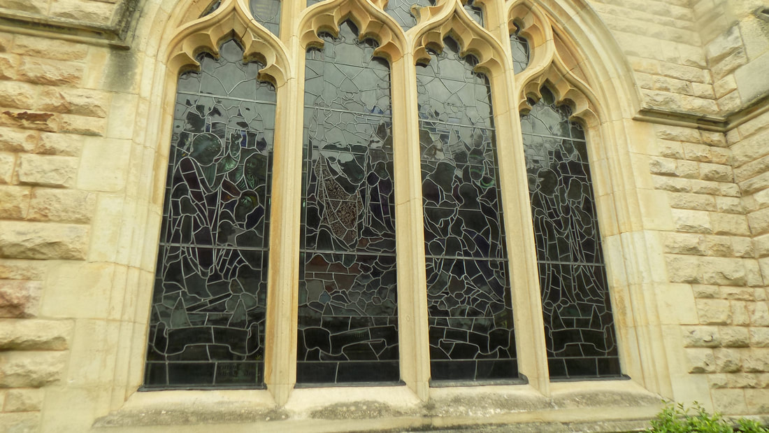
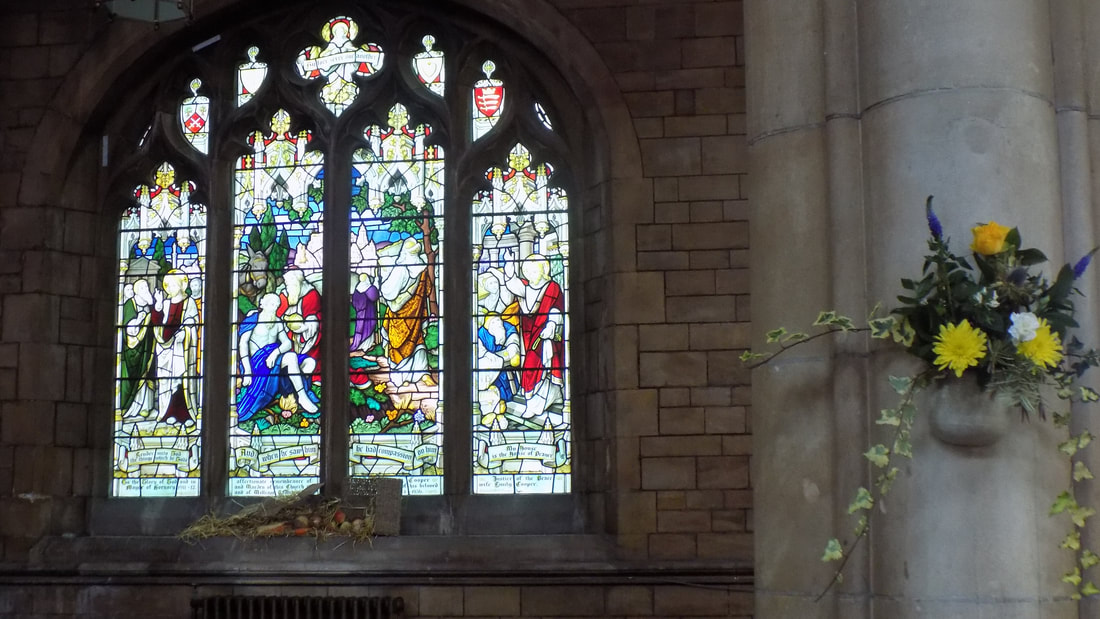
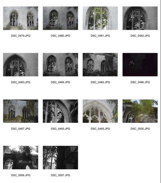
The first photo has photo is a wonderful example of negative space being used to highlight the detail of the church. Moreover, the arrangement of photo five create a magical, almost holy feel as a church should convey. This is shown by the similar yellow in the glass and flowers, the beams of light shining though and the petals along the window sill. Although most of the photos came out quite dark and some of the photos look dull due to this. A way I could overcome this issue may be by changing my ISO to brighten the pictures.
Technical ISO
ISO is the sensitivity of the image sensor. This means that the lower the ISO number, the less sensitive your camera is to light and so the finer the grain. Meaning the photo will come out less pixelated. Higher ISO settings are generally used in darker situations to get faster shutter speeds, but it can add grain or noise to the photo making it look quite pixelated and giving it a blue like tint. (Hover on the photos to see the ISO used). As the photos show the higher the ISO the clearer and brighter the picture starts to become.
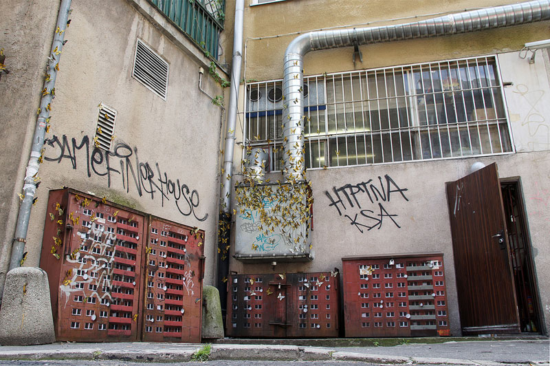
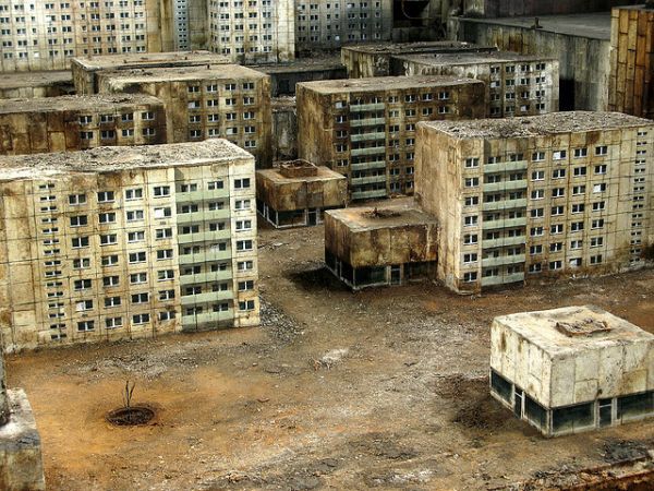
Brutalism
Brutalism is a post war architectural style, it originated in the early twentieth century but truly started to thrive from the 1950s to the 1970s. Some key people who were involved in making brutalism popular were Peter and Allison Smithson. London is made up of many brutalist buildings such as the Ministry of Education, some distinctive qualities that brutalist buildings are geometric shapes, flat colour and raw concrete. Their structures are usually simple block like forms consisting of small windows.
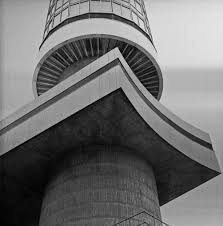
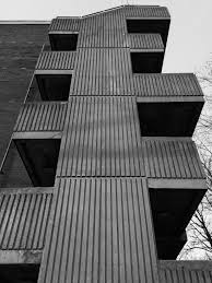
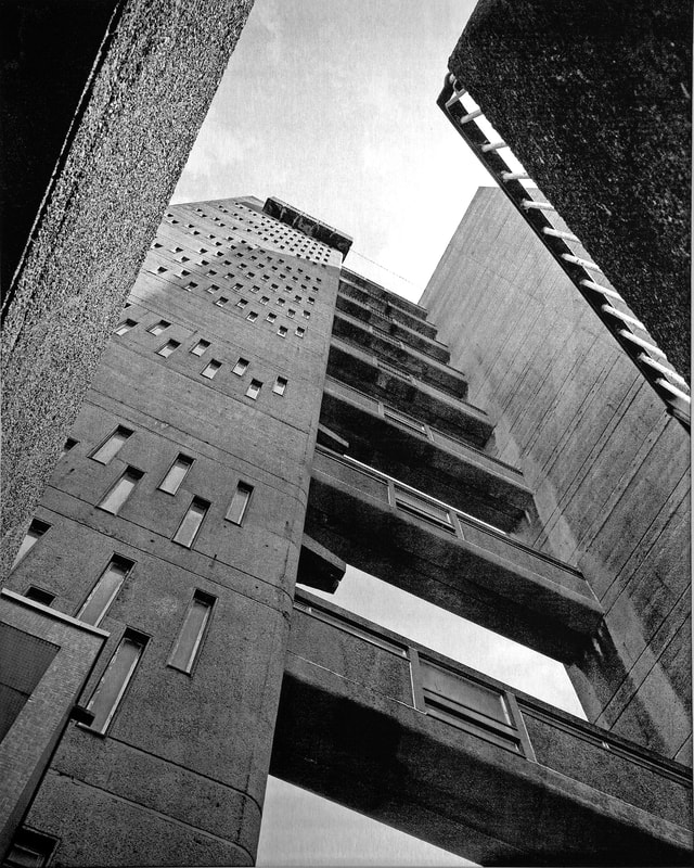
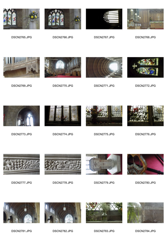
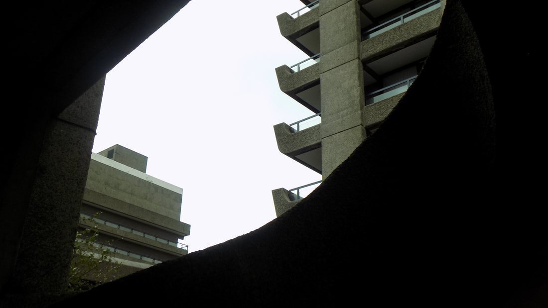
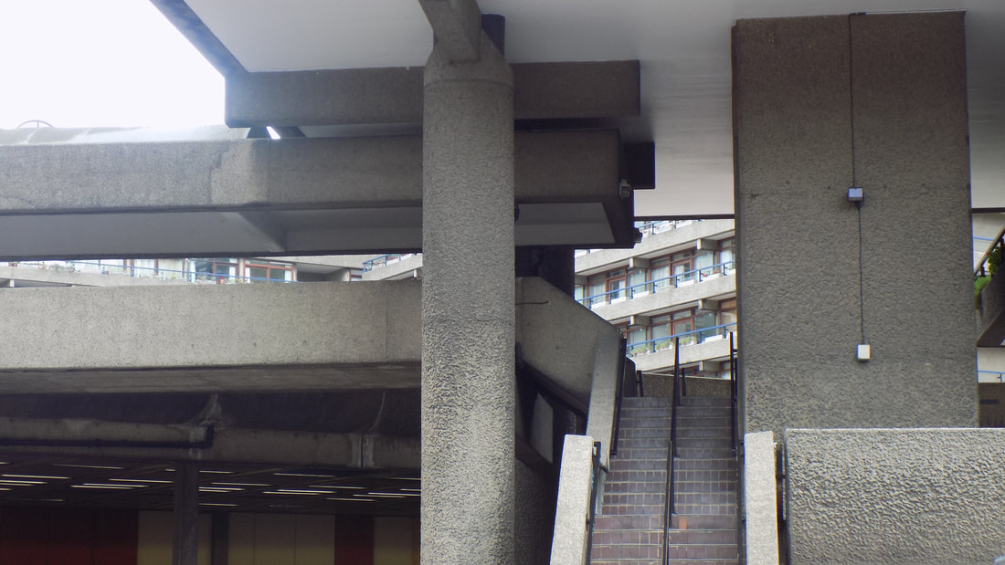
Simon Phipps
Simon Phipps is a brutalist photographer who as dedicated the last 15 years of this life to documenting brutalist architecture in the UK. Brutalism is a style of architecture originated from the work of renowned architect Le Corbusier. One of the principle ideas of brutalism is Béton Brut (raw concrete). Phipps mainly only shot in greyscale, this may be so that the bleakness of the buildings are shown and the only thing to concentrate on in his photos. Moreover he usually angles upwards to emphasis the empowerment of the buildings, as shown in the last picture.
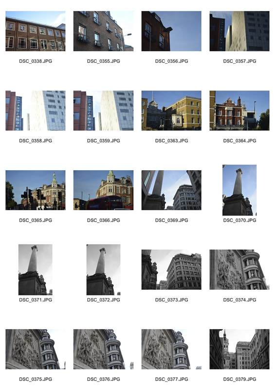
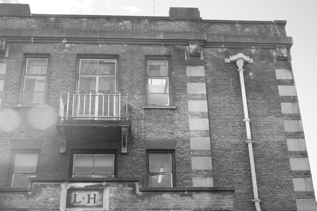
First response
Our task was to visit brutalist buildings and capture their structural makeup of brutalist architecture. When taking the photos we were meant to consider some composition tips, such as negative space, form and shape and line and perspective. I visited the Brunswick Centre and The Barbican and tried to convey these composition tips in my photos shown below.

|
|
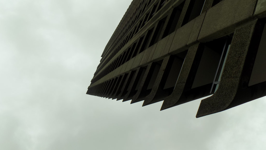
Negative space
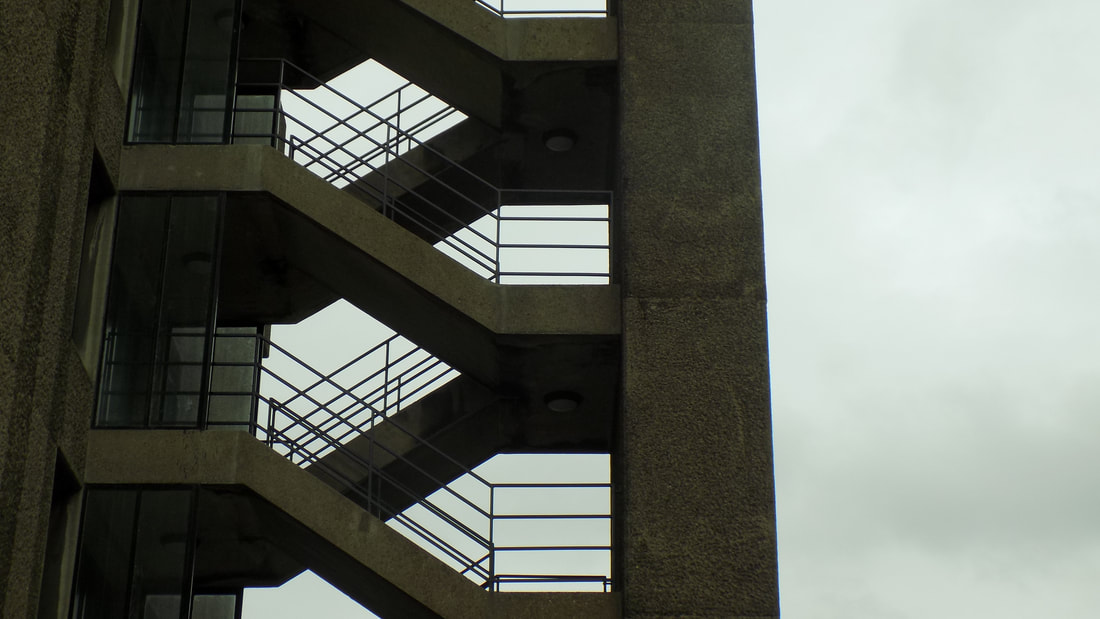
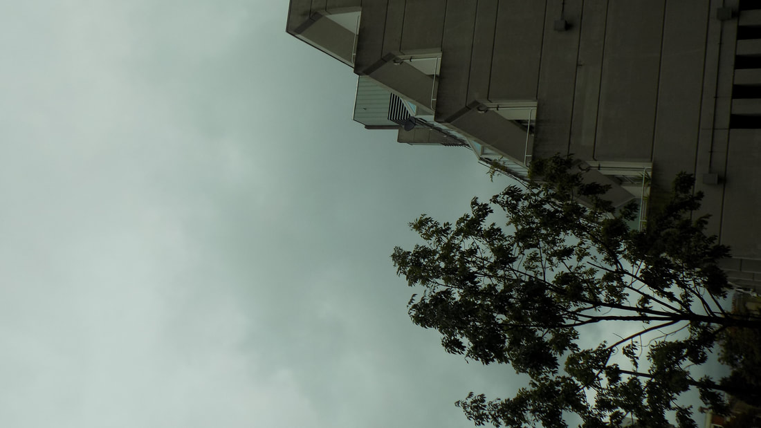
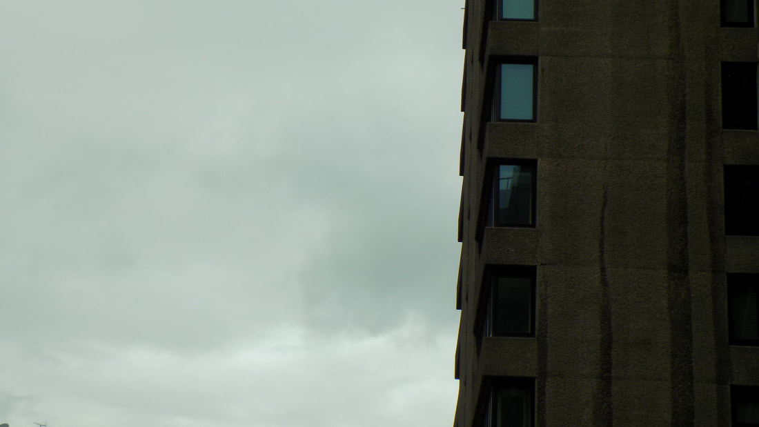
These three photos are examples of negative space being used. The use of negative space allows the structure of the buildings to be highlighted and focused on. For example in the first picture the railings are clear to see and contrast with the white background. Although it would be better if the camera was flat when taking the picture and not angles upwards, as this made the photo wonky. As well photo two may have been better captured with a different ISO so that it was brighter and the detail of the building could have been more visible. Lastly the use of negative space in the last picture works well to portray the buildings structure.
Line and perspective
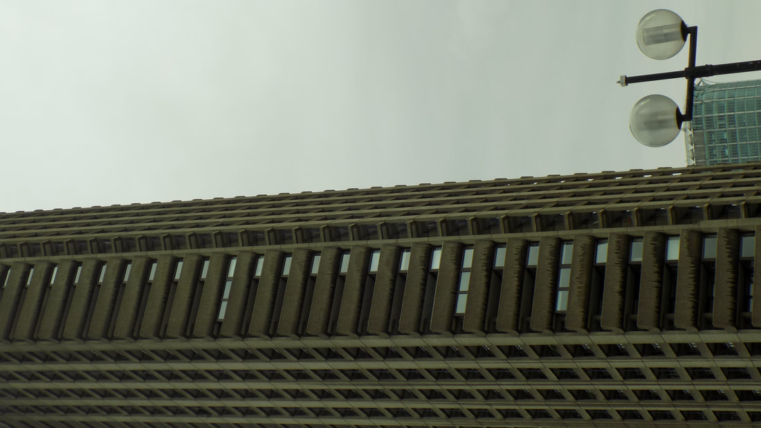
These three photos are where I have tried to use line and perspective in my work to make them unique. The first photo was taken through a spiral staircase, it has a contrast of the black frame of he stairs and the bright outside of the building edge and sky. The lines of the staircase change how the building is perceived as only a small part of it is seen and the rest is left to interpretation. The second photos perspective has been changed as it is unsure how tall the building really is. In the last photo the lines of the building on its side make it seem to be something other than what it is. Only the perspective of the light indicts that the photo is of a building on its side. However the building seems to be a bit out of focus and so would be better if it was a more focused picture.
Form/Shape

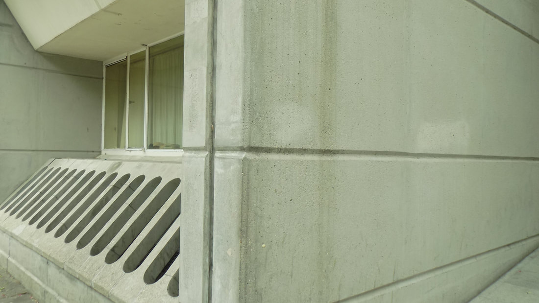
Form and shape is established in these three photos to create a strong brutalist image. In photo one the form and shape of the architecture is sharp and easy to follow as you are able to trace the concrete beams all the way round the building. However the buildings in the background make the photo quite full. The second photo has a strong and simplistic form to it. This helps to highlight the detail of the image. the last photo has strong concrete shapes in it which makes the photo very brutalist.
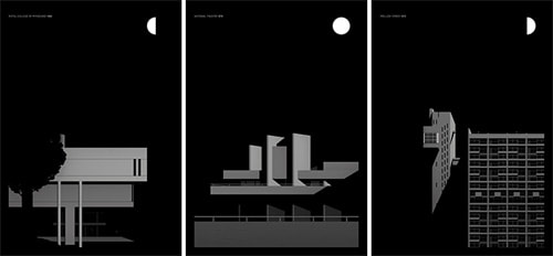
Thomas Danthony - Extension
Thomas Danthony is a brutalist photographer, who takes photos of brutalist architecture and turns them into simplistic pictures using Photoshop techniques. He does this in order to give the buildings a more 2D, flat structure, below are some examples of this work.
Our task was to try and imitate Thomas Danthony's style of photography. We used one of our brutalist photos we had previously taken and adapted them in photoshop, we did this by first putting the photo into greyscale. Then selecting the parts we wants and doing an average blur on them to get the different sections different shades.
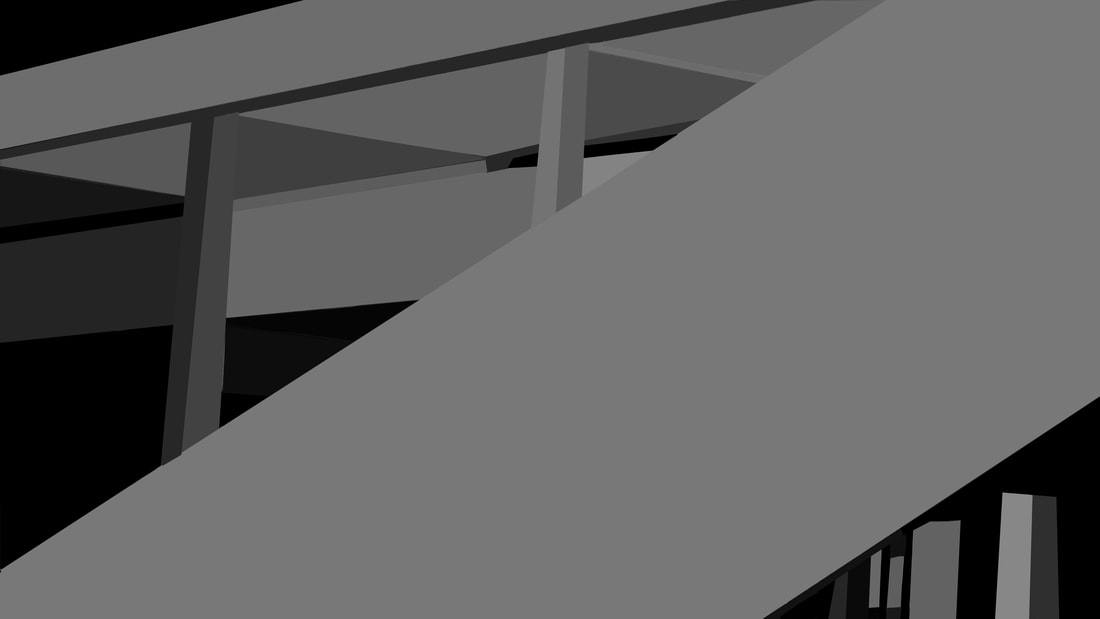
The photo I chose to use was a good choice because it has strong structural shapes. This made it easier to separate the different parts of the photo, also due to block forms of the concrete in the brutalist photo, the coloured sections contrast nicely focus on the shapes in the photo. If I were had used a more noisy photo to do this photoshop technique it would have been harder and not as well done. Moreover the focus of the shapes would have been less prominent. However some of the lines in my edit above are not straight and so make some of the shapes not as sharp and 2D.
EVOL - Extension
EVOL is a berlin based street artist, he tries to bring the street art inside so that exhibitions can be done of it. He essential photographs buildings and then uses the photos to create miniature buildings and small cities. He uses old furniture or cardboard as a base to stick the photos on and paint on to create his work. Examples of his work as shown below, our work was being inspired by the first example.
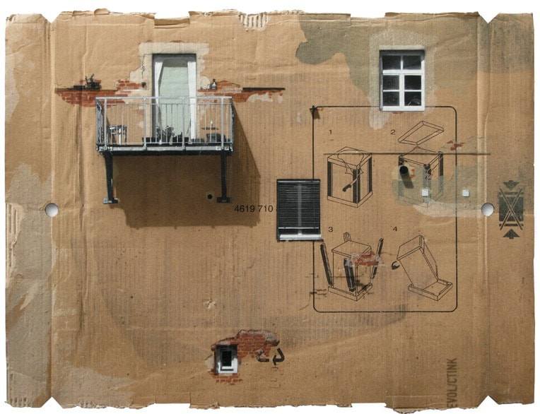
Our task was to use photos we had taken and cut parts of them out to create something similar to what EVOL does with his work. We also could use other things to make effects on the cardboard such as paints, pens and crayons. As seen in mine below I used crayons and black pen to outline the structures I had cut out and stuck on the cardboard to give them depth. Also I used steel cloth to give the cardboard a wear look. My attempt is seen below.
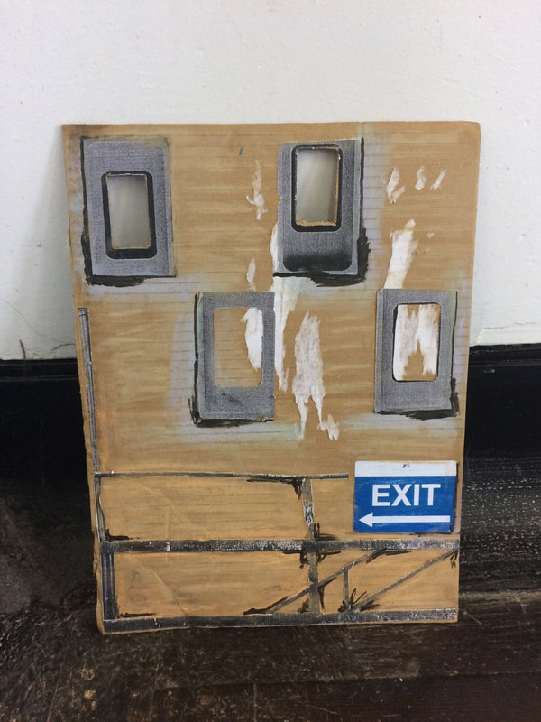
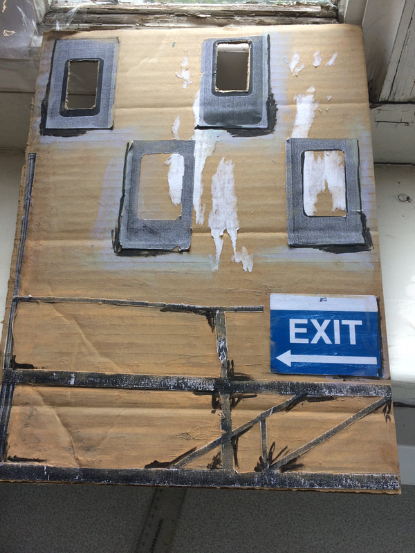
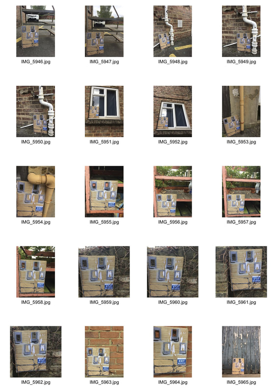
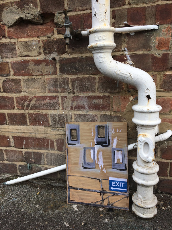
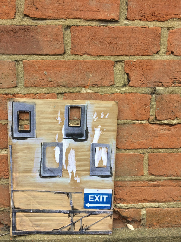
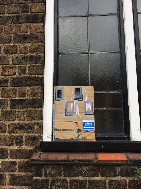
We took them out into the streets as EVOL does and photographed them. In the first photo the white piping highlights the cardboard features and acts as a frame, also the colour of the bricks in the second photo complement the colours of the crayons I used in the blank spaces of the cardboard. Its a simple but nice photo, lastly the third photo is taken from a different angle the dark colours of the window and bricks again highlight the features on the cardboard. Although the photos all have some kind of brick background, it may have looked better in front of another type of building background.
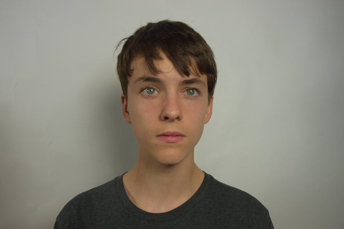
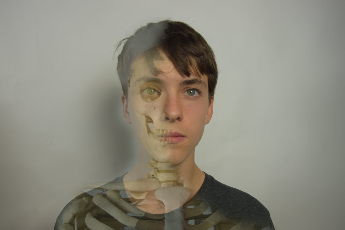
Structure in the body
For this section of structure we were looking at the structure found in the body. The skeleton is a prominent structure in the body which we can use for this. Our task was to photograph portraits of people and then of the skeleton in studio conditions. Then to use Photoshop to merge the portraits with the skeleton. As shown below I experimented with Photoshop in order to create my picture below. I chose to leave the portrait under the skeleton still visible, in order to make an almost x-ray effect, as if the x-ray machine was just hovering over the left side of the body.
|
|
Three strands
The three strands I chose to focus on were contrasts in architecture, details in leaves and posed vs natural. I chose these different strands as they all focus of structures in different areas of life, for example in buildings, nature and people.
Strand 1: Contrats in Architecture
Allen Klosowski
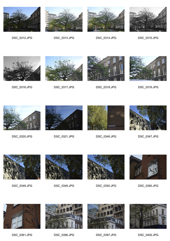
Allen Klosowski is a photographer of architecture and how their presents effects the environment, he uses different angles of the buildings to alter how we perceive them. His photos also focus on the form and structure of the buildings, this is what inspired me about his photos to take mine. I focused on the form and shape of the buildings. As well as he takes photos of buildings built of different materials not all just of concrete, like brutalism does. I want to show the contrast in the effect the different materials can have on how we perceive them.
|
|
I wanted to photograph different structures of buildings, old and new to show the different effects the contrasts in the buildings could create. Moreover, I wanted to experiment with the difference in coloured and black and white photos. I found my favourite photos were mainly of the buildings that had a simple form and shape, also the photos that i took with negative space as it shows the presents of the buildings, like how Allen Klosowki does.
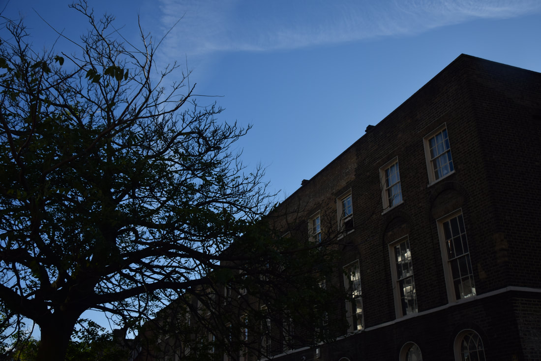
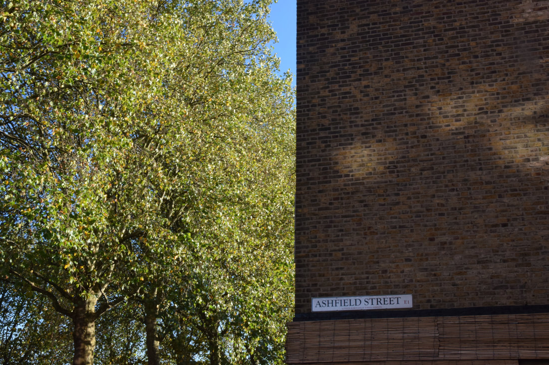
In the first photo the use of negative space and the clouds in the sky help to present the structure and presents. The angle of the photo also adds to making it look overpowering. The second photo has a old western feel due to the black and white and the sun ray thats on the left. This old black and white effect contrasts with the fourth photo, this is because the fourth has a 2D modern, simplistic, colourful effect due to the complementary blue and grey colours, also due to the box layering structure of the photo. In the fifth photo lines of the building change the perception of the building as it look like it gets smaller on the right side. This light building contrast with the older concrete darker one on the right of the photo. The third photo could be less busy and focused more on a contrast in the buildings. The last photo highlights the contrast in new and old buildings and the different materials the best. The church on the left almost looks as if it has been photoshopped in, the light stone and different shapes, contrast nicely with the light blue box layering of the middle building. It would be better if these were the only things in the photo, so all the focus was on their contrast.
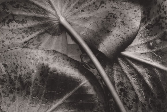
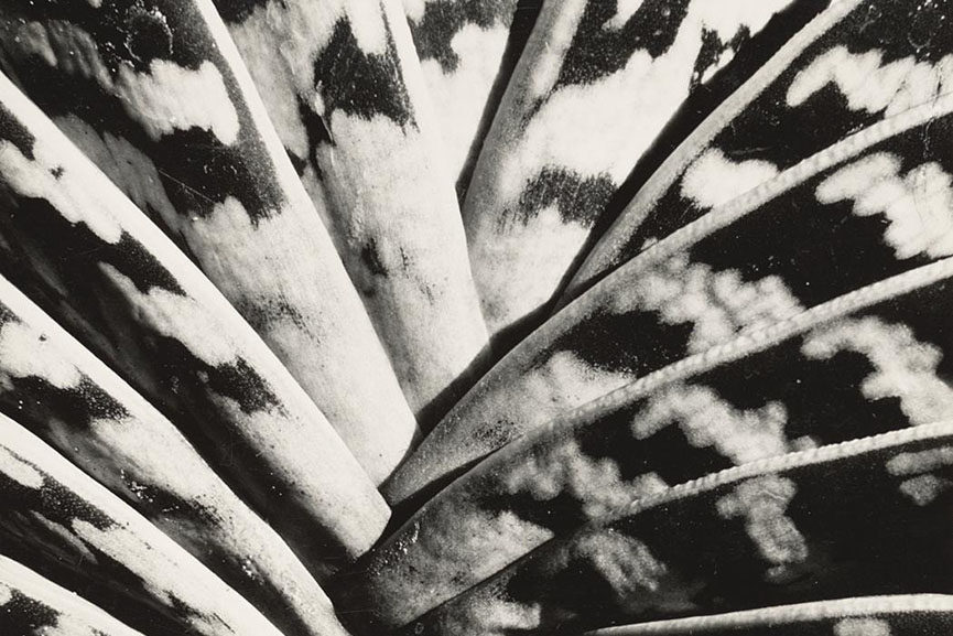
Strand 2: Details in leaves
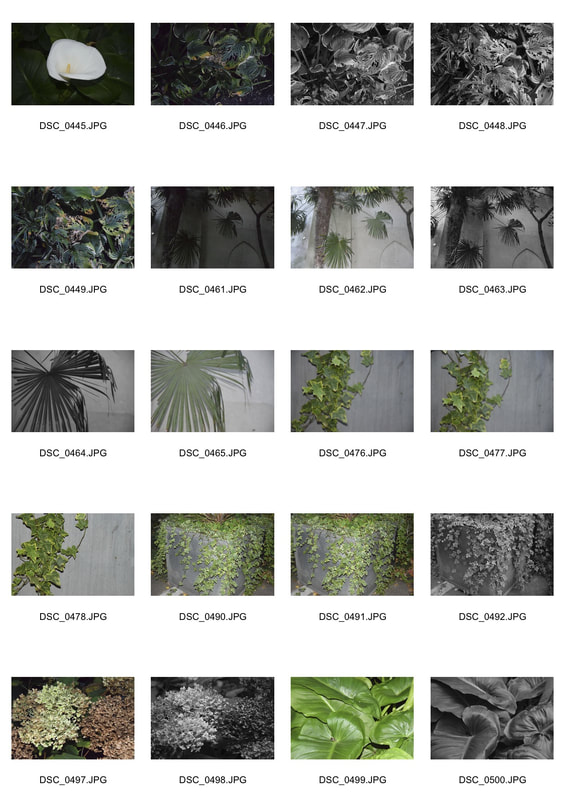
F64 group
F64 group were photographers that tried to focus on the pure reality and beauty of their subjects through its detail and texture. They mainly photographed nature, they used the F/stop 64 and long exposures which meant their photos came out extremely clear and sharp, As shown in the photos below.
|
|
I wanted to capture the detail of nature, I thought the best way to do this would be through the details in the petals and leaves of the flowers. I did this by using a high aperture and sharp focus to make the photos like the F64 group. My camera was unable to go to an aperture that high, but I was able to use it at around f/stop 22. However this meant that there was less light coming in through the lens to take photos, so in some i had to alter the ISO or use flash.
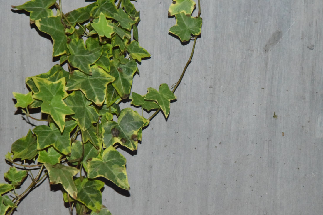
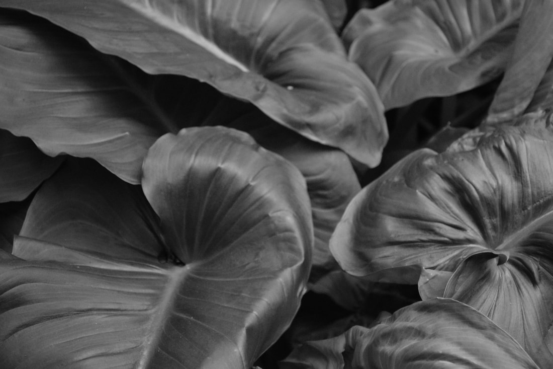
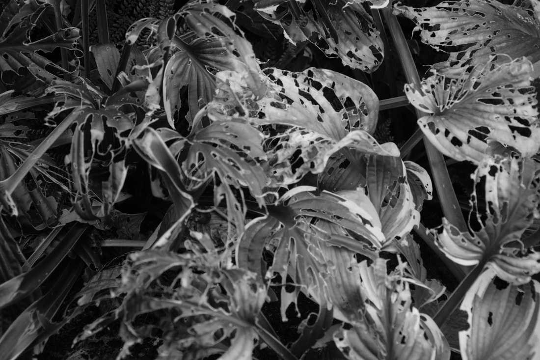
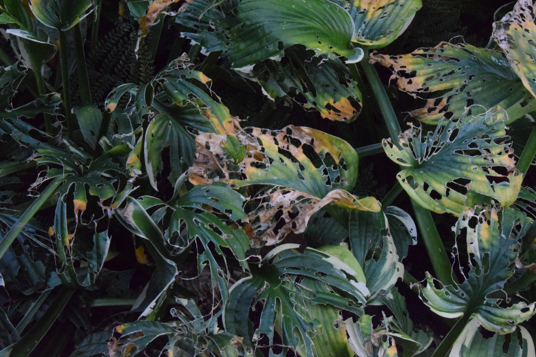
The first three photos are in my opinion the best in portraying the detail in the leaves. This is because they are clear and sharp. In the first, the blurred background helps to emphasis the detail in the leaves and putt he focus on them. In the second the flash works well in making the photo clear, also the plain background puts the focus on the ivy. The third is the best in highlighting the detail in the leaves, the black and white help to put the focus on the detail of the lines on the leaves. However the detail is lost in the fourth photo as its not in the best focus, and is a bit too noisy. The contrast of the colours in the sixth make the photo unique.
Extension - Compliments winthin nature and buildings
|
|
This section is an extension of my nature strand, it shows how structures in nature such as trees compliment the strong structure of the buildings. The idea was to show how man made objects such as buildings, can contrast nicely with natural things such as trees.
In the first photo the tree and buildings look like silhouettes due to the darkness of them, there structure is highlighted through the light blue sky. In the second picture i tried to portray the difference between the natural and the man made, the buildings wall gives the photo a 2D feel. The use of aperture in the third picture creates a bleak photo, the building and nature compliment each other to create this effect. The next two photos work well of the srong structure
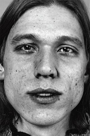
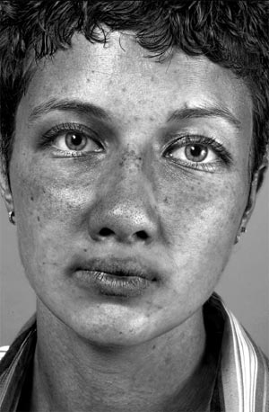
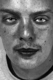
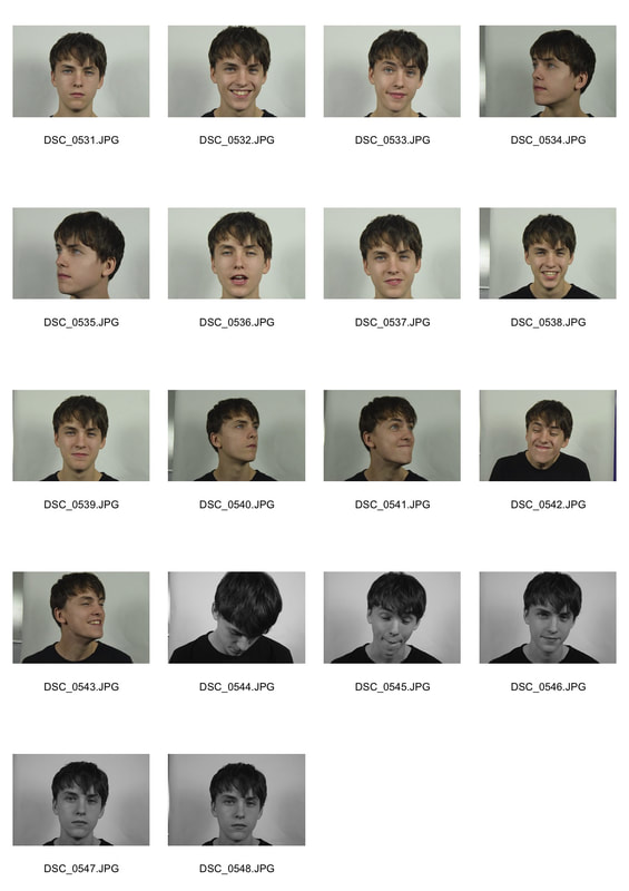
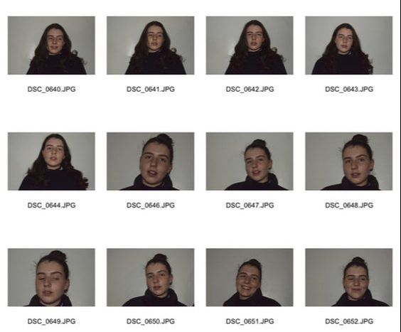
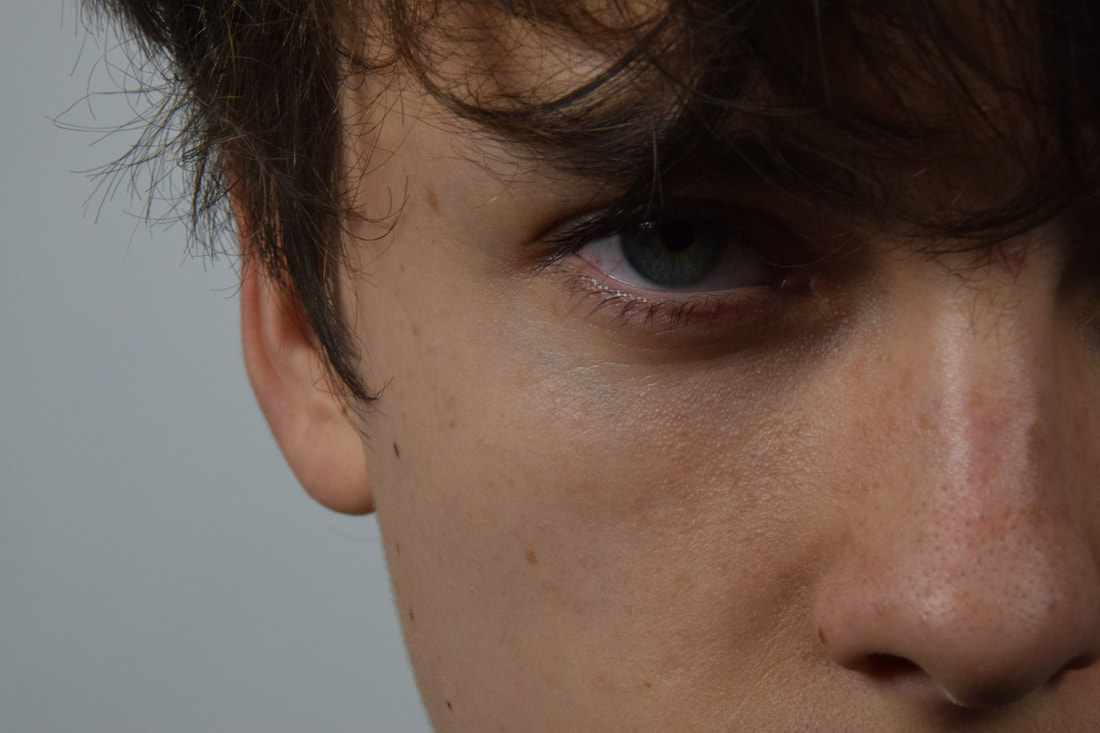
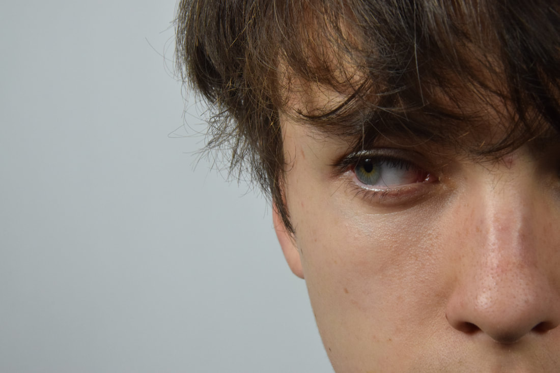
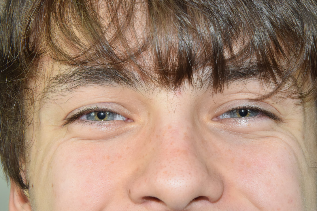
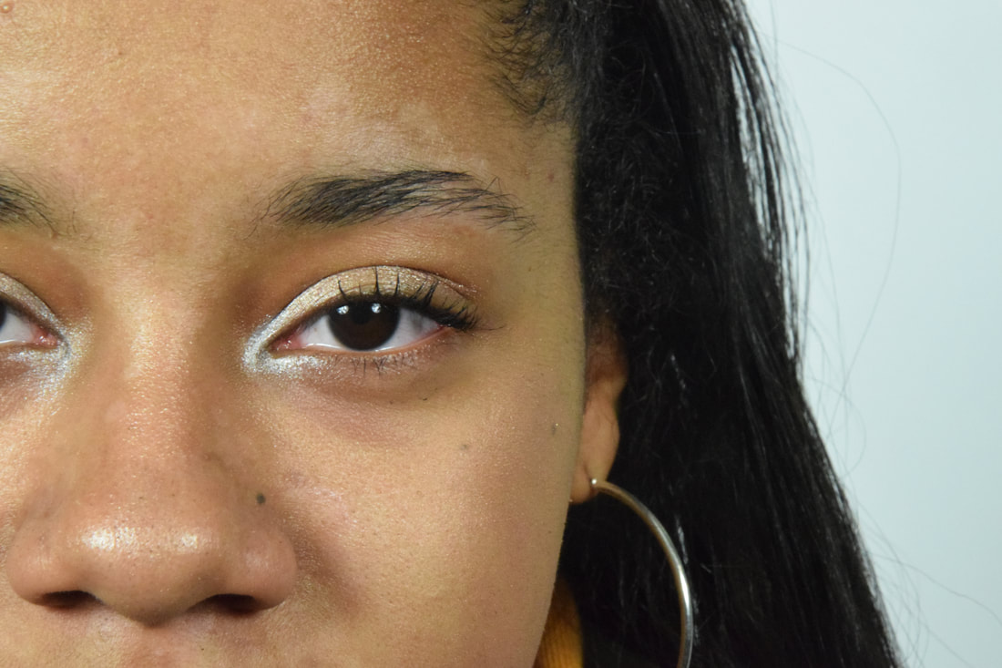
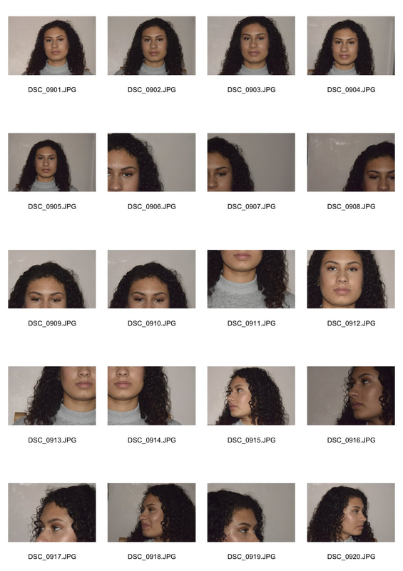
Strand 3: Posed vs Natural
Nils Orth
Nils Orth is a photographer who is very interested in peoples portraits, he wanted there details and emotions to be shown through the pictures. He wanted people to see the imperfections on their faces and see that it was beautiful, even though it was not the conventional beauty in society. The photos were taken to make an impact on peoples views, his exhibition did this so much that people visited it more than once. The photos are of many different peoples features merged together to create this subjective beauty. Examples of his work are shown below.
|
|
I wanted to express emotions and texture through my photos, in a similar way to how Nils Orth does in his. In order to do this I photographed peoples portraits in studio conditions, ones of them posed and ones more natural when they were laughing. I did his so that the contrast in there facial features would be highlighted. In order to put emphasis on the textures of peoples facial features i had to photograph people with imperfections, as clear skin would of not worked for showing texture. In order to put emphasis on their features i used the black and white tool in photoshop, this put the photo in black and white and then allowed me to alter which colours showed up the most. I mainly used reds and yellows to highlight the imperfections, however this made their skin very dark and so i then altered the levels to brighten the background and skin.
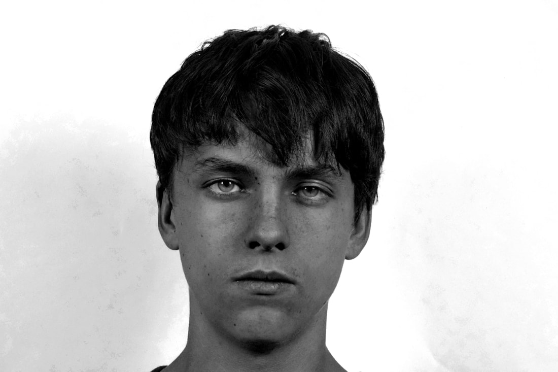
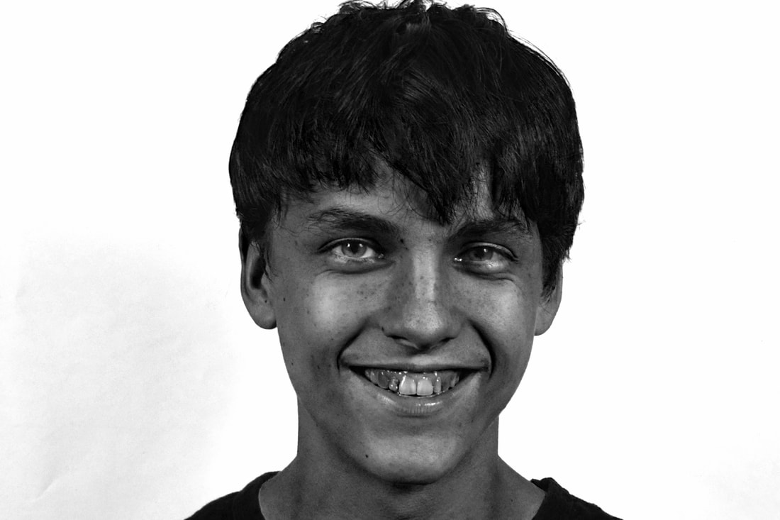
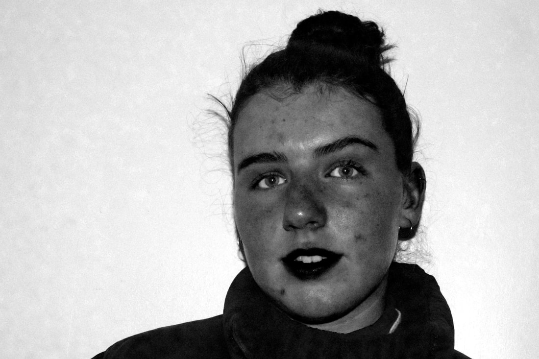
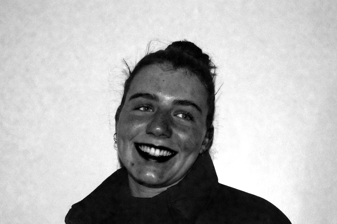
The first picture does not show the imperfections in as much detail as i would of like it to, i could have improved on this by taken the picture closer or sharper. I was unable to change it to be like this in photoshop as it would of made his skin too dark. However the second pictures where he is smiling hows the texture of his skin better and more clearly. As well, the texture of his hair is seen more in this picture as it is not as dark. In the photos of the girl both work well in showing her texture, this is because i darkened them more. However this meant that the background became less sharp and pixelated due to the fact the image was taken with flash, the first ones of the boy were not and so this was not an issue. The blurry background may draw attention away from the texture and detail of her.
Overall the images would have been better in depicting the texture like Nils Orth if they were done closer up and in sharper focus. Nevertheless the texture and imperfections of the skin were still highlighted and attention was drawn to them.
Overall the images would have been better in depicting the texture like Nils Orth if they were done closer up and in sharper focus. Nevertheless the texture and imperfections of the skin were still highlighted and attention was drawn to them.
www- has explained what her intentions are with the photos and how it relates to the artist, and really good explanation of process on photoshop and really good description of what you thought went wrong in the photos and then good evaluation of how you thought the textures looked good in the photos of the girl
ebi- maybe reference the artist a bit more in your paragraph about the intention by maybe rephrasing some of his ideas and then comparing it to your own.
ebi- maybe reference the artist a bit more in your paragraph about the intention by maybe rephrasing some of his ideas and then comparing it to your own.
Development on posed vs natural
I decided to develop the strand on people, instead of the ones on buildings and nature. This is because I thought that a lot more could be done with the bodies structure of men and women, than with buildings and nature.
Removing features portraits
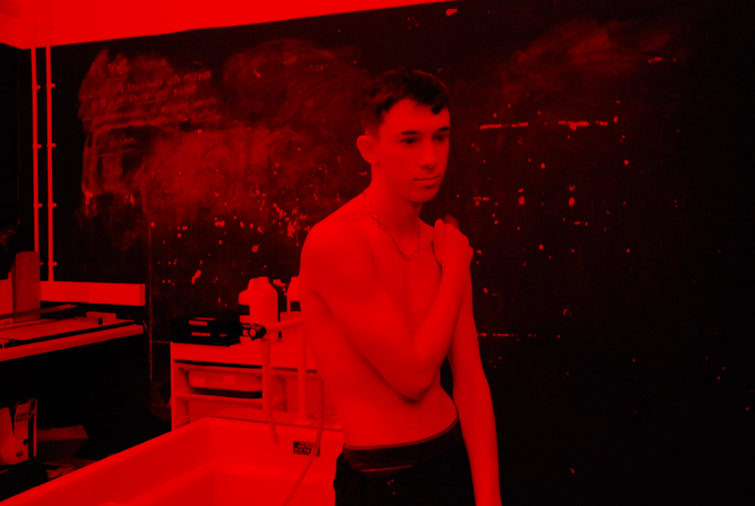
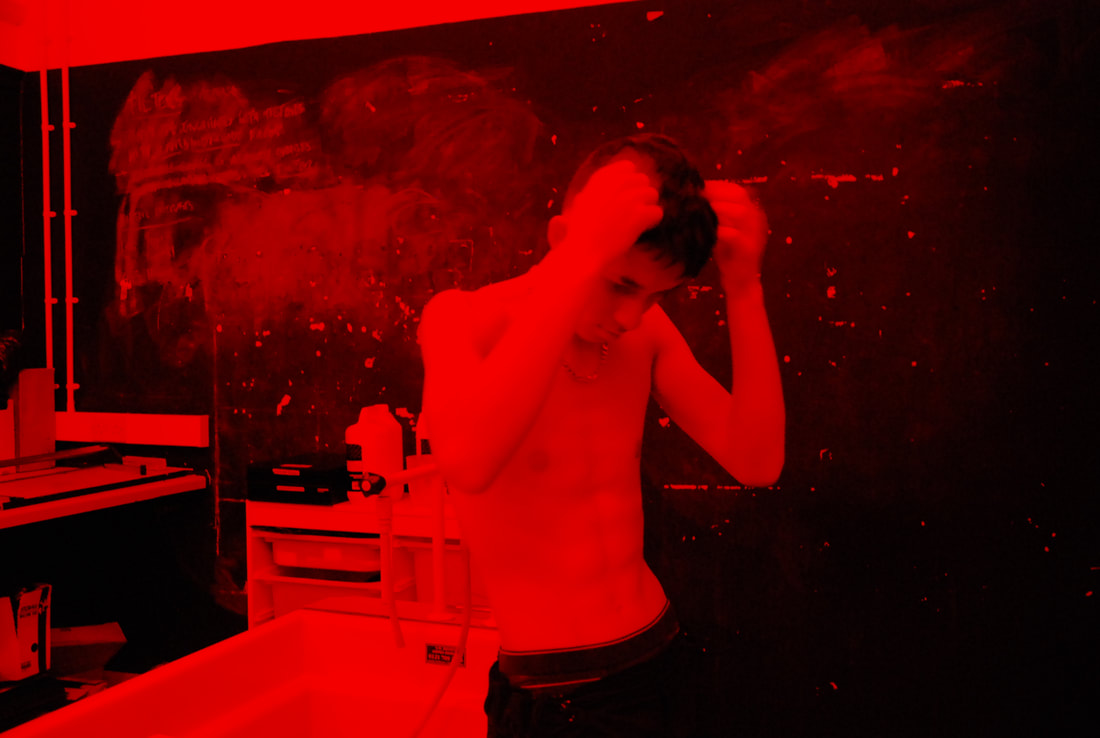
Carrying on from the portraits above, which focused on highlighting the imperfections and texture of their faces. This development was about getting rid of key features, such as the eyes and lips so that the focus was the rest of the detail in the portrait, Such as the hair. I wanted to do it in the dark room and make photograms, so that the light and dark features would be prominent.
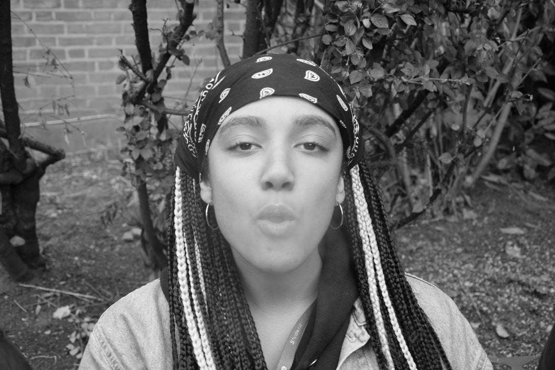
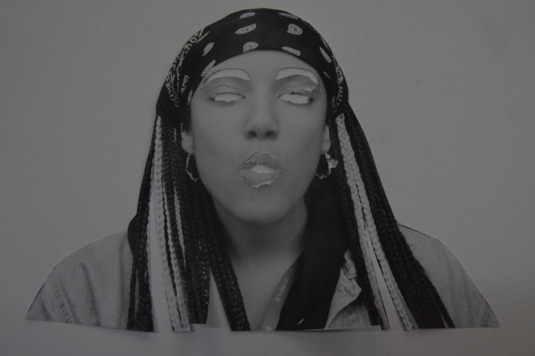
I chose to use this photo as she has light and dark features such as her hair and bandana, i thought these would contrast nicely in the photogram. Using a stanley knife I cut out key parts, such as the eyebrows and eyes so that more focus would be on the detail of the hair.
I used different exposure times in each of the four photograms i made, the longest exposure time was done on the one on the left and the shortest on the right. The longest time was around one second and the shortest was around half a second. They were all left in each of the solutions for roughly a minute. The most detail was shown in the third photogram, this is due to the exposure time. Also this was the only one that I placed a glass sheet over to flatten the image. This may be why the most amount of detail was shown.
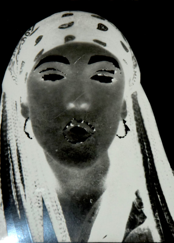
The detail in the bandana and hair are shown very well in this photogram, as well the contrast in the dark and light features help to portray the detail and texture further. Although due to the glass being placed on top, the photogram became more pixelated and scratched. Giving it an old, worn feel. This was not the intention, however it works in giving the photogram more depth.
Figures in colour
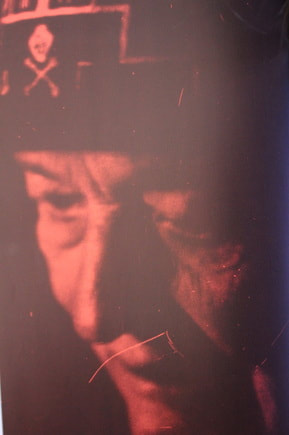
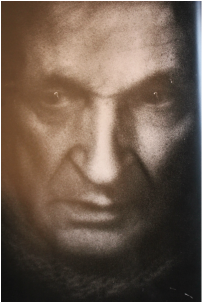
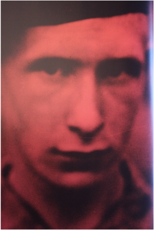
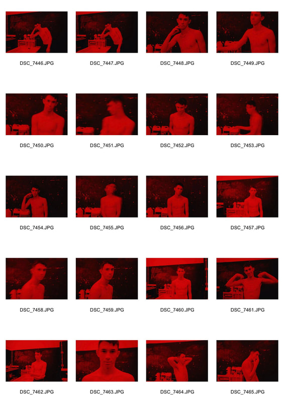
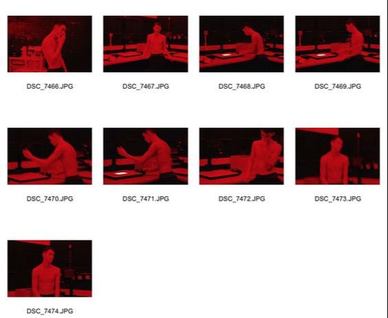
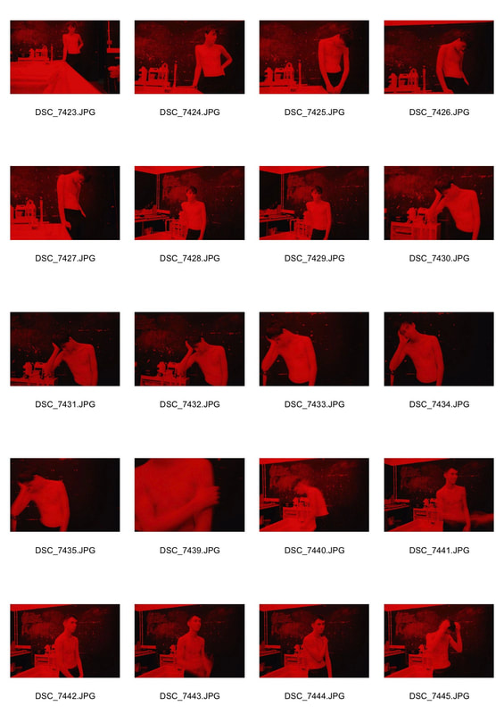
Deborah Turbeville
Turbeville was a fashion designer before becoming a photographer in New York, her photography has a unique and old fell to it as her photos are usually blurry, grainy, tormented into painterly colours, scratched, marked or sellotaped. She was fascinated by the beaten, worn and forgotten which is evident in her photos, she wanted to give them a ghostly or an old memory feel to them. Some of her work is shown below.
|
|
I wanted to use the red tint in my photos like him Turbeville does in order to give them a deeper meaning and different effect than just photographing in normal lighting. In order to get this red lighting I used the dark room as it is already a room with red lighting in it. However this meant that there was less natural light to take the photo and so the shutter speed was very slow, meaning that the photo was exposed for longer. This made the photos blurry like Turbevilles are, although I preferred them in focus and so used a tripod to steady the camera. I preferred the photos when taken with a tripod as they were a lot sharper, detailed and of a higher quality due to the long exposure time.

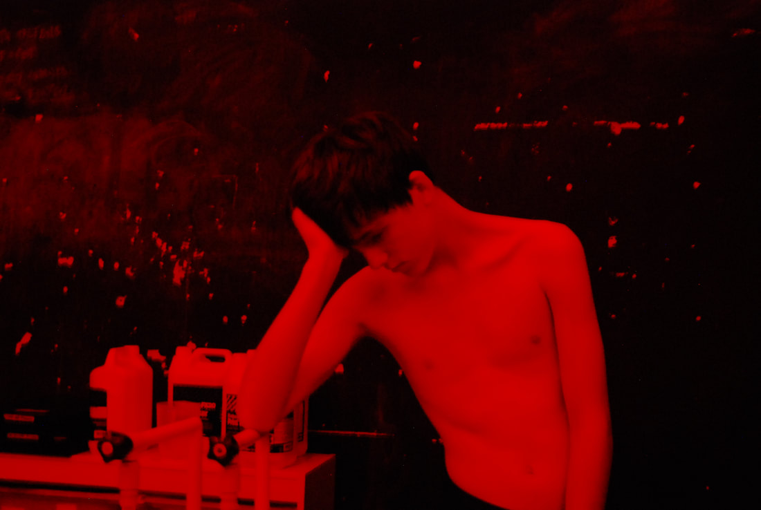
Overall the red lighting worked well in all the photos by creating a different aesthetic and a deeper meaning to the emotions of the figures, then would of been portrayed in normal daylight. In the fifth photo the shape and form of his arm and body shifted to the right, create a path for the eye to follow round, the lightness of his body contrasts with the black background. In the sixth photo the projected white light contrasts to all the dark features in the photo. However photo one and four could be more focused on something, as there is not an exact focus in them.
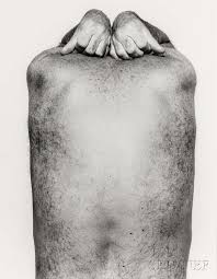
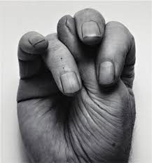
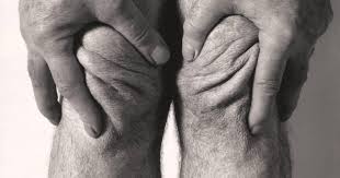
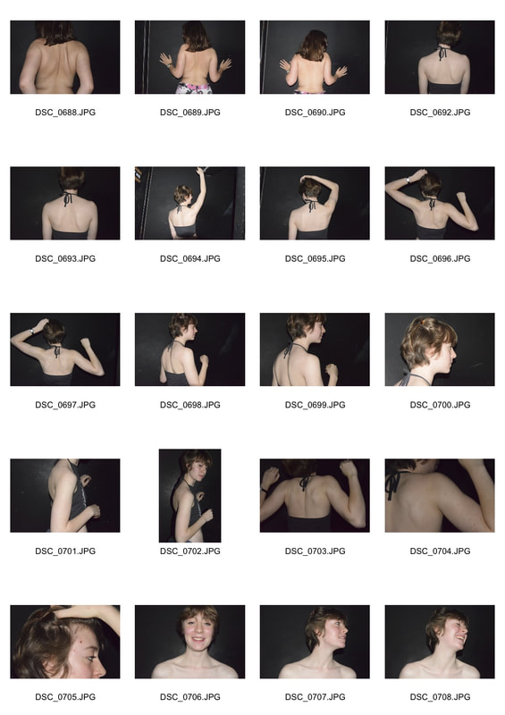
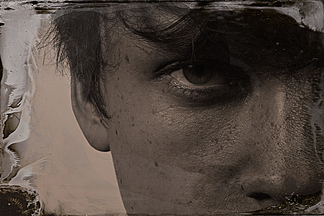
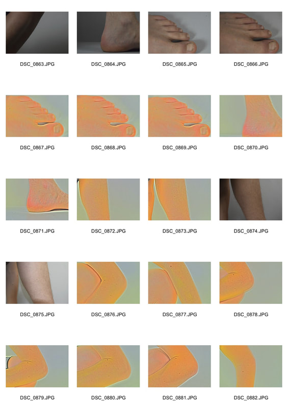
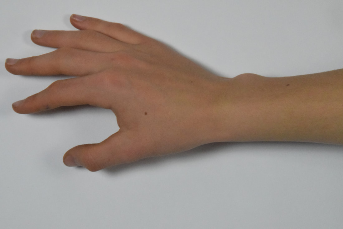
The Body
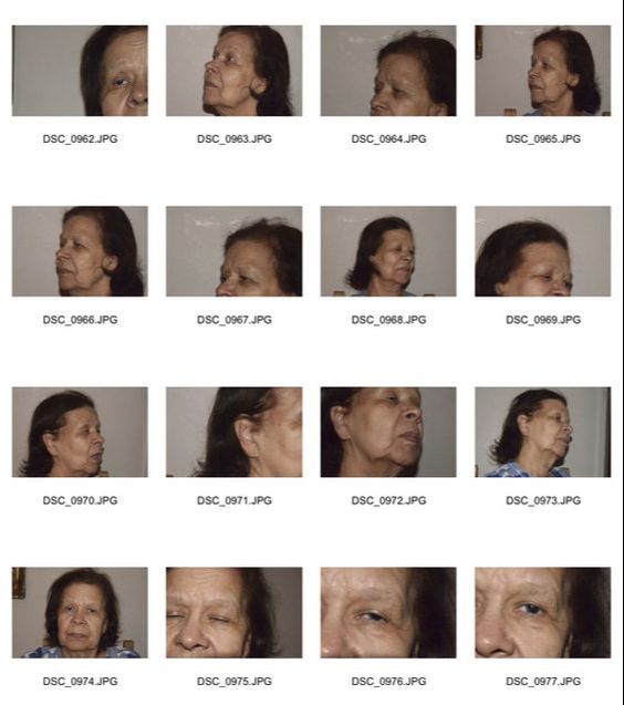
John Coplans
John Coplans was a british photographer of ageing bodies, before being a photographer he served in the army. When he stopped serving he decided to become an artist. He never photographed the face so that the parts he photographed did not have an identity and could be anyone. They are a series of black and white nude photos of the ageing body. He wanted to make people aware of the ageing body, most of his photos are self portraits. He says he does not take photos of his face as it makes him feel like he could be anyone in any time period.

|
|
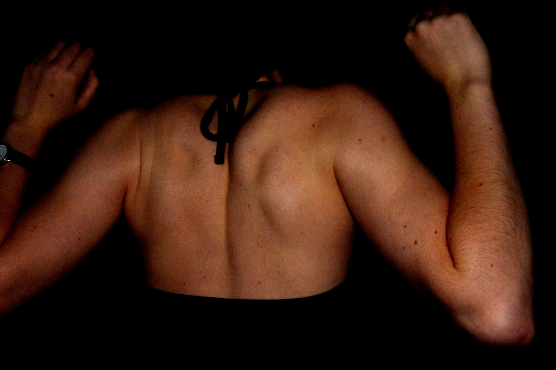
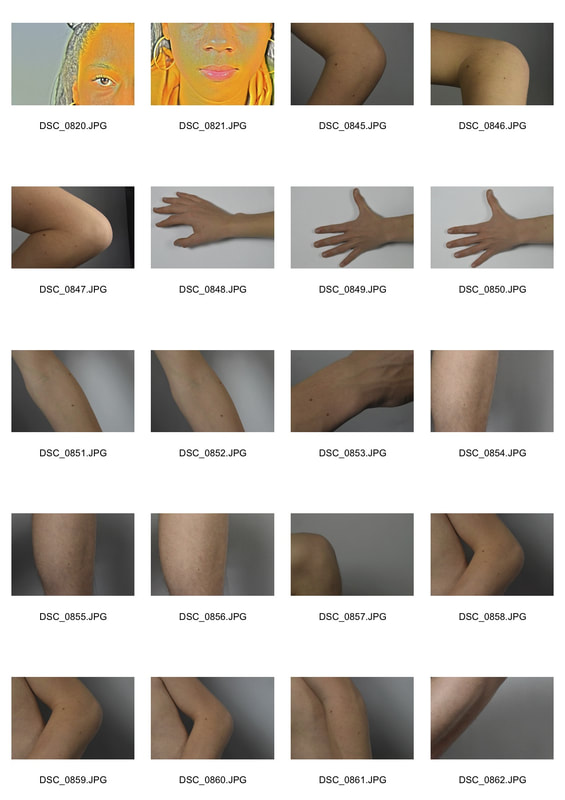
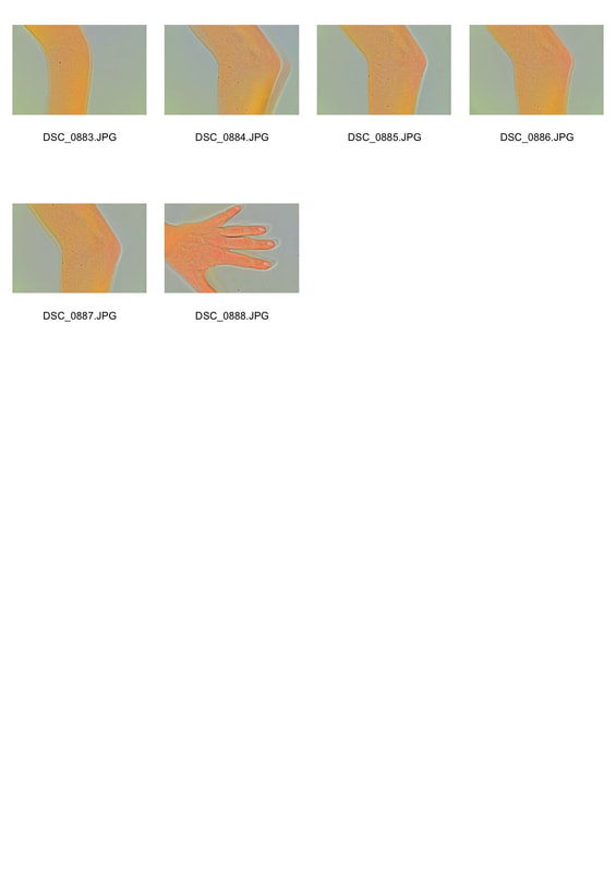
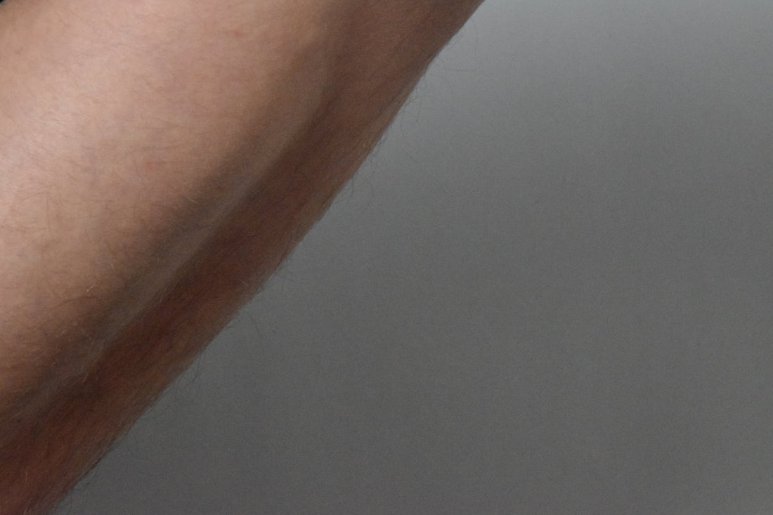
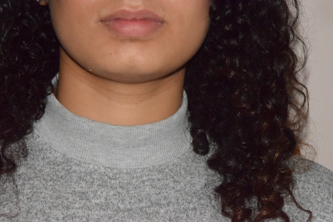
I decided to focus on the human back structure and collar bones. Unlike John Coplans who focuses on aged skin, i decided to focus more on the texture of the skin and features. Such as moles and freckles, this was a follow on from Nils Orth on the imperfections . I used a black background instead of a coloured one like the previous section, as it seemed more natural and simplistic. This was good for these photos as it meant that all the focus would be on the body not the effect of the lighting.
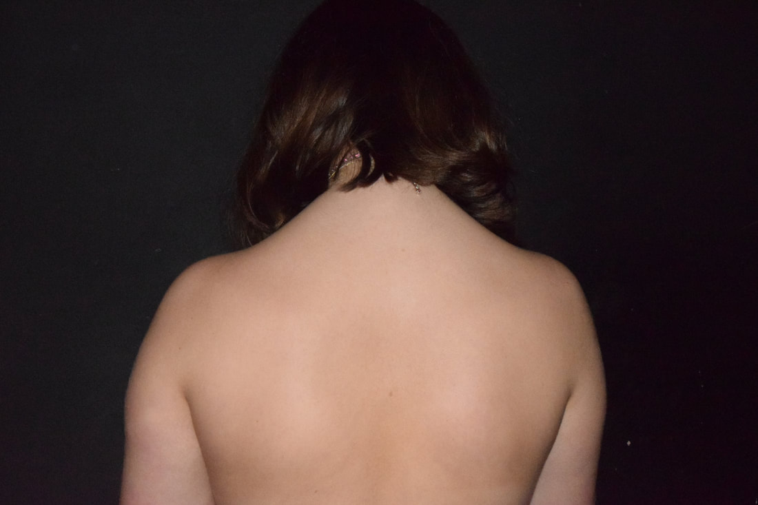
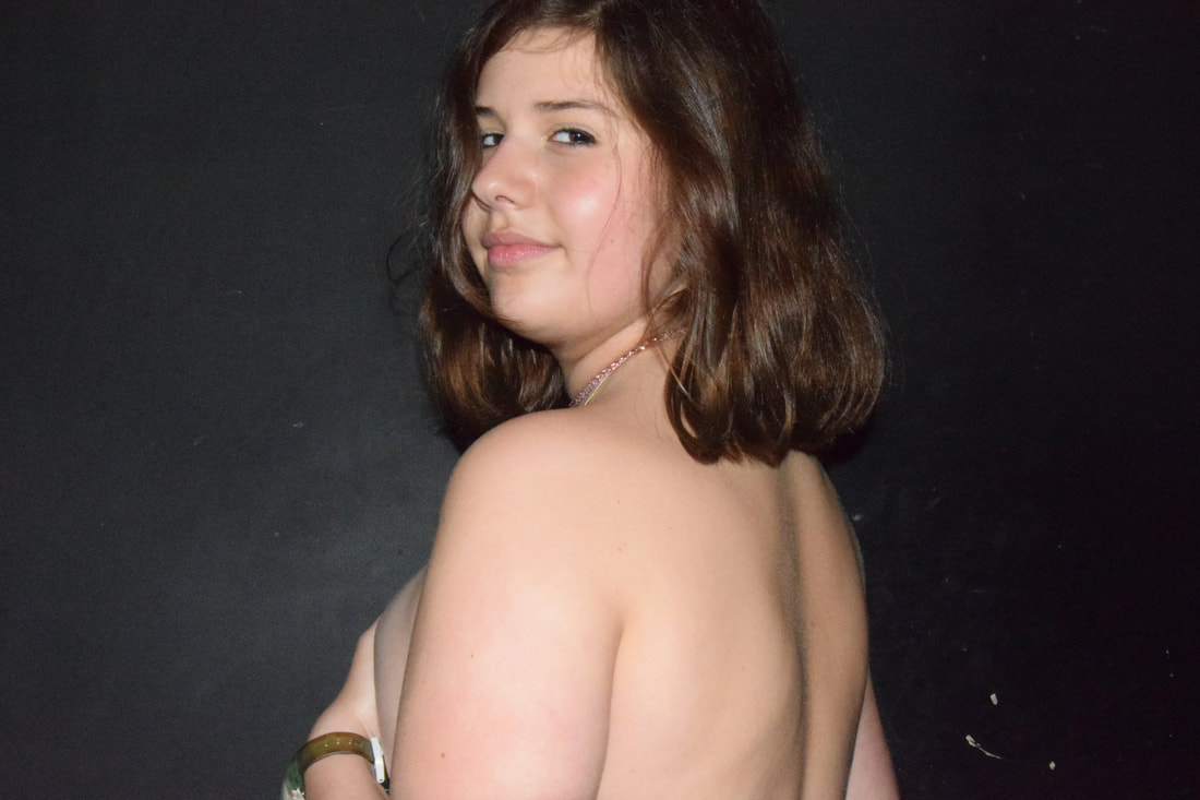
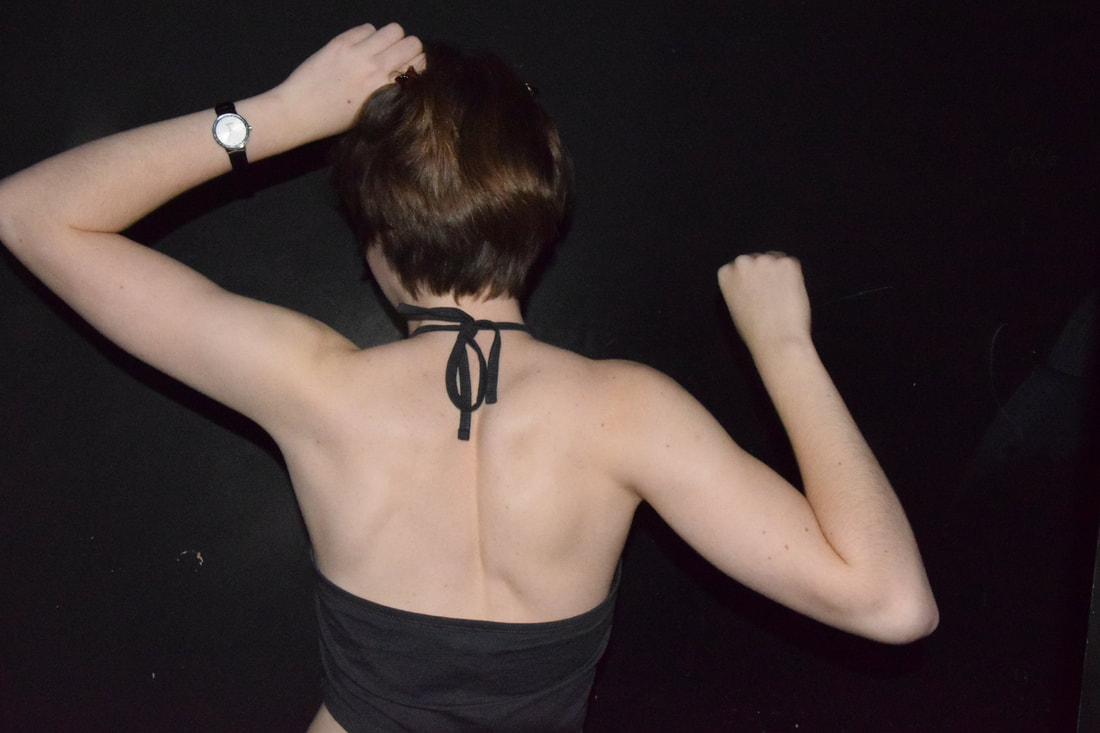
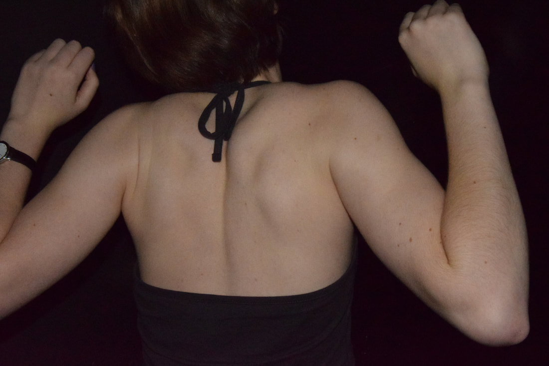
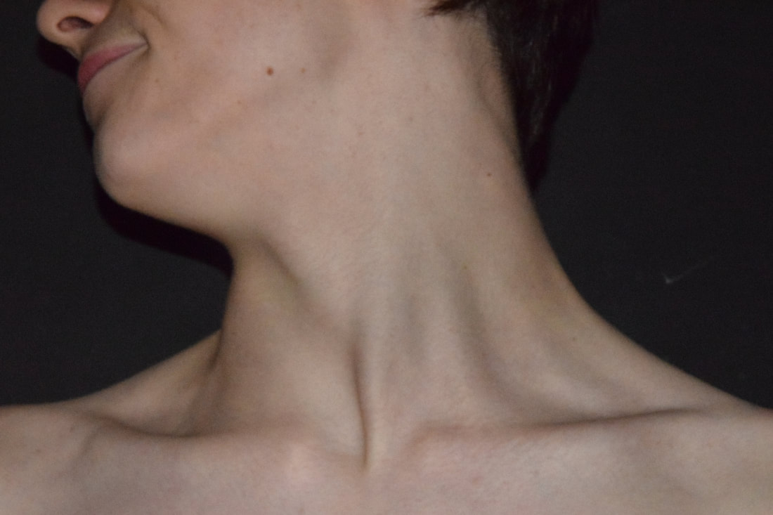
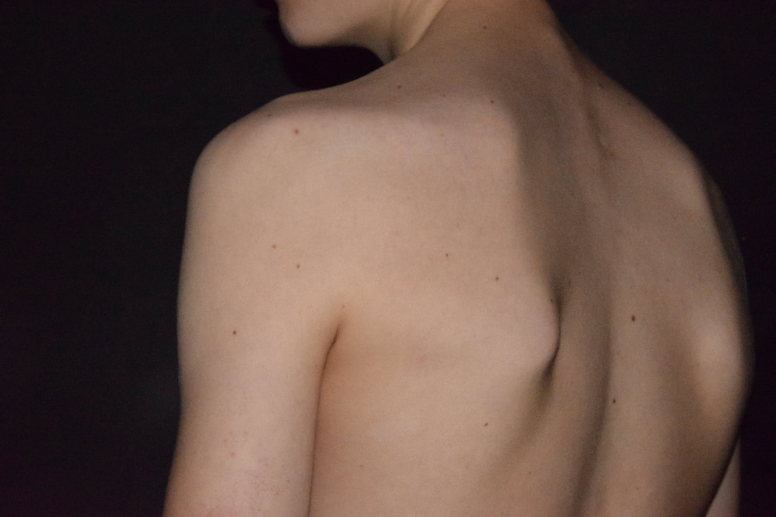
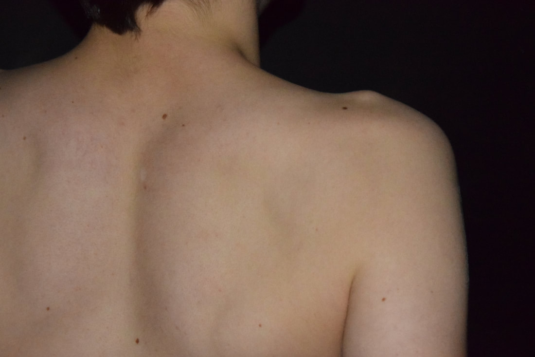
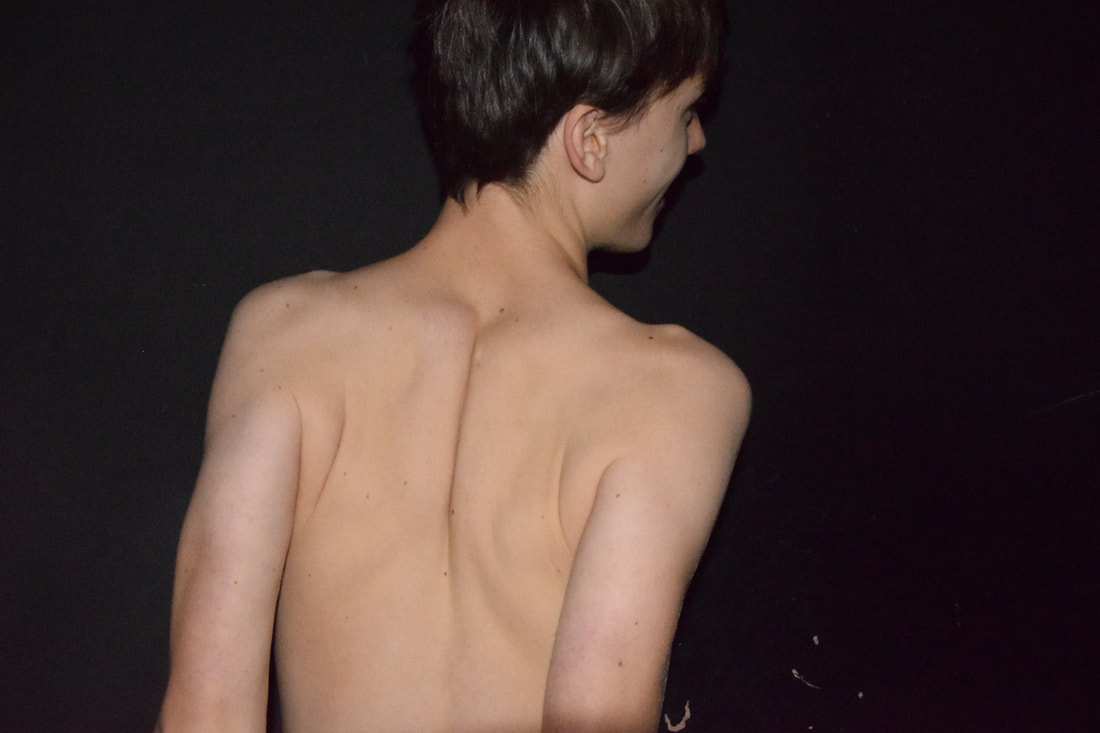
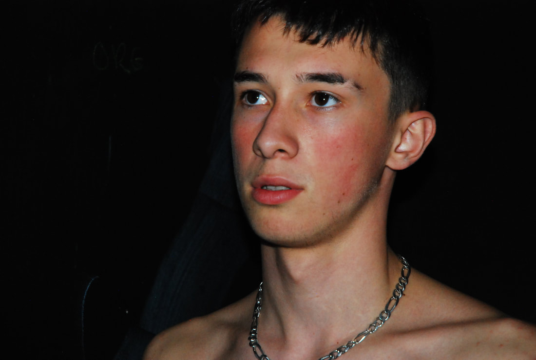
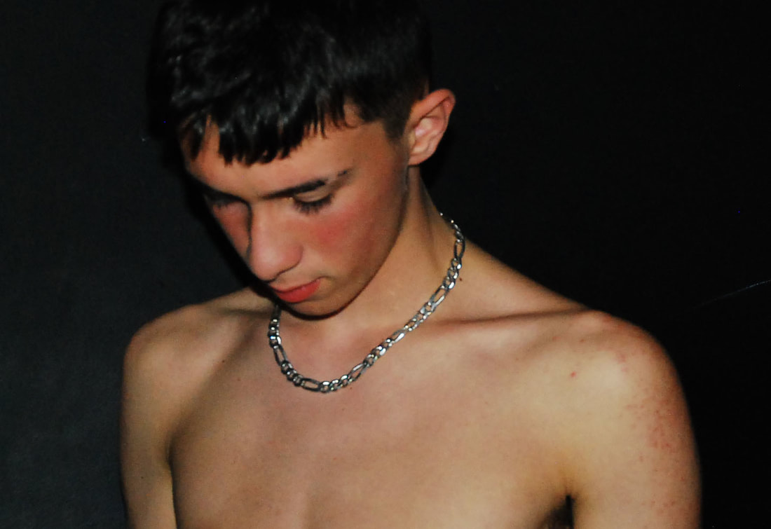
I took these photos with flash which helped to highlight the contrast of black background with the lighter skin colour. The photos that i think worked best were the ones that focused on one part of the body, for example the sixth, seventh, eighth, ninth and eleventh. The sixth worked well due to the texture of the hair and how it falls, also the way she is looking with her eye adds emotion to the photo. The seventh photo highlights the bone structure of the collar bone well and focus of the photo is aimed on it due to the zoom of the photo. The angle of the eighth photo and the isolation of just the back, helps to focus on the skin features and give the photo depth due to the shadows. The eleventh photo best shows the detail of the facial features, the emotion and the structure of the collar bone. However some photos could be more focused on a certain part of the body, foe example the tenth photo could be better if it was zoomed on the back lines or shoulders.
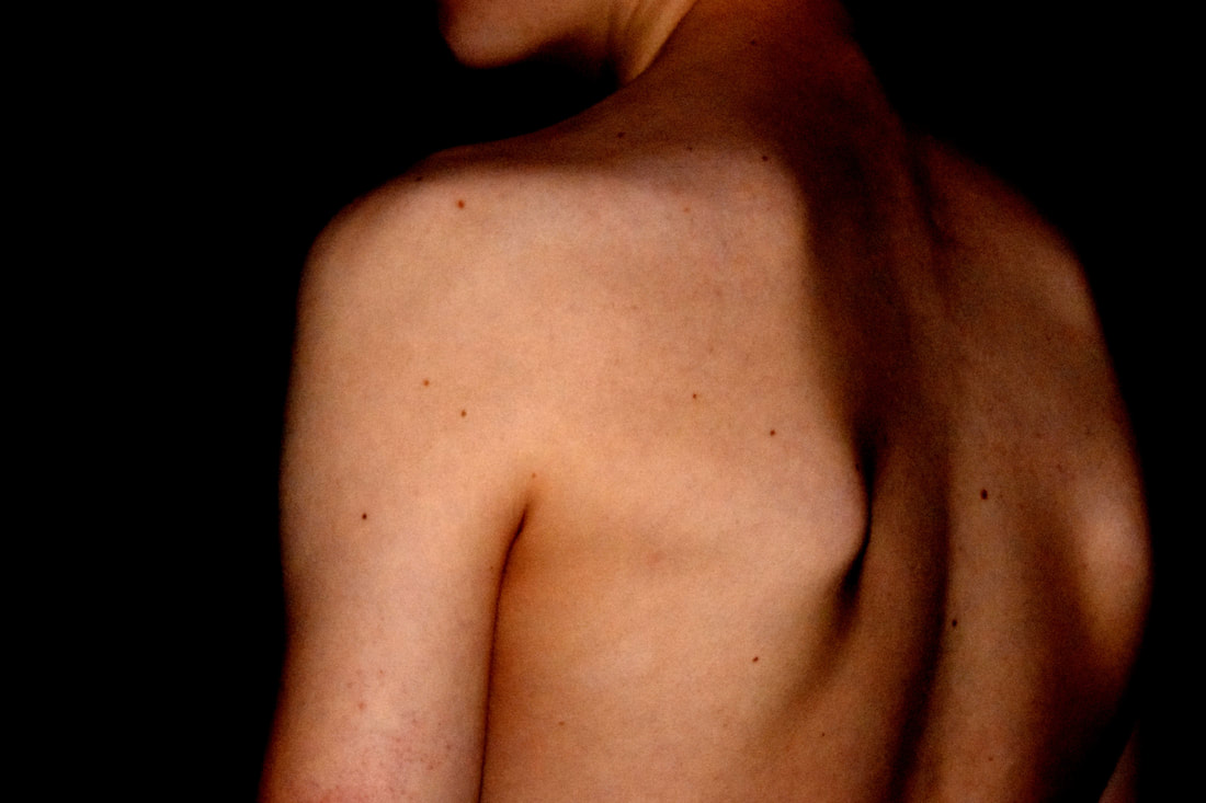
Here I edited my favourite photos by using different levels on contrast. Because when taking the photos flash was used, the photos appeared to look more 2D than 3D. Due to this, I decided to edit them to give the photos more texture and a more 3D effect. I used these two photos because they, like John Coplans, had no identity to them and focused on a certain part of the body. The upper back features. The freckles help to show the texture of the skin, much like how Nils Orth photos. The levels helped to apply shadows and apply a more painting effect. The second photo may have been better edited if it focused more on just the arm or just the back.
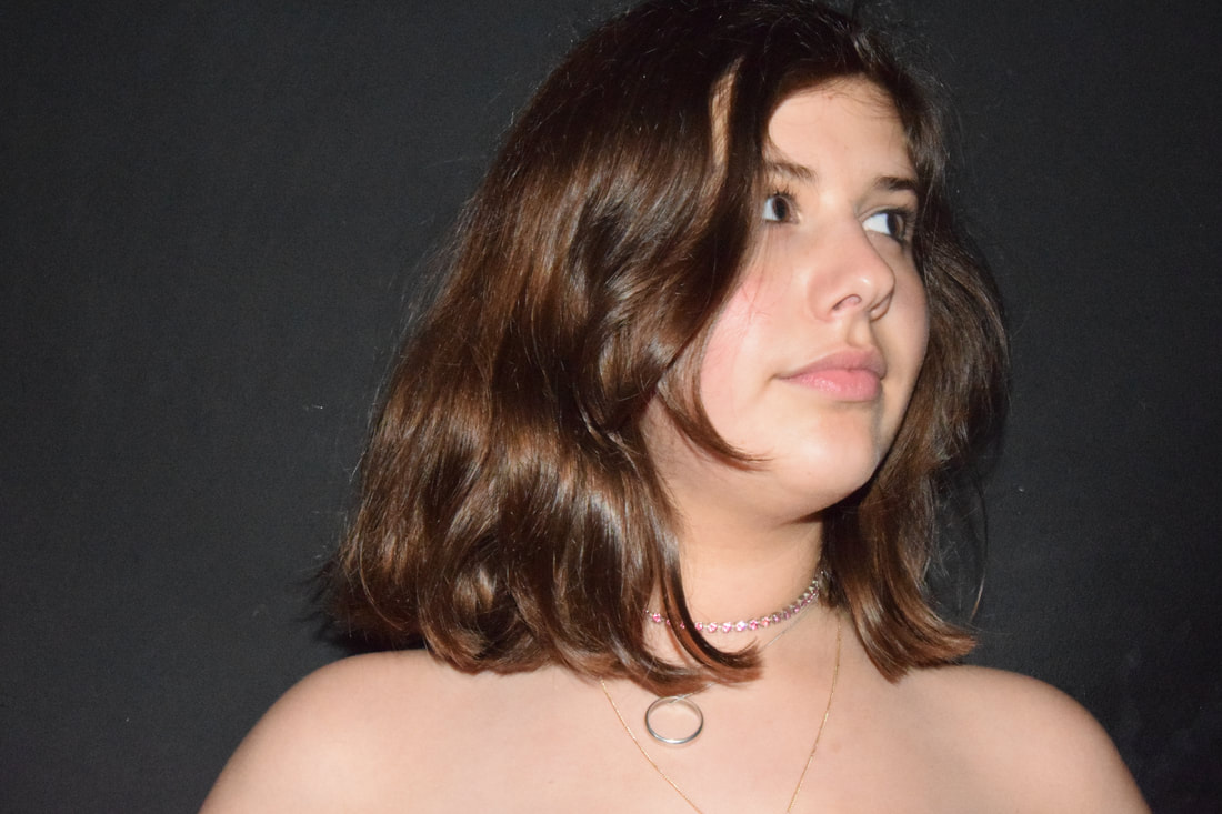
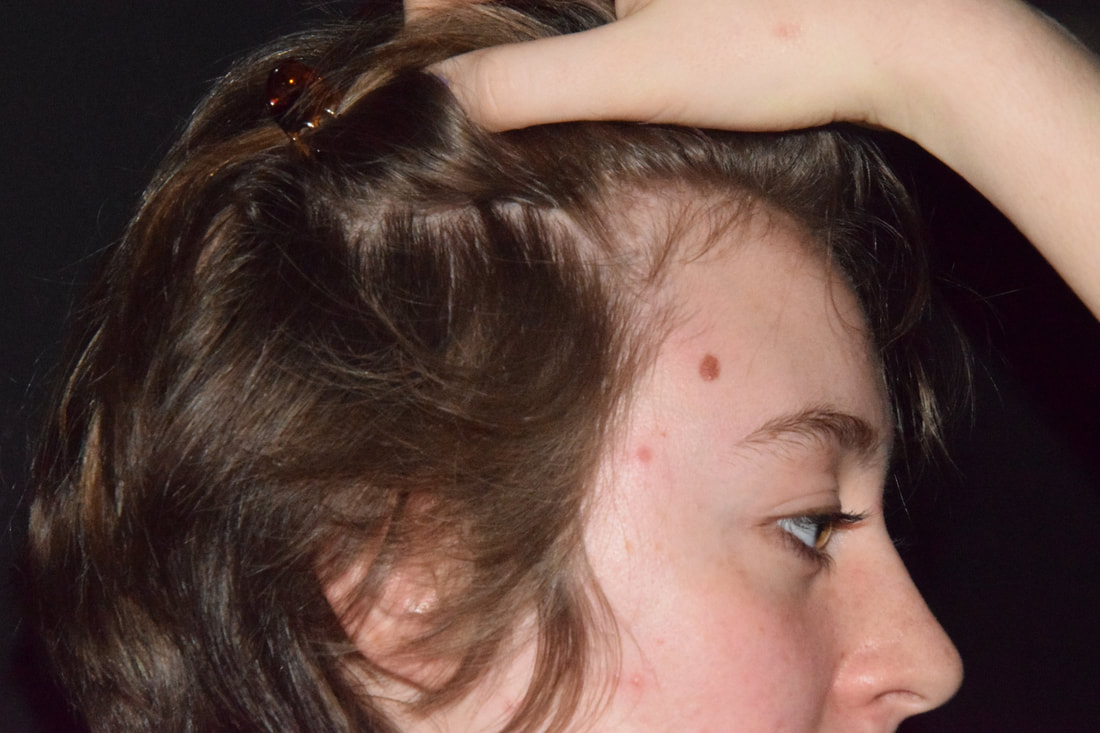
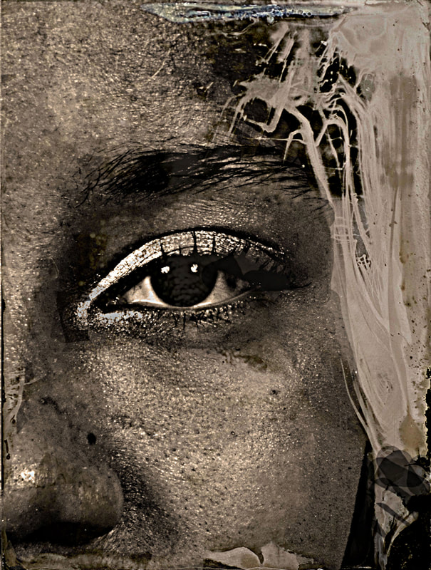
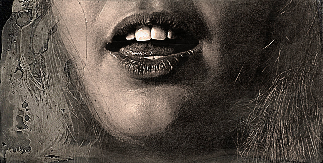
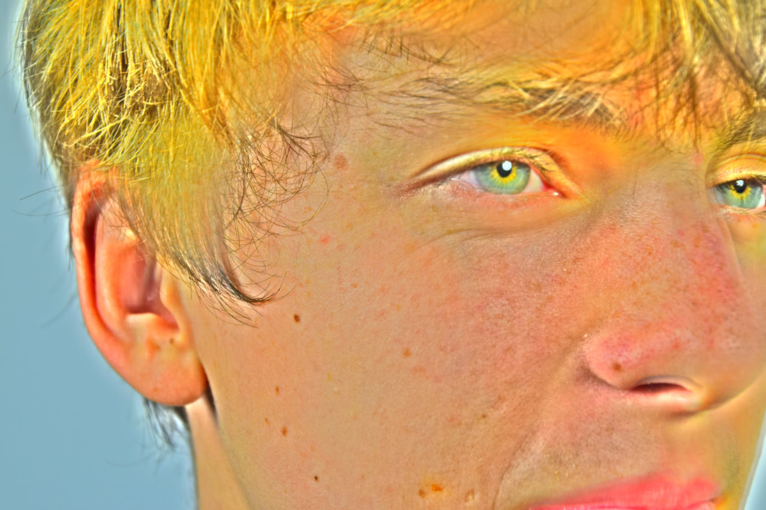
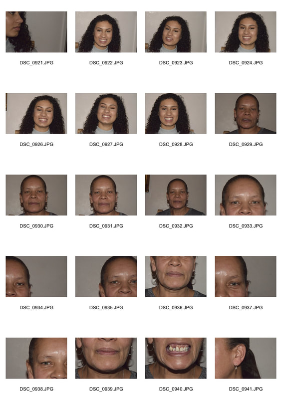
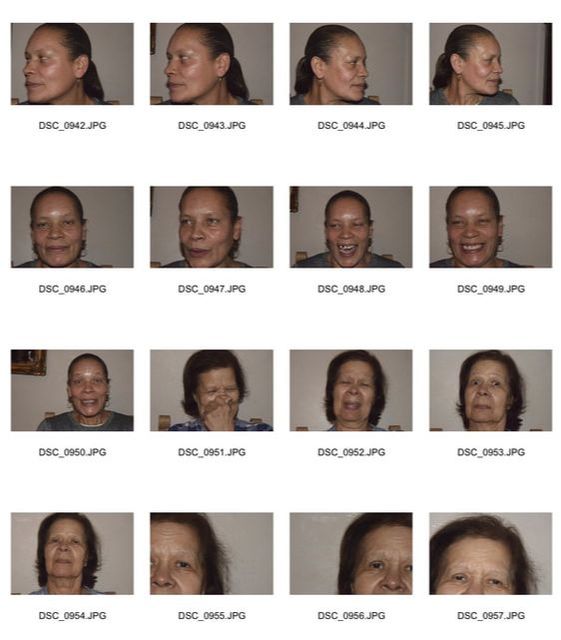
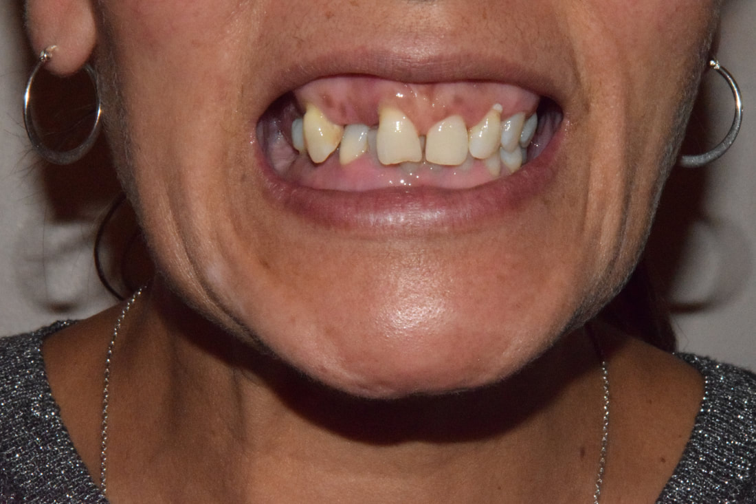
Myra Greene-character recognition
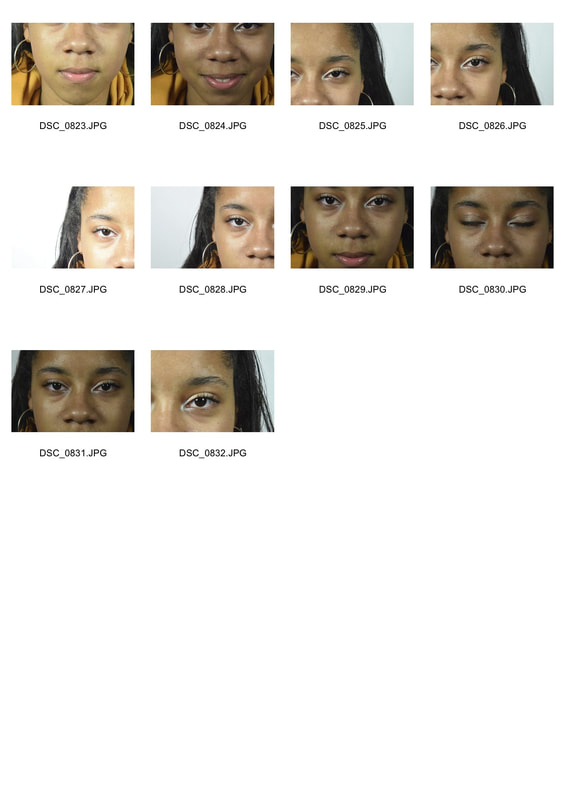
Myra Greene is a photographer who was very interested in race and how we can try to judge someones charter through their features. In this part of her photography career she decided to focus on close up features of black americans, it was a series she done shortly after Hurricane Katrina. She was shocked at how some of New Orleans’s black residents were left to fend for themselves or worse. She made this series of black-glass ambrotypes, taking glistening close-ups of their facial features, as shown below.
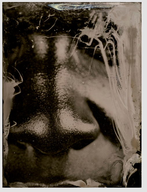
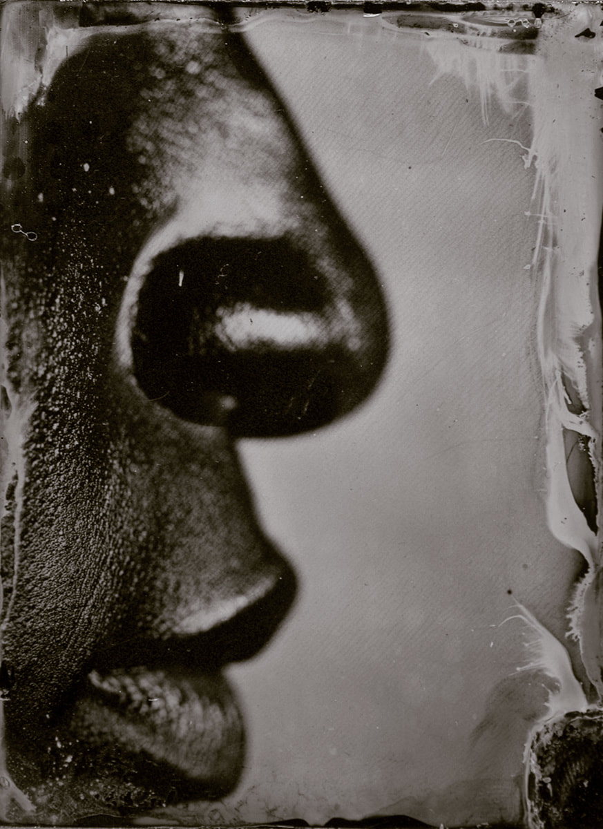
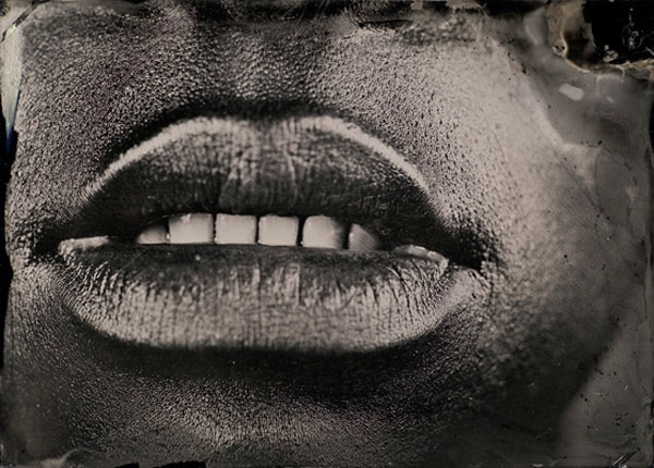

|
|
These photos were taken in studio conditions with a white background. I used a tripod close up to the face to stabilise the camera, also i used a high aperture to highlight the detail of the skin and facial features. I focused on taking pictures of certain areas of the face like Myra Greene does, for example areas of the mouth, eyes and sectioned off areas of the face.
In the first two photos I focused on areas of the mouth and how the lips portray the emotion of the photos. They both have a playful feel to them due to the shape of the lips. The next photo came out a bit dark due to the high aperture so less light was able to enter the camera. However the serious emotion is portrayed through the straight look into the camera and the shadowing of the hair. The next portrays a confused, contemplating look. The negative space helps to create this. The next portrays a happier effect, due to the features of the eyes being the main focus of the photo. The creases around the eyes and the bright green and yellow of the eye creates a happy atmosphere of the photo. Aswell the face fills the whole frame which highlights the features. The last photo, similar to the third, has a serious atmosphere due to the straight look. However, the colour of the eye is lost, this could have been fixed by taking a closer picture of the eye.
These are the steps I took to create an effect on my photos similar to Mrya Greene's photos. The first step was to put my chosen photo into the black and white setting in Photoshop, and then use the adjustments of the colours to highlight the facial features. I mainly used the red and yellows to bring out the skin features such as the freckles along the nose, the other colours were mainly used to highlight his eyes. This step was in order to give the photos the sharp clear detail Myra Greene's have. Next I flatten the image so that I would be able to tint the colour of the photo, I used a sepia tint to give the photo a warmer and older impression. further developing the old worn down effect to the edges of the photo, I layered Myra Greene photos and edge effects similar to the ones her photos have on top of mine. I then changed the capacity of the photo so I could see mine underneath, and then changed the capacity of the rubber and used it to rub out the parts of the layer on top I did not want. After, I sharpen each layer so that the skin features where highlighted and the layer on top was seen more. Lastly, I duplicated the layer on top so that it would enhance the worn out, scratched glass look.
In the first photo black and white features where highlighted the best due to the eye shadow make up she is wearing around her eyes. The photo fills the frame and so the viewers are more drawn to detail of the features. The skin in the photo also has a glistening effect on it, similar to the eye shadow. This is due to the sharpening tool on photoshop. The straight look into the camera lens portrays a serious meaning from the subject in the photo. The edges are a bit roughly rubbed out in the bottom right corners, however the effect adds to glass print effect Greene's has. The second photos detail of the skin has been lost in parts and could of been highlighted better by a more up close photo, however the deep emotion portrayed through the intense stare is crucial to the photos atmosphere. The third has a happier feel than the others, this is due to the eyes capturing the happy emotion from him laughing when the photo was taken. This photo fills the frame and so the details, such as the freckles along the nose, are sharper. The layer on top created a steamed glass look, again making the photo have a warmer atmosphere than the others. The last photo focused on the lips, by using photoshop to adjust the colours of the photo, the detail of the lips was enhanced, making all the creases visible. This gives the photo a clear raw effect, much like Myra Greene's has. I used the open mouth rather then the closed mouth photo, as the contrast in the white teeth and black lips was more interesting. The layered effect works well around the edges of the photo, as it frames the face well. The first photo is the clearest and most raw, linking to Myra Greene's glass effect. So it may have been better if they were all done to the same quality.
Also I tried to create the effect Myra Greene's photos have not using photoshop. First I printed out two versions of the photo, one on normal paper and the other on photographic paper. I then covered them in image maker to give the image texture, after they were covered I placed plain paper on top of them and waited for them to dry. Meanwhile I printed another on photographic paper and placed it in bleach. The bleach gave it a frosted over effect, however the skin texture was lost in doing this as the bleach drained the colour from the photo. This is shown in the last photo. Once the image maker was dried i used a sponge and water to rub off the layer on top to give it the rough frosted over look. It worked better on the photographic paper in picture 4 than on the normal paper in pictures 2 and 3. this is because the image maker and water changed the colour of the photo on the normal paper. The 4th and 5th turned out the best due to the photographic paper and the texture remaining in the 4th.
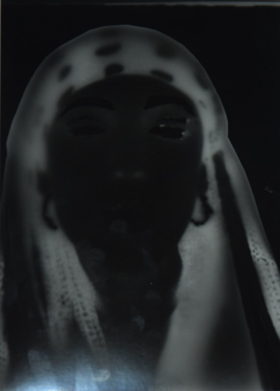
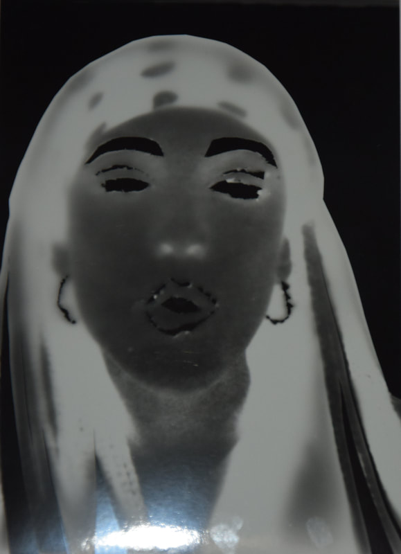
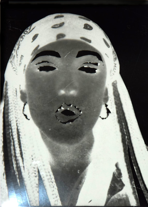
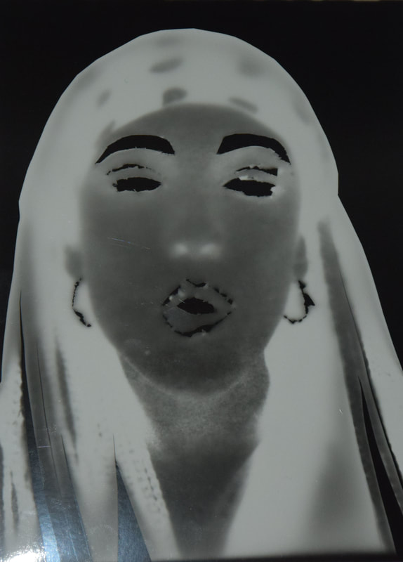
Myra Greene-self portraits
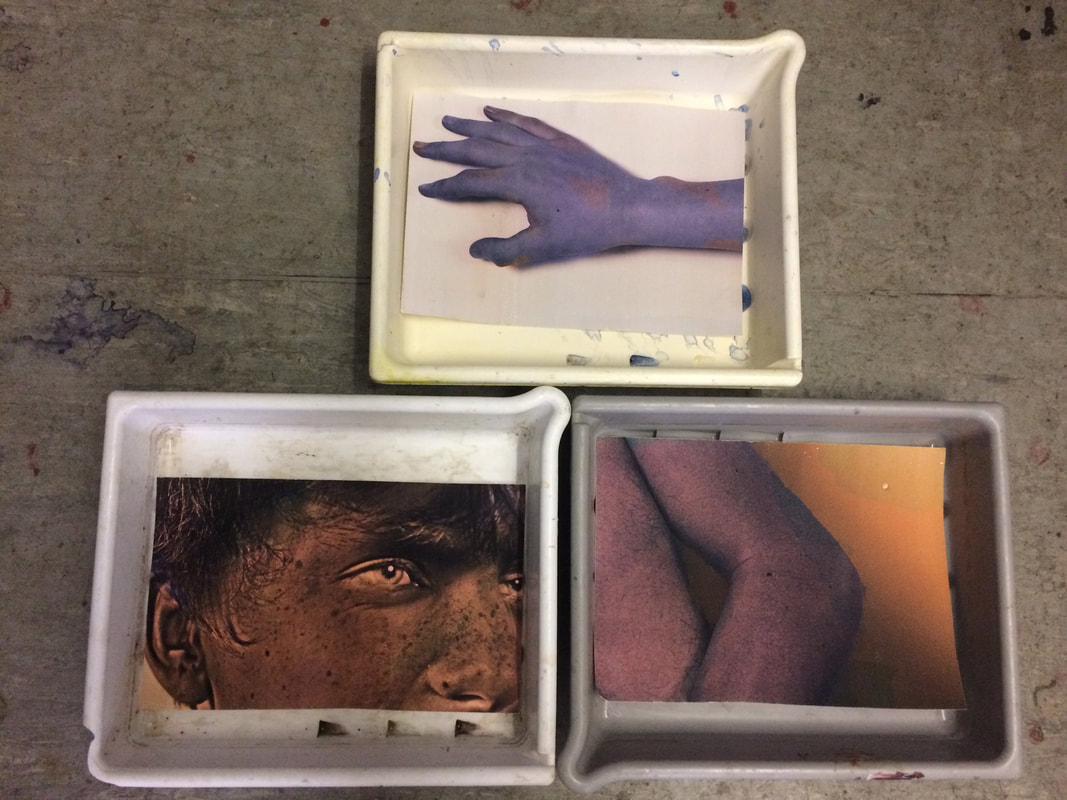
In this section of her career she was focusing on isolating body parts more than facial features. She made them dark and gloomy as it reflected part of her life. She wanted to make her body into this dark state not just her mind mentally. She was also interested in the scratchy effect of the watercolour paper. She made them by polariods and making prints through photos by using different papers, she wanted them to have various layers and sprayed them with hydrogen peroxide to create these bubble effects. She also tore the sides to make them look more like prints, she them to be one offs and look like prints but still be photos.
|
|
These photos were taken with a high aperture and some in a HDR filter on my camera. I used the HDR filter as I thought it would highlight the detail in the body parts, also the colour it produced could have been toned down in photoshop to get the colours Myra Greene has in hers. I focused on isolating body parts in an abstract way, I did it against a blank background to get simple isolated photos. ( To give the photos seem like scientific documentations).
The HDR gave the first photo more detail and gave the eyes a unique bright colours, layering them from green to white. It also put emphasises on the skins details. However the angle of the image and how it fills the frame is a bit unusual. The next three work well in isolating the body parts in an abstract way, as they could be mistaken for parts of the body they are not. I wanted them to be simplistic but also have detail on them, this is why I used a high aperture so the moles, hair skin indents would still be seen. The hand photo works well in isolating it from the rest of the body and giving it that scientific documentation effect I wanted them to have. The last photo shows the structure of the shin well however may not be the focus of the photo due to all the negative space.
I first changed the photo into black and white so that I could enhance the detail on the skin, then I flattened the photo so that i could apply a photo filter. Next I used photoshop to alter the colour of the photos, to give them that gloomy feel Myra Greene portrays through hers. However I did not do mine as dark, but still used the light, pastel colours. I mainly used blue, yellow and some green at different densities to create the effect the chemicals did on Myra Greene's. I selected certain areas using the select tool and used a photo fill to alter the colour. Once all the filters were applied I sharpen the photos, this was in order to make the photos detail more clear.
After using photoshop to change the colour of the photos, I printed them of onto water colour paper to give the photos more of a texture. Then I put them into trays of water to drain the ink from the photos however the colour did not drain that much. The next stage was to cover them in honey, I decided to use honey as it would give a golden gloss and look like the bubbles on Greene's.
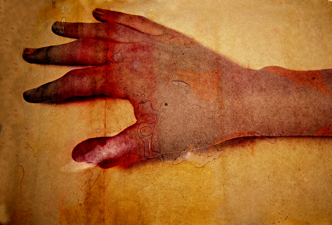
The hand worked well in looking like an isolated part of the body, as if it was not attach. Moreover the shadow underneath the hand makes it a more 3D. The blues give it a cold eerie feel, however the orange sections may be too specific in where they are and may need to be more random, in order for it to look like chemicals effected it not photoshop.
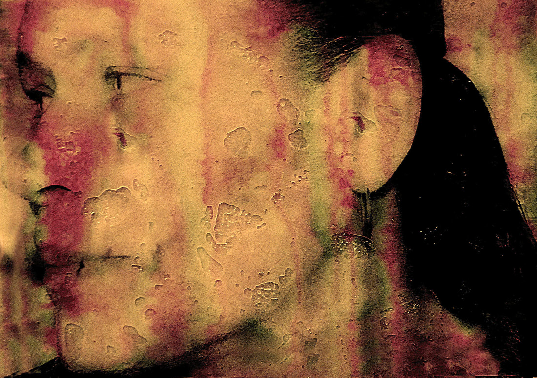
The detail os the skin, for example the freckles have been highlighted well in the face photo. The photo fills the frame unlike the other ones, which makes the detail more intense. Although it was harder to alter the colour of the face as it was more difficult to locate certain areas to select.
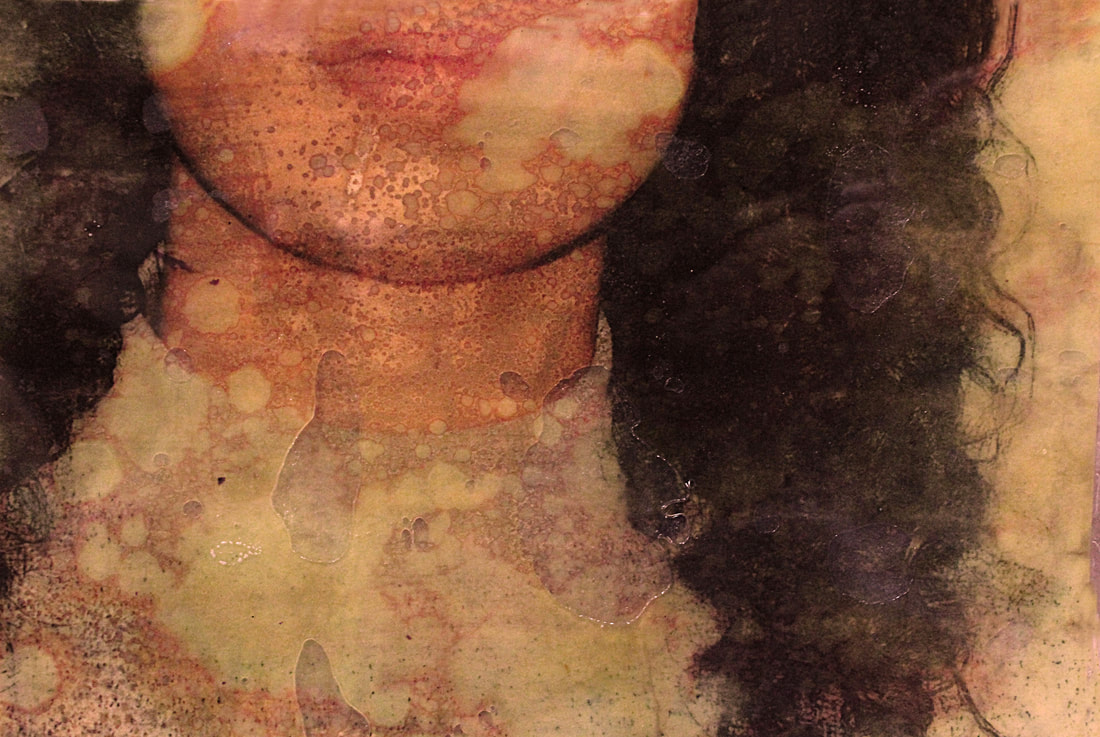
The last photo is most similar to Myra Greene self portraits. This is due to the colours used and the abstract form of the arm over the leg. Unlike in the hand, the colour look more natural in how the sections are selected. The purple, green and yellow all add to the gloomy effect portrayed in Greene's.
The hand worked well in looking like an isolated part of the body, as if it was not attach. Moreover the shadow underneath the hand makes it a more 3D. The blues give it a cold eerie feel, however the orange sections may be too specific in where they are and may need to be more random, in order for it to look like chemicals effected it not photoshop.
The detail os the skin, for example the freckles have been highlighted well in the face photo. The photo fills the frame unlike the other ones, which makes the detail more intense. Although it was harder to alter the colour of the face as it was more difficult to locate certain areas to select.
The last photo is most similar to Myra Greene self portraits. This is due to the colours used and the abstract form of the arm over the leg. Unlike in the hand, the colour look more natural in how the sections are selected. The purple, green and yellow all add to the gloomy effect portrayed in Greene's.
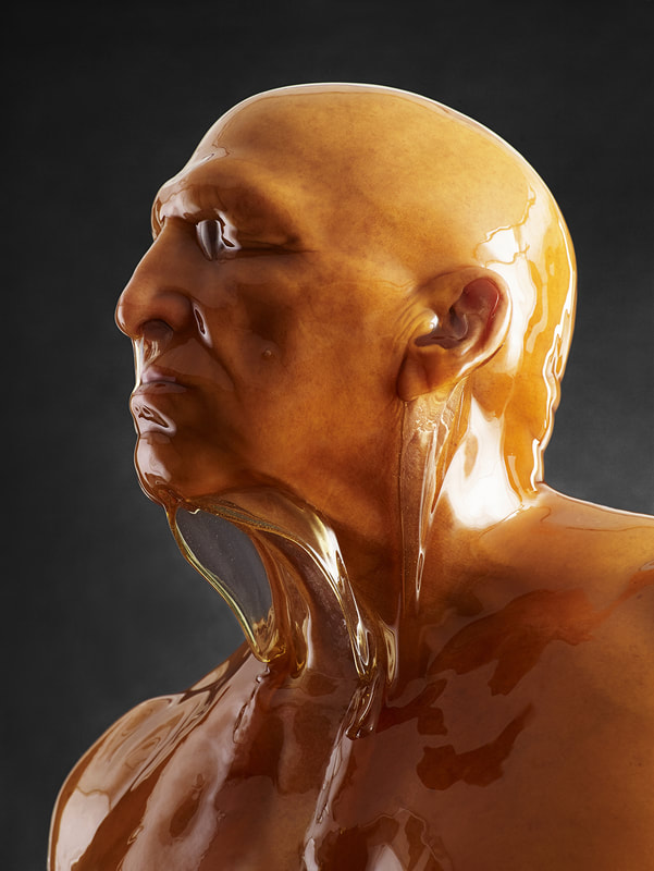
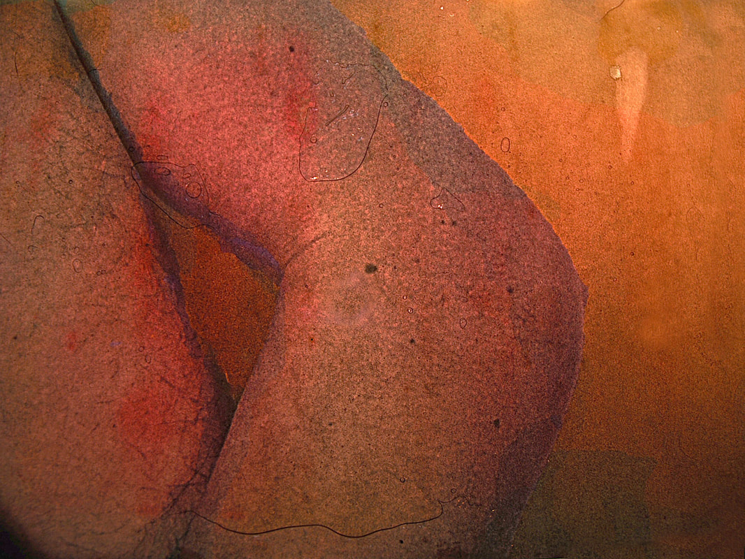
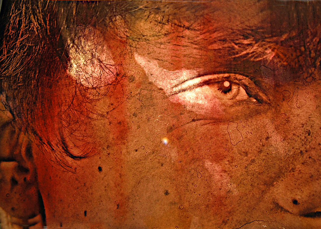
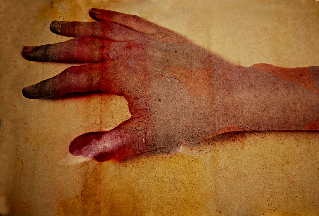
Blake Little
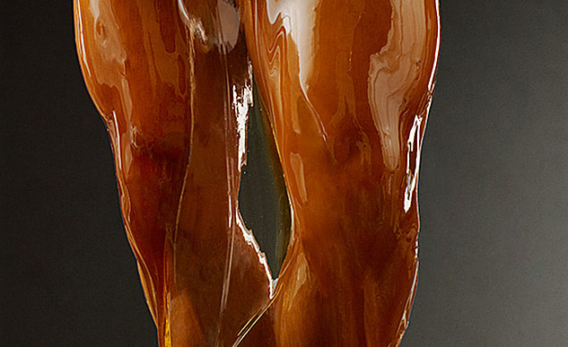
Blake Little is a photographer who explored the idea of preservation through the use of honey. The gallons of honey created a stunning golden layer over the models. He photographed people while naked and covered in honey, the thick golden coat looked like amber and so he named the project preservation. The money gives the models a smooth finished look, and makes them look like statues. I wanted to cover my photos in honey to give them the bubble effect Myra Greene's have, but also to give them the glossy, golden preserved look Blake Little's photos have.
|
|
Before completely covering the photos in honey I first looked at how I could place the honey to create certain effects. As shown in the slide shows, the photos first have stages of honey being placed in certain areas and dribbled down. Then the photos are coated in a full thick layer of honey.
The honey in this photo was placed along the bottom of the fingers, implying thy had been dipped in honey and it was now dripping off. This looks best in the second photo as the honey is thick and the golden, whereas in the third the honey has ran off too much and lost its thickness. The fourth photo is taken without flash and the fifth with flash. Without flash, the honey gives the photo a thick coating, plastic effect however may draw detail away from the actual photo. Whereas with flash the honey looks less thick and more airy. As it created more bubbles and the photo under could still be seen.
With this photo it was harder to decide where to place the honey to run down, but i decided to do it on the eye as it would seem like a tear drop. Then from the ear and the head, however when I tilted the paper to run the honey down the face it also ran the honey around the eye ruining the tear drop. Despite, the honey highlights the eyes detail though its glossy effect. Next the photos were completely covered in honey, in the fourth photo there is no flash and in the fifth flash was used. Again without flash the photo has a thick plastic feel, whereas with flash the honey gives it an underwater glistening feel. Creating a purer floaty effect, whereas a stiff thick one.
In this photo I decided to run the honey along the top and place different consistencies of it, when i ran the honey down this allowed the lines to be different lengths and thicknesses. As seen in the 1st and 2nd photos, I particularly like how some of the lines have thinned and then become thicker at different stages of the lines. In the third photo it was all covered in honey and not taken with flash, however in the fourth and fifth the photo is taken with flash. Similar to the ones above, without flash a thick layer of plastic is depicted, this links to Blake Little as it unifies the photos qualities and adds a preserved look. The ones taken with flash again add an underwater, light, airy effect. Also the detail of the photo is more prominent when taken with flash as the photo is clearer to see.
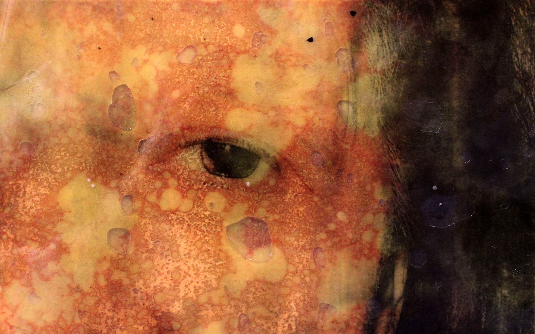
After the photos had been completely covered in honey, I flattened them by putting acetate paper on top as it is clear and squashed the honey creating air bubbles. This created an effect similar to Greene's bubble effect she created by spraying bleach on. Once they were under the acetate paper I put them on top of the light box and photographed them. This made the colour shine through, this is seen most clearly in the face picture, red lines appeared and gave them a older more damaged effect.
In the first photo the colours were highlighted in an complementary way to each other and the squashed honey creates a aged authentic look. Much like in the last photo, the paper looks worn out like an teabag effect. Further isolating the hand from the whole body. However in the second photo it looks less worn down, this may be because the photo fills the whole frame. The red lines and where the light has shone through more add to the authenticity of the photos. Linking to making them look more like one off prints then photos, which Myra Greene wanted to do. As well putting them on the light box allowed them to portray a deeper meaning and darker emotions are portrayed.
In the first photo the colours were highlighted in an complementary way to each other and the squashed honey creates a aged authentic look. Much like in the last photo, the paper looks worn out like an teabag effect. Further isolating the hand from the whole body. However in the second photo it looks less worn down, this may be because the photo fills the whole frame. The red lines and where the light has shone through more add to the authenticity of the photos. Linking to making them look more like one off prints then photos, which Myra Greene wanted to do. As well putting them on the light box allowed them to portray a deeper meaning and darker emotions are portrayed.
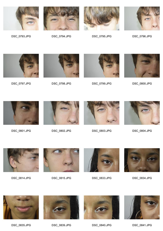
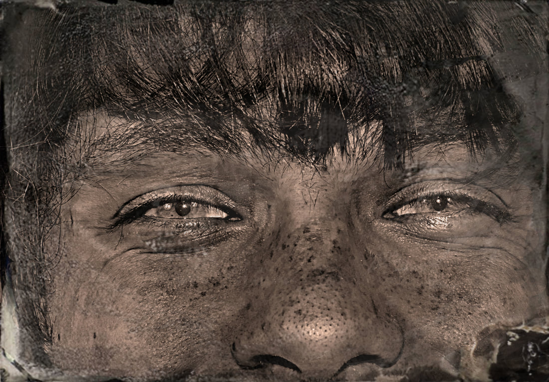
Final piece: Ages
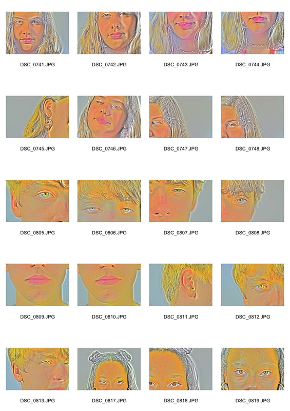
This section was for my final piece, so I tired to incorporate parts of what I done so far into it. I wanted to focus on the detail in facial features and the skin again, however i wanted a variety in features. So i photographed three different people of three different age groups, young (20's) middle age (40s) and elderly (70s). The aim was to show how the skin and its features age and alter overtime. Focusing on the ages and the detail was influenced from when i did work linked to John Coplans.
Also i wanted to try to create the colour effect i did above for Myra Greene's photos in photoshop naturally.
Also i wanted to try to create the colour effect i did above for Myra Greene's photos in photoshop naturally.
|
|
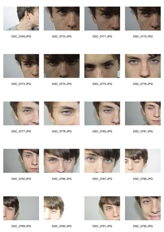
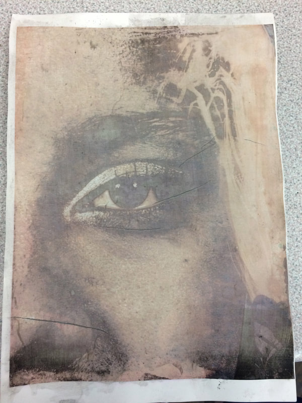
I took these photos in front of a white wall so they would have a plain background that would not draw the attention away from the subject. I used a high aperture and flash to highlight the details of the face, I did mainly close up shots to fill the frame so the focus was purely on the face. I focused on comparing their side faces, lips and eyes.
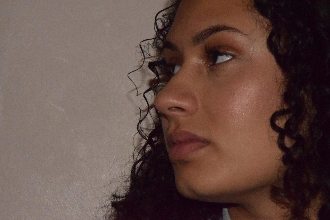
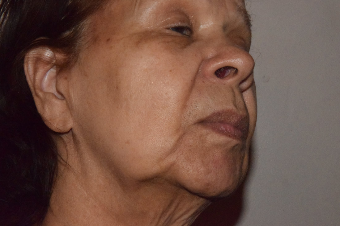
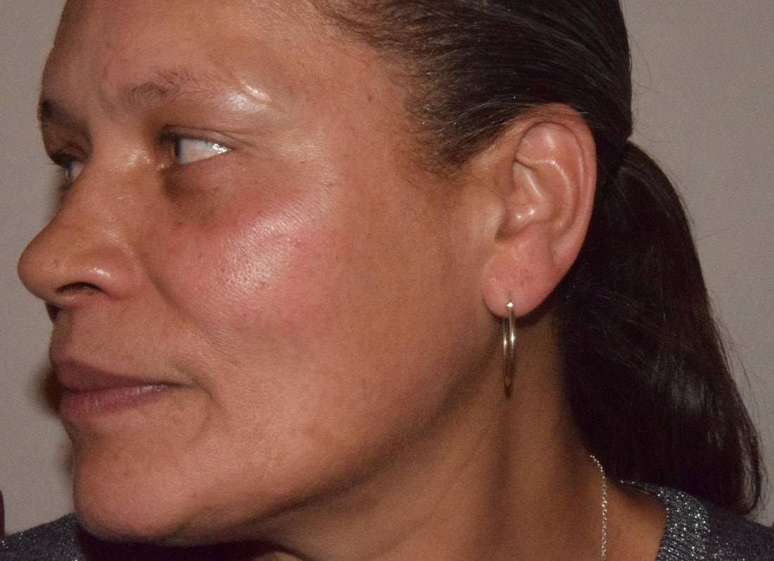
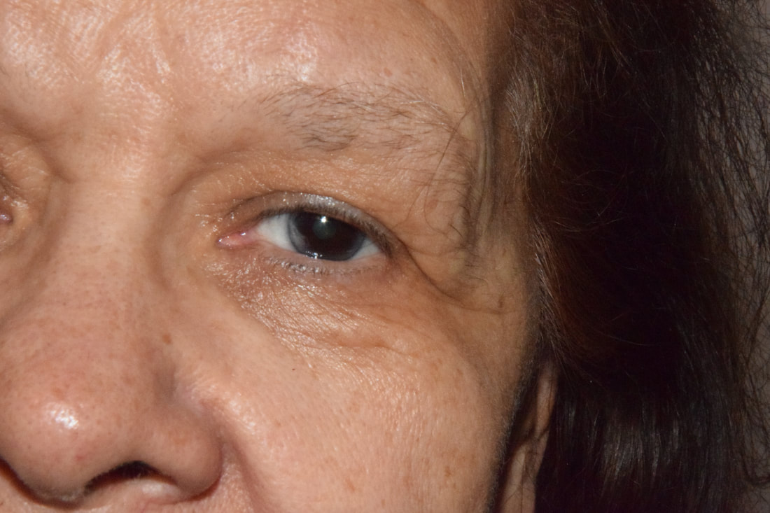
The first row of photos focused on the side profiles of the ages and their differences, the second on the mouth and the third on the eyes. I chose these first three as they all portray a longing look through their eyes y showed the difference in the ages of skin. The next three were focusing on the mouth, however the last was of the whole face as it was better then the ones I took of the mouth. The first lip photo is simplistic and has a clear structure to it as the face is framed nicely by the hair. The next photo in itself, depicts the aging that has occurred overtime on the teeth and gums due to smoking. The shape of the mouth and teeth give the photo a more gritty look compared to the others. The last row focused on the eyes and this quarter of the face. The first works well in capturing the detail and emotion, however there is too much negative space as the photo was not taken close enough. The next two capture the colour of the eyes nicely and the detail of the skin around the eyes, especially in the last photo as the frame is completely full, drawing all the viewers attention to the details.
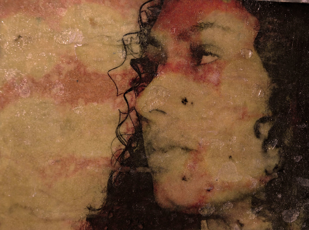
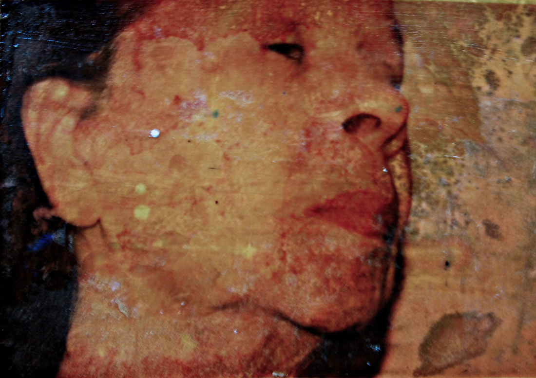
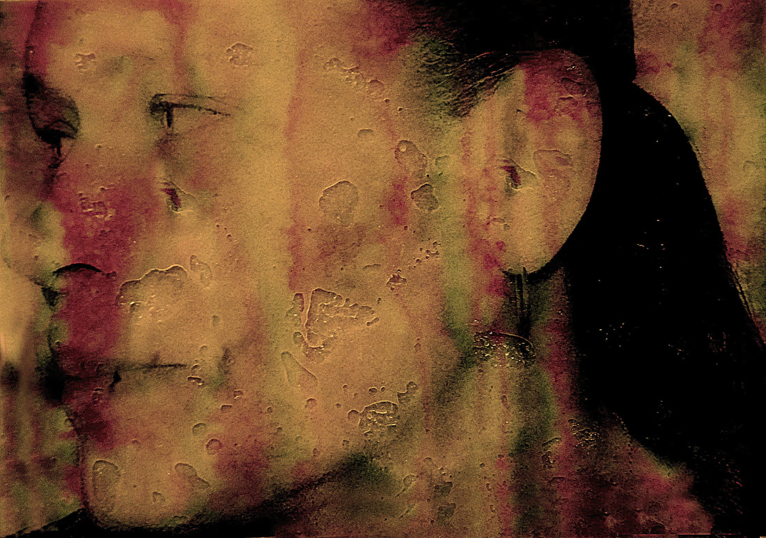
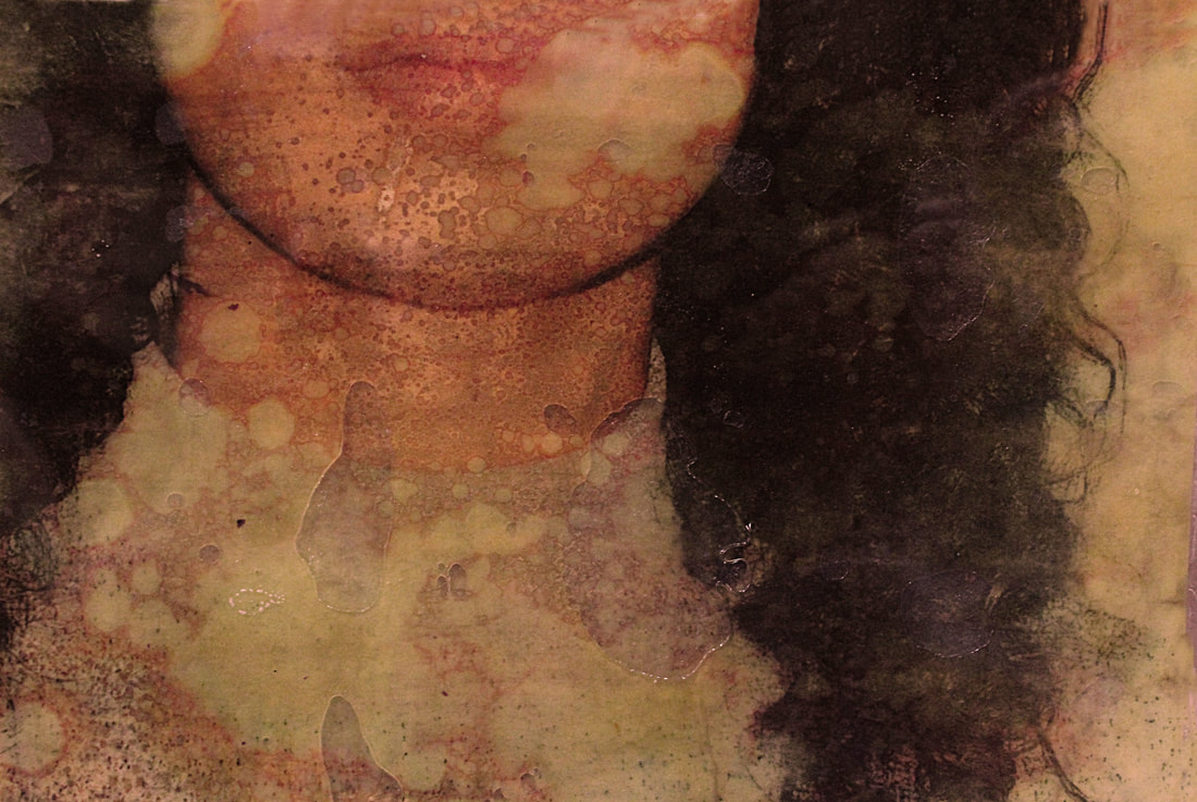
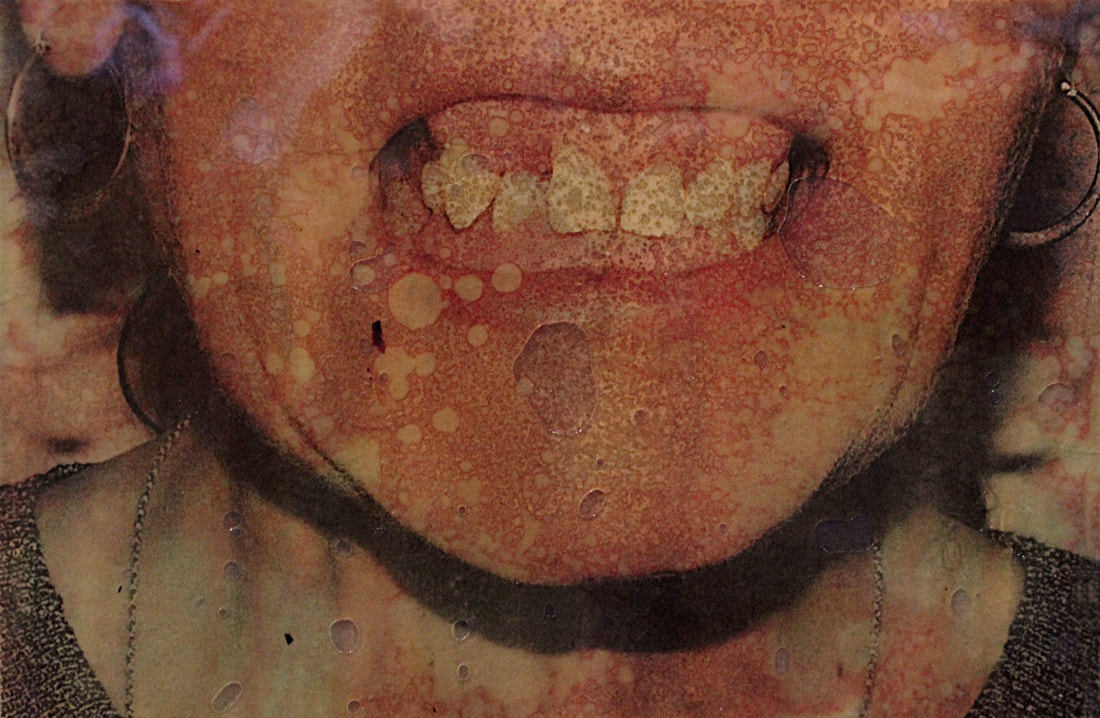
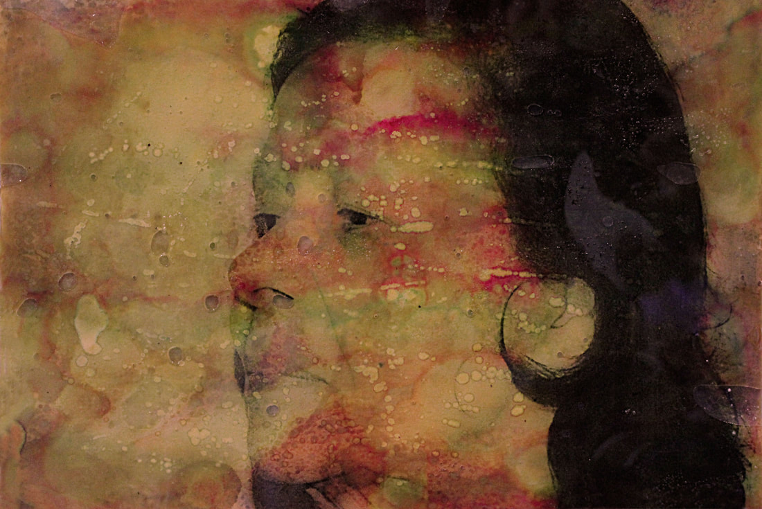
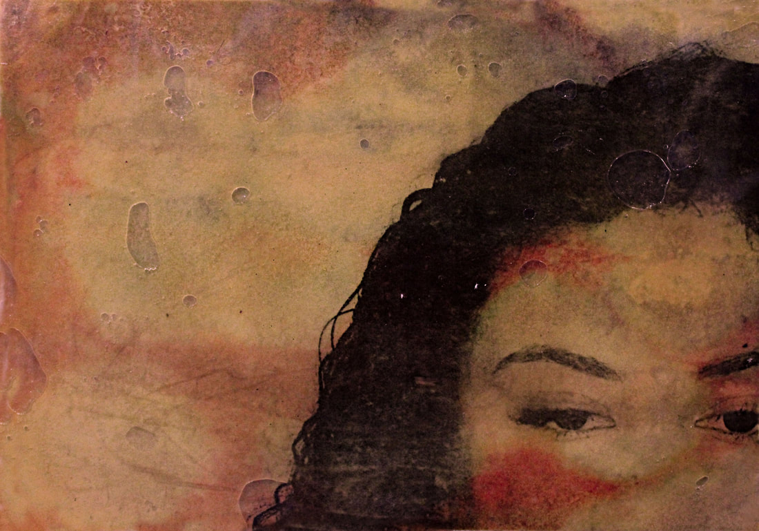
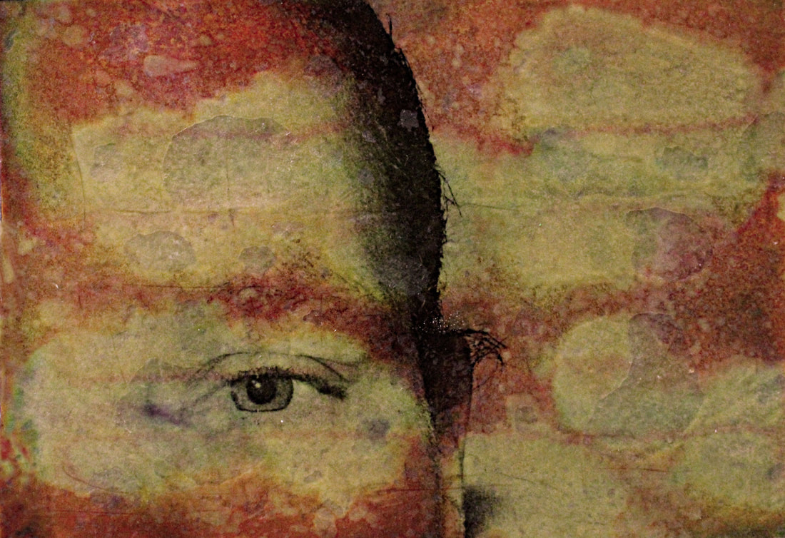
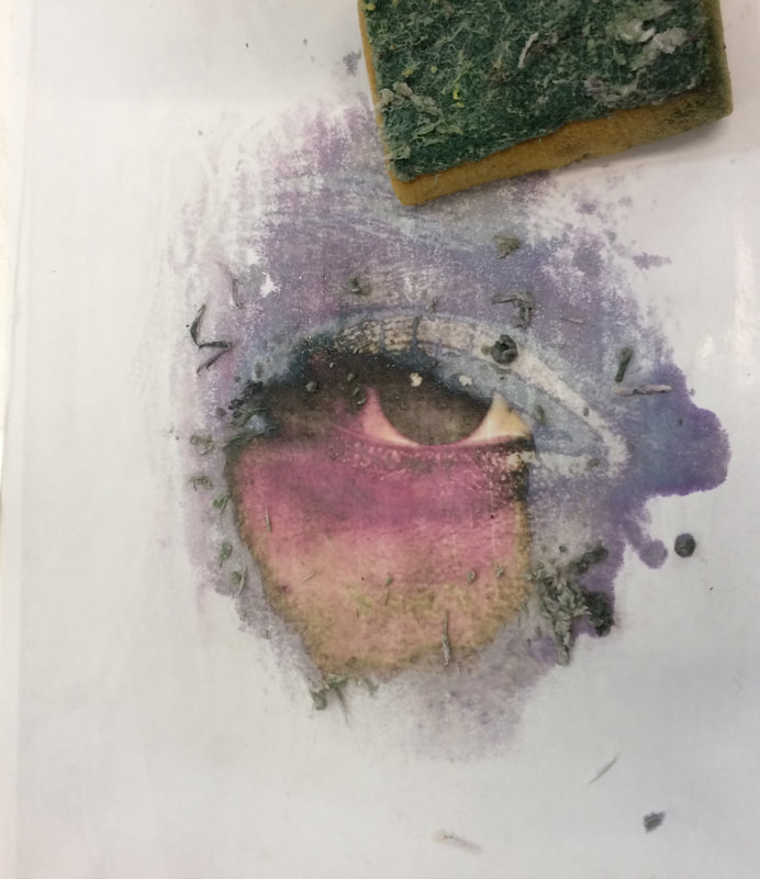
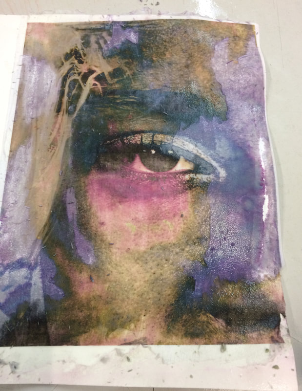
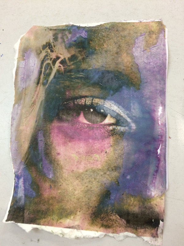
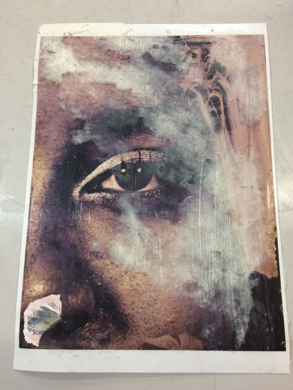
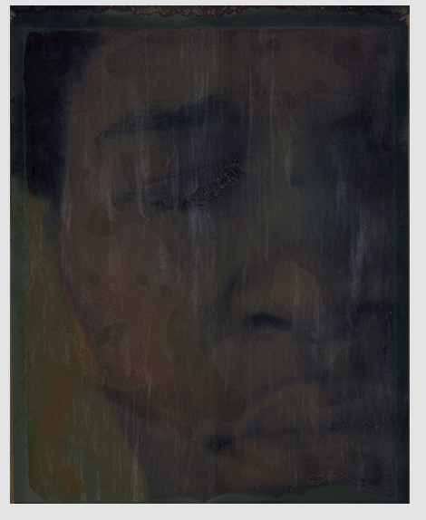
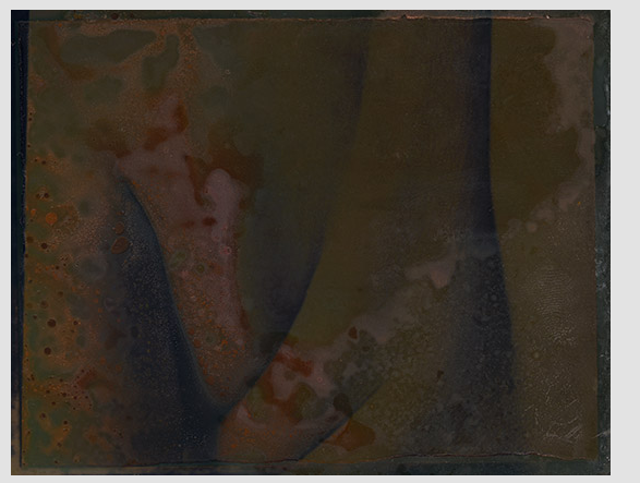
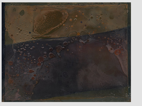
I tired to create the colours Myra Greene used in hers naturally by using bleach. Then a layer of honey was used to create the bubble effect. First i printed the photos out on a piece of card, so that the paper would have texture and thickness to it. I wanted the paper to have these qualities so that the bleach would not erode the paper just the image. (The photos were printed in colour). Next i placed them in trays and sprayed them with bleach, this is why there are white patches as this was were the lumps of bleach sat. I then wiped bleach all over the photos and sprayed areas lightly. Where there is small dots, such as in the fifth photo, this is were the bleach has been lightly sprayed. I then rinsed them off with water to stop the bleach from changing the photo anymore and waited fro them to dry. The bleach had changed the photos from simple portraits, to having a deeper, more gritty meaning. The next stage in creating the photos above, was to layer them in honey and then place them under acetate paper so that the money would be squashed and air bubbles would appear. Lastly i used photoshop to sharpen the detail of the bubbles and features. I also used various photo filters, such as yellows, reds, and magenta to give all the photos a similar colour and effect.
Using bleach gave the photos a more unique quality than using photoshop did. This links to the same intentions Myra Greene had, as she wanted them to look more like one-off prints than photos. However it was more experimental and so i did not know what the photos would look like until the process was done. Due to using an experimental method instead of photoshop, the bleach effected the photos in slightly different ways. The main problem with using the bleach was that it drained/removed the detail in areas. For example the actually creases in the skin that can be seen in the original photos can not be seen in the final product. Making it harder to compare the differences of ageing skin, nevertheless it added a new detail of the overall atmosphere of the photos.
In the first photo the features stayed dark whereas the skin faded away, this makes the bleach effect look as if it was projected onto the face. The bleach in the next photo created many different colours which none of the others have, creating a very unique image. Even though the detail of the skin may have been lost, the colours the bleach made add a more interesting aspect to the photo. Again the next came out very different, adding a uniqueness to the image. Red and green lines appeared along the face, as if the colour had been drained off the image and not sprayed on. It creates a damaged effect, aswell the honey created many bubbles underneath around the face further adding to this damaged almost decaying look. In this row the images all have been transformed to look like strong murals of significant figures portraying deep emotions through there looks.
In the next row the first one has lost too much detail in parts eg around the mouth, however the image still works in isolating the mouth area of the face. In second in this row has been transformed from a picture of some teeth to a impressionable gritty one, the very small dots over the skin and discolour of the neck skin imply a infected dirty atmosphere to the photo. In the last one in this row the bleach got rid of a lot of the detail nut added its own, much like in the third one of the first row, deep greens and reds were shown and the honey looks as if it has been sprayed across the face.
In the last row the first photos features are shown in a strong dark way much like the first photo in the first row, creating an almost silhouette effect. On the face area the bleach is nicely sectioned off creating a pattern, however in the negative space of the photo the bleach has drained the colour too much. In the next photo the bleach has gotten rid of most of the skins detail, however this worked to an advantage of the photo as it highlighted the beauty of the eye. Again in the last photo the eye is the focus of the photo as it is most rich in colour, however the bleach drained all the detail from the photo, leaving it looking too noisy and not appealing.
Final selects
These were the final images I decided to get printed, I decided to get them printed in A3 instead of A2 as I did not want their detail to get lost when blowing them up. I thought A3 would be the right size to display them and allow them to keep their rich and dense detail and colour.